Choosing the right icon for the Store in a UWP or Desktop Bridge app
The manifest editor included in Visual Studio 2017 for UWP or Desktop Bridge apps is a great starting point to handle the various assets of your application. Thanks to an option added starting from the 2017 release, in fact, you have the chance to automatically generate all the required assets (including support for the various scaling factors) starting from a single high resolution image.
However, if you want a more polished result, you can also differentiate the various assets, by choosing to use different images for the various sizes which are required.
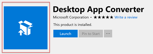
One of the assets that you can customize is the one for the Store listing, which is highlighted in the image below:
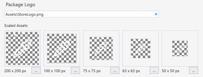
Often, it happens that many developers try to handle this asset by setting the one called Package Logo in the manifest editor:
However, if you set it and then you upload the application on the Store, you will notice that that it isn’t actually used. As you can notice, the name of the file is StoreLogo.png and this has led many developers to believe that this is actually the image used by the Store when it lists your application. Unfortunately, the name is misleading because this asset is actually used for other scenarios, like:
- The App Installer (the screen you see when you sideload an application by manually double clicking on an AppX package)
- The Dev Center
- The report an app option on the Store
- The write a review option on the Store
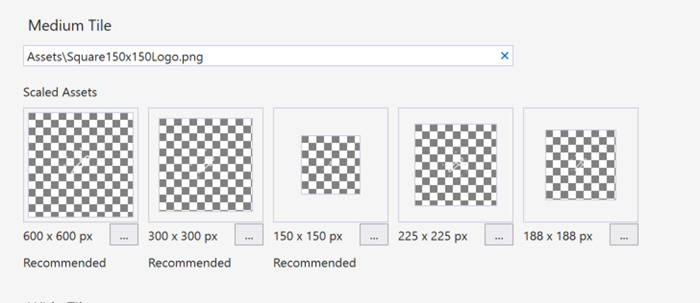
The real asset used for Store listing is the same one used for the Medium tile, which file name is called Square150x150Logo.png:
What if I want to have a different asset for the Medium Tile and for the Store listing? Good news, since a while the Dev Center has added an option to further customize the Store logo by uploading a custom image during the submission instead of using the asset included in the package.
You’ll find this option in the section called Store logos, inside the Store listing step of the submission process:
Here you have the option to upload:
- One image with resolution 1080 x 1080 or 2160 x 2160 pixels, which will be used on every Windows 10 device
- One image with resolution 720 x 1080 or 1440 x 2160 pixel, which will be used on the Xbox Store. If you don’t upload this image, the previous one will be used.
- One image with resolution 300x300, which however applies only to Windows Phone 8.1 applications.
Once you have uploaded the images, you also have to check the option below titled For customers on Windows 10 and Xbox, display uploaded logo images instead of the images from my packages. This way you’ll be sure that the Store will use the images you have provided instead of the Medium Tile asset from your package.
Wrapping up
In this post we have seen a great way to polish even further the Store listing of your application, making it even more appealing for your customers. As an advice, my suggestion is to use this option to provide assets with a better quality and more polished than the ones in the package. It shouldn’t be used to provide an asset completely different than the one that you’re going to use as tile or in the Start menu listing. It could generate confusion for the final user, who expects to find in his computer the same or a similar icon than the one he saw on the Store.
You can find more details on the official documentation https://docs.microsoft.com/en-us/windows/uwp/publish/app-screenshots-and-images#store-logos
Happy coding!


