Not Monitored
Tag not monitored by Microsoft.
41,891 questions
This browser is no longer supported.
Upgrade to Microsoft Edge to take advantage of the latest features, security updates, and technical support.
' cx='32' cy='32' r='32' /%3E%3Ctext x='50%25' y='55%25' dominant-baseline='middle' text-anchor='middle' fill='%23FFF' %3EJS%3C/text%3E%3C/svg%3E)
I am currently working on a dashboard report for engineers performance and seemed to have found some rather strange behaviour that I can not seem to fathom out. The report consists of a number of similar charts showing several different KPIs that the business relies on. I tried to highlight a selected category selected by the user but some charts work and some others fail. After searching around the data trying different things I found what the problem is but unsure what needs to be done to stop the problem.
Basic Report with no highlights works correctly, data sorted ok.
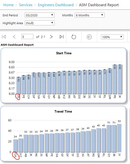
Labels on first columns correct with data expected.
Selecting a person to highlight depending on values for AB
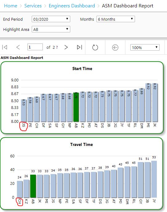
Both charts have the correctly highlighted category and labels on axis are correct.
Selecting first category on the top chart (which is the one that works correctly).
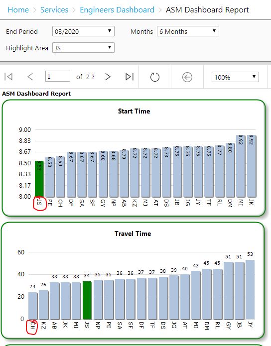
Again both charts have a correctly highlighted category.
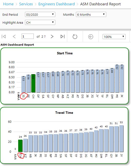
Choosing to highlight the first category in the bottom chart the following happens.
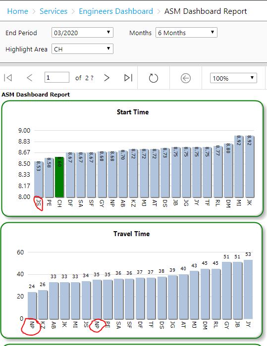
The category label for the first column is incorrect it instead duplicates one off the other categories, but the data value is correct. This is only happening on the first column of some charts. By adding in a dummy row of data so that the data for CH is in column 2, the highlighting works see below.
Any ideas on what I need to do to sort the problem out. Adding the extra data is possible but looks untidy, I can blank out labels etc, but adding filter to chart creates the same problem.
Thank you
Jason

Hi,
Q&A currently supports the products listed in right-hand pane (more to be added later on)
You can reach the experts in the dedicated SQL Server Reporting Services forums over here:
https://social.msdn.microsoft.com/Forums/sqlserver/en-US/home?forum=sqlreportingservices
(please don't forget to mark helpful replies as answer)
Best regards,
Leon
Hi Leon
Sorry about that. I tried there but could not get it to submit, tried to get account verified but not working yet but said this was a new link.
I will wait for account to be verified and try again.
Stay Safe
Jason