Microsoft Keynotes and Death By PowerPoint
There is nothing quite like watching a presentation that is just jam-packed with bullet points, with a presenter that is reading the same information as you are. Jesper wrote a great post a few years ago on Death by Powerpoint, and Youtube is full of videos that mock PowerPoint presentations, such as this great bit on the perils of PowerPoint by comedian Don McMillan.
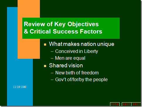
If you look back at the great speeches of history, was PowerPoint a critical success factor? Novig covers the Gettysburg Address as it would have appeared if President Lincoln had augmented his speech with PowerPoint (https://norvig.com/Gettysburg/)
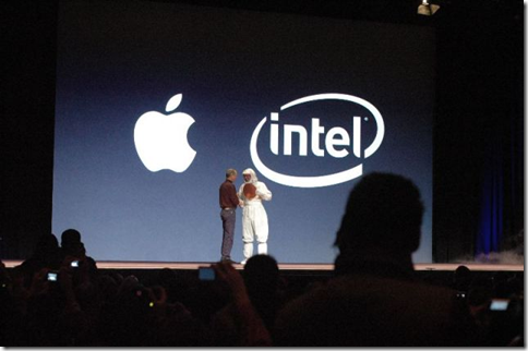
In the Technology Industry, Steve Jobs has a reputation for giving Keynote Presentations (yes, for you Mac-heads, that is a double-entendre) that are visually compelling, and virtually bereft of bullet points. (Image courtesy of MacObserver)
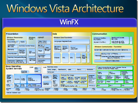
I hate to say it, but when I think of "Microsoft Presentations", I tend to think of beauties like the following from Jim Allchin's presentation during Bill Gates' keynote at the 2005 Professional Developer's Conference. Apparently Windows Vista is comprised of a bunch of boxes.
Fortunately, there are academics and authors that have researched and presented on better ways of sharing information with audiences, and the solution does not involve bullet points and eight-point-fonts.
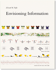
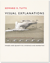
According to Edward Tufte, Professor Emeritus at Yale University, who has written several works on the topic of visualizing information:
We've drifted into this presentation mode without realizing the cost to the content and the audience in the process.
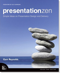
Garr Reynolds has a great blog (Presentation Zen) and book by the same name that covers simple ideas on Presentation Design and Delivery (ironically, the subtitle of the book).
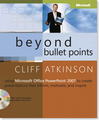
Even MS Press has a book on presentation design (Beyond Bullet Points by Cliff Atkinson) that shows how to use PowerPoint to create presentations that inform, motivate, and inspire (yes, I copied the subtitle again).
So... why does this matter? Am I just lamenting about the presentations from Microsoft? Nope! I was watching Ray Ozzie's keynote from MIX08, and was pleasantly surprised to see visually compelling PowerPoint Decks, bereft of bullet points, that served to enhance the speaker, rather than interfere with the presentations. The Agenda is simple, bullet-points are non-existent, colors convey where Ozzie/Guthrie were in the presentation, and the footer of each slide ties back into the agenda.
Scroll back up to look at the PDC '05 slide, and then take a gander at the ones below. They are absolutely night-and-day, and I believe they reflect the enhanced focus on design that is taking place at Microsoft.
Comments
Anonymous
January 01, 2003
You want a real challenge, try delivering a presentation to a camera or microphone. No audience.Anonymous
January 01, 2003
PingBack from http://technology.thegeekyblog.com/2008/03/17/microsoft-keynotes-and-death-by-powerpoint/Anonymous
January 01, 2003
Stay tuned... Microphone and Camtasia are on their way ;)
