How to: Observe Fabric Data Warehouse utilization trends
Applies to: ✅ SQL analytics endpoint and Warehouse in Microsoft Fabric
Learn how to observe trends and spikes in your data warehousing workload in Microsoft Fabric using the Microsoft Fabric Capacity Metrics app.
The Microsoft Fabric Capacity Metrics app provides visibility into capacity usage for all Fabric workloads in one place. It's mostly used by capacity administrators to monitor the performance of workloads and their usage, compared to purchased capacity.
Prerequisites
- Have a Microsoft Fabric licenses, which grants Capacity Units (CUs) shared across all Fabric workloads.
- Add the Microsoft Fabric Capacity Metrics app from AppSource.
Observe overall trend across all items in Fabric capacity
In the Fabric Capacity Metrics app, use the Multi metric ribbon chart to find peaks in CU utilization. Look for patterns in your Fabric usage that coincide with peak end-user activity, nightly processing, periodic reporting, etc. Determine what resources are consuming the most CUs at peak utilization and/or business hours.
This graph can provide high-level CU trends in the last 14 days to see which Fabric workload has used the most CU.
- Use the Item table to identify specific warehouses consuming most Compute. The
Itemstable in the multi metric ribbon chart provides aggregated consumption at item level. In this view, for example, you can identify which items have consumed the most CUs. - Select "Warehouse" in the Select item kind(s) dropdown list.
- Sort the Item table by CU(s), descending.
- You can now identify the items using the most capacity units, overall duration of activity, number of users, and more.
Drill through peak activity
Use the timepoint graph to identify a range of activity where CU utilization was at its peak. We can identify individual interactive and background activities consuming utilization.
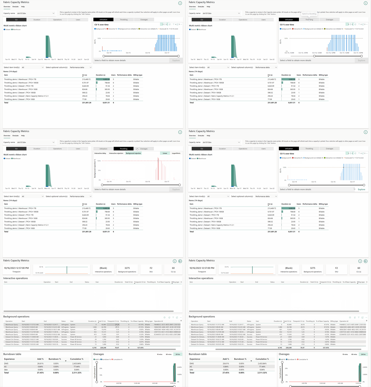
The following animated image walks through several steps you can use to drill through utilization, throttling, and overage information. For more information, visit Throttling in Microsoft Fabric.
- Select the Utilization tab in timepoint explore graph to identify the timepoint at which capacity utilization exceeded more than what was purchased. The yellow dotted line provides visibility into upper SKU limit. The upper SKU limit is based on the SKU purchased along with the enablement of autoscale, if the capacity has autoscale enabled.
- Select the Throttling tab and go to the Background rejection section, which is most applicable for Warehouse requests. In the previous sample animated image, observe that on October 16, 2023 at 12:57 PM, all background requests in the capacity were throttled. The 100% line represents the maximum limit based on the Fabric SKU purchased.
- Select the Overages tab. This graph gives an overview of the debt that is being collected and carry forwarded across time periods.
- Add % (Green): When the capacity overloads and starts adding to debt bucket.
- Burndown % (Blue): When the debt starts burning down and overall capacity utilization falls below 100%.
- Cumulative % (Red): Represents the total overall debt at timepoints. This needs to be burned down eventually.
- In the Utilization, Throttling, or Overages tabs, select a specific timepoint to enable the Explore button for further drill through analysis.
- Select Explore. The new page provides tables to explore details of both interactive and background operations. The page shows some background operations that are not occurring at that time, due to the 24-hour smoothing logic. In the previous animated image, operations are displayed between October 15 12:57 PM to October 16 12:57 PM, because of the background operations still being smoothed at the selected timepoint.
- In the Background operations table, you can also identify users, operations, start/stop times, durations that consumed the most CUs.
The table of operations also provides a list of operations that are InProgress, so you can understand long running queries and its current CU consumption.
Identification of an operation that consumed many resources: sort the table by Total CU(s) descending to find the most expensive queries, then use Operation Id to uniquely identify an operation. This is the distributed statement ID, which can be used in other monitoring tools like dynamic management views (DMVs) and Query Insights for end-to-end traceability, such as in
dist_statement_idin sys.dm_exec_requests, anddistributed_statement_idin query insights.exec_requests_history. Examples:The following sample T-SQL query uses the Operation Id inside a query on the
sys.dm_exec_requestsdynamic management view.SELECT * FROM sys.dm_exec_requests WHERE dist_statement_id = '00AA00AA-BB11-CC22-DD33-44EE44EE44EE';The following T-SQL query uses the Operation Id in a query on the
queryinsights.exec_requests_historyview.SELECT * FROM queryinsights.exec_requests_history WHERE distributed_statement_id = '00AA00AA-BB11-CC22-DD33-44EE44EE44EE`;
- The Burndown table graph represents the different Fabric workloads that are running on this capacity and the % compute consumed by them at the selected timepoint.
- The table entry for DMS is your Warehouse workload. In the previous sample animated image, DMS has added 26% to the overall carryforward debt.
- The Cumulative % column provides a percentage of how much the capacity has overconsumed. This value should be below 100% to avoid throttling. For example, in the previous sample animated image, 2433.84% indicates that DMS used 24 times more capacity than what the current SKU (F2) allows.
Related content
- Billing and utilization reporting in Fabric Data Warehouse
- Monitor connections, sessions, and requests using DMVs
- Workload management
- Fabric Data Warehouse performance guidelines
- What is the Microsoft Fabric Capacity Metrics app?
- Smoothing and throttling in Fabric Data Warehouse
- Pause and resume in Fabric Data Warehouse
