Universal Windows Platform (UWP)
A Microsoft platform for building and publishing apps for Windows desktop devices.
3,010 questions
This browser is no longer supported.
Upgrade to Microsoft Edge to take advantage of the latest features, security updates, and technical support.
' cx='32' cy='32' r='32' /%3E%3Ctext x='50%25' y='55%25' dominant-baseline='middle' text-anchor='middle' fill='%23FFF' %3ESW%3C/text%3E%3C/svg%3E)
Hi
Something get wrong with a textbox background in my uwp project .
Till yesterday my app works fine and today i made so change : i replace the base grid with a relative panel
but when i run the app the textbox has lost the background but if i click the relative panel area the background comebacks .
So for testing i opened a new blank uwp project and copied the xaml code and also in the design i added an another textbox
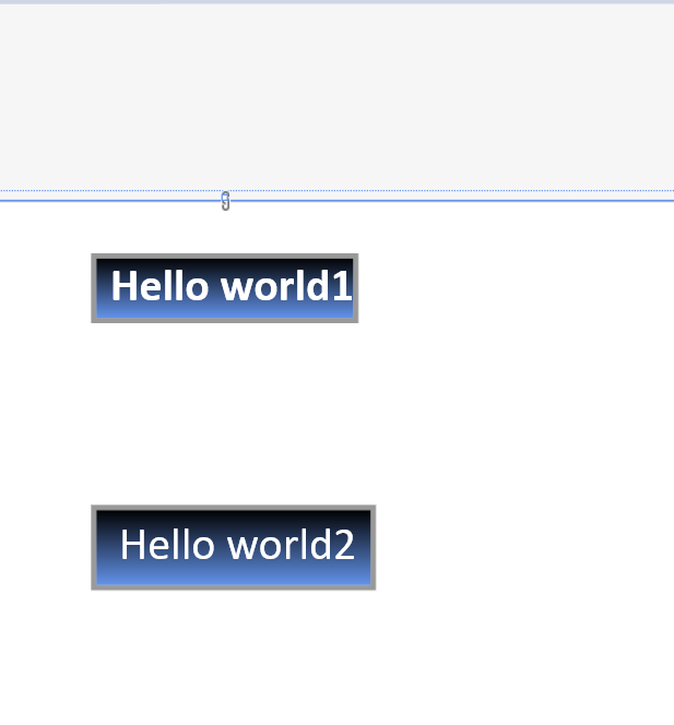
<TextBox x:Name="title" Text="Hello world1"  FontFamily="Calibri" FontSize="21"
FontWeight="Bold" IsReadOnly="True" Padding="6,0,0,0" Foreground="White TextWrapping="Wrap"   Height="auto"  Width="auto"
HorizontalAlignment="Center" VerticalAlignment="Top" Margin="0,24,0,0" ><TextBox.Background>
<LinearGradientBrush EndPoint="0.5,1" StartPoint="0.5,0">
<GradientStop Color="Black"/>
<GradientStop Color="CornflowerBlue" Offset="1"/>
</LinearGradientBrush>
</TextBox.Background>
</TextBox>

<TextBox x:Name="title2" HorizontalAlignment="Center" Height="Auto"  Width="Auto"
 Margin="0,672,0,0" Text="Hello world2" Foreground="White"
 TextWrapping="Wrap" VerticalAlignment="Top" FontFamily="Calibri" FontSize="21">
<TextBox.Background>
<LinearGradientBrush EndPoint="0.5,1" StartPoint="0.5,0">
<GradientStop Color="Black"/>
<GradientStop Color="CornflowerBlue" Offset="1"/>
</LinearGradientBrush>
</TextBox.Background>
</TextBox>
Here the design
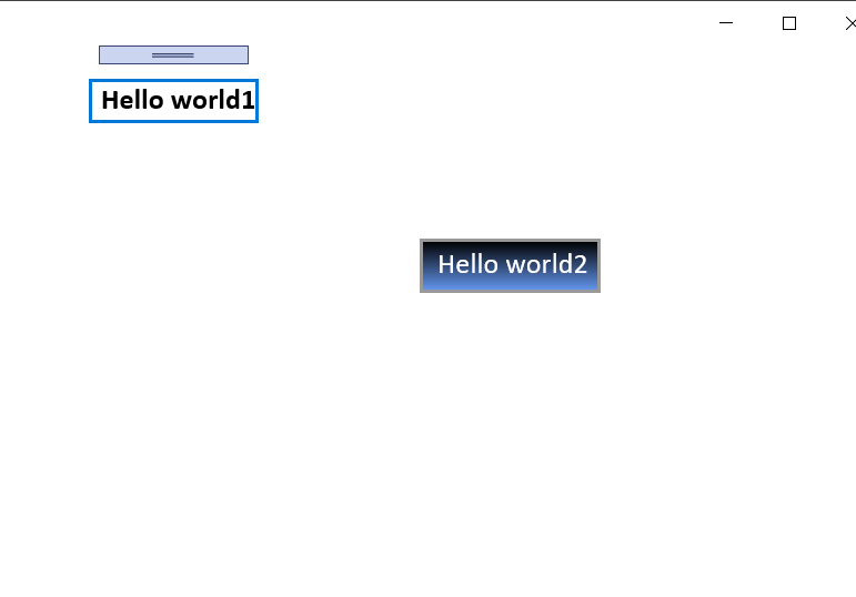
When i run the app
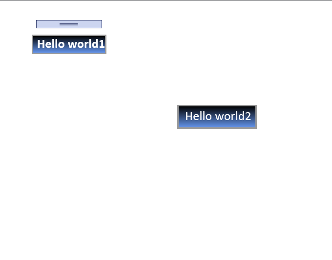
After i clicked the relative panel
Thanks

Hello,
Welcome to our Microsoft Q&A platform!
The TextBox background changes because it has the focus.
Interactive controls like TextBox are stateful. Maybe you will find that when you click the TextBox, the border color and text color will be darkened. The same situation will happen to Button, such as pointer over the button and pressed button, the color of the button will change.
The Background you currently set will only be applied to the TextBox in the default state. If you want to completely customize the style of the TextBox in various states, you need to modify the TextBox control template.
<LinearGradientBrush EndPoint="0.5,1" StartPoint="0.5,0" x:Key="CustomTextBoxBackground">
<GradientStop Color="Black"/>
<GradientStop Color="CornflowerBlue" Offset="1"/>
</LinearGradientBrush>
<Style TargetType="TextBox" x:Key="CustomTextBoxStyle">
<Setter Property="Foreground" Value="{ThemeResource TextControlForeground}" />
<Setter Property="Background" Value="{ThemeResource CustomTextBoxBackground}" />
<Setter Property="BorderBrush" Value="{ThemeResource TextControlBorderBrush}" />
<Setter Property="SelectionHighlightColor" Value="{ThemeResource TextControlSelectionHighlightColor}" />
<Setter Property="BorderThickness" Value="{ThemeResource TextControlBorderThemeThickness}" />
<Setter Property="FontFamily" Value="{ThemeResource ContentControlThemeFontFamily}" />
<Setter Property="FontSize" Value="{ThemeResource ControlContentThemeFontSize}" />
<Setter Property="ScrollViewer.HorizontalScrollMode" Value="Auto" />
<Setter Property="ScrollViewer.VerticalScrollMode" Value="Auto" />
<Setter Property="ScrollViewer.HorizontalScrollBarVisibility" Value="Hidden" />
<Setter Property="ScrollViewer.VerticalScrollBarVisibility" Value="Hidden" />
<Setter Property="ScrollViewer.IsDeferredScrollingEnabled" Value="False" />
<Setter Property="Padding" Value="{ThemeResource TextControlThemePadding}" />
<Setter Property="UseSystemFocusVisuals" Value="{ThemeResource IsApplicationFocusVisualKindReveal}" />
<Setter Property="ContextFlyout" Value="{StaticResource TextControlCommandBarContextFlyout}" />
<Setter Property="SelectionFlyout" Value="{StaticResource TextControlCommandBarSelectionFlyout}" />
<Setter Property="Template">
<Setter.Value>
<ControlTemplate TargetType="TextBox">
<Grid>
<Grid.Resources>
<Style x:Name="DeleteButtonStyle" TargetType="Button">
<Setter Property="Template">
<Setter.Value>
<ControlTemplate TargetType="Button">
<Grid x:Name="ButtonLayoutGrid"
BorderBrush="{ThemeResource TextControlButtonBorderBrush}"
BorderThickness="{TemplateBinding BorderThickness}"
Background="{ThemeResource TextControlButtonBackground}">
<VisualStateManager.VisualStateGroups>
<VisualStateGroup x:Name="CommonStates">
<VisualState x:Name="Normal" />
<VisualState x:Name="PointerOver">
<Storyboard>
<ObjectAnimationUsingKeyFrames Storyboard.TargetName="ButtonLayoutGrid" Storyboard.TargetProperty="Background">
<DiscreteObjectKeyFrame KeyTime="0" Value="{ThemeResource TextControlButtonBackgroundPointerOver}" />
</ObjectAnimationUsingKeyFrames>
<ObjectAnimationUsingKeyFrames Storyboard.TargetName="ButtonLayoutGrid" Storyboard.TargetProperty="BorderBrush">
<DiscreteObjectKeyFrame KeyTime="0" Value="{ThemeResource TextControlButtonBorderBrushPointerOver}" />
</ObjectAnimationUsingKeyFrames>
<ObjectAnimationUsingKeyFrames Storyboard.TargetName="GlyphElement" Storyboard.TargetProperty="Foreground">
<DiscreteObjectKeyFrame KeyTime="0" Value="{ThemeResource TextControlButtonForegroundPointerOver}" />
</ObjectAnimationUsingKeyFrames>
</Storyboard>
</VisualState>
<VisualState x:Name="Pressed">
<Storyboard>
<ObjectAnimationUsingKeyFrames Storyboard.TargetName="ButtonLayoutGrid" Storyboard.TargetProperty="Background">
<DiscreteObjectKeyFrame KeyTime="0" Value="{ThemeResource TextControlButtonBackgroundPressed}" />
</ObjectAnimationUsingKeyFrames>
<ObjectAnimationUsingKeyFrames Storyboard.TargetName="ButtonLayoutGrid" Storyboard.TargetProperty="BorderBrush">
<DiscreteObjectKeyFrame KeyTime="0" Value="{ThemeResource TextControlButtonBorderBrushPressed}" />
</ObjectAnimationUsingKeyFrames>
<ObjectAnimationUsingKeyFrames Storyboard.TargetName="GlyphElement" Storyboard.TargetProperty="Foreground">
<DiscreteObjectKeyFrame KeyTime="0" Value="{ThemeResource TextControlButtonForegroundPressed}" />
</ObjectAnimationUsingKeyFrames>
</Storyboard>
</VisualState>
<VisualState x:Name="Disabled">
<Storyboard>
<DoubleAnimation Storyboard.TargetName="ButtonLayoutGrid"
Storyboard.TargetProperty="Opacity"
To="0"
Duration="0" />
</Storyboard>
</VisualState>
</VisualStateGroup>
</VisualStateManager.VisualStateGroups>
<TextBlock x:Name="GlyphElement"
Foreground="{ThemeResource TextControlButtonForeground}"
VerticalAlignment="Center"
HorizontalAlignment="Center"
FontStyle="Normal"
FontSize="12"
Text=""
FontFamily="{ThemeResource SymbolThemeFontFamily}"
AutomationProperties.AccessibilityView="Raw" />
</Grid>
</ControlTemplate>
</Setter.Value>
</Setter>
</Style>
</Grid.Resources>
<VisualStateManager.VisualStateGroups>
<VisualStateGroup x:Name="CommonStates">
<VisualState x:Name="Normal" />
<VisualState x:Name="Disabled">
<Storyboard>
<ObjectAnimationUsingKeyFrames Storyboard.TargetName="HeaderContentPresenter" Storyboard.TargetProperty="Foreground">
<DiscreteObjectKeyFrame KeyTime="0" Value="{ThemeResource TextControlHeaderForegroundDisabled}" />
</ObjectAnimationUsingKeyFrames>
<ObjectAnimationUsingKeyFrames Storyboard.TargetName="BorderElement" Storyboard.TargetProperty="Background">
<DiscreteObjectKeyFrame KeyTime="0" Value="{ThemeResource TextControlBackgroundDisabled}" />
</ObjectAnimationUsingKeyFrames>
<ObjectAnimationUsingKeyFrames Storyboard.TargetName="BorderElement" Storyboard.TargetProperty="BorderBrush">
<DiscreteObjectKeyFrame KeyTime="0" Value="{ThemeResource TextControlBorderBrushDisabled}" />
</ObjectAnimationUsingKeyFrames>
<ObjectAnimationUsingKeyFrames Storyboard.TargetName="ContentElement" Storyboard.TargetProperty="Foreground">
<DiscreteObjectKeyFrame KeyTime="0" Value="{ThemeResource TextControlForegroundDisabled}" />
</ObjectAnimationUsingKeyFrames>
<ObjectAnimationUsingKeyFrames Storyboard.TargetName="PlaceholderTextContentPresenter" Storyboard.TargetProperty="Foreground">
<DiscreteObjectKeyFrame KeyTime="0" Value="{Binding PlaceholderForeground, RelativeSource={RelativeSource TemplatedParent}, TargetNullValue={ThemeResource TextControlPlaceholderForegroundDisabled}}" />
</ObjectAnimationUsingKeyFrames>
</Storyboard>
</VisualState>
<VisualState x:Name="PointerOver">
<Storyboard>
<ObjectAnimationUsingKeyFrames Storyboard.TargetName="BorderElement" Storyboard.TargetProperty="BorderBrush">
<DiscreteObjectKeyFrame KeyTime="0" Value="{ThemeResource TextControlBorderBrushPointerOver}" />
</ObjectAnimationUsingKeyFrames>
<ObjectAnimationUsingKeyFrames Storyboard.TargetName="BorderElement" Storyboard.TargetProperty="Background">
<DiscreteObjectKeyFrame KeyTime="0" Value="{ThemeResource CustomTextBoxBackground}" />
</ObjectAnimationUsingKeyFrames>
<ObjectAnimationUsingKeyFrames Storyboard.TargetName="PlaceholderTextContentPresenter" Storyboard.TargetProperty="Foreground">
<DiscreteObjectKeyFrame KeyTime="0" Value="{Binding PlaceholderForeground, RelativeSource={RelativeSource TemplatedParent}, TargetNullValue={ThemeResource TextControlPlaceholderForegroundPointerOver}}" />
</ObjectAnimationUsingKeyFrames>
<ObjectAnimationUsingKeyFrames Storyboard.TargetName="ContentElement" Storyboard.TargetProperty="Foreground">
<DiscreteObjectKeyFrame KeyTime="0" Value="{ThemeResource TextControlForegroundPointerOver}" />
</ObjectAnimationUsingKeyFrames>
</Storyboard>
</VisualState>
<VisualState x:Name="Focused">
<Storyboard>
<ObjectAnimationUsingKeyFrames Storyboard.TargetName="PlaceholderTextContentPresenter" Storyboard.TargetProperty="Foreground">
<DiscreteObjectKeyFrame KeyTime="0" Value="{Binding PlaceholderForeground, RelativeSource={RelativeSource TemplatedParent}, TargetNullValue={ThemeResource TextControlPlaceholderForegroundFocused}}" />
</ObjectAnimationUsingKeyFrames>
<ObjectAnimationUsingKeyFrames Storyboard.TargetName="BorderElement" Storyboard.TargetProperty="Background">
<DiscreteObjectKeyFrame KeyTime="0" Value="{ThemeResource CustomTextBoxBackground}" />
</ObjectAnimationUsingKeyFrames>
<ObjectAnimationUsingKeyFrames Storyboard.TargetName="BorderElement" Storyboard.TargetProperty="BorderBrush">
<DiscreteObjectKeyFrame KeyTime="0" Value="{ThemeResource TextControlBorderBrushFocused}" />
</ObjectAnimationUsingKeyFrames>
<ObjectAnimationUsingKeyFrames Storyboard.TargetName="ContentElement" Storyboard.TargetProperty="Foreground">
<DiscreteObjectKeyFrame KeyTime="0" Value="{ThemeResource TextControlForegroundFocused}" />
</ObjectAnimationUsingKeyFrames>
<ObjectAnimationUsingKeyFrames Storyboard.TargetName="ContentElement" Storyboard.TargetProperty="RequestedTheme">
<DiscreteObjectKeyFrame KeyTime="0" Value="Light" />
</ObjectAnimationUsingKeyFrames>
</Storyboard>
</VisualState>
</VisualStateGroup>
<VisualStateGroup x:Name="ButtonStates">
<VisualState x:Name="ButtonVisible">
<Storyboard>
<ObjectAnimationUsingKeyFrames Storyboard.TargetName="DeleteButton" Storyboard.TargetProperty="Visibility">
<DiscreteObjectKeyFrame KeyTime="0">
<DiscreteObjectKeyFrame.Value>
<Visibility>Visible</Visibility>
</DiscreteObjectKeyFrame.Value>
</DiscreteObjectKeyFrame>
</ObjectAnimationUsingKeyFrames>
</Storyboard>
</VisualState>
<VisualState x:Name="ButtonCollapsed" />
</VisualStateGroup>
</VisualStateManager.VisualStateGroups>
<Grid.RowDefinitions>
<RowDefinition Height="Auto" />
<RowDefinition Height="*" />
<RowDefinition Height="Auto" />
</Grid.RowDefinitions>
<Grid.ColumnDefinitions>
<ColumnDefinition Width="*" />
<ColumnDefinition Width="Auto" />
</Grid.ColumnDefinitions>
<ContentPresenter x:Name="HeaderContentPresenter"
Grid.Row="0"
Grid.Column="0"
Grid.ColumnSpan="2"
Content="{TemplateBinding Header}"
ContentTemplate="{TemplateBinding HeaderTemplate}"
FontWeight="Normal"
Foreground="{ThemeResource TextControlHeaderForeground}"
Margin="{ThemeResource TextBoxTopHeaderMargin}"
TextWrapping="Wrap"
VerticalAlignment="Top"
Visibility="Collapsed"
x:DeferLoadStrategy="Lazy" />
<Border x:Name="BorderElement"
Grid.Row="1"
Grid.Column="0"
Grid.RowSpan="1"
Grid.ColumnSpan="2"
Background="{TemplateBinding Background}"
BorderBrush="{TemplateBinding BorderBrush}"
BorderThickness="{TemplateBinding BorderThickness}"
CornerRadius="{TemplateBinding CornerRadius}"
Control.IsTemplateFocusTarget="True"
MinWidth="{ThemeResource TextControlThemeMinWidth}"
MinHeight="{ThemeResource TextControlThemeMinHeight}" />
<ScrollViewer x:Name="ContentElement"
Grid.Row="1"
Grid.Column="0"
HorizontalScrollMode="{TemplateBinding ScrollViewer.HorizontalScrollMode}"
HorizontalScrollBarVisibility="{TemplateBinding ScrollViewer.HorizontalScrollBarVisibility}"
VerticalScrollMode="{TemplateBinding ScrollViewer.VerticalScrollMode}"
VerticalScrollBarVisibility="{TemplateBinding ScrollViewer.VerticalScrollBarVisibility}"
IsHorizontalRailEnabled="{TemplateBinding ScrollViewer.IsHorizontalRailEnabled}"
IsVerticalRailEnabled="{TemplateBinding ScrollViewer.IsVerticalRailEnabled}"
IsDeferredScrollingEnabled="{TemplateBinding ScrollViewer.IsDeferredScrollingEnabled}"
Margin="{TemplateBinding BorderThickness}"
Padding="{TemplateBinding Padding}"
IsTabStop="False"
AutomationProperties.AccessibilityView="Raw"
ZoomMode="Disabled" />
<TextBlock x:Name="PlaceholderTextContentPresenter"
Grid.Row="1"
Grid.Column="0"
Grid.ColumnSpan="2"
Foreground="{Binding PlaceholderForeground, RelativeSource={RelativeSource TemplatedParent}, TargetNullValue={ThemeResource TextControlPlaceholderForeground}}"
Margin="{TemplateBinding BorderThickness}"
Padding="{TemplateBinding Padding}"
Text="{TemplateBinding PlaceholderText}"
TextAlignment="{TemplateBinding TextAlignment}"
TextWrapping="{TemplateBinding TextWrapping}"
IsHitTestVisible="False" />
<Button x:Name="DeleteButton"
Grid.Row="1"
Grid.Column="1"
Style="{StaticResource DeleteButtonStyle}"
BorderThickness="{TemplateBinding BorderThickness}"
Margin="{ThemeResource HelperButtonThemePadding}"
IsTabStop="False"
Visibility="Collapsed"
AutomationProperties.AccessibilityView="Raw"
FontSize="{TemplateBinding FontSize}"
MinWidth="34"
VerticalAlignment="Stretch" />
<ContentPresenter x:Name="DescriptionPresenter"
Grid.Row="2"
Grid.Column="0"
Grid.ColumnSpan="2"
Content="{TemplateBinding Description}"
Foreground="{ThemeResource SystemControlDescriptionTextForegroundBrush}"
AutomationProperties.AccessibilityView="Raw"
x:Load="False"/>
</Grid>
</ControlTemplate>
</Setter.Value>
</Setter>
</Style>
You can copy this code into Page.Resources tag.
Use
<TextBox Style="{StaticResource CustomTextBoxStyle}"/>
Thanks.