Plan and implement SharePoint site navigation
The fundamental principles and practices for site and page navigation apply to classic and modern SharePoint architectures. However, your options for implementing navigation differ based on the framework for your sites and intranet. For example, the default navigation experiences available in classic SharePoint site hierarchies - sites with subsites - aren't available in the modern experience.
Instead, hubs provide a great way to achieve the cross-site navigation features previously available in managed navigation and site hierarchies in classic SharePoint. No matter which framework you're using, you can use the guidance in this document to help you create the right navigation for your organization.
In this article:
- Explore considerations and best practices for site and page navigation design
- Learn about site navigation best practices
- Learn about menu styles and experiences
SharePoint site navigation
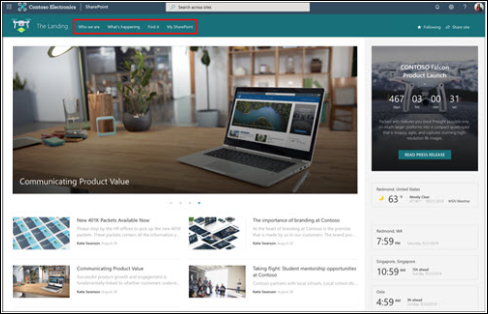
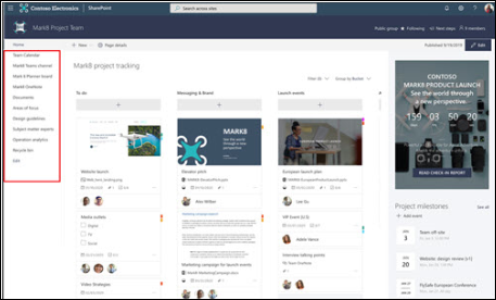
This planning guide primarily addresses site navigation: the top (team and communication sites and hubs) and left (team sites only) navigation experiences.
Top site navigation

Left site navigation

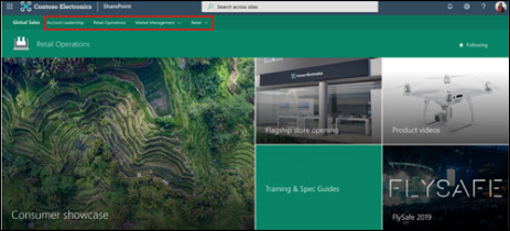
Hub navigation (top site)

"When we're observing customers carrying out tasks on websites we notice certain common patterns. For example, we find that when people arrive at a particular site they start by navigating about 70% of the time. When people get stuck navigating, they may resort to using site search." -- Gerry McGovern
Why navigation is important
The most effective SharePoint sites help viewers find what they need quickly so that they can use the information they need to make decisions, learn about what is going on, access the tools they need, or engage with colleagues to help solve a problem.
Even when search is available, most viewers start their web experiences by browsing. That pattern persists on internal web sites as well. Good navigation experiences present viewers with a complete picture of what is available on the site and, combined with the home page, provide a comprehensive "story" for the site.
Page navigation and site navigation display differently. The links in site navigation are static on every page in the site. The navigation links on individual pages are accessed only when the viewer lands on the page. A benefit to on-page links is that they can be different from page to page. Both types of navigational links guide your viewers by providing wayfinding experiences.
The key advantage of site navigation links is that they're always visible in the context of the site. Because site navigation links are persistent, they provide an opportunity to provide significant value for site viewers as they traverse the site and address their goals: to find and do what they came for. Hub navigation links extend this wayfinding experience to other sites in the hub “family.” This supports navigating to related content not just on the site, but on related sites as well. Setting site navigation links to open in a new tab can help site viewers find the information they want, without navigating away from the current page that they are on.
Site and page navigation fundamentals
When you plan site and page navigation, you want to think about:
- Organizing – Grouping logical and similar intents
- Labeling – Writing clear labels your users will immediately understand
- Usability – Users' ability to easily navigate the end to end experience
- Findability – Users' ability to quickly find what they need
Navigation should always be planned from the perspective of the user of information – the viewers to your site. Planning effective navigation involves considering not just the information you want to present, but also thinking about the information your viewers want or need to consume.
Therefore, organizing and labeling your navigation links is critical for the purposes of usability and findability. If 70% of viewers come to your sites expecting to browse for information, the usability of your site depends on creating a great browsing experience. To learn more, see Information architecture principles in SharePoint.
Organizing
There is no one right way to organize your navigation links. You will make different choices based on the type of site you're creating and your viewers. Organizing concepts might include:
- Services
- Products
- Activities
- Audiences (if your viewers can clearly identify the audience to which they belong – such as student or teacher)
- Expertise areas or functions
The default navigation for all SharePoint sites primarily includes type of content. For communication sites, the default navigation includes Documents, Pages, and Site Contents. These categories are helpful as you're building your site, but they are not typically going to add value to your viewers once your site is ready to launch.
This is because the consumer of a communication site typically doesn't care about the type of content – they care about the purpose or subject of the content. For communication sites, plan to delete the "out of the box" navigation when you're ready to launch and replace it with something that aligns with the guidance provided in the local navigation section of this guide.
The default navigation for team sites includes links to the related services provided by Microsoft 365 for modern teams – including a link to the shared team notebook and the conversations for the team in Outlook. These represent the typical features that teams need to effectively collaborate and might be hard for people to find without the experience provided by the navigation.
You may choose to supplement or refine these links for your team sites, but you will also likely find that the default navigation experience is a good starting point. You may be more likely to keep most of these links than you would with a communication site.
Navigation menus in SharePoint
There are two types of navigation menu styles for SharePoint sites - cascading and mega menu. Team sites and communication sites support both mega menus and cascading menus. Hubs, whether they are team sites or communication sites, add an additional mega menu to the site. Mega menus are not available in on-premises sites. Learn about how to customize the navigation on your SharePoint site.
Cascading menu

Mega menu

Menu links
There are two types of navigation links: a label and a link. A label is simply a category link – it lets you group related links but is not a link itself. A link requires a hyperlink and presents a “clickable” experience for the user. A label should always have at least one link below.
Both cascading and mega menus support up to three levels of navigation in your menu. The first level represents the tabs you see across the top. The second level is the next level below the tab and the third level is indented or below the second level. Mega menus work best when you're using all three levels of navigation experiences. If you use a mega menu, the second level of links will appear in bold. If you only need two levels in your menu, consider using the cascading style.
Menu experiences
There are two types navigation experiences – targeted and not targeted. With targeted navigation, you can choose who sees navigation links to create more personal navigation experiences. With non-targeted links, all users see the link, even if they don’t have access to the target location. Learn about how to target navigation links in menus.
Menu symbols
All types of menu links support some decoration with emojis. Emojis can be used at the beginning or end of a link label to add some visual interest to your links.
Choose an emoji that relates to the label topic. You can search for emojis at emojipedia.org, or use the Windows key + period (.). Copy the emoji and add it to the label when you're editing your navigation.
Link to pages, not individual documents
Document links open in a new window, which is helpful if someone wants to close the document after reading, but document links take viewers to a new context. In some cases, this may be the experience you want. But when navigation points to a page with an embedded document instead of directly to a document, you have an opportunity to provide context for the document and retain the navigational context for the site. Think about the following alternatives if you want to use a navigation link to open to a single document:
- Can you re-create the document content as a page instead of a document? Pages are easier to read online and provide opportunities to create rich, dynamic experiences for your viewers. Modern pages are easier to read on mobile devices. Documents are great when viewers need to download or print – but when all they need to do is read, a short, well-crafted page is a better way to present and maintain information.
- Embed the document or a link to the document on a page. When a visitor clicks the link to a page, the site navigation remains visible. The page allows you to provide context for the document and it also keeps the viewer in the context of your site.
Practice progressive disclosure
Navigation should answer the question, "What can I do on this site or from this location?" But, limited real estate on the navigation bar or quick launch means you need to apply the principle of progressive disclosure. This approach suggests that you group your content into logical categories and provide a limited set of choices for your viewers to allow them to explore each content category to learn more.
Progressive disclosure applies to all types of navigation and not just top or site navigation. It also applies to page content. You don't need to have a link to every bit of content on your site or in your portal in the navigation – but your viewers should be able to get a sense of the entire site by exploring your navigation options. Great navigation experiences help viewers understand:
- Where am I?
- What can I do here?
- Where can I go next?
Plan to optimize the navigation experiences for your viewers by combining navigation and page links to answer these three questions.
Managing navigation expectations
Navigation enhances the story of your digital workplace by making it easy for users to browse the content they need. On the internet, we expect to have to search for the content we need. Yet on the intranet, viewers expect a navigation experience that is carefully curated to help them understand and find the content they need.
Curating a navigation experience for intranets and digital workplaces comprised of even just a few hundred sites can be a daunting task – especially your goal (or the goal assigned to you) is to make sure that all content is findable in "three clicks." Contrary to popular belief, your viewers will not leave your site or give up if they are unable to find what they are looking for in three clicks! More or fewer clicks do not make viewers happier or perceive that the site is faster.
What really matters in navigation experiences is "information scent" – whether the label for the link provides an adequate clue about where the "click" will go. It is the quality of the label and whether the label fulfills its promise that has the highest impact on usability. Viewers are willing to click to find information if they are confident that with each click, they are headed in the right direction – closer to their goal.
"Information scent" on SharePoint sites can be achieved with clear, mutually exclusive labels for links and labels lists and libraries that clearly tell viewers what they will find. You can improve your navigation by spending time testing to make sure that the navigation labels resonate with your viewers and following the guidance for labels recommended in this document. Your navigation outcomes will be most successful if you take the time to understand your viewers, their key "tasks and asks," and design navigation experiences that keep their promises.