Guided walkthrough: Creating a leadership site for your organization
In this article, we show you elements of an example leadership site to inspire you, and help you learn how to create similar sites for your own organization. In this example, the leadership site provides your organization insight into the goals and priorities of the leadership team. Watch this video to see how to build it, or read the following article.
Let's get started
First, if you haven't already created a Communication site, check out the Create your site section in this article. If you need to learn how to add sections and web parts, check out the section Add sections and web parts in this article.
Once you have your created your site and know how to edit pages, you can use the following steps to add the elements shown.
Example leadership site
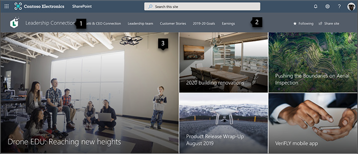
1. Showcase your company branding Make it yours with a logo and theme. Learn how
2. Make your site easy to get around Customize navigation to make it easy for people to discover important content on your site. Learn how
3. Focus on priorities Feature curated content that's a priority for the organization. Learn how

4. Share timely news Share the most recent news, like vision statements and blog postings. Learn how
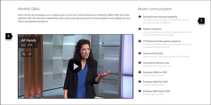
5. Connect to important resources Link to pages and sites that cover key topics. Learn how
6. Engage with video Add video to keep people updated on the latest talks, updates, and more. Learn how
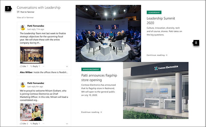
7. Keep communication fresh Share recent conversations and comments from your organization. Learn how
8. Showcase images Add more images with text and links to make your page look great and engage users. Learn how

9. Keep everyone up-to-date Show a calendar of the latest events. Learn how

10. Create a call to action Create a call to action for sign-ups, surveys, or other important actions. Learn how

11. Use text Use the Text web part to add a quote or share a message. Learn how
Create your site
To make a site like the one shown here, you'll create a Communication site. To do this, select Create site from the SharePoint start page (or, if you're going to associate this site with a Hub site, navigate to the hub site and select Create site there so that the communication site is automatically associated with that hub site).

Next, choose Communication site, and then the Blank layout. Fill out your site name, description, and other information, and select Finish.
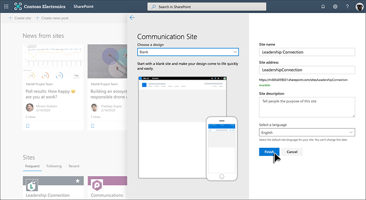
For more information, see Create a communication site in SharePoint Online.
Showcase your company branding
You can quickly and easily customize the look of your SharePoint site to reflect your professional style and brand.
Change the look settings are located under Settings  in the top right corner of your SharePoint site.
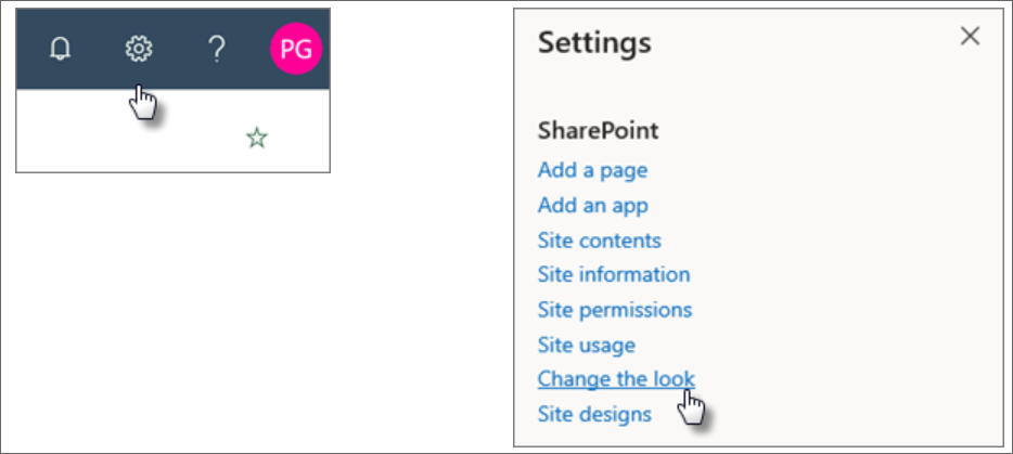
You can select the site theme you want, and even customize it.
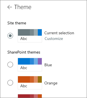
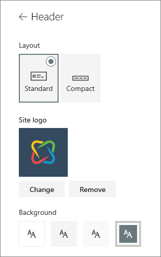
You can change your header layout and logo when you select Header under Change the look.
Under Change the look, you can also find options for navigation (cascade or mega menu) and footer options. For more information on changing the look of your site, see Change the look of your SharePoint site.
Make your site easy to get around
Easily edit the left and top menus to link the page to other SharePoint pages or on the Internet.
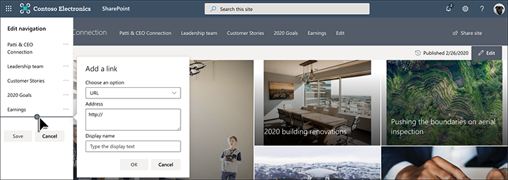
Select Edit on the bottom of the left navigation to manage links there, or on the top menu to manage links there. Hover over the location in the menu where you want to add a link, and select +. Then add the type of link you want to add, your website address, and name to display in the navigation bar in the Add a link dialog box. Want to reorder your navigation links? Just drag them into the position you want.
For more detailed information on navigation, see Customize the navigation on your SharePoint site.
Add sections and web parts
Sections make up your page, and are where you place one or more web parts. While editing the page, each section will show controls to edit the layout, move, or delete the sections.
Start editing by clicking Edit on the top right of the page.

The + symbol before or after a section adds a section using one of several layouts.
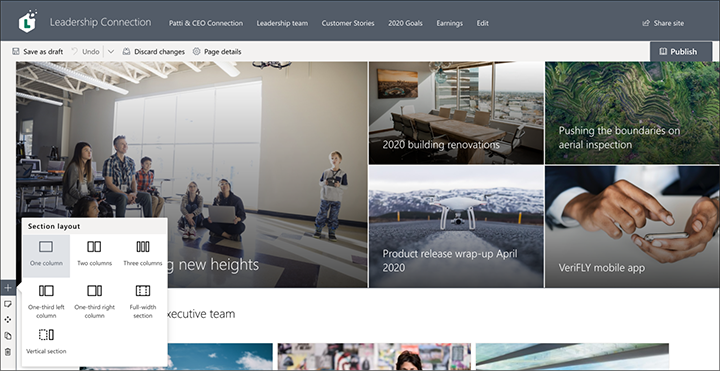
For information on working with sections, see Add or remove sections and columns on a page.
To add web parts to sections, select the plus symbol  in a section, which may appear before or after a web part in a section. Then select a web part to use. For more information on all web parts, see Using web parts on SharePoint pages.
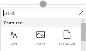
Web parts may be edited, moved, or deleted within sections. The Edit web part icon opens detailed controls unique to each web part type.
Focus on priorities with the Hero web part
Let your team know what's most important with high-impact hero images, company branding, and important news. The initial impact of the Leadership site home page is created by large and eye-catching images of the Hero web part. The layout used in this example is Three tiles.
Hero layout
Editing the web part presents layout options. The Tiles option, such as the one shown below, presents layouts for between one and five tiles. The Layers option sets each image as a layer with the image next to the title. Up to five layers are possible, so that you can use the web part to fill the entire page.
In this example, the Hero web part is in a full-width section.
Use the Move item  button on the left to rearrange the tiles within the Hero web part.
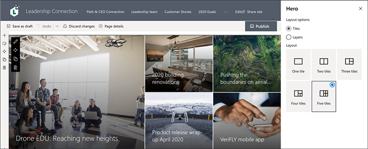
Customize each tile
When you select a tile, you'll see a toolbar at the bottom of the tile where you can select Edit details where you can change the link and image used. With the larger tile, you can also set call to action text and link. On the same toolbar, you can set focal point for the hover animation, plus zoom in and zoom out of the image.
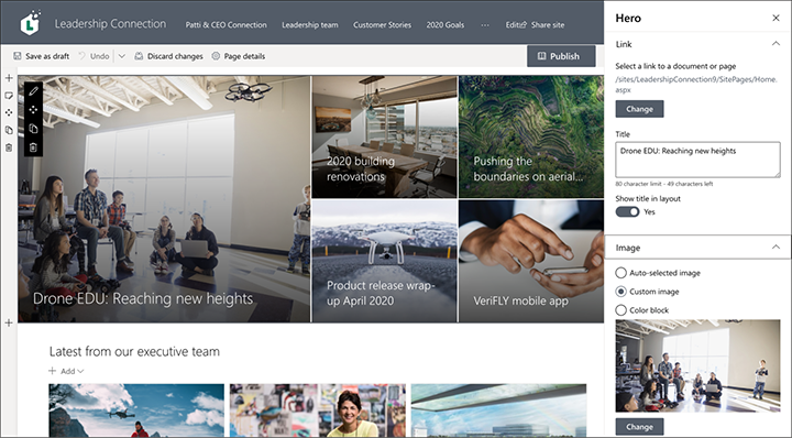
For more details on using the Hero web part, see Use the Hero web part.
Share timely news with the News web part
The News web part provides controls to choose the News Source and Layout, and to Organize and Filter the content. Under Layout, there are five options to adjust now news items are presented. In this example, news stories are coming the site as the source, and the Top story layout. The stories are presented side by side with large images because only two news stories on the site are published.
In this example, the web part is in a one-column section.
For more details on using the News web part, see Use the News web part on a SharePoint page.
Connect to important resources with the Quick Links web part
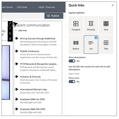
With the Quick links web part, you have the ability to easily create professional, on-page menus for listing links to other pages or sites. In this example, the web part is using the Compact layout, but other layouts, like Button and Filmstrip, are available.
In this Leadership site example shown above, this web part is in the second column of a two-column section.
For more details on using the Quick links web part, see Use the Quick Links web part.
Add video with the Stream web part
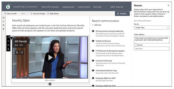
Using the Microsoft Stream service, you can add Stream videos to your page for enhanced visuals and higher user engagement.
In this Leadership site example shown above, this web part is in the first column of a two-column section.
For more details on using the Stream web part, see Use the Stream web part.
Keep communication fresh with the Viva Engage web part
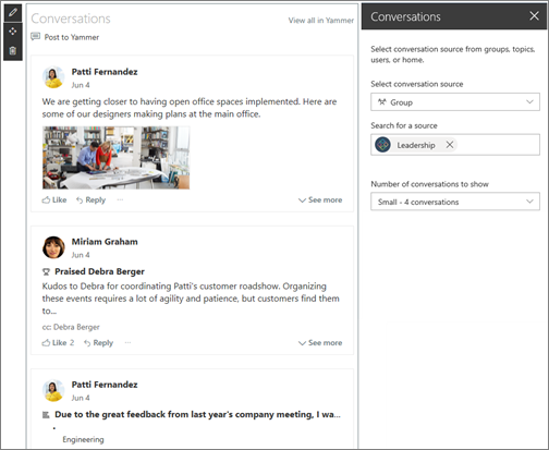
With Viva Engage, you can have organization-wide conversations. Now you can have those conversations right on your page with the Viva Engage Conversations web part. In this example, the conversation is being pulled from a Viva Engage group called Leadership.
In this Leadership site example shown above, this web part is in the first column of a two-column section.
For more details on using the Viva Engage web part, see Use a Viva Engage web part in SharePoint Online.
Engage users with a second Hero web part
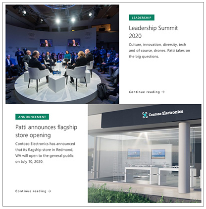
The Hero web part doesn't have to be for the top of the page only. In this example, a second hero web part further down the page uses the Layers layout with two rows to display larger images.
Learn more about the Hero web part.
Keep everyone up to date with the Events web part
The Events web part allows you to easily display upcoming events on your page. In this example, leadership events are highlighted.
In this Leadership site example, the web part is in the second column of a two-column section.
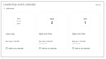
Learn more about the Events web part in Use the Events web part.
Add a Call to action web part
The Call to action web part allows you to create a button with a call to action for users. In this example, it's used to encourage and direct employees to sign up for a speaker session.
In this Leadership site example, the web part is in the second column of a two-column section.
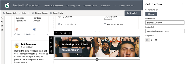
For more details on how to use this web part, see Use the Call to action web part.
Make words matter using the Text web part
Enhance the message
The leadership quote uses the Text web part. This web part allows basic text formatting, including styles and tables, for creating fixed sections of formatted text. In this example, the Text web part is using the Pull quote style. Clicking the ... control at the right end of the formatting toolbar offers more options to the right of the web part.
In this Leadership site example shown above, the web part is in a one-column section.
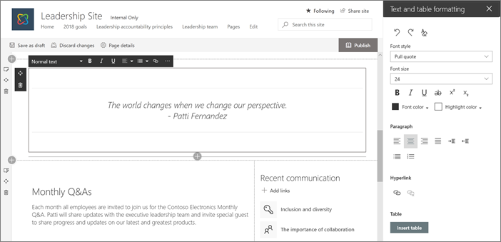
For more details on using the Text web part, see Add text and tables to your page with the Text web part.
Want more?
Get inspired with more examples in the SharePoint look book.
See other guided walkthroughs for creating sties for your organization.