Quality of service (QoS) dashboard
This dashboard displays the quality of deployments for all your offers. A higher offer deployment success signifies a higher quality of service offered to your customers.
View graphical representations of the following items:
- Total deployments
- Deployment by status
- Quality by offers
- Successful deployments
- Failed deployments
- Deployments – error codes and resources
- Deployment errors by offer plan
- Quality by deployment duration
- Geographical spread
Additionally, view offer deployment details in tabular form.
Important
This dashboard is currently only available for Azure application offers available to all (not private plans). For any public or private offer, if all plans are private then quality of service report does not show data
This feature is currently applicable to all partners performing deployment of Azure application offers using Azure Resource Manager (ARM) templates (but not for private plans). This report doesn't show data for other marketplace offers.
Note
The maximum latency for data reporting is 36 hours.
Page level filters
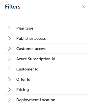
The page has different dashboard-level filters you can use to filter the Quality of service data based on the following:
- Plan type
- Publisher access
- Customer access
- Azure subscription ID
- Customer ID
- Offer ID
- Pricing
- Deployment location
Each filter is expandable with multiple options that you can select. Filter options are dynamic and based on the selected date range.
To select the filters, in the top-right of the page, select Filters.
In the panel that appears on the right, select the filters you want, and then select Apply.
Total deployments
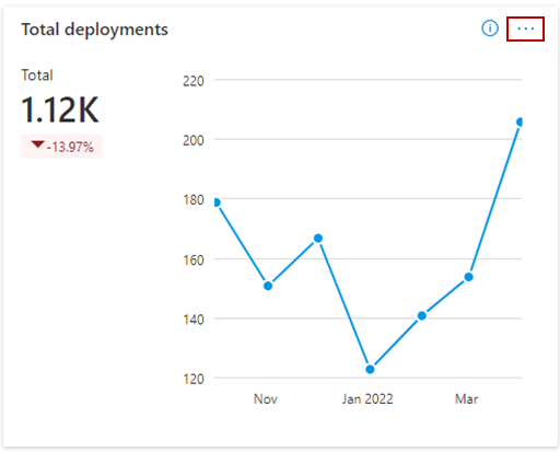
This graph shows the total deployment of offers. Metrics and growth trends are represented in a line chart. View value for each month by hovering over the line chart.
The percentage value below the Deployments metrics represents the amount of growth or decline during the selected month range.
About this graph:
- Total count of offer deployments for the selected date range.
- Change in percentage of offer deployments during the selected date range.
- Month over month trend of total count for offer deployments.
Deployments by status
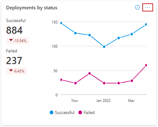
This graph shows the metric and trend of successful and failed offer deployments by customers for the selected month range. Offer deployments can have two statuses: Successful or Failed.
About this graph:
- Total count of successful and failed deployments of offers for the selected date range.
- Change in percentage of successful and failed offer deployments for the selected date range.
- Month over month trend of successful and failed offer deployment counts.
Quality by offers
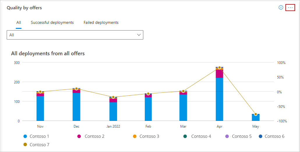
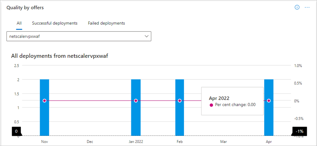
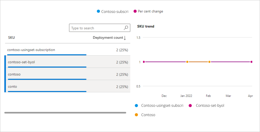
This graph shows quality-of-service by offers and their corresponding SKUs, also called plans. It provides metrics and trends for Total, Successful, and Failed offer deployments monthly. The bar chart represents the number of deployments.
The line chart represents the percentage change in:
- Total deployments (the All tab)
- Success deployments (the Successful tab)
- Failed deployments (the Failure tab).
The chart shows the metric and trends of all offers. The top offers are displayed in the graph and the rest of the offers are grouped as Rest All.
About this graph:
- Select specific offers in the legend to display only that offer and the associated SKUs in the graph.
- Hover over a slice in the graph to display the number of deployments and percentage of that offer compared to total number of deployments across all offers.
- The Quality by offers trend displays month-by-month growth or decline trends.
About this graph:
- Select specific offers and associated SKUs in the legend to be displayed.
- The Quality by offers trend displays month-by-month metrics.
- When viewing a month-over-month trend for an offer, select a maximum of three SKUs of that offer.
- The line chart represents the same percentage changes as noted for the prior graph.
Deployment errors codes and resources
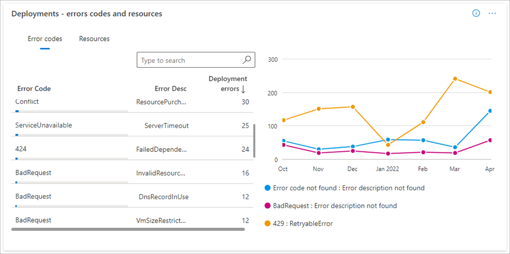
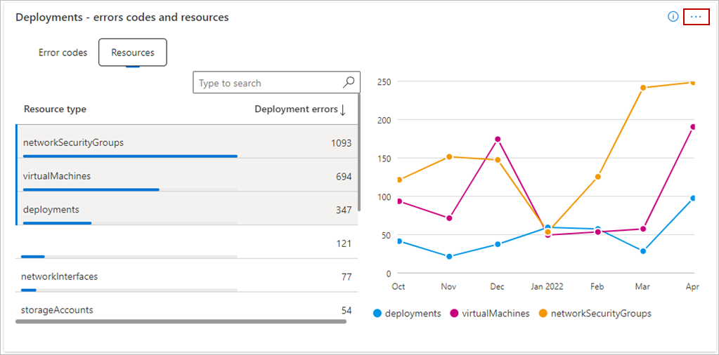
This graph shows metrics and trends of the offer deployments basis error codes and resources. The tabular section can be pivoted on error codes and resources. The first subtab provides analytics basis error codes, description, and error counts. The second provides an analytic basis for the deployment of resources. The line chart provides the total error count basis error codes and resources.
For more information about error codes, see Troubleshoot common Azure deployment errors with Azure Resource Manager and Resource providers for Azure services.
About these graphs:
- Select specific errors or resources in the legend to be displayed.
- The trend widget displays error count on a month-by-month basis.
- When viewing a month-over-month trend by error codes or resources, select a maximum of three items in the table.
- Sort error codes and resources for deployment failures by basis error count in the table.
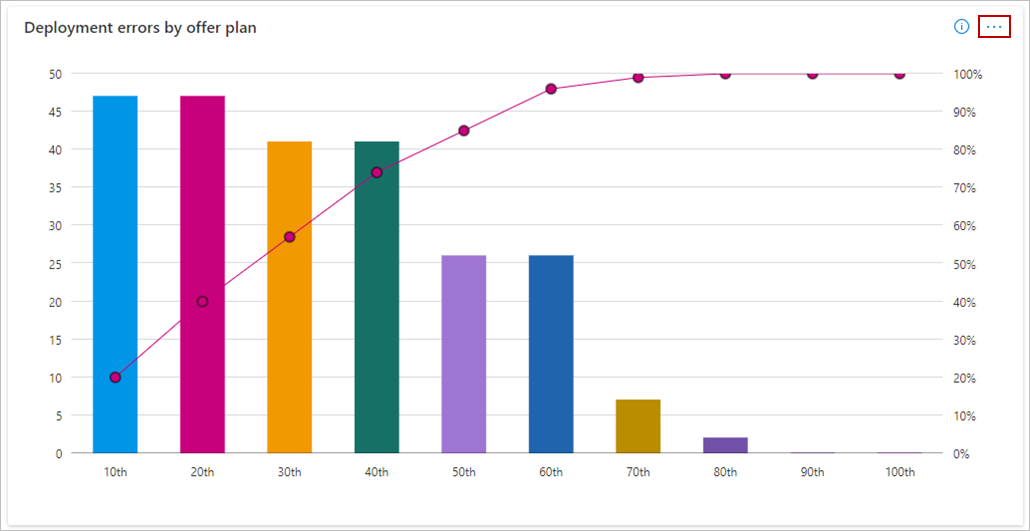
Deployment errors by offer plan
On this graph, the Y-axis represents deployment error count and the X-axis represents the percentile of top offer plans (by error count).
About this graph:
- The bar chart represents the deployment error counts for the selected month range.
- The values on the line chart represent the cumulative error percentages by offer plan.
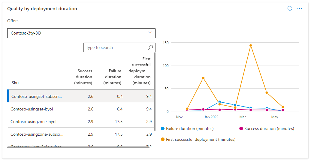
Quality by deployment duration
This graph shows the metric and trend for the average time duration for a successful and failed deployment. View the metrics by selecting an offer in the drop-down menu. Select a SKU in the tabular view or enter it in the search bar. The following list shows different mean deployments durations (in minutes):
- Success duration – Mean time of deployment duration with offer deployments status marked as Success. This aggregated metric is calculated using the time duration between start and end timestamps of deployments marked with successful status.
- Failure duration – Mean time of deployments duration with offer deployment status marked as Failure. This aggregated metric is calculated using the time duration between start and end timestamps of deployments marked with Failure status.
- First Successful deployment duration – Mean time of deployment duration with offer deployment status marked as Success. This aggregated metric is calculated using the time duration between start timestamp of first deployment and end timestamp of the final deployment marked with Successful status. It's calculated for each deployment marked for a specific Offer SKU and Customer.
About this graph:
- Select Failure, Success, or First successful deployment duration in the legend to be displayed.
- The line graph presents the Mean duration of deployments marked as successful, failed, and successful deployments with failed prior attempts.
- Mean time for first deployment factors the time spent on failure attempts before the deployment is marked as successful.
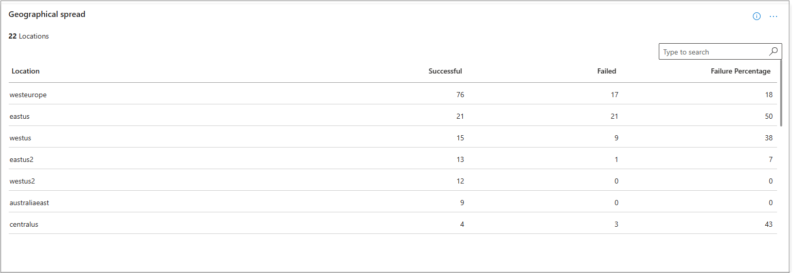
Geographical spread
This widget shows the geographical spread for successful and failed deployment counts for the selected month range. It also shows failure percentage against each region.
Detailed data
Important
To download the data in CSV, you can use the Download data option, available at the top of the page.
This table shows all offer deployment details available. Download the report to view the raw data on offer deployments.
About this table:
- Displays a numbered list of the 1000 top deployments sorted by date of deployment.
- Each column in the grid is sortable.
- The detail view is paginated. Select other pages at the bottom.
Data Dictionary
| Column name | Definition |
|---|---|
| OfferId | The name of the deployed offer |
| Sku | The name of the deployed offer plan/SKU |
| DeploymentStatus | The offer deployment status marked as either successful or failed |
| DeploymentCorrelationId | The identifier used to distinguish different deployments. The same value means all resources being deployed are for one deployment. |
| SubscriptionId | The Subscription ID of the customer |
| CustomerTenantId | The Tenant ID of the customer |
| CustomerName | The name of the customer |
| TemplateType | Type of Azure App deployed. It can be either Managed Application or Solution Templates and it can't be private. |
| StartTime | The start time of the deployment |
| EndTime | The end time of the deployment |
| DeploymentDurationInMilliSeconds | The total time duration of offer deployment in milliseconds. It's shown in minutes in the graph. |
| DeploymentRegion | The location of the Azure App deployment |
| ResourceProvider | The resource provider for the particular deployed resource |
| ResourceUri | The URI of the deployed resource |
| ResourceGroup | The resource group where the resource is deployed |
| ResourceType | The type of deployed resource |
| ResourceName | The name of the deployed resource |
| ErrorCode | The error code for the deployment failure |
| ErrorName | The error name for the deployment failure |
| ErrorMessage | The error message for the deployment failure |
| DeepErrorCode | If present, contains further information on the error code |
| DeepErrorMessage | If present, contains further information on the error message |
| CustomerAccess | This column denotes if customer has Full access or Restricted access for deployment of Azure app |
| PublisherAccess | This column denotes if publisher access is Enabled or Disabled for deployment of Azure app |
Related content
- For information about deployment errors, see Troubleshoot common Azure deployment errors with Azure Resource Manager.
- For information about resource providers, see Resource providers for Azure services.
- For graphs, trends, and values of aggregate data that summarize marketplace activity for your offer, see Summary dashboard in commercial marketplace analytics.
- For a list of your download requests over the last 30 days, see Downloads hub in commercial marketplace insights.
- For FAQs about commercial marketplace analytics and a comprehensive dictionary of data terms, see Commercial marketplace analytics common questions.

