Designing your Microsoft Teams meeting extension
You can create apps to make meetings more productive. For example, ask people to complete a survey during a meeting or send a quick reminder that doesn’t interrupt the flow of the meeting.
Microsoft Teams UI Kit
You can find more comprehensive design guidelines, including elements that you can grab and modify as needed, in the Microsoft Teams UI Kit.
Add a meeting extension
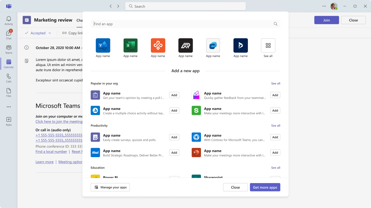
Users can add a meeting extension before and during meetings. They can also add an app for a specific meeting directly from the Microsoft Teams Store.
Add before a meeting
In the meeting details, users can select Add a tab + to open the app flyout and find apps optimized for meetings.
Add during a meeting
Mobile
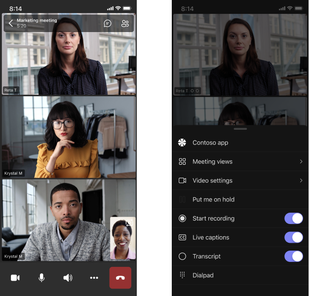
Once app is added (for example, on desktop), users can access the app in a meeting by selecting More ![]() .
.
Desktop
In a meeting, users can select More ![]() > Add an app and select the app they want.
> Add an app and select the app they want.
Before a meeting
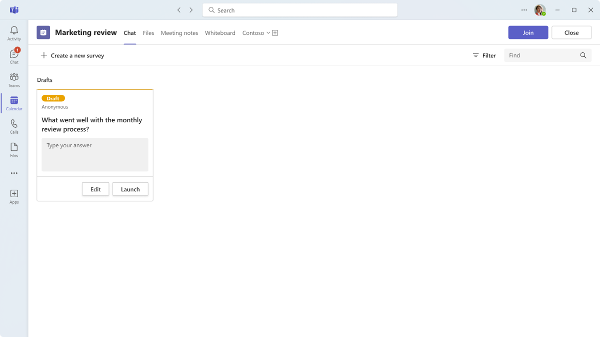
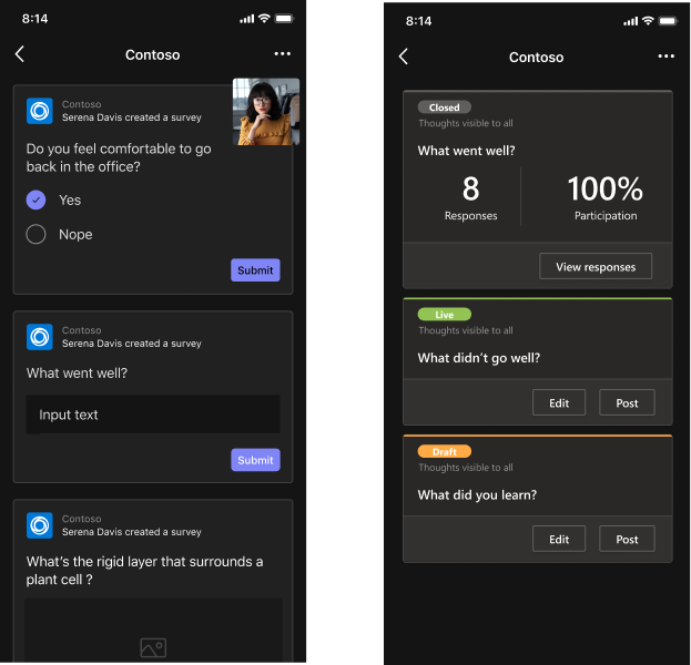
Prior to a meeting, your app's available to users in a tab. The following example shows a draft survey question that people can answer during the meeting:
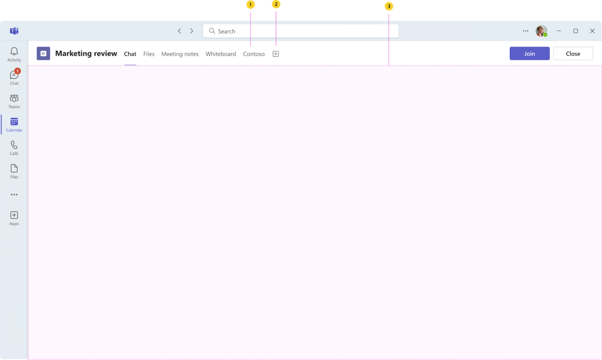
Anatomy: Meeting tab (before and after meetings)
| Counter | Description |
|---|---|
| 1 | Tab name: Navigation label for your tab. |
| 2 | Tab overflow: Opens tab actions, such as rename and remove. |
| 3 | iframe: Displays your app content. |
Design with UI templates
Use one of the following Teams UI templates to help design your meeting tab:
- List: Lists can display related items in a scannable format and allow users to take actions on an entire list or individual items.
- Task board: A task board, sometimes called a kanban board or swim lanes, is a collection of cards often used to track the status of work items or tickets.
- Dashboard: A dashboard is a canvas containing multiple cards that provide an overview of data or content.
- Form: Forms are for collecting, validating, and submitting user input in a structured way.
- Empty state: The empty state template can be used for many scenarios, including sign in, first-run experiences, error messages, and more.
- Left nav: The left nav component can help if your tab requires some navigation. In general, you should keep navigation to a minimum.
Use an in-meeting tab
The in-meeting tab is a canvas for augmenting collaboration during meetings. Attendees can see and interact with app content in a dedicated space outside the meeting stage through shared or role-based views.
Use cases
People might use the in-meeting tab to:
- Provide detailed feedback. For example, evaluate a job candidate.
- Create a poll, survey, or task item for the meeting participants.
- Display notes relevant to the meeting. For example, information about a sales lead.
Mobile
Desktop
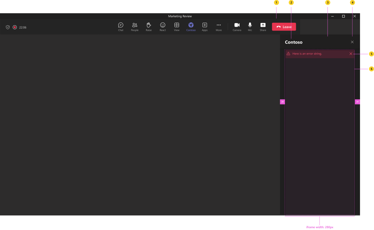
Anatomy: In-meeting tab
| Counter | Description |
|---|---|
| 1 | App icon (selected): 16-pixels transparent app logo. |
| 2 | App name |
| 3 | Header: Includes your app name. |
| 4 | Close button: Dismisses the tab. Always use the upper-right close icon instead of an action in the footer. |
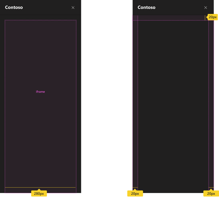
| 5 | Notification bar: Error alerts display directly below the header and push the rest of your iframe content down 20 pixels. |
| 6 | iframe: Displays your app content. |
Spacing
Optimize your in-meeting tab to fit edge-to-edge within the 280 pixel-wide iframe area. There are 20 pixels of padding on the left and right sides of the iframe and between the tab header. The iframe is full bleed to the bottom of the tab.
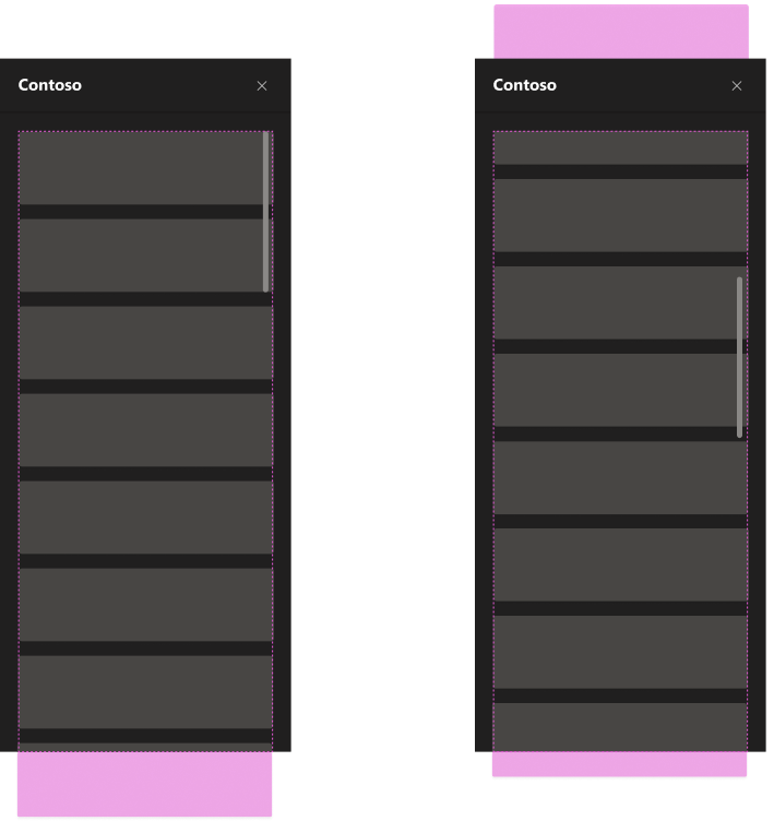
Scrolling
Remember the following if you allow scrolling:
- Content in the iframe contents should only scroll vertically.
- Users should only see the content they've scrolled to (nothing above or below).
- The scrollbar is part of the iframe content.
Navigation
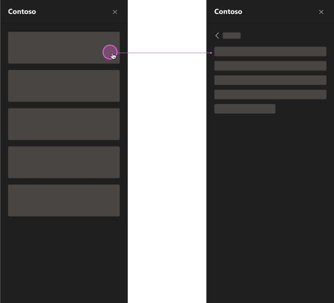
For scenarios with navigation layers or heavy content, we recommend allowing users to go to a secondary layer. Users must be able to go back to the previous layer.
Use an in-meeting dialog
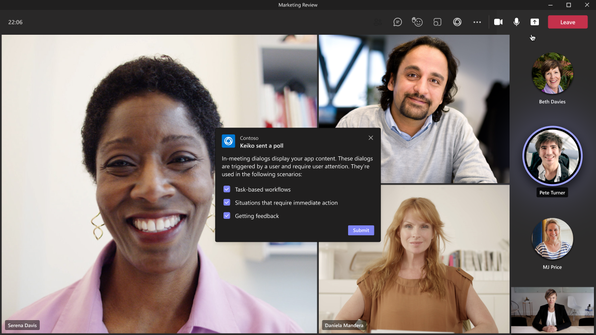
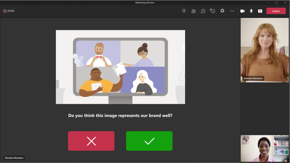
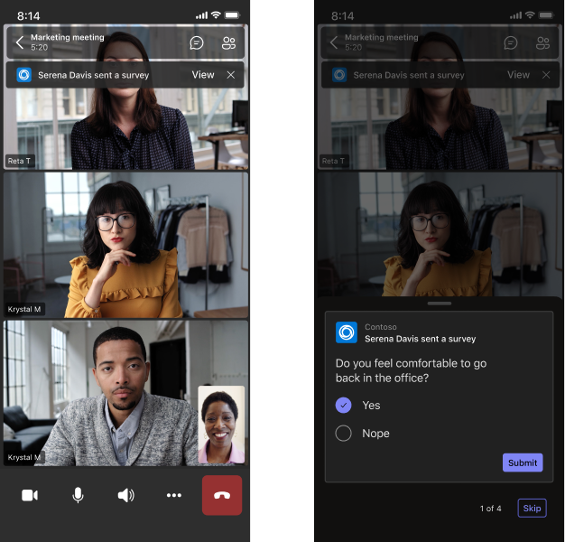
In-meeting dialogs display on the Teams meeting stage. They require a user's attention, confirmation, or interaction but are subtle and don't interrupt the meeting. You should use these sparingly and for scenarios that are light and task oriented.
Use cases
In-meeting dialogs are triggered by a user (such as the meeting organizer) who might want participants to:
- Provide brief feedback.
- Take a short survey or poll.
- Submit approvals.
- Get reminders.
Mobile
Desktop
Anatomy: In-meeting dialog
| Counter | Description |
|---|---|
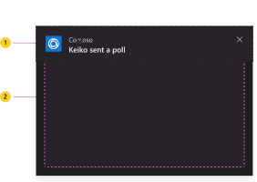
| 1 | Header: Includes app icon, name, action string, and close icon. |
| 2 | iframe: Displays your app content. |
Anatomy: In-meeting dialog header
There are two header variants. When possible, use the variant with the avatar to reinforce that the dialog is coming from a person.
| Counter | Description |
|---|---|
| 1 | Avatar: Person who initiates the in-meeting dialog. |
| 2 | App icon |
| 3 | App name |
| 4 | Close button: Dismisses the dialog. |
| 5 | Action string: Typically describes who initiated the dialog. |
Responsive behavior: In-meeting dialogs
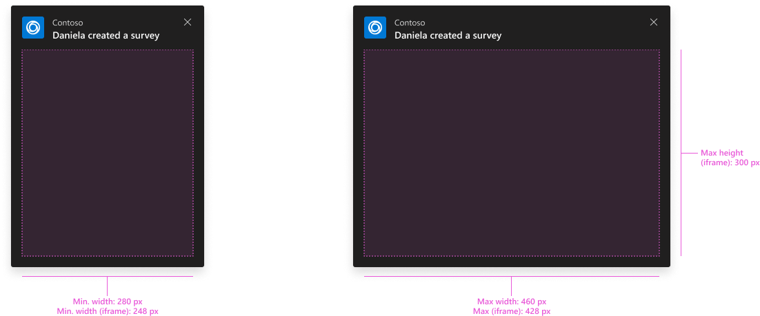
In-meeting dialogs can vary in size to account for different scenarios. Make sure to maintain padding and component sizes.
- Width: You can specify the width of the dialog's iframe anywhere within the supported size range.
- Height: You can specify the height of the dialog's iframe anywhere within the supported size range. You also can allow users to scroll vertically if your app content exceeds the maximum height.
Use the shared meeting stage
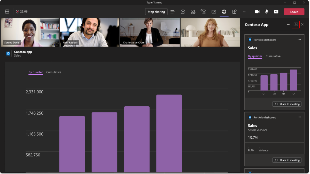
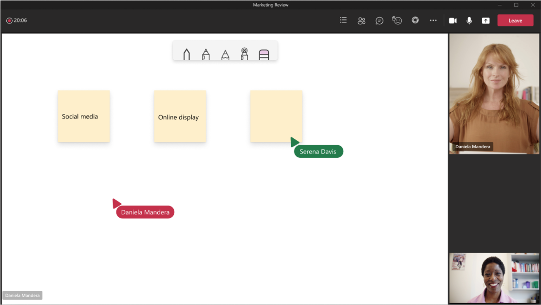
You can allow users to share and interact with some or all of your app content on the meeting stage. Here are examples of how people might use this feature during a meeting:
- Editing a document.
- Whiteboarding
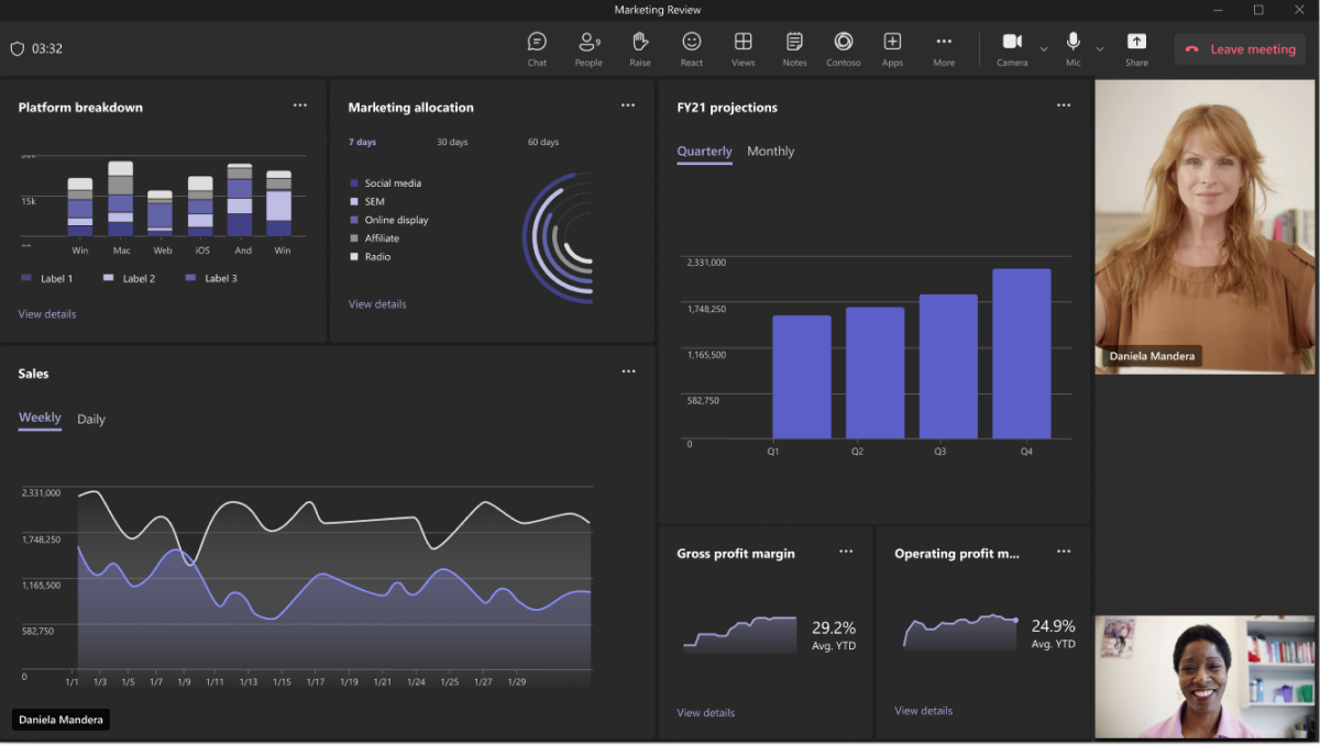
- Reviewing a dashboard.
- Watching a video.
- Playing a game.
Apps shared to the meeting stage occupy the same space as a shared screen. The stage reorients for all meeting participants the same way, too.
Use cases
The shared meeting stage is all about collaboration and participation. Here are some example scenarios to help you get started.
Edit and review: Dive into dashboards and planning with everyone in the meeting.
Whiteboard: Draw and ideate together on a shared canvas.
Quiz: Test knowledge and gain insights with interactive materials.
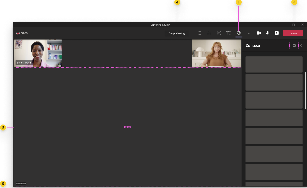
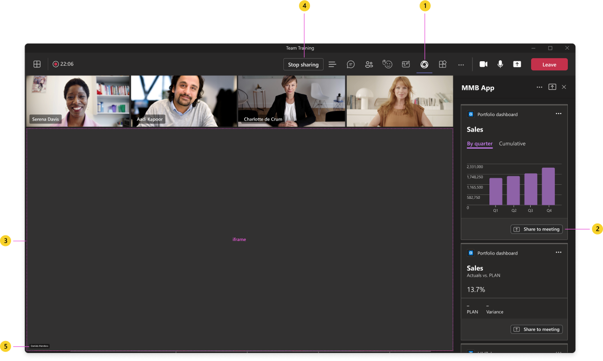
Anatomy: Share all app content to a meeting
| Counter | Description |
|---|---|
| 1 | App icon: The highlighted icon indicates the app's in-meeting tab is open. |
| 2 | Share to meeting button: The entry point to share the app to the meeting. Displays if you configure your app to use the shared meeting stage. |
| 3 | iframe: Displays your app content. |
| 4 | Stop sharing button: Stops sharing the app to the meeting stage. Displays only for the participant who started the share. |
| 5 | Presenter attribution: Displays the name of the participant who shared the app. |
Anatomy: Share specific app content to a meeting
| Counter | Description |
|---|---|
| 1 | App icon: The highlighted icon indicates the app's in-meeting tab is open. |
| 2 | Share to meeting button: The entry point to share the app to the meeting. For a consistent experience, always use the standard Teams share icon. Share to meeting is the recommended default text, but you can also customize it for your use cases. For example, Play together for a gaming app or Watch together for a video app. Either way, make it clear that the action creates a shared, interactive experience with everyone in the meeting. |
| 3 | iframe: Displays your app content. |
| 4 | Stop sharing button: Stops sharing the app to the meeting stage. Displays only for the participant who started the share. |
| 5 | Presenter attribution: Displays the name of the participant who shared the app. |
Responsive behavior: Shared meeting stage
Apps shared to the meeting stage vary in size based on the state of the meeting and how the user resizes the window. Maintain padding and the responsive layout of navigation and controls just as you would in a browser.
- Side panel: A user can have the side panel open at any time during a meeting to chat, view the roster, or use an app (that is, in-meeting tab). The stage dynamically rearranges when the panel is open.
- Video and audio grid: The video and audio grid is always visible to show meeting participants. When a user spotlights or pins someone in the meeting, this increases the height or width of the participant grid depending on the orientation.
Meeting stage (without side panel)
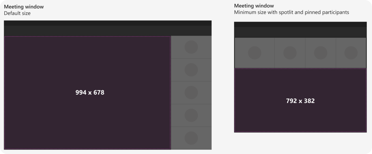
When the side panel isn't open, the meeting stage is 994x678 pixels, by default and can be a minimum 792x382 pixel.
Meeting stage (with side panel)
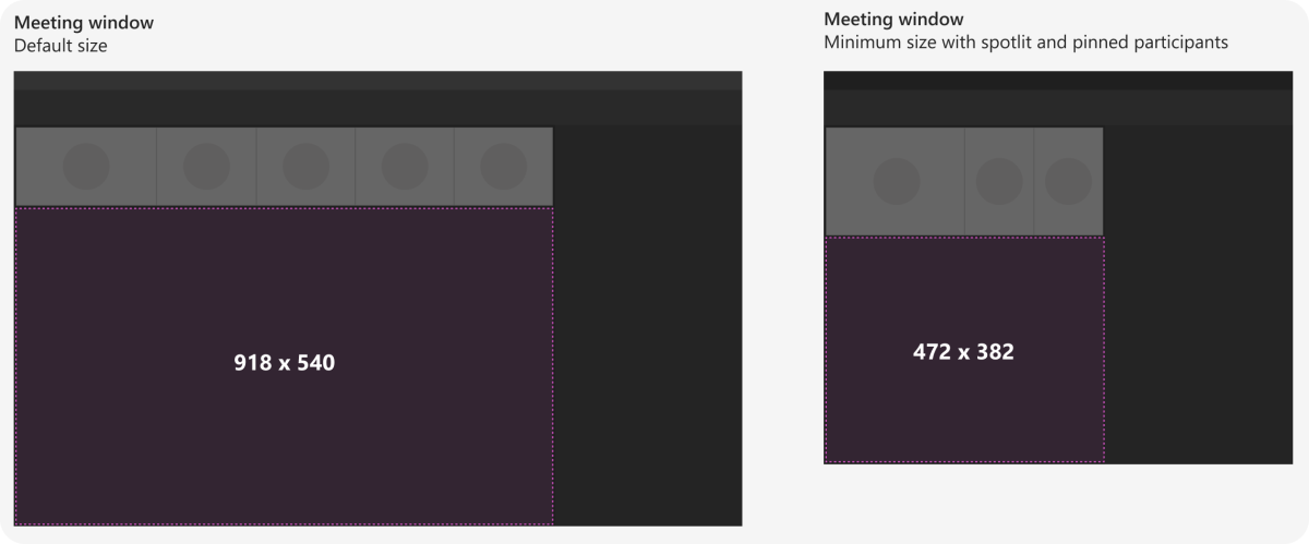
When the side panel is open, the meeting stage is 918x540 pixels by default and can be a minimum 472x382 pixels.
After a meeting
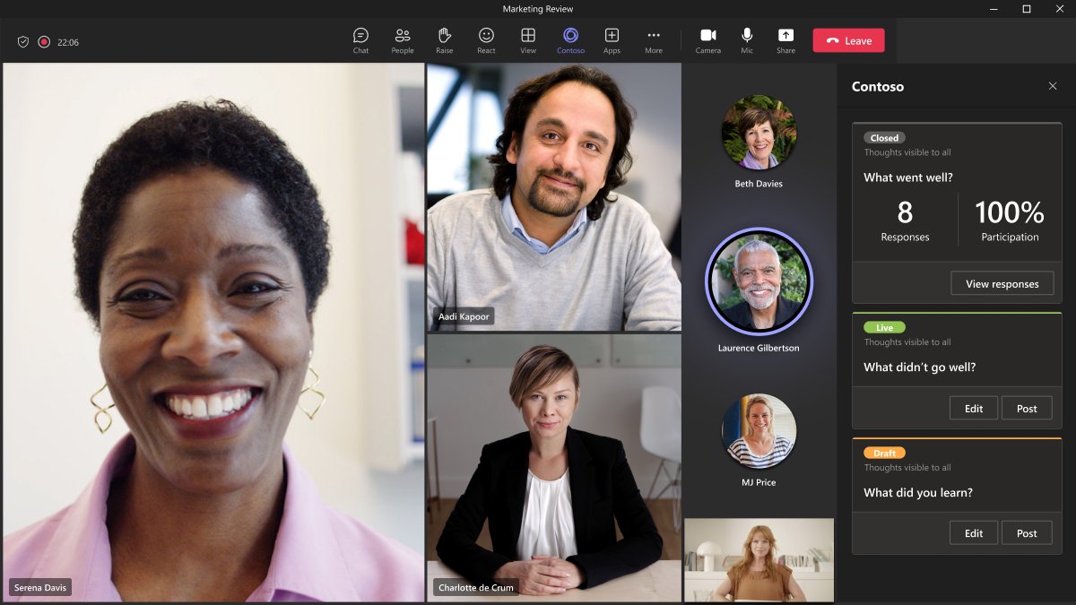
You can go back to a meeting after it ends and view app content. In this example, the meeting organizer can look at poll results in the Contoso tab. (Note: From a design standpoint, there's no difference between the pre- and post-meeting tab experience.)
Best practices
Use these recommendations to create a quality app experience.
Interactions
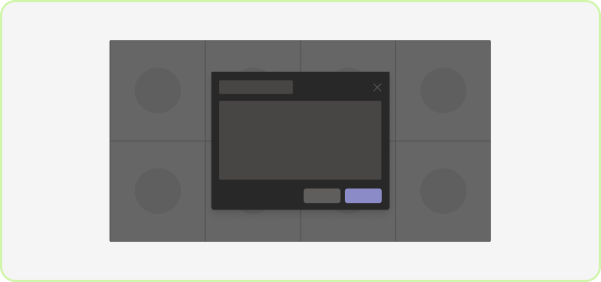
Do: Limit the number of interactions
For in-meeting dialogs, remove unnecessary content that doesn't help users accomplish something quickly.
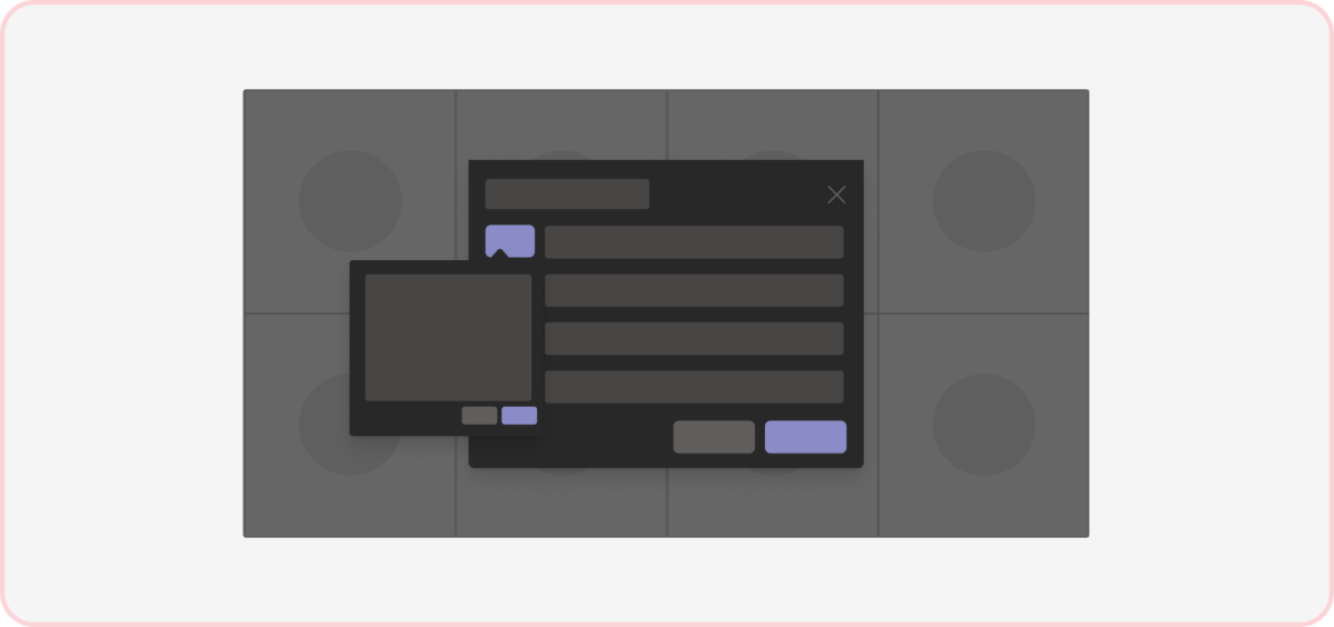
Don't: Introduce unnecessary elements
A single in-meeting dialog with multiple interactions can distract from the meeting.
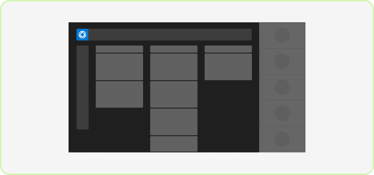
Do: Create a focused environment
We recommend keeping your app’s experience scoped to just the meeting stage. You can use an in-meeting tab in the side panel as a secondary, private view for certain scenarios.
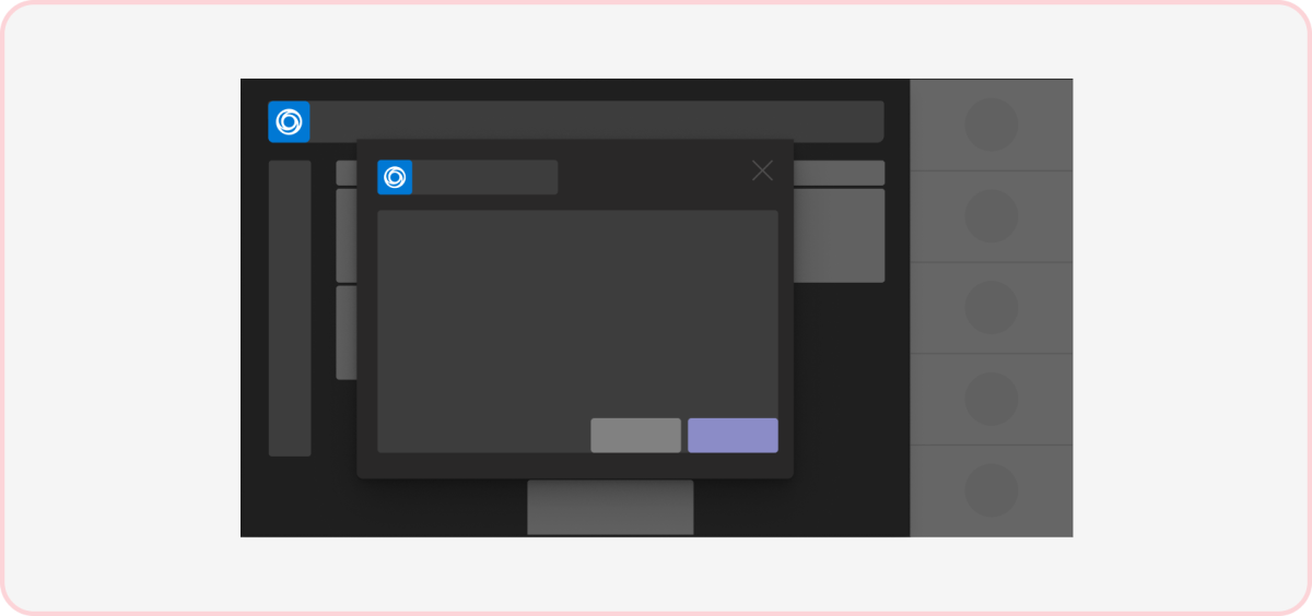
Don't: Include competing surfaces
Your app should only ask users to focus on a single surface a time, whether it's collaborating on the stage or responding to an in-meeting dialog. (Note: You can’t keep dialogs being triggered by other apps while your app is on the stage.)
Layout

Do: Use a one-column dialog
Since the dialogs are at the center of the meeting stage, task completion should be fast, and simple to avoid user frustration.
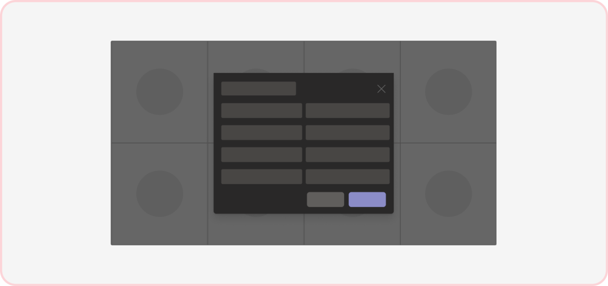
Don't: Clutter the space
Dense or overly structured content can be distracting and overwhelming, especially during a meeting.
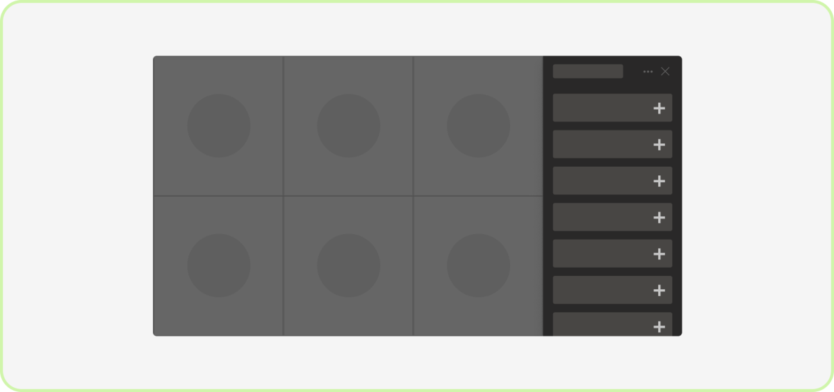
Do: Use a one-column tab
Given the in-meeting tab's narrow nature, we strongly recommend displaying the contents in a single column.
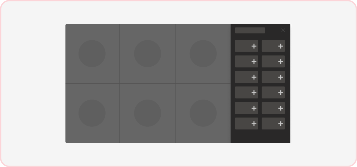
Don't: Use multiple columns
Due to the limited space of the in-meeting tab, layouts with more than one column aren’t recommended.
Controls
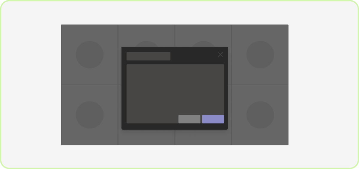
Do: Right align the primary action
We recommend positioning the most visually heavy action to the right-most location.
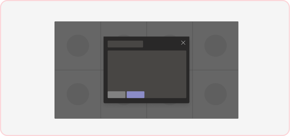
Don't: Left or center align actions
This deviates from the standard Teams pattern for control placement in a dialog and may conflict with a dialog behind the top one.
Scrolling
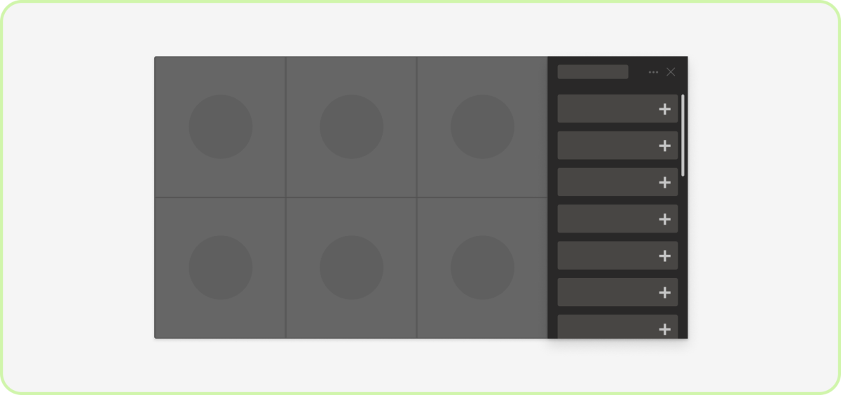
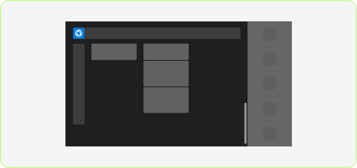
Do: Scroll vertically
Users expect vertical scrolling in Teams (and elsewhere). This may not apply if you have a creative canvas, such as a whiteboard, which users can pan across the x and y axis.
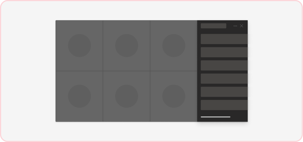
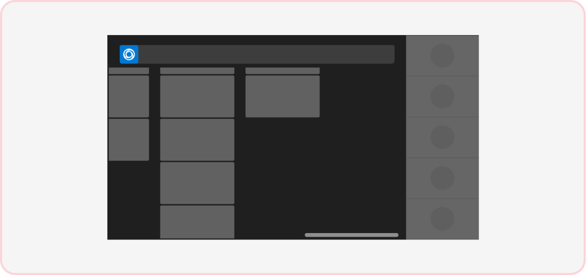
Don't: Scroll horizontally
Horizontal scrolling isn’t an expected behavior in Teams (including the meeting environment).
Workflows
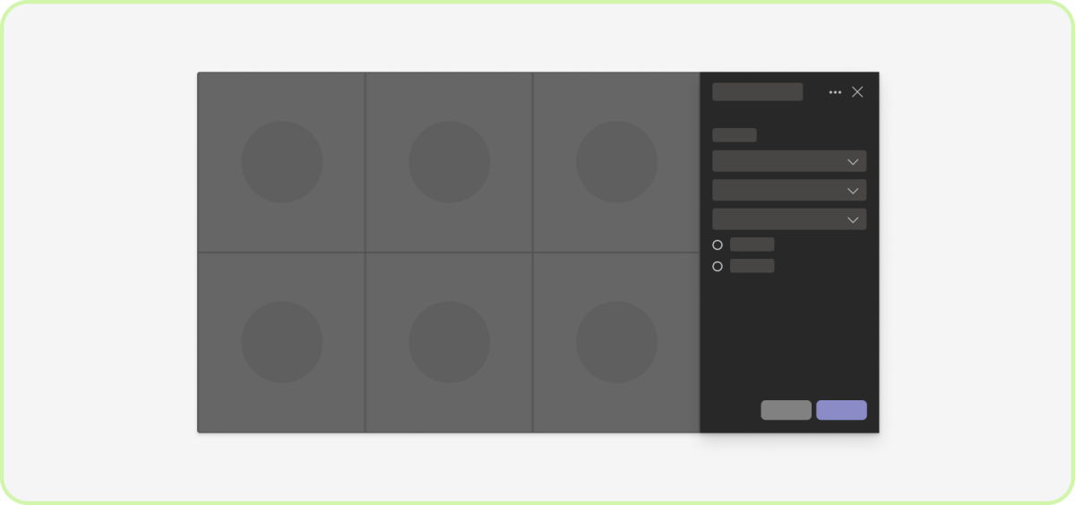
Do: Surface complex scenarios in the in-meeting tab
If your app includes multiple tasks, we strongly recommend using an in-meeting tab with a single-column layout.
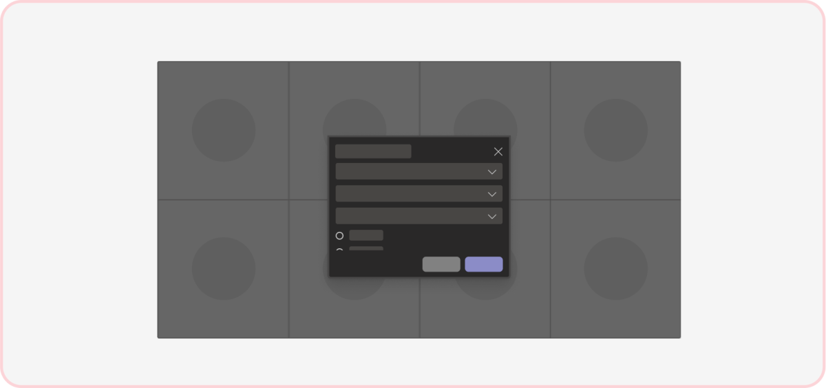
Don't: Make in-meeting dialogs complex
In-meeting dialogs are intended for brief interactions.
Theming

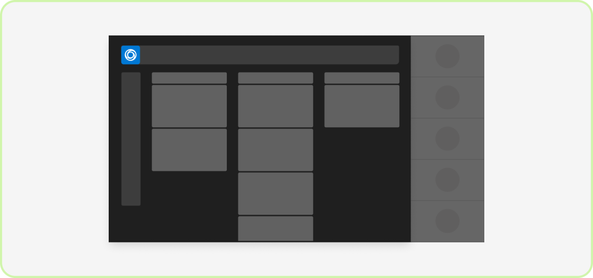
Do: Focus on dark theme
Teams meetings are optimized for dark theme to help reduce visual and cognitive noise so users can focus on the discussion and shared content. Keep in mind certain types of apps (such as whiteboarding and document editing) don't need a dark canvas.
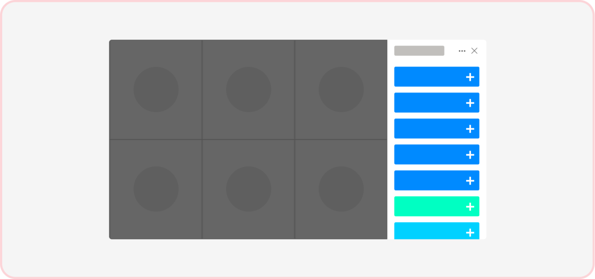
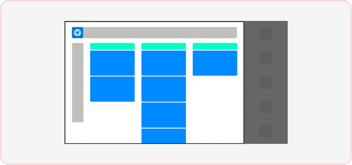
Don't: Use unfamiliar colors
Colors that clash with the meeting environment may be distracting and appear less native to Teams. Learn about the Teams color ramp, including call theme neutrals.
Navigation
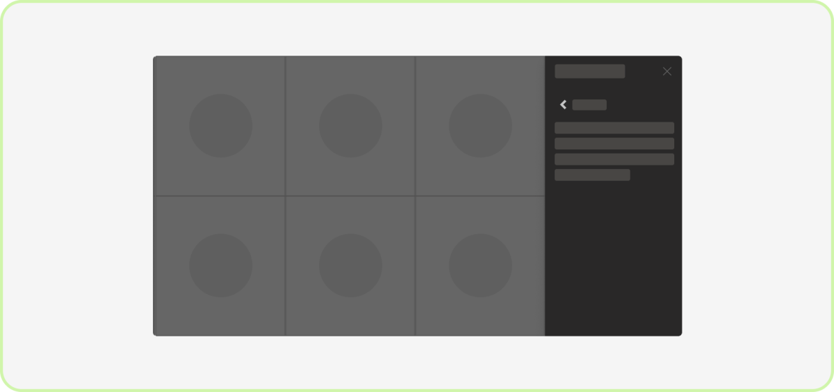
Do: Have a back button
If you've more than one layer of navigation in an in-meeting tab, users must be able to go back to their previous views.
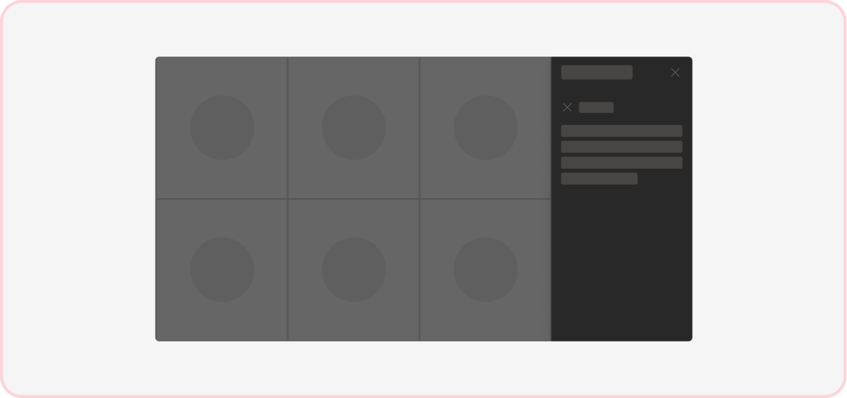
Don't: Include another dismiss button
Providing an option to close in-meeting tab content may cause issues since there’s already a button in the header to dismiss the in-meeting tab itself.
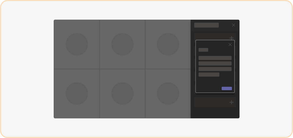
Caution: Avoid modals within the in-meeting tab
Modals (also known as dialogs (referred as task modules in TeamsJS v1.x)) in the already narrow in-meeting tab might wrap and obscure the content.
Responsive behavior
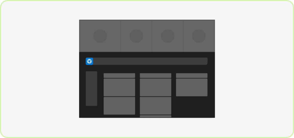
Do: Resize and scale your app responsively
App content should dynamically resize and condense in smaller windows. Keep your app’s main navigation and any floating controls visible.
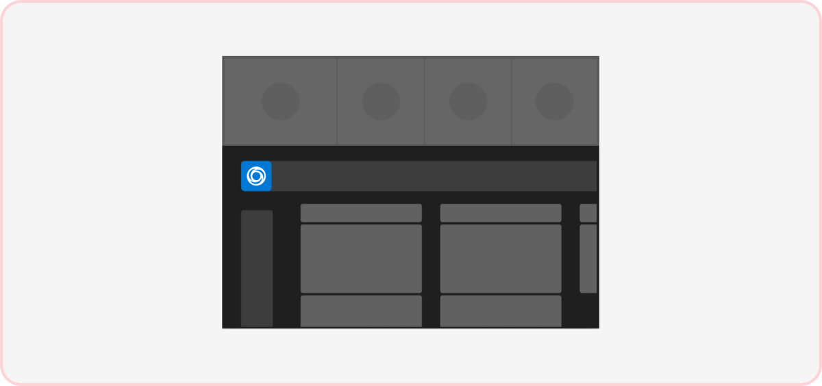
Don't: Crop or clip primary UI components
Floating navigation and controls off screen and requiring a scroll to find can be confusing for users. Your app content shouldn’t scroll horizontally when it can't fit in the iframe.
Next step
Platform Docs
