Use Sitecore OrderCloud connector
After the Sitecore OrderCloud connector is deployed and configured, the out of box Power BI report is refreshed with the data related to Orders, Customers & Products, in the Silver lakehouse
You can go to the Power BI dashboard with ready-to-use reports from your workspace. The dashboard contains the following sections:
Filters
This section has filters based on which all the report in this dashboard is filtered. The available variable to select are:
- Country: You can select any specific country/region to view the sales data for that country/region only. Default value is All.
- Product category: You can select the specific product category here for which you like to see the data. Default value is All.
- Period: You can select the duration for which you want to view the data.
Sales summary
This section displays a quick snapshot on sales data containing data across sales orders and customer transactions and shows the following values:
- Total sales revenue: This shows sales revenue for the selected period and variation from the revenue of the similar previous period. You can also see returns and cancellation amounts here
- Total customers: this shows the breakup across new and repeat customers
- Average transaction value: This shows average transaction value across the selected period
- Average basket size: This shows average basket size across the selected period
Distribution of sales
This report shows the break up of sales across different geographies. This report is a touch sensitive data powered by Bing maps, here you can touch and zoom the map, which will further break up and show sales view across countries/regions based on the zoom done. The size of the bubble is proportional to the amount of sales. You can also see the sales data in a tabular format just below this view.
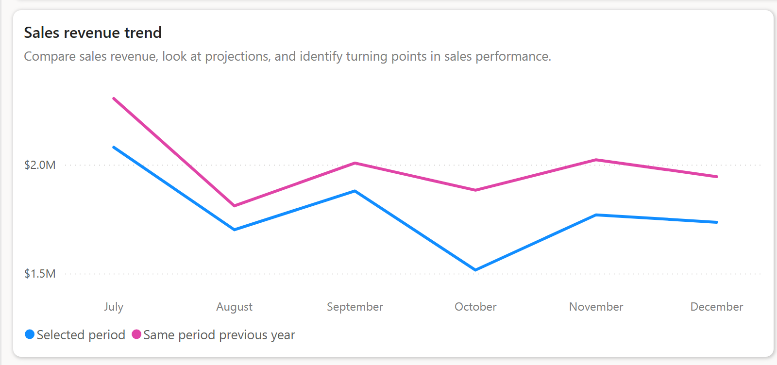
Sales revenue trend
This report shows a line graph that depicts the sales number growth/decline across the current year and previous year. This report is good for pictorial Year-on-Year (YoY) comparison of sales.
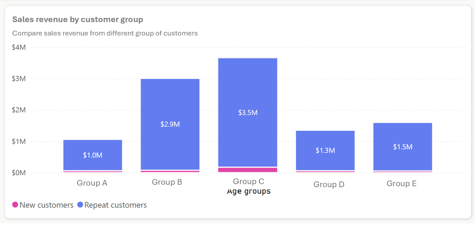
Sales revenue by customer group
Sitecore OrderCloud allows you to maintain different customer groups. This report shows the sales across customer groups spread as a bar graph. You can use this report to see how each group is accounting towards your revenue growth.
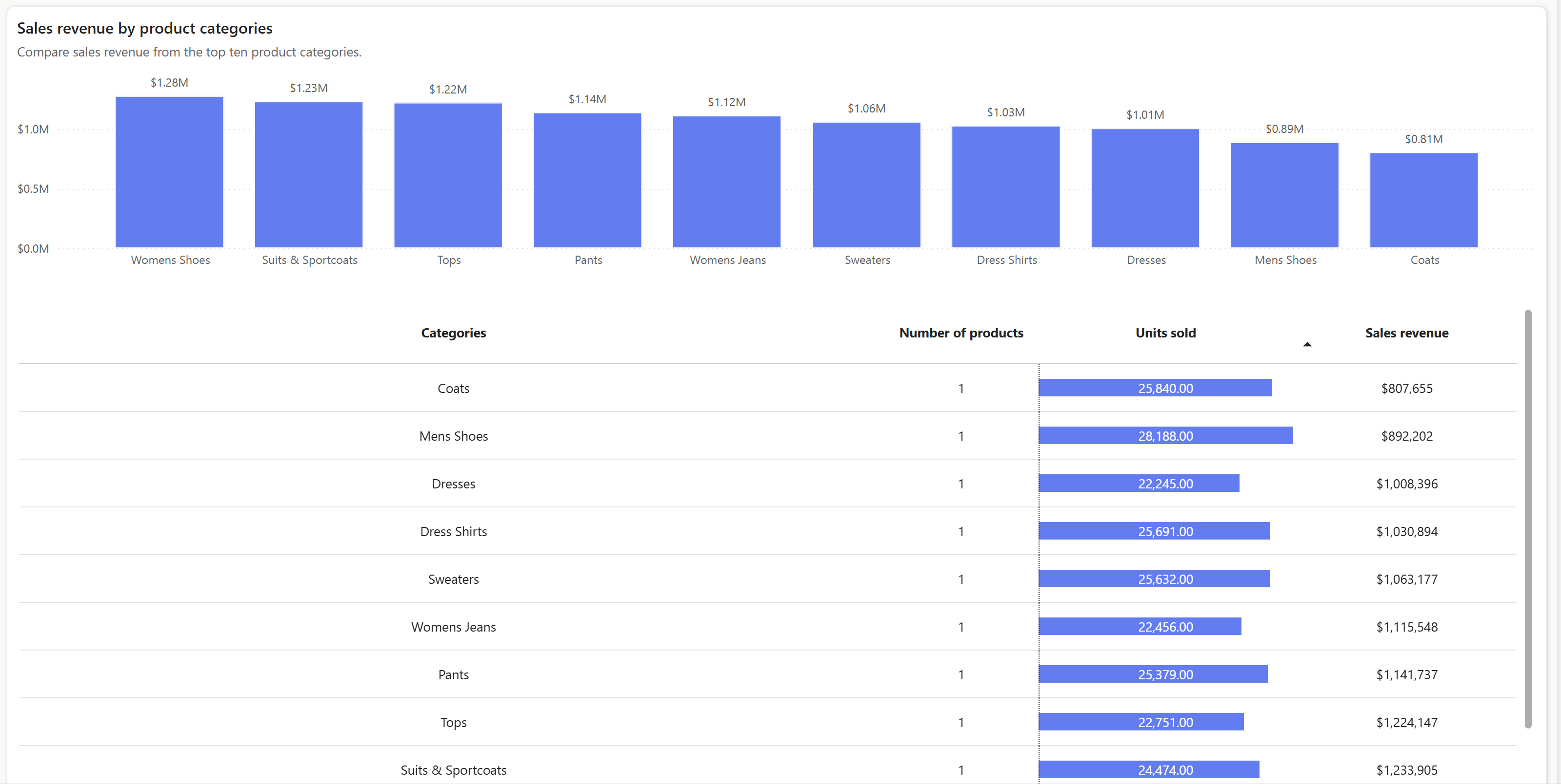
Sales revenue by product categories
Use this report to view the sales breakup across product categories, for the selected duration. This graph depicts each category by a bar. You can also see the information in a tabular format just under the graph depiction.


