Get started with XAML
In a .NET Multi-platform App UI (.NET MAUI) app, XAML is mostly used to define the visual contents of a page and works together with a C# code-behind file. The code-behind file provides code support for the markup. Together, these two files contribute to a new class definition that includes child views and property initialization. Within the XAML file, classes and properties are referenced with XML elements and attributes, and links between the markup and code are established.
Anatomy of a XAML file
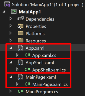
A new .NET MAUI app contains three XAML files, and their associated code-behind files:

The first file pairing is App.xaml, a XAML file, and App.xaml.cs, a C# code-behind file associated with the XAML file. Both App.xaml and App.xaml.cs contribute to a class named App that derives from Application. The second file pairing is AppShell.xaml and AppShell.xaml.cs, which contribute to a class named AppShell that derives from Shell. Most other classes with XAML files contribute to a class that derives from ContentPage, and define the UI of a page. This is true of the MainPage.xaml and MainPage.xaml.cs files.
The MainPage.xaml file has the following structure:
<ContentPage xmlns="http://schemas.microsoft.com/dotnet/2021/maui"
             xmlns:x="http://schemas.microsoft.com/winfx/2009/xaml"
             x:Class="MyMauiApp.MainPage">
    ...
</ContentPage>
The two XML namespace (xmlns) declarations refer to URIs on microsoft.com. However, there's no content at these URIs, and they basically function as version identifiers.
The first XML namespace declaration means that tags defined within the XAML file with no prefix refer to classes in .NET MAUI, for example ContentPage. The second namespace declaration defines a prefix of x. This is used for several elements and attributes that are intrinsic to XAML itself and which are supported by other implementations of XAML. However, these elements and attributes are slightly different depending on the year embedded in the URI. .NET MAUI supports the 2009 XAML specification.
At the end of the first tag, the x prefix is used for an attribute named Class. Because the use of this x prefix is virtually universal for the XAML namespace, XAML attributes such as Class are almost always referred to as x:Class. The x:Class attribute specifies a fully qualified .NET class name: the MainPage class in the MyMauiApp namespace. This means that this XAML file defines a new class named MainPage in the MyMauiApp namespace that derives from ContentPage (the tag in which the x:Class attribute appears).
The x:Class attribute can only appear in the root element of a XAML file to define a derived C# class. This is the only new class defined in the XAML file. Everything else that appears in a XAML file is instead simply instantiated from existing classes and initialized.
The MainPage.xaml.cs file looks similar to this:
namespace MyMauiApp;

public partial class MainPage : ContentPage
{
    public MainPage()
    {
        InitializeComponent();
    }
}
The MainPage class derives from ContentPage, and is a partial class definition.
When Visual Studio builds the project, a source generator generates new C# source that contains the definition of the InitializeComponent method that's called from the MainPage constructor and adds it to the compilation object.
At runtime, code in the MauiProgram class bootstraps the app and executes the App class constructor, which instantiates AppShell. The AppShell class instantiates the first page of the app to be displayed, which is MainPage. The MainPage constructor calls InitializeComponent, which initializes all the objects defined in the XAML file, connects them all together in parent-child relationships, attaches event handlers defined in code to events set in the XAML file, and sets the resultant tree of objects as the content of the page.
Note
The AppShell class uses .NET MAUI Shell to set the first page of the app to be displayed. However, Shell is beyond the scope of this introduction to XAML. For more information, see .NET MAUI Shell.
Set page content
A ContentPage should contain a single child, that can be a view or a layout with child views. The child of the ContentPage is automatically set as the value of the ContentPage.Content property.
The following example shows a ContentPage containing a Label:
<ContentPage xmlns="http://schemas.microsoft.com/dotnet/2021/maui"
             xmlns:x="http://schemas.microsoft.com/winfx/2009/xaml"
             x:Class="XamlSamples.HelloXamlPage"
             Title="Hello XAML Page">
    <Label Text="Hello, XAML!"
           VerticalOptions="Center"
           HorizontalTextAlignment="Center"
           Rotation="-15"
           FontSize="18"
           FontAttributes="Bold"
           TextColor="Blue" />
</ContentPage>
From the example above the relationship between classes, properties, and XML should be evident. A .NET MAUI class (such as ContentPage or Label) appears in the XAML file as an XML element. Properties of that class—including Title on ContentPage and seven properties of Label usually appear as XML attributes.
Many shortcuts exist to set the values of these properties. Some properties are basic data types. For example, the Title and Text properties are of type string, and Rotation is of type double. The HorizontalTextAlignment property is of type TextAlignment, which is an enumeration. For a property of any enumeration type, all you need to supply is a member name.
For properties of more complex types, however, converters are used for parsing the XAML. These are classes in .NET MAUI that derive from TypeConverter. For the example above, several .NET MAUI converters are automatically applied to convert string values to their correct type:
LayoutOptionsConverterfor theVerticalOptionsproperty. This converter converts the names of public static fields of theLayoutOptionsstructure to values of typeLayoutOptions.ColorTypeConverterfor theTextColorproperty. This converter converts the names of public static fields of the Colors class or hexadecimal RGB values, with or without an alpha channel.
Page navigation
When you run a .NET MAUI app, the MainPage is typically displayed. To see a different page you can either set that as the new startup page in the AppShell.xaml file, or navigate to the new page from MainPage.
To implement navigation, in the MainPage.xaml.cs constructor, you can create a simple Button and use the event handler to navigate to HelloXamlPage:
public MainPage()
{
    InitializeComponent();

    Button button = new Button
    {
        Text = "Navigate!",
        HorizontalOptions = LayoutOptions.Center,
        VerticalOptions = LayoutOptions.Center
    };

    button.Clicked += async (sender, args) =>
    {
        await Navigation.PushAsync(new HelloXamlPage());
    };

    Content = button;
}
When you compile and deploy the new version of this app, a button appears on the screen. Pressing it navigates to HelloXamlPage:

You can navigate back to MainPage using the navigation bar that appears on each platform.
Note
An alternative to this navigation model is to use .NET MAUI Shell. For more information, see .NET MAUI Shell overview.
XAML and code interactions
The child of most ContentPage derivatives is a layout, such as a StackLayout or a Grid, and the layout can contain multiple children. In XAML, these parent-child relationships are established with normal XML hierarchy:
<ContentPage xmlns="http://schemas.microsoft.com/dotnet/2021/maui"
             xmlns:x="http://schemas.microsoft.com/winfx/2009/xaml"
             x:Class="XamlSamples.XamlPlusCodePage"
             Title="XAML + Code Page">
    <StackLayout>
        <Slider VerticalOptions="Center" />
        <Label Text="A simple Label"
               FontSize="18"
               HorizontalOptions="Center"
               VerticalOptions="Center" />
        <Button Text="Click Me!"
                HorizontalOptions="Center"
                VerticalOptions="Center" />
    </StackLayout>
</ContentPage>
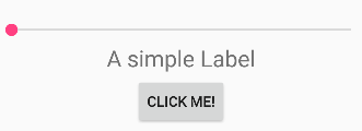
This XAML file is syntactically complete, and produces the following UI:

However, while you can interact with the Slider and Button, the UI isn't updated. The Slider should cause the Label to display the current value, and the Button should do something.
Displaying a Slider value using a Label can be achieved entirely in XAML with a data binding. However, it's useful to see the code solution first. Even so, handling the Button click definitely requires code. This means that the code-behind file for XamlPlusCodePage must contain handlers for the ValueChanged event of the Slider and the Clicked event of the Button:
namespace XamlSamples
{
    public partial class XamlPlusCodePage
    {
        public XamlPlusCodePage()
        {
            InitializeComponent();
        }

        void OnSliderValueChanged(object sender, ValueChangedEventArgs args)
        {
            valueLabel.Text = args.NewValue.ToString("F3");
        }

        async void OnButtonClicked(object sender, EventArgs args)
        {
            Button button = (Button)sender;
            await DisplayAlert("Clicked!", "The button labeled '" + button.Text + "' has been clicked", "OK");
        }
    }
}
Back in the XAML file, the Slider and Button tags need to include attributes for the ValueChanged and Clicked events that reference these handlers:
<ContentPage xmlns="http://schemas.microsoft.com/dotnet/2021/maui"
             xmlns:x="http://schemas.microsoft.com/winfx/2009/xaml"
             x:Class="XamlSamples.XamlPlusCodePage"
             Title="XAML + Code Page">
    <StackLayout>
        <Slider VerticalOptions="Center"
                ValueChanged="OnSliderValueChanged" />
        <Label x:Name="valueLabel"
               Text="A simple Label"
               FontSize="18"
               HorizontalOptions="Center"
               VerticalOptions="Center" />
        <Button Text="Click Me!"
                HorizontalOptions="Center"
                VerticalOptions="Center"
                Clicked="OnButtonClicked" />
    </StackLayout>
</ContentPage>
Notice that assigning a handler to an event has the same syntax as assigning a value to a property. In addition, for the ValueChanged event handler of the Slider to use the Label to display the current value, the handler needs to reference that object from code. Therefore, the Label needs a name, which is specified with the x:Name attribute. The x prefix of the x:Name attribute indicates that this attribute is intrinsic to XAML. The name you assign to the x:Name attribute has the same rules as C# variable names. For example, it must begin with a letter or underscore and contain no embedded spaces.
The ValueChanged event handler can now set the Label to display the new Slider value, which is available from the event arguments:
void OnSliderValueChanged(object sender, ValueChangedEventArgs args)
{
    valueLabel.Text = args.NewValue.ToString("F3");
}
Alternatively, the handler could obtain the Slider object that is generating this event from the sender argument and obtain the Value property from that:
void OnSliderValueChanged(object sender, ValueChangedEventArgs args)
{
    valueLabel.Text = ((Slider)sender).Value.ToString("F3");
}
The result is that any manipulation of the Slider causes its value to be displayed in the Label:

In the example above the Button simulates a response to a Clicked event by displaying an alert with the Text of the button. Therefore, the event handler can cast the sender argument to a Button and then access its properties:
async void OnButtonClicked(object sender, EventArgs args)
{
    Button button = (Button)sender;
    await DisplayAlert("Clicked!", "The button labeled '" + button.Text + "' has been clicked", "OK");
}
The OnButtonClicked method is defined as async because the DisplayAlert method is asynchronous and should be prefaced with the await operator, which returns when the method completes. Because this method obtains the Button firing the event from the sender argument, the same handler could be used for multiple buttons.
Next steps
XAML is mostly designed for instantiating and initializing objects. But often, properties must be set to complex objects that cannot easily be represented as XML strings, and sometimes properties defined by one class must be set on a child class. These two needs require the essential XAML syntax features of property elements and attached properties.
 Browse the sample