New chart visualizations in Databricks
Important
This feature is in Public Preview.
Azure Databricks has released a Public Preview of new charts for visualizing data in notebooks and in Databricks SQL. These new charts feature better performance, improved colors, and faster interactivity. These charts will replace the legacy rendering library currently used by Azure Databricks charts.
The following chart types are affected by the preview:
- Area charts
- Bar charts
- Box charts
- Bubble charts
- Combo charts
- Heatmap charts
- Histogram charts
- Line charts
- Pie charts
- Scatter charts
Colors
The new chart visualizations feature new default colors to improve aesthetics and readability. Color is very important in clarifying what signals are in the data. These new colors have been extensively tested for readability to ensure that chart elements remain distinguishable.

Series selection
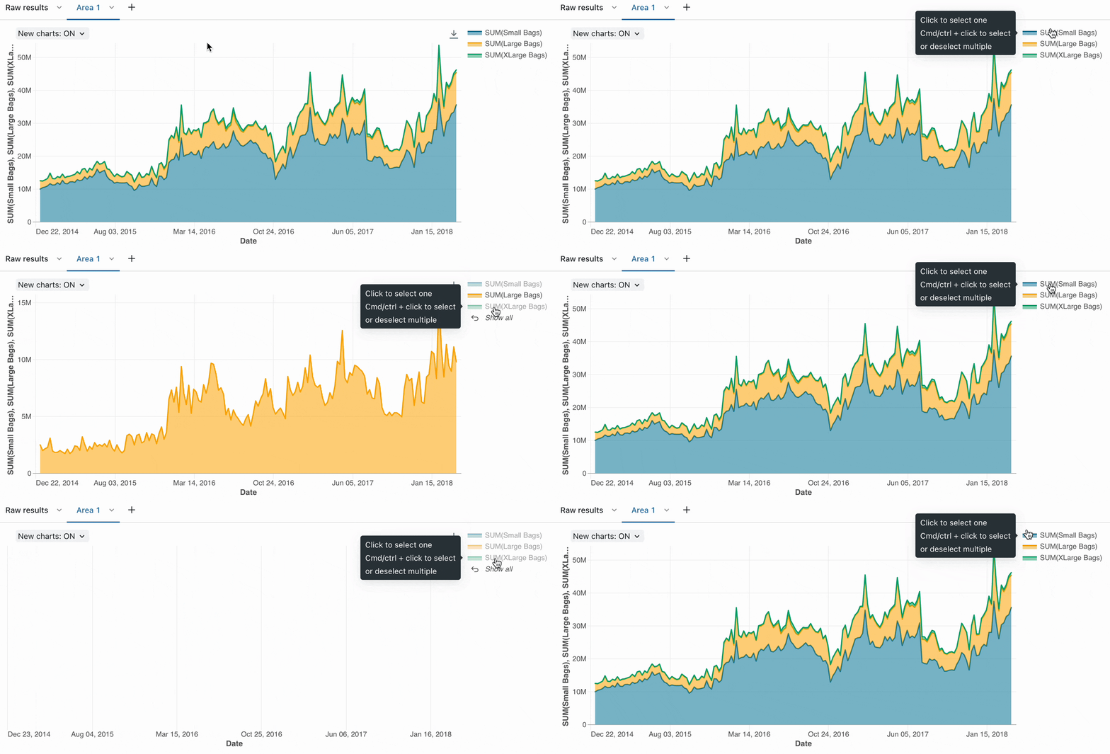
When analyzing visualizations with multiple series, you might want to select a specific series to analyze on a chart. The new charts support this behavior with the following commands:
- Click on a single legend item to select that series
- Cmd/Ctrl + click on a legend item to select or deselect multiple series

Sorted tooltips
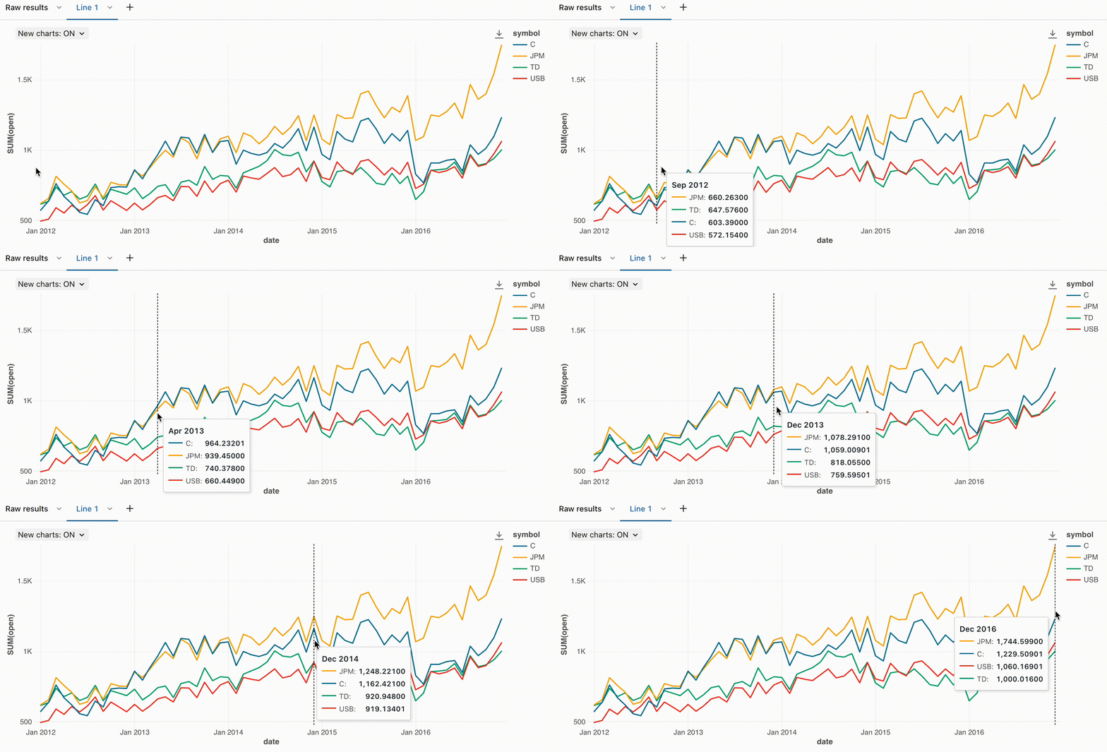
When analyzing time series visualizations, it can be helpful to understand the ranking of each series at a given point in time. With the new chart visualizations, tooltips on line charts and unstacked bar charts are now ordered by magnitude for easier analysis.

Zoom
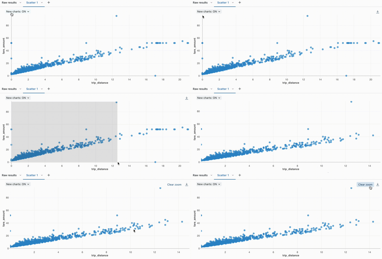
For data-dense charts, zooming in on individual data points can be helpful to investigate details and to crop outliers. To zoom in on the new charts, click and drag on the canvas. To clear the zoom, hover over the canvas and click the Clear zoom button in the upper right corner of the visualization.

Download as PNG file
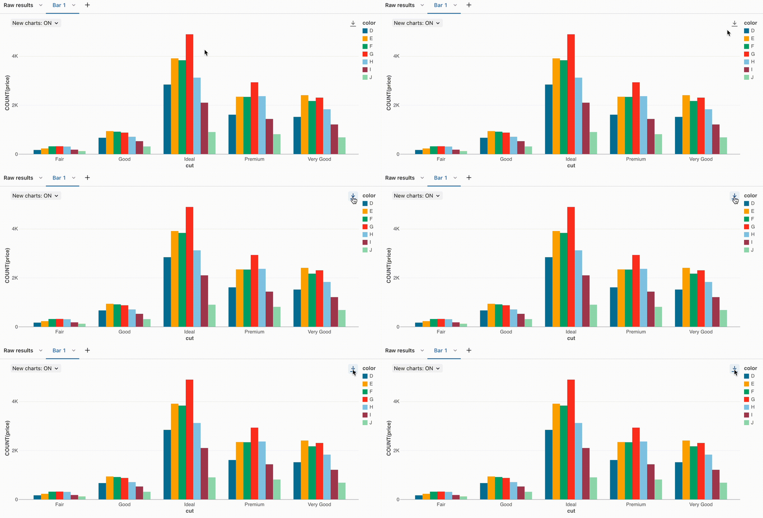
After creating a visualization, you may want to add the visualization to a presentation. If your presentation has a brand theme, you might want to export the visualization as a PNG to ensure a transparent background. The new visualizations support downloading images as PNGs. To dowload a visualization as a PNG file, hover over the canvas and click the download icon.
