Customize views in cost analysis
This article helps you customize views in cost analysis to understand how you're being charged and to investigate unexpected changes.
Prerequisites
To customize views, you must have at least the Cost Management Reader (or Contributor) role.
You should be familiar with the information at Quickstart: Explore and analyze costs with cost analysis.
Get started with customizing views
Customizing views in cost analysis includes anything from tweaking display settings to changing what data gets included or how it's summarized. You customize views when trying to understand what you're spending and where the costs originated. For example, you can drill into data, apply specific filters or groupings, or change display settings, like whether to view a chart or table. The following sections cover each of these customization options.
Group costs
Use the Group by option to group common properties so that you get a breakdown of costs and to identify top contributors. It should be your first change when drilling into data because it helps you identify the largest changes. To group by resource tags, for example, select the tag key you want to group by. Costs are divided by each tag value, with another segment for resources that don't have the tag applied.
Most Azure resources support tagging. However, some tags aren't available in Cost Management and billing. Additionally, resource group tags aren't supported. Support for tags applies to usage reported after the tag was applied to the resource. Tags aren't applied retroactively for cost rollups.
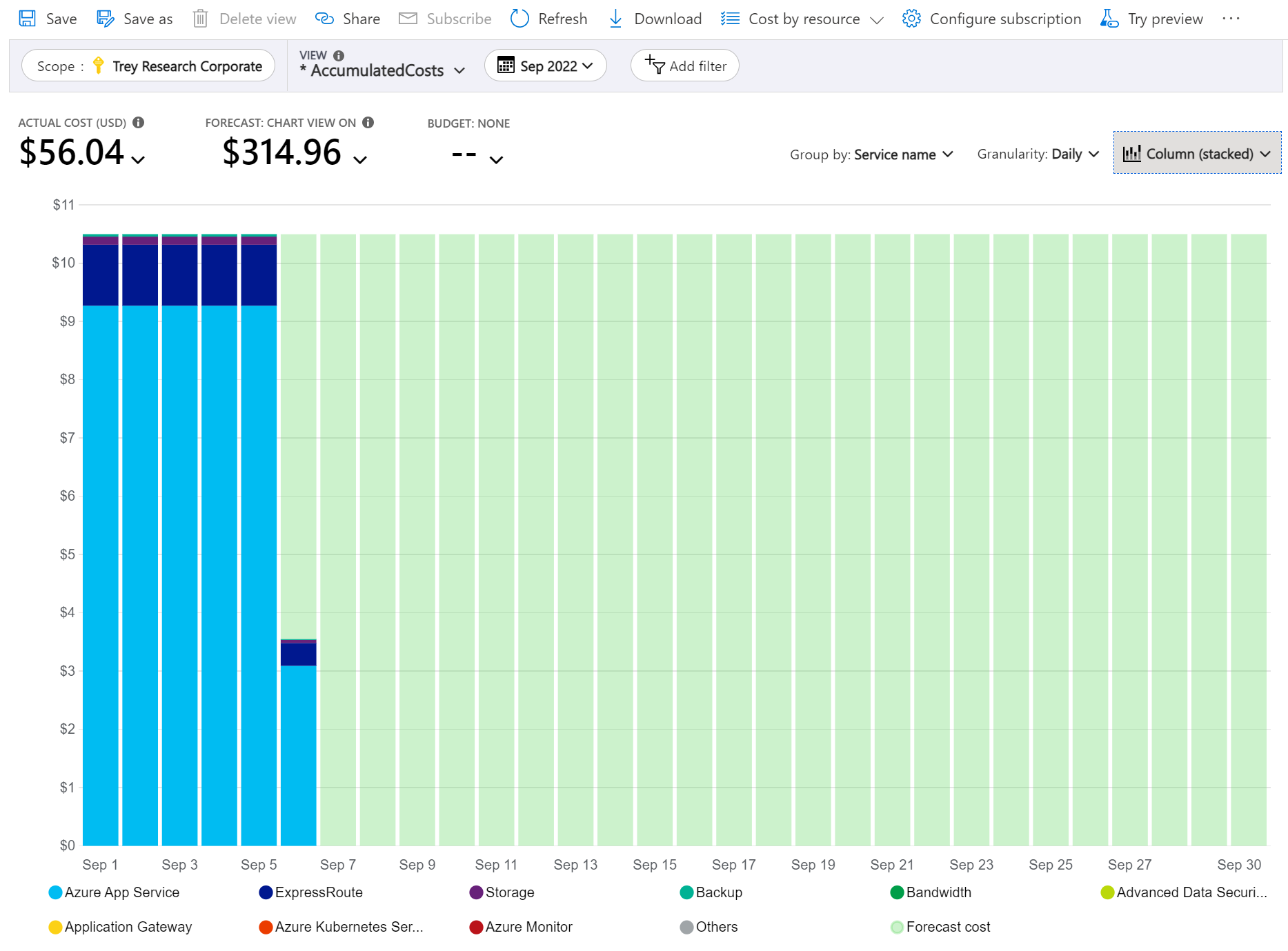
Here's a view of Azure service costs for the current month, grouped by Service name.
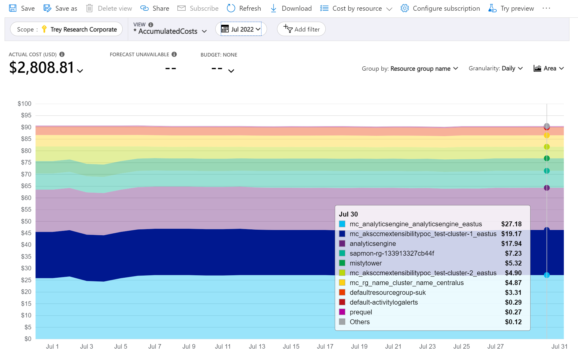
The following image shows resource group names. You can group by tag to view total costs per tag or group by Resource group name.
When you're grouping costs by a specific attribute, the top 10 cost contributors are shown from highest to lowest. If there are more than 10, the top nine cost contributors are shown with an Others group that represents all remaining groups combined. When you're grouping by tags, an Untagged group appears for costs that don't have the tag key applied. Untagged is always last, even if untagged costs are higher than tagged costs. Untagged costs are part of Others, if 10 or more tag values exist. To see the items grouped under Others, either select the segment to apply a filter or switch to the table view and set granularity to None. It displays all values ranked from highest to lowest cost.
Classic virtual machines, networking, and storage resources don't share detailed billing data. They're merged as Classic services when grouping costs.
Cost analysis doesn't support grouping by multiple attributes. To work around it, you can apply a filter for a desired attribute and group by the more detailed attribute. For instance, filter down to a specific resource group, then group by resource.
Pivot charts under the main chart show different groupings, which give you a broader picture of your overall costs for the selected time period and filters. Select a property or tag to view aggregated costs by any dimension. When you apply a filter to the main chart, the filter also affects pivot charts. Costs are filtered, too. Pivot charts also align to the actual or amortized metric selected for the main chart and to the currency. Pivot charts aren't aligned with Group by or Granularity selections applied to the main chart.
Select a date range
There are many cases where you need deeper analysis. Customization starts at the top of the page, with the date selection.
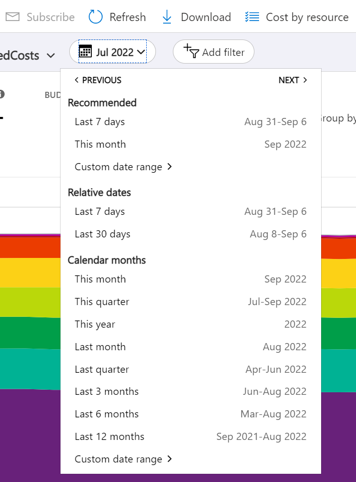
Cost analysis shows data for the current month by default. Use the date selector to switch to common date ranges quickly. Examples include the last seven days, the last month, the current year, or a custom date range. Pay-as-you-go subscriptions also include date ranges based on your billing period, which isn't bound to the calendar month, like the current billing period or last invoice.
Filter charges
Add filters to narrow down or drill into your specific charges. It's especially helpful when trying to understand an unexpected change. Start by selecting the Add filter pill, then select the desired attribute, and lastly select the options you want to filter down to. Your view is automatically updated when you apply the filter.
You can add multiple filters. As you add filters, you notice that the available values for each filter include the previously selected filters. For instance, if you apply a resource group filter, then add a resource filter, the resource filter options only show resources in the selected resource group.
When you view charts, you can also select a chart segment to apply a filter. After selecting a chart segment, you should consider changing the group by attribute to see other details about the attribute you selected.
Switch between actual and amortized cost
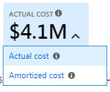
By default, cost analysis shows all usage and purchase costs as they get accrued and appear on your invoice, also known as Actual cost. Viewing actual cost is ideal for reconciling your invoice. However, purchase spikes in cost can be alarming when you're keeping an eye out for spending anomalies and other changes in cost. To flatten out spikes caused by reservation purchase costs, switch to Amortized cost.
Amortized cost breaks down reservation purchases into daily chunks and spreads them over the duration of the reservation term. Most reservation terms are one or three years. Let's look at a one-year reservation example. Instead of seeing a $365 purchase on January 1, you'll see a $1.00 purchase every day from January 1 to December 31. In addition to basic amortization, these costs are also reallocated and associated by using the specific resources that used the reservation. For example, if that $1.00 daily charge was split between two virtual machines, you'd see two $0.50 charges for the day. If part of the reservation isn't utilized for the day, you'd see one $0.50 charge associated with the applicable virtual machine and another $0.50 charge with a charge type of UnusedReservation. Unused reservation costs can be seen only when you view amortized cost.
If you buy a one-year reservation on May 26 with an upfront payment, the amortized cost is divided by 365 (assuming it's not a leap year) and spread from May 26 through May 25 of the next year. If you pay monthly, the monthly fee is divided by the number of days in that month. The free is spread evenly across May 26 through June 25, with the next month's fee spread across June 26 through July 25.
Because of the change in how costs are represented, it's important to note that actual cost and amortized cost views show different total numbers. Generally, the total cost for months with a reservation purchase decreases when viewing amortized costs, while the costs for the months following the reservation purchase increase. Amortization is available only for reservation purchases and doesn't apply to Azure Marketplace purchases at this time.
Select a currency
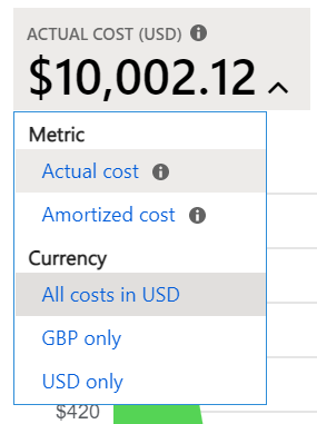
Costs are shown in your billing currency by default. If you have charges in multiple currencies, costs are automatically converted to USD. If you have any non-USD charges, you can switch between currencies in the total KPI menu. You might see options like GBP only to view only the charges in that one currency or All costs in USD to view the normalized costs in USD. You can't view costs normalized to other currencies today.
Select a budget
When you view a chart, it can be helpful to visualize your charges against a budget. It's especially helpful when showing accumulated daily costs with a forecast trending towards your budget. If your costs go over your budget, you see a red critical icon next to your budget. If your forecast goes over your budget, you see a yellow warning icon.
When you view daily or monthly costs, your budget might get estimated for the period. For instance, a monthly budget of $31 are shown as $1/day (est). Note your budget isn't shown as red when it exceeds this estimated amount on a specific day or month.
Budgets that have filters aren't currently supported in cost analysis. You don't see them in the list. Budgets on lower-level scopes are also not shown in cost analysis today. To view a budget for a specific scope, change scope using the scope picker.
Change granularity
Use Granularity to indicate how you want to view cost over time. The lowest level you can view is Daily costs. You can view daily costs for up to 3 months or 92 consecutive days. If you select more than 92 days, cost analysis switches to Monthly granularity. It updates your date range to include the start and end of the selected months to provide the most accurate picture of your monthly costs. You can view up to 12 months of monthly costs.
If you'd like to view a running total of charges on either a daily or monthly basis, select Accumulated. Accumulated is especially helpful when you view your forecast as it helps you see the trend over time.
If you'd like to view the total for the entire period (no granularity), select None. Selecting no granularity is helpful when grouping costs by a specific attribute in either a chart or table.
| Granularity | Description |
|---|---|
| None | Shows the total cost for the entire date range. |
| Daily | Shows cost per day (UTC). |
| Monthly | Shows cost per calendar month (UTC). |
| Accumulated | Shows the running total for each day including the total of all previous days in the selected date range. |
Granularity examples
Here's an example illustrating how granularity changes the view for varying costs per month.
Example actual costs per month:
- August 2023 = 11
- September 2023 = 11
- October 2023 = 11
- November 2023 = 16
- December 2023 = 11
- January 2024 = 11
Here's an example screenshot where the Granularity is set to show Monthly costs for the six-month period:
Here's an example where the Granularity is changed to show Accumulated costs:
Visualize costs in a chart
Cost analysis supports the following chart types:
- Area charts are ideal for showing a running total with forecast trending towards a budget.
- Line charts are ideal for reviewing relative changes. Line charts aren't stacked, which helps spot changes easily.
- Column (stacked) charts are ideal for reviewing your daily or monthly run rate. It shows a breakdown by some attribute to easily spot which group has the most charges. Groups are sorted from largest to smallest from left-to-right, bottom-to-top.
- Column (grouped) charts are helpful when you view grouped costs with no granularity.
View costs in table format
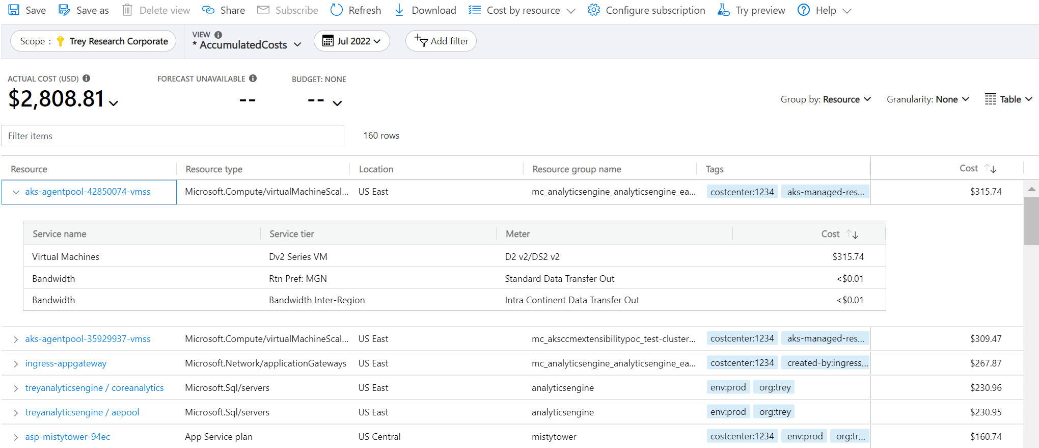
You can view the full dataset for any view. Whichever selections or filters that you apply affect the data presented. To see the full dataset, select the chart type list and then select Table view.
Related content
- Learn about Saving and sharing customized views.
