Stat visualizations
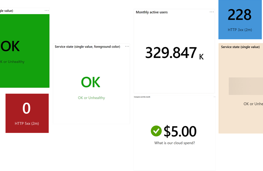
Azure Workbooks let you easily query and combine data from different Azure subscriptions into a single metric. You can customize how this metric looks, including text and background colors, font sizes, and set up thresholds that change icons and colors based on the value.
Stat helps you create dashboards that give you instant alerts when a service is healthy or unhealthy, or when important metrics drop below a certain level. This way, you stay informed and can quickly respond to critical changes.
Add a stat
Switch the workbook to edit mode by selecting Edit.
Use the Add query link to add a log query control to the workbook.
For Query type, select Azure Resource Graph. For Resource type, select, for example, Application Insights, and select the resources to target.
Use the query editor to enter the KQL (Kusto Query Language) for your analysis.
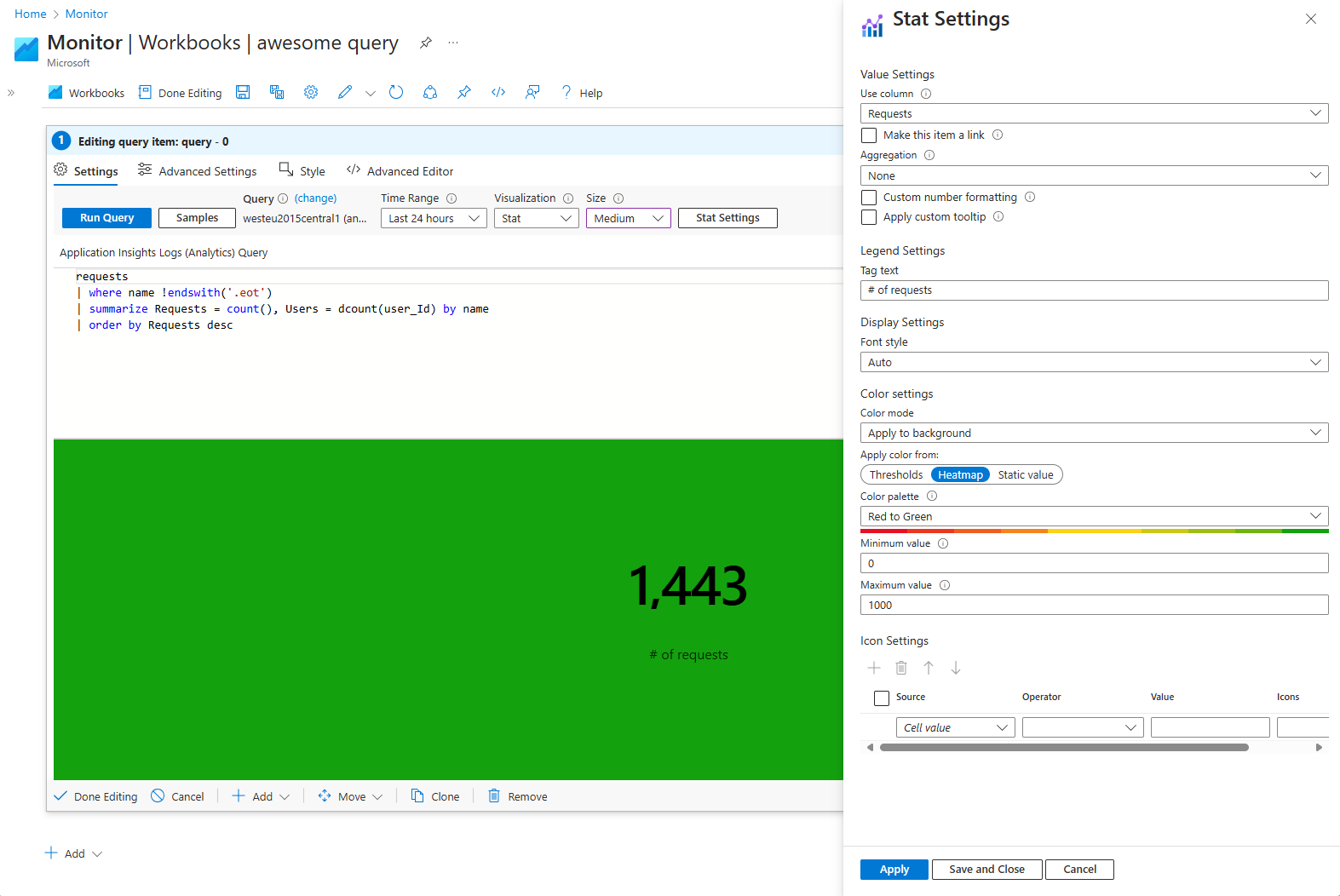
requests
| where name !endswith('.eot')
| summarize Requests = count(), Users = dcount(user_Id) by name
| order by Requests desc
Set Visualization to Stat.
Select the Stat Settings button to open the Stat Settings pane:
- In Use column, set:
Requests - In Tag text, set:
# of requests - In Color settings, set:
- Apply color from:
Heatmap - Color palette:
Red to Green - Minimum value: 0
- Maximum value: 1,000
- Apply color from:
- In Use column, set:
Select the Save and Close button at the bottom of the pane.
Single-value and aggregated data
Stat visualizations can display either a single data point from a query or aggregated data from multiple rows in a query result.
Single-value data
For instance, a single-value data structure might look like this:
| Timestamp | Value |
|---|---|
| 2024-08-08T18:36:12Z | OK |
For the above data, the visualization would display "OK" if the "Value" column is selected. This single value can be a number, string, or other data types.
Aggregated data
Stat visualizations can also process time series data and perform simple aggregations. For example:
| Timestamp | Value |
|---|---|
| 2024-08-08T18:30:00Z | 42 |
| 2024-08-08T18:31:00Z | 45 |
| 2024-08-08T18:32:00Z | 50 |
| ... | ... |
For the above data, the visualization would display the first value by default. If an aggregation function is specified, it applies the function to the selected column's values, summarizing the data accordingly.
Stat settings
| Setting | Description |
|---|---|
Use column |
Selects the column that provides the numeric or text value to be displayed in the visualization. |
Make this item a link |
Enables the selected value to function as a clickable link. |
Aggregation |
Chooses an aggregation function to apply to the query results, such as None, Sum, Average, etc. Aggregation is relevant when working with multiple data points. |
Custom number formatting |
Allows custom formatting of numeric values, such as specifying decimal places or adding a prefix/suffix. |
Apply custom tooltip |
Enables the addition of a custom tooltip to the stat, which provides additional information when hovering over the stat. |
Tag text |
Sets the legend text to be displayed below the main value in the visualization, providing context for the data. |
Font style |
Selects the font size and style used in the visualization. The default Auto option adjusts the font size based on the overall size of the visualization. |
Color mode |
Determines how colors are applied in the stat. For instance, you can apply the color to the background or foreground. |
Apply color from |
Specifies the method for determining the color applied to the stat. Options include Thresholds, Heatmap, or a Static value. |
Color settings |
Allow you to set the background or foreground of the stat. |
Icon Settings |
Allows you to add and customize icons based on conditions defined by the Source, Operator, and Value. Icons can visually represent different states or thresholds. |
Applying color based on thresholds
Thresholds apply a specific color depending on the visualization's value meeting a specific condition.
| Setting | Description |
|---|---|
| Source | The origin of data (for example, 'Cell value' or a column). |
| Operator | The comparison operator (for example, less than, equal to). |
| Value | The threshold that triggers coloring. |
| Color | The color applied when conditions are met; defaults to 'None.' |
Switch the workbook to edit mode by selecting Edit.
Use the Add query link to add a log query control to the workbook.
For Query type, select Azure Resource Graph. For Resource type, select, for example, Application Insights, and select the resources to target.
Use the query editor to enter the KQL for your analysis.
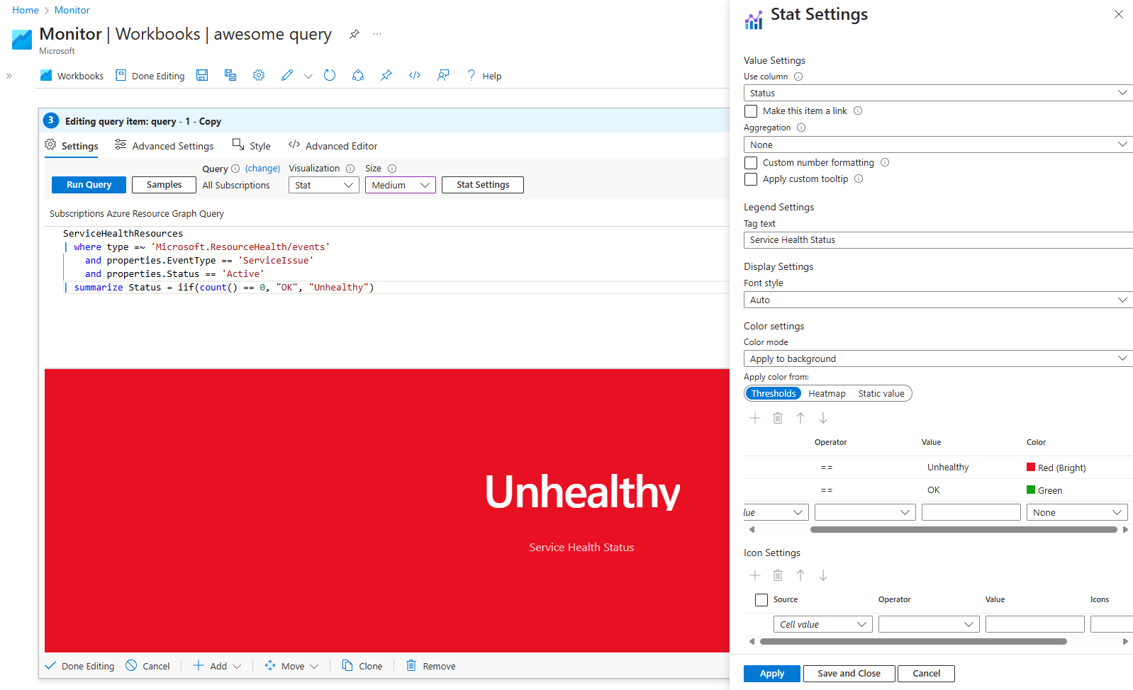
ServiceHealthResources
| where type =~ 'Microsoft.ResourceHealth/events'
    and properties.EventType == 'ServiceIssue'
    and properties.Status == 'Active'
| summarize Status = iif(count() == 0, "OK", "Unhealthy")
Set Visualization to Stat.
Select the Stat Settings button to open the Stat Settings pane:
- In Use column, set:
Status - In Tag text, set:
Service Health Status - In Color settings, set:
- Apply color from:
Thresholds - In the fields, create the first threshold:
- Operator:
== - Value:
Unhealthy - Color:
Red (bright)
- Operator:
- In the fields, create the second threshold:
- Operator:
== - Value:
OK - Color:
Green
- Operator:
- Apply color from:
- In Use column, set:
Select the Save and Close button at the bottom of the pane.
The query now displays a different color, depending on the resource health status of your queries.
Applying a heatmap-style color
When the Heatmap option is selected, the visualization's color is selected according to the gradient between the minimum and maximum value.
| Field | Description |
|---|---|
| Color Palette | Choose a gradient for the heatmap (for example, 'Red to Green'). |
| Minimum Value | Set the lower bound for the heatmap. |
| Maximum Value | Set the upper bound for the heatmap. |
Switch the workbook to edit mode by selecting Edit.
Use the Add query link to add a query control to the workbook.
For Query type, select Azure Resource Graph. For Resource type, select, for example, Application Insights, and select the resources to target.
Use the query editor to enter the KQL for your analysis.
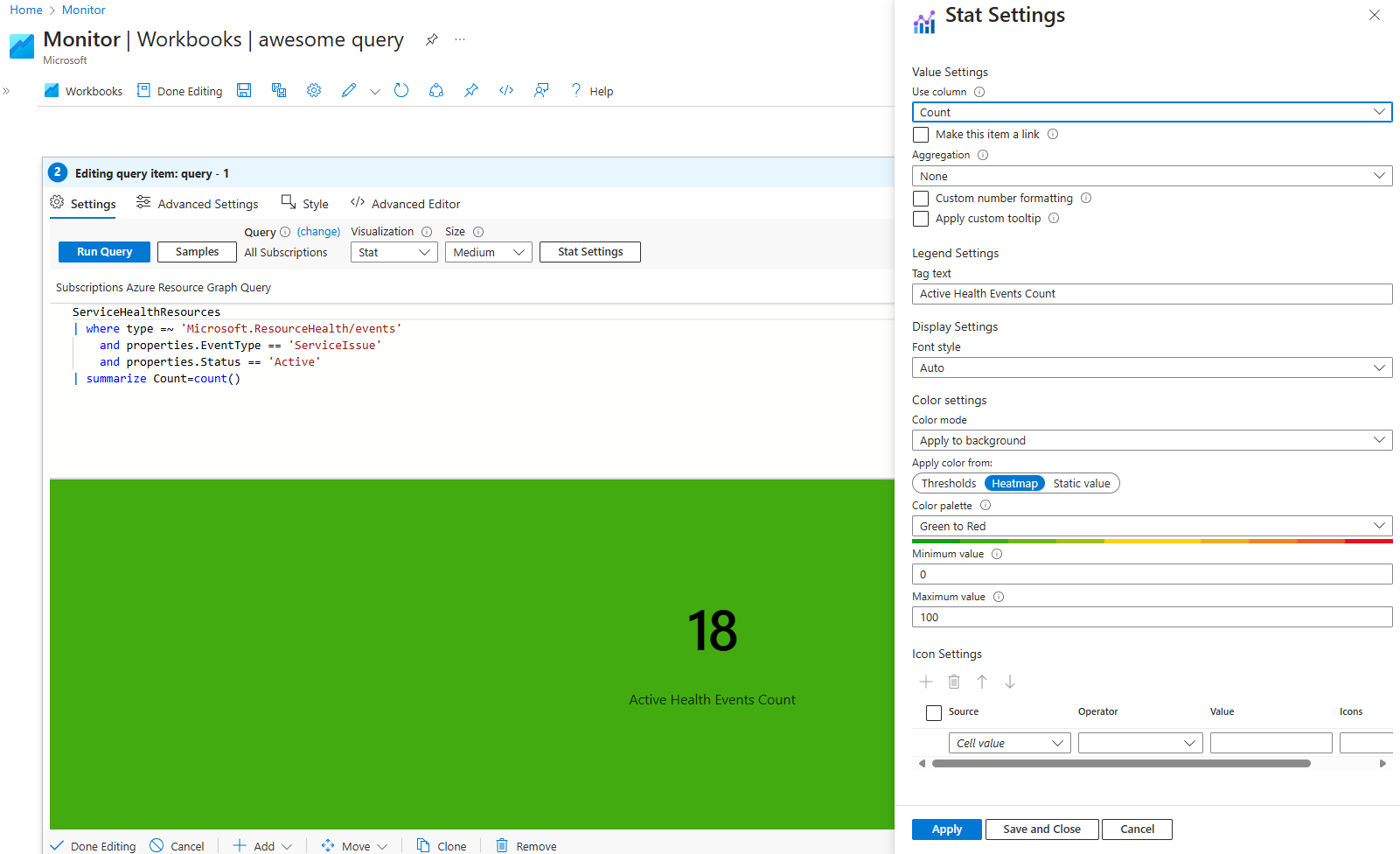
ServiceHealthResources
| where type =~ 'Microsoft.ResourceHealth/events'
    and properties.EventType == 'ServiceIssue'
    and properties.Status == 'Active'
| summarize Count=count()
Set Visualization to Stat.
Select the Stat Settings button to open the Stat Settings pane:
- In Use column, set:
Count - In Tag text, set:
Active Health Events Count - In Color settings, set:
- Apply color from:
Heatmap - Color palette:
Green to Red - Minimum value:
0 - Maximum value:
100
- Apply color from:
- In Use column, set:
Select the Save and Close button at the bottom of the pane.
Depending on the value returned by the query in the Count column, the color falls within the gradient of the chosen palette.
Applying a static color
When the Static value option is selected, the Color field dictates which color is used for the stat.
Use cases
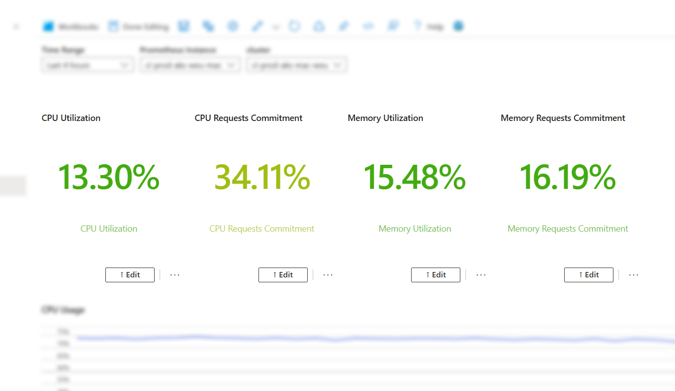
Querying AKS (Azure Kubernetes Service) clusters for resource usage
Switch the workbook to edit mode by selecting Edit.
Use the Add parameters link to add a parameters step to the query.
Select Add parameter, then configure the parameter:
Parameter name:
PrometheusDisplay name:
Prometheus instanceParameter type:
Resource pickerRequired:
CheckedGet data from:
QuerySet the query to:
- Data source:
Azure Resource Graph
resources | where type =~ "microsoft.monitor/accounts" and isnotempty(todynamic(properties).metrics.prometheusQueryEndpoint) | project id- Data source:
Select Save.
Select Add parameter, then configure the parameter:
- Parameter name:
TimeRange - Display name:
Time range - Parameter type:
Time range picker - Select Save.
- Parameter name:
Select Done editing to finish configuring the parameters.
- Once the parameter queries finish loading, select the desired Prometheus instance you'd like to monitor.
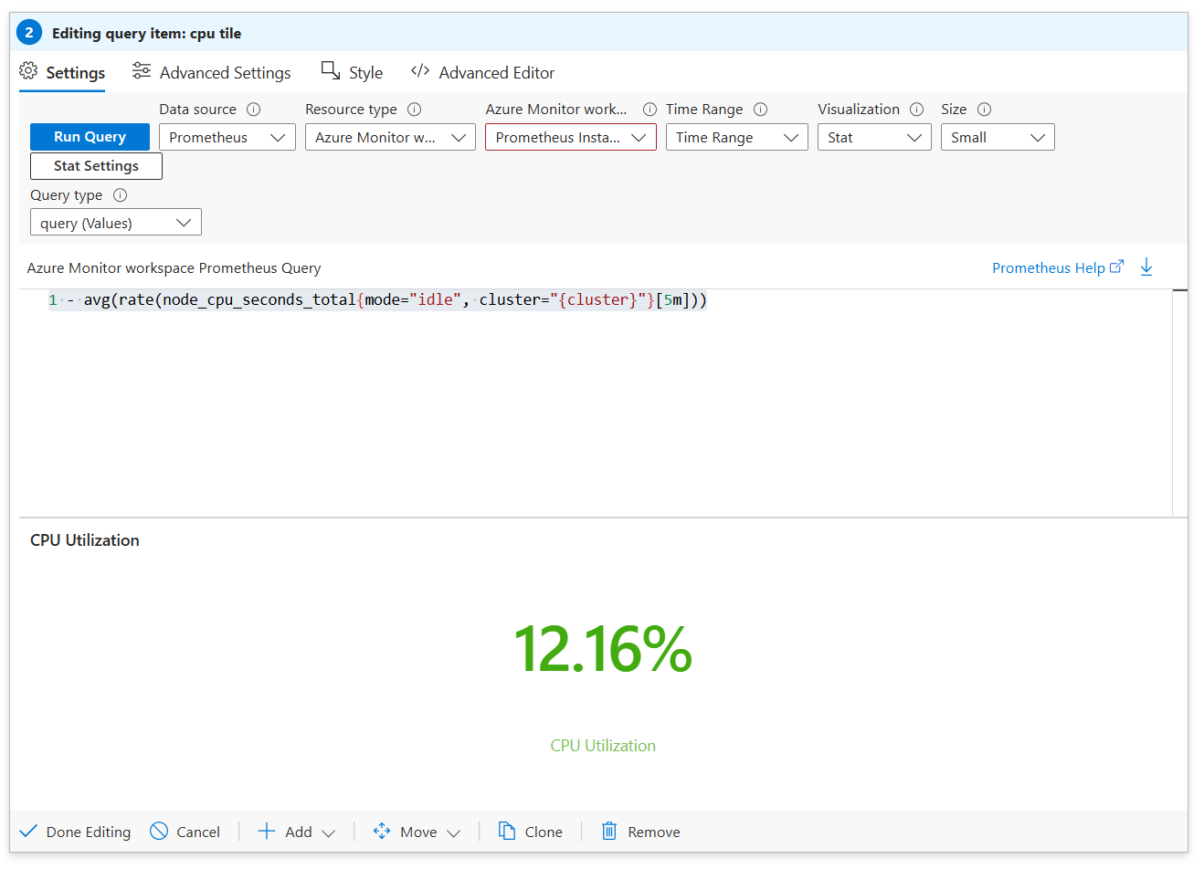
Use the Add query link to add a query control to the workbook.
For Query type, select Prometheus.
For Azure Monitor workspace, under Resource Parameters, select
Prometheus Instance.For Time Range, under Time Range Parameters, select
TimeRange.For Visualization, select
Stat.For the query, choose which metric you'd like to monitor:
CPU Utilization:
1 - avg(rate(node_cpu_seconds_total{mode="idle"}[5m]))Memory Utilization:
1 - sum( sum(
node_memory_MemAvailable_bytes or
(
     node_memory_Buffers_bytes +
     node_memory_Cached_bytes +
     node_memory_MemFree_bytes +
     node_memory_Slab_bytes
)
) by (cluster)) / sum(node_memory_MemTotal_bytes)
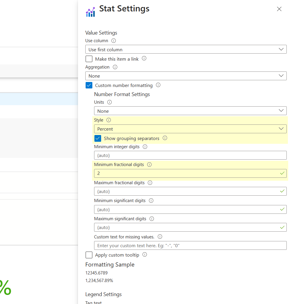
For each metric, the value must be formatted. Select Stat Settings.
Select Run Query and see the desired metric.
Select Done Editing to exit the step.
