Azure Monitor metrics explorer with PromQL (Preview)
Azure Monitor metrics explorer with PromQL (Preview) allows you to analyze metrics using Prometheus query language (PromQL) for metrics stored in an Azure Monitor workspace.
Azure Monitor metrics explorer with PromQL (Preview) is available from the Metrics menu item of any Azure Monitor workspace. You can query metrics from Azure Monitor workspaces using PromQL or any other Azure resource using the query builder.
Note
You must have the Monitoring Reader role at the subscription level to visualize metrics across multiple resources, resource groups, or a subscription. For more information, see Assign Azure roles in the Azure portal.
Create a chart
The chart pane has two options for charting a metric:
- Add with editor.
- Add with builder.
Adding a chart with the editor allows you to enter a PromQL query to retrieve metrics data. The editor provides syntax highlighting and intellisense for PromQL queries. Currently, queries are limited to the metrics stored in an Azure Monitor workspace. For more information on PromQL, see Querying Prometheus.
Adding a chart with the builder allows you to select metrics from any of your Azure resources. The builder provides a list of metrics available in the selected scope. Select the metric, aggregation type, and chart type from the builder. The builder can't be used to chart metrics stored in an Azure Monitor workspace.
Create a chart with the editor and PromQL
To add a metric using the query editor:
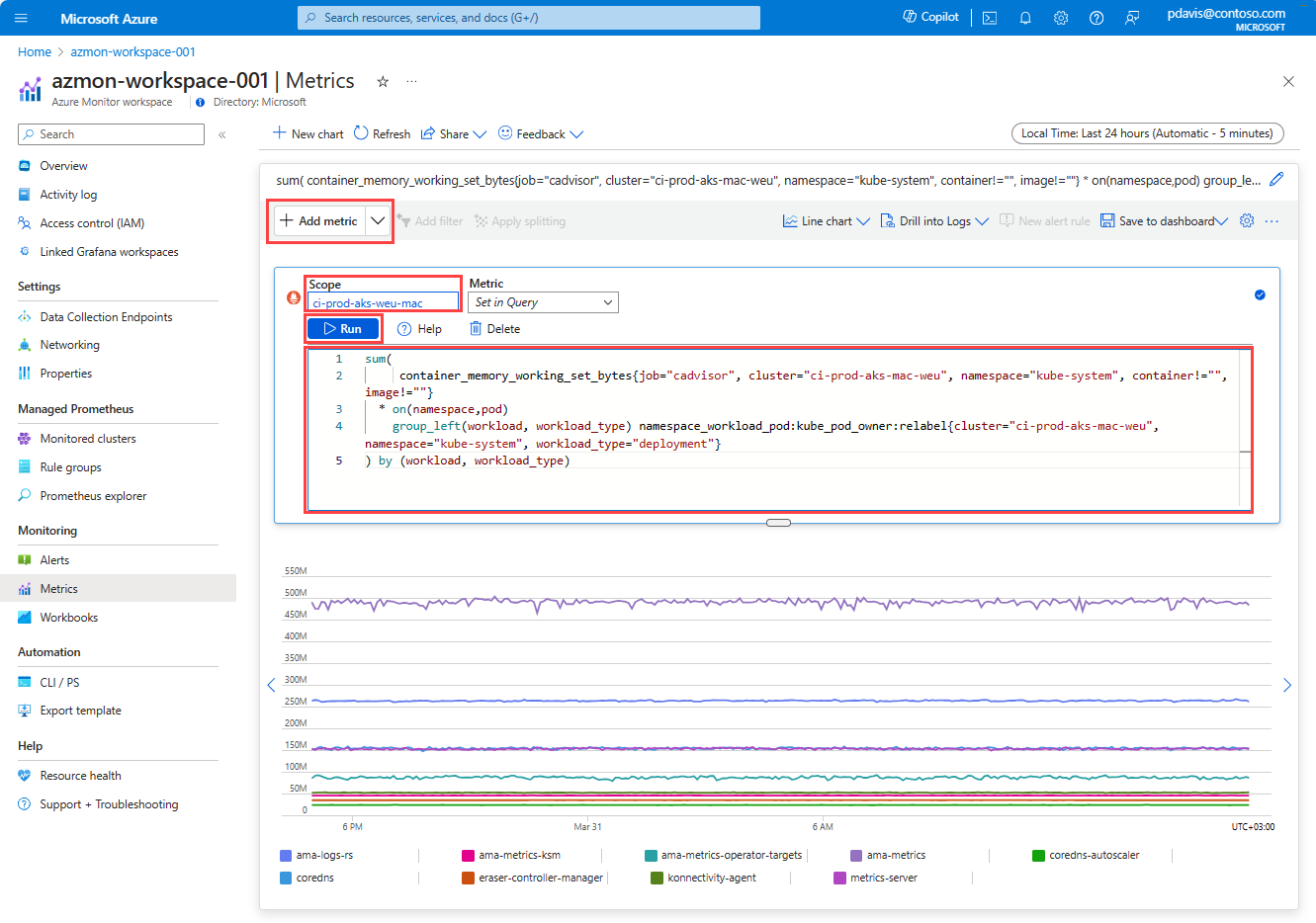
Select Add metric and select Add with editor from the dropdown.
Select a Scope from the dropdown list. This scope is the Azure Monitor workspace where the metrics are stored.
Enter a PromQL query in the editor field, or select a single metric from Metric dropdown.
Select Run to run the query and display the results in the chart. You can customize the chart by selecting the gear-wheel icon. You can change the chart title, add annotations, and set the time range for the chart.
Create a chart with the builder
To add a metric with the builder:
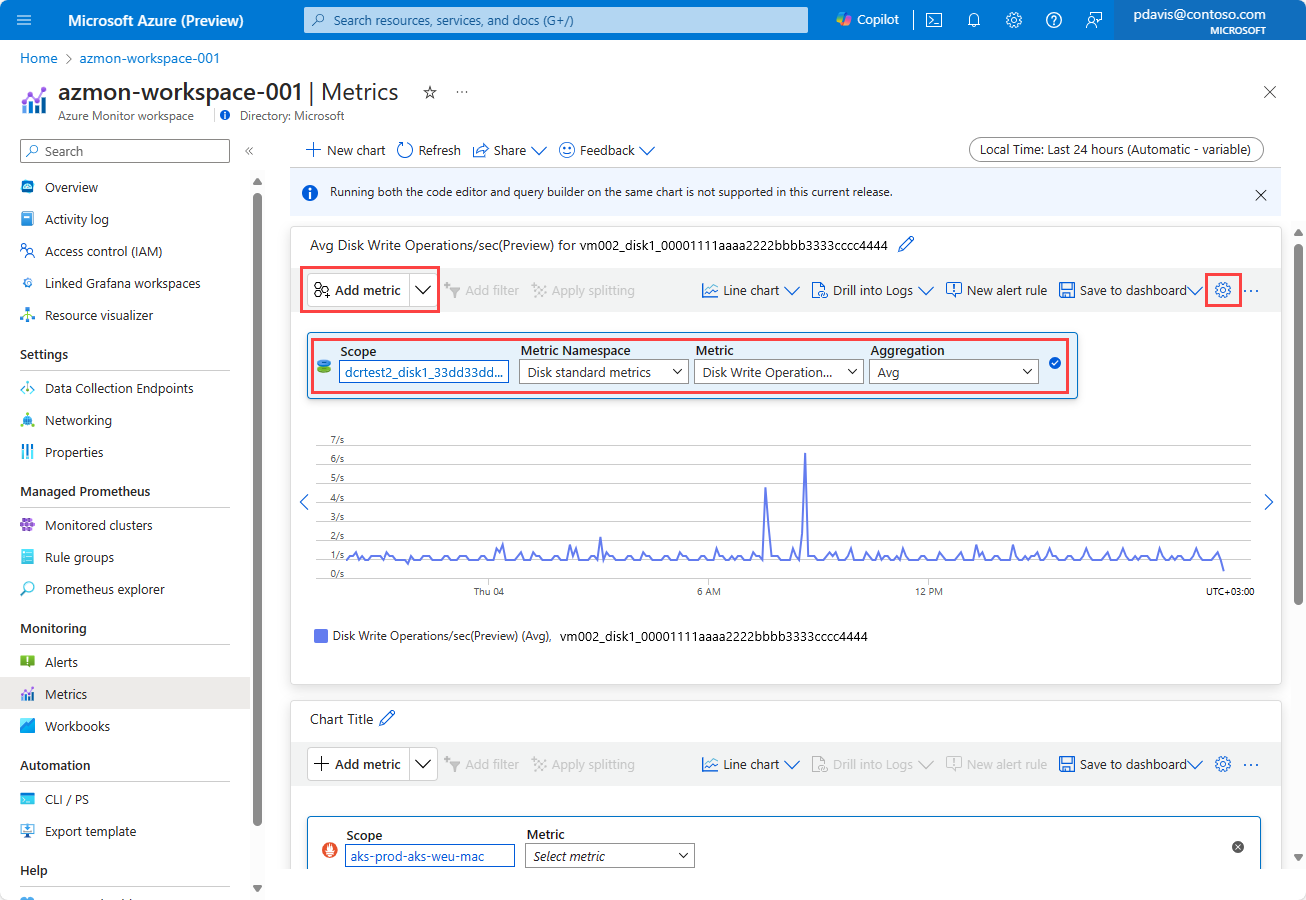
Select Add metric and select Add with builder from the dropdown.
Select a Scope. The scope can be any Azure resource in your subscription.
Select a Metric Namespace from the dropdown list. The metrics namespace is the category of the metric.
Select a Metric from the dropdown list.
Select the Aggregation type from the dropdown list.
For more information on the selecting scope, metrics, and aggregation, see Analyze metrics.
Metrics are displayed by default as a line chart. Select your preferred chart type from the dropdown list in the toolbar. Customize the chart by selecting the gear-wheel icon. You can change the chart title, add annotations, and set the time range for the chart.
Multiple metrics and charts
Each workspace can host multiple charts. Each chart can contain multiple metrics.
Add a metric
Add multiple metrics to the chart by selecting Add metric. Use either the builder or the editor to add metrics to the chart.
Note
Using both the code editor and query builder on the same chart is not supported in the Preview release of Azure Monitor metrics explorer and may result in unexpected behavior.
Add a new chart
Create additional charts by selecting New chart. Each chart can have multiple metrics and different chart types and settings.
Time range and granularity are applied to all the charts in the workspace.
Remove a chart
To remove a chart, select the ellipsis (...) options icon and select Remove.
Configure time range and granularity
Configure the time range and granularity for your metric chart to view data that's relevant to your monitoring scenario. By default, the chart shows the most recent 24 hours of metrics data.
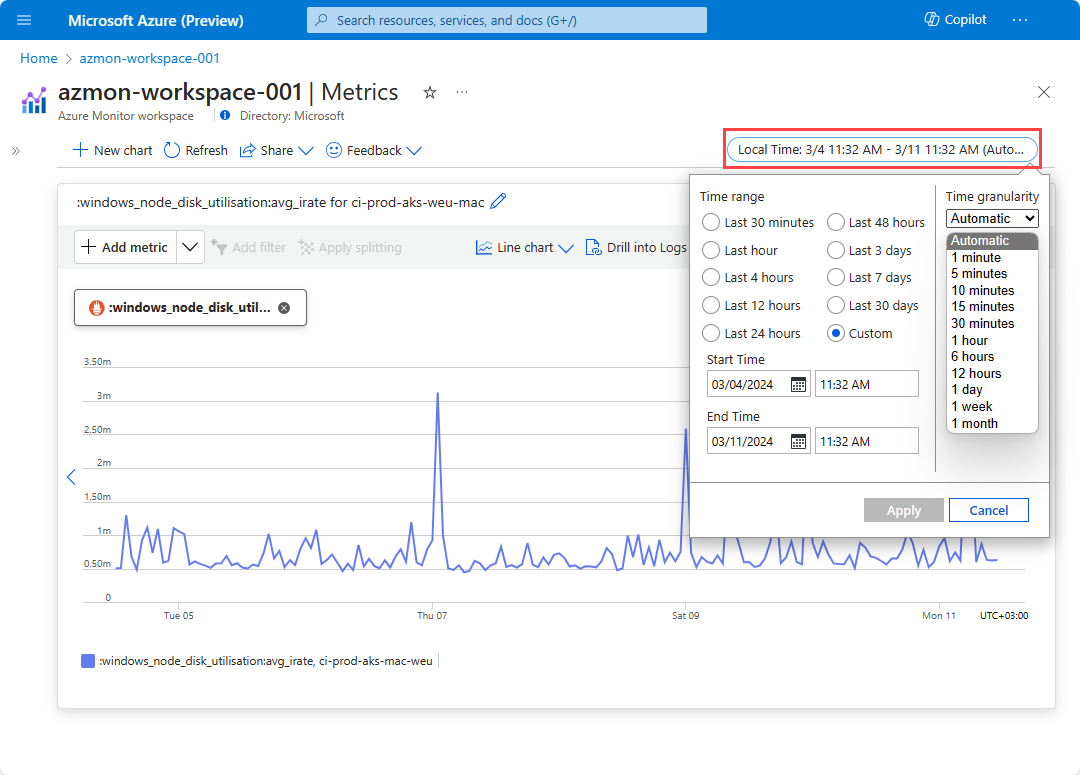
Set the time range for the chart by selecting the time picker in the toolbar. Select a predefined time range, or set a custom time range.
Time grain is the frequency of sampling and display of the data points on the chart. Select the time granularity by using the time picker in the metrics explorer. If the data is stored at a lower or more frequent granularity than selected, the metric values displayed are aggregated to the level of granularity selected. The time grain is set to automatic by default. The automatic setting selects the best time grain based on the time range selected.
For more information on configuring time range and granularity, see Analyze metrics.
Chart features
Interact with the charts to gain deeper insights into your metrics data. Interactive features include the following:
- Zoom-in. Select and drag to zoom in on a specific area of the chart.
- Pan. Shift chart left and right along the time axis.
- Change chart settings such as chart type, Y-axis range, and legends.
- Save and share charts
For more information on chart features, see Interactive chart features.


