Character design standards - Lowercase for Latin 1
Advance width rule
All glyphs in proportionally spaced typefaces have advance widths that are dependent on their proportional design.
Vertical alignment rules
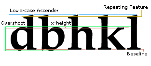
Flat characters align with the lowercase x-height and baseline
Lowercase flat height values are the tops of all flat characters that have the same top feature. These characters should be at the same value exactly in most text fonts.
Note: The diagonal strokes on the character v or w, alignment of the bottom varies depending on the thickness of the bottom where the two strokes join. A very pointed v needs to descend below the baseline so it does not appear short. A wide bottom junction design may reside on the baseline.
Lowercase ascender and descender height rules
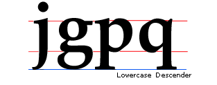
Characters that have ascenders or descenders very often are at the same vertical height value regardless if they are round or flat. Unlike other round characters these round ascenders (such as the f) or descenders (such as the g or j) many times do not overshoot other flat or slanted characters (such as the b, d, h, l, p, or q).
Round overshoot rules
All other lowercase round characters that have the same top and bottom feature should be at the same value exactly in most text fonts. They should overshoot the baseline of the flat characters the same amount as the top overshoots the lowercase flat characters.
Note: It is far more important the tops and bottoms of round characters are visually more than mathematically equal. It is common for designers to make some round characters, such as the lowercase s and c slightly smaller than the lowercase o. See the quotation on visual character heights in the uppercase section by Matthew Carter, Carter and Cone Type, Inc.
Spacing rules
The two most important characters with regard to spacing in the lowercase are the n and the o. These two are the model characters most type designers use to space the rest of the group. They are used in chains to test how the current character spaces between other straight or round stems. When spacing outlines, glyphs should be visually centered as opposed to mathematically. It is helpful in upright modern geometric designs to use a mathematical logic in spacing. In such a case the sidebearing values of round featured characters are mathematically the same and usually less than the flat characters values.
All characters should position in their cell in a similar way so when placed in text they space evenly. This does not mean the center of its advance width. It is common for some typefaces (italics) to position the black (black width) of the glyph to the right of the mathematical center of the advance width. The n and o are used to test how the current character centers in the font, not in its advance width.

Specific character standards
German double s - eszett
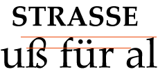
Unicode: U+00DFDesign: This character is a ligature of two lowercase 's' characters and is a traditionally based ligature made with an archaic long 's' and lowercase 's'. On personal computers, it has been used as a substitute for the greek lowercase beta U+03B2 commonly in the version numbers of files and applications.
The top bowl and bottom bowl should meet at approximately the x-height of the lowercase.
In Cap Only typefaces, two uppercase 'S' characters are used as the design for this character. The ligature form is a lowercase design. The advance width of the Cap Only German double 'S' usually is not made twice the width of the single 'S'. It is made to space slightly tighter than two uppercase S characters.

Alignment rules: The top should align with the lowercase ascender.
Long lowercase s
Unicode: U+017FDesign: This character is an archaic form of the lowercase s. Its origins are from the earliest forms of the lowercase, from cursive scribe's literature. In early Roman scribe's literature, it appeared with lowercase ascenders in the minuscule, or half-uncial, alphabet. Uncial came to England with Roman missionaries in the Christian literature of the sixth and seventh century.
Its form is similar to the lowercase f. This character's shape is also related to the design of the German double s U+00DF.
Alignment rules: This character aligns with the lowercase ascender and is of the same style as the lowercase f.
Advance width rule: The advance width should be the same as the lowercase f.
Ampersand
Unicode: U+0026Design: This character is an abbreviation for the word 'and'. It is historically based on the Latin word 'et' and its name is said to be derived from the words 'and per se'. It is a unique design with a stroke weight that often relates to the lowercase and it is commonly grouped with lowercase ligatures. Traditionally it was grouped with the uppercase due to common use in business names.
Alignment rules: Its alignment is unique and it commonly is slightly shorter than the uppercase top overshoot height.
Advance width rule: The advance width is proportional to the design.
Lowercase oe diphthong
Unicode: U+0153Lowercase ae diphthong
Unicode: U+00e6Design: The central connection of both elements of the ligature should be the same weight visually as similar strokes of the lowercase. Commonly the lowercase e is the more dominant character in the ligature.
Advance width rule: The advance width is proportional to the design. The left sidebearing is commonly the same as in the lowercase o or a and the right sidebearing is commonly the same as in the lowercase e.

Lowercase l slash
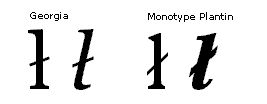
Unicode: U+0142Design: This letter is used in Polish and many languages including some native American languages. The bar length is commonly slightly longer on the right than the left and large enough to be clearly visible at all sizes. The bar angle should be approximately 30 degrees. The bar angle in Palatino Linotype regular is 30.2 degrees from horizontal and Palatino Linotype italic is 31.85 degrees from horizontal.
For help on the design, bar length and angle for the Polish language see the suggestions for Polish diacritics by Adam Twardoch.
Advance width rule: The advance width is commonly the same as the lowercase l. In sans serif fonts the advance width may need to be larger than the lowercase l.

Lowercase o slash
Unicode: U+00F8Design: This letter is used in Danish and Norwegian languages. The bar length is commonly equal too or greater than the leftmost and rightmost portions of the lowercase o and equal to or greater than the top and bottom. Its angle should evenly divide the counter. Some very bold and display designs the bar does not extend through the center counter of the lowercase o instead it only extends from the outer portions of the letter.
Advance width rule: The advance width is commonly the same as the lowercase o.

Lowercase eth
Unicode: U+00F0Design: This character's design is based on the lowercase o with an added ascender. The ascender generally extends to the lowercase ascender height vertically.

Advance width rule: The advance width should be the same as the lowercase o.
For more help on designing the eth and thorn see the tutorial by Icelandic type designer Gunnlaugur SE Briem.
Lowercase d with stroke - dyet
Unicode: U+0111Design: This character's is used in the Croatian, Vietnamese, Macedonian and Serbian languages. Its design is based on the lowercase d with an added bar. The bar should be the same thickness as other lowercase characters with bars. Vertically the bar should be visually centered between the x-height and the ascender. It should horizontally extend to the right of the stem similarly to the serif in serif designs and enough to be visible at small size but not long enough to cause spacing problems for sans serif designs. To the left the bar should extend approximately one half the width of the lower bowl of the d and in italic designs visually one half the bowl.

Advance width rule: The advance width should be the same as the lowercase d. In sans serif designs it may be necessary for the advance width of this character to be greater than that of the lowercase d to visually compensate for the bar.
Lowercase t with stroke
Unicode: U+0167Design: This character's design is based on the lowercase t with a bar. The bar should extend left of the main stem about the same distance as the crossbar of the t. The thickness should be the same as other lowercase characters with bars. The right side of the bar should extend farther from the main stem than the left side.

Advance width rule: The advance width should be the same as the lowercase t.
Lowercase h with stroke
Unicode: U+0127Design: This character's design is based on the lowercase h with a bar. The bar should be the same thickness as other lowercase characters with bars in the font. Vertically the bar should visually center between the x-height and the ascender. It should horizontally extend to the left of the stem similarly to the serif in serif designs and enough to be visible at small size but not long enough to cause spacing problems for sans serif designs. To the right the bar should extend approximately one half the width of the lower bowl of the lowercase h and in italic designs visually one half the bowl.

Advance width rule: The advance width should be equal to the lowercase h character's advance width. In sans serif designs it may be necessary for the advance width of this character to be greater than that of the lowercase h to visually compensate for the bar.
Lowercase thorn
Unicode: U+00FEDesign: This character's design is based on the lowercase p and the lowercase l.

Advance width rule: The advance width should be equal to the lowercase p character's advance width.
For more help on designing the eth and thorn see the tutorial by Icelandic type designer Gunnlaugur SE Briem.
Lowercase eng
Unicode: U+014BDesign: This character's design is based on the lowercase n.

Advance width rule: The advance width should be based on the lowercase n character's advance width. It is commonly necessary to decrease the right sidebearing in serif fonts to compensate for the loss of the serif.
Feminine ordinal
Unicode: U+00AAMasculine ordinal
Unicode: U+00BADesign: These ordinal characters are used in the Spanish and other romance languages for proper gender ordinal numbers. Similar to the English abbreviations 1st, 2nd, 3rd and 4th.
There are two basic styles of design for the ordinals. Some designs have a bar beneath the ordinal. Others do not. The ordinal version with the bar is the preferred version.
Spanish abbreviations for primera, primer, segunda, and segundo.

Note: Traditionally in Portuguese the ordinal characters should contain the underline. The underline helps avoid confusion between the masculine ordinal and the degree character. This is important at low resolution, such as the screen, when both characters are very similar in size and shape.
Language information contributed by Mário Feliciano, Secretonix-Typography & Design. Lisbon, Portugal
Alignment: Aligns with the figure height. Commonly at the top of the figure height.
Advance width: The advance width is commonly proportional to the design.
Spacing: This character should space between figure zeros.
Greenlandic lowercase kra
Unicode: U+0138Design: The design should be of the weight of the lowercase. This is not a small cap version of the uppercase K. In serif designs the left top serif should be of the same design as the lowercase n, i, m, j etc.

Alignment rules: This character aligns with the lowercase flat x-height.
Advance width rule: The advance width is proportional to the design.
Lowercase ligatures
Lowercase ff ligature
Unicode: U+fb00Used as a doubled f ligature and also as an abbreviation in music for fortissimo.
Lowercase fi ligature
Unicode: U+fb01 and U+f001Lowercase fl ligature
Unicode: U+fb02 and U+f002Lowercase ffi ligature
Unicode: U+fb03Lowercase ffl ligature
Unicode: U+fb04Long s and t ligature
Unicode: U+fb05Lowercase st ligature
Unicode: U+fb06These characters are traditional typographic lowercase ligatures that are present in Unicode 2.0. The fi and fl ligature placed in all fonts released previous to the Unicode 2.0 specification, were set at the beginning of the private use area at positions U+f001 and U+f002. Unicode version 1.0 did not support ligature forms that are not a main character of the script until the release of version 2.0 of the Unicode specification.
Design: Traditionally these characters were individually designed and found commonly only in serif fonts. They are not just a merging of two or three lowercase letters. These character's ligature connection (if present) should be a smooth transition and not a simple overlap of contours. Sans serif fonts are not calligraphic in nature and it is common for these ligatures to be a tighter spaced version of the two or three base lowercase glyphs.
Advance width rule: The left sidebearing should be equal to the base model character's left sidebearing (example: the f in a fi ligature). The right sidebearing should be equal to the sidebearing of the right most character's original right sidebearing (example: the i in a ffi ligature).
Lowercase ch ligature
Unicode: A substitute glyph for U+0063 and U+0068This glyph is a traditional ligature for the lowercase c and h characters found in Fraktur style German lettering. It has been included with other lowercase ligatures in some Roman typefaces such as the typefaces of Hermann Zapf, Rudolph Koch's Kabel and David Berlow's Berlin Sans. The lowercase c and lowercase h are treated as one character when reading German and many typographers kern them quite closely together when setting text. In the German language the c and h characters are rarely broken by hyphenation. The c and h are hyphenated in the rare case of the first word component ending with a c (commonly of foreign origin) and the next word component beginning with an h.
Example: The foreign words: 'Ad hoc' and the abbreviation for the Macintosh computer: 'Mac' when combined with the German word for help, 'hilfe' are commonly written in German text as Mac-Hilfe and Ad-hoc-Hilfe.
Advance width: The advance width is proportional to the design. The left sidebearing should be the same as the lowercase c character’s sidebearing. The right sidebearing should be the same as the lowercase h character’s sidebearing. The white space between the characters of the ligature are spaced commonly much less than the white space between the lowercase c and h characters.
Lowercase ck ligature
Unicode: A substitute glyph for U+0063 and U+006BThis glyph is a traditional ligature for the lowercase c and k characters found in Fraktur style German lettering. It has been included with other lowercase ligatures in some Roman typefaces such as the typefaces of Hermann Zapf, Rudolph Koch's Kabel and David Berlow's Berlin Sans.
Advance width: The advance width is proportional to the design. The left sidebearing should be the same as the lowercase c character's sidebearing. The right sidebearing should be the same as the lowercase k character's sidebearing. The white space between the characters of the ligature are spaced commonly much less than the white space between the lowercase c and k characters.
In German text setting and hyphenation the lowercase c and k are written in one of two ways.
Traditionally in all German speaking countries/regions the lowercase c and k should be separated as: k-k
- Example : The German word Zucker would be separated at the end of a line as : Zuk- ker.
In modern German spelling the lowercase c and k are not broken.
- Example : The German word Zucker would be broken at the end of the line as : Zu- cker.
Lowercase tz ligature
Unicode: A substitute glyph for U+0074 and U+007AThis glyph is a traditional ligature for the lowercase t and z characters used in the German language. It is mostly designed as a finial character.This ligature has been included with other lowercase ligatures in some Roman typefaces such as the typefaces of Hermann Zapf, Rudolph Koch's Kabel and David Berlow's Berlin Sans.
Advance width: The advance width is proportional to the design. The left sidebearing should be the same as the lowercase t character's sidebearing. The right sidebearing should be the same as the lowercase z character's sidebearing or specific to the design in a more decorative finial style. The white space between the characters of the ligature are spaced commonly much less than the white space between the lowercase t and z characters.
'The reason for many ligatures is not so much an esthetic one, but one of simple labour-saving. When I worked as a comp, we used a lot of those regular German workhorse faces, like (Berthold) Block, and they often had ligatures for frequently used combinations. There was sch, ch, tz, st, and ss. All these occur in every other German word, and if you're setting type by hand and are judged by your hourly output, saving one character per word makes a lot of difference. The letter c never appears on its own in German words, only ever preceding an h or a k, so it usually looks too far apart from these letters. Another reason to have a ligature. They didn't often look like a ligature, however, as they were not touching, but still cast onto one body.'
Comments on the use of ligatures in German text by Prof. Erik Spiekermann, MetaDesign: Berlin, Germany
Superior lowercase
There are several forms of superior lowercase letters each with a specific use.
Ordinals are superior lowercase letters that are used in abbreviations in Spanish and other romance languages. See the male and female ordinals in this section.
In mathematics, letters are used as variables and are vertically and horizontally positioned, different depending on the formula. To make the formulas more clear these letterforms are usually larger than the ones used in text settings. An example of a common math related superior letter is the superior n U+207F found in the Microsoft WGL4 character set to support the PC-8 code page for Hewlett-Packard printers.
The form that more closely relates to the lowercase are letters that are intended to be used with text. This form aligns with the uppercase letters.
These lowercase letters commonly are placed so the x-height is at the top of the uppercase. More typographically correct and commonly placed so the superior ascender height is at about the uppercase height. This places the superior baseline at approximately half the uppercase height and the superior lowercase x-height lower than the uppercase height. Commonly included in this set of characters is the accented lowercase e grave. While typographically considered incorrect in French, the e grave is commonly used in the abbreviations of the words première and in deuxième, troisième, and higher ordinal numerals. The common and typographically correct abbreviations are shown in the illustration below.
The abbreviations for premier, première, and deuxième.

Abbreviations are very common in the French language. Below are some additional lowercase superiors used in a few common abbreviations. Note the alignment of the lowercase l in the abbreviation of the word mademoiselle.

Language information contributed by Jean-François Porchez, Porchez Typofonderie, France
There are no Unicode numbers for these characters. The Unicode Consortium sees these characters as glyph variants and not unique characters. These glyphs can be accessed in OpenType fonts by glyph substitution.

