Tip #50: Did you know…How to absolute position the controls in Visual Studio Designer?
Absolute positioning control(s) in the designer can seem confusing at first until you learn the visual cues. You can do one of the following two possible actions by dragging the control in the designer.
- Re-parent the control
- Change the controls position.
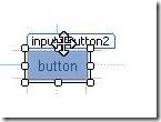
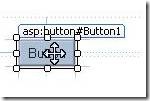
When you drag the body of the control, you are changing the parent of the control. You can see this because the cursor changes to the small arrow with a square box.
On the other hand, when you drag it by the white tag, you change the physical position of the control. You can see this because the cursor changes to the 4-way arrow and there is no square box.
Unfortunately, today the cursor shows a 4-way arrow when you hover over the body of a web control and that’s a known issue. It should be only a 4-way arrow when you a hover on the white tag and a standard arrow when you hover on the body. You will see the right behavior with HTML button.
Note: Additionally the first drop of the control always sets its parenting always, not its position.
Vinayabhushana GattamReddy
TM || Visual Web Developer
Comments
Anonymous
March 31, 2009
Absolute positioning control(s) in the designer can seem confusing at first until you learn the visualAnonymous
March 31, 2009
The comment has been removedAnonymous
March 31, 2009
The visual layout of the page in design mode still seems confusing to me. Objects such as datasources always show and are hard to move out of the way to allow me to visually layout the objects that will display in the browser. Is there a standard way to move those objects out of the way? Place them in a separate table cell? etc?Anonymous
March 31, 2009
Good article. Didn't know this one. Kent, it is a generally accepted practice to place non-visual designer elements, such as datasources, at the bottom of the page, beyond all other controls. If they are at the top, they will very often conflict with the visual "flow" of your design, but shouldn't give you much trouble at the bottom.Anonymous
February 01, 2011
thanks for your help and posting and writing which is important and helpful i expect more and more help


