SharePoint 3.0 Document Libraries & CRM
Flood...
Firstly let me appologise for not posting regularly these last few months. Work has been expremely busy since Christmas, as has family life with my two boys running me ragged. However, to make up for this, I thought I'd share some of the bits and pieces I have been working on. One requirement that crops up all the time is to integrate Windows SharePoint Services (WSS) 3.0 document libraries within the CRM interface to provide a single place to access related CRM and SharePoint information. There are several article which show you how you can acheive this using an IFRAME within a CRM form, and even show you how to change the document library relative to the CRM record you are actually viewing
- Display a SharePoint document library in a Microsoft Dynamics CRM 3.0 form
- Convergence EMEA 2007 Demonstration - CRM and Contextual SharePoint Document Libraries/Folders
- Code snippet for creating a SharePoint document library
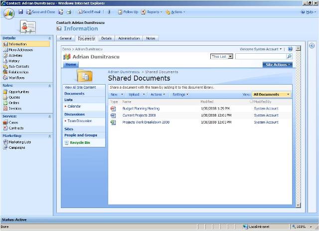
However, one "ugly" side effect of this is that you get all WSS navigation UI inside your IFRAME, which doesn't look particularly clean as you can see.

Now, spured on by Rich Dickinson's post SharePoint Document Libraries in Microsoft CRM which showed us how to remove the navigation and title-bar "chrome" from a WSS 2.0 Document Library I set about finding a way of achieving this with WSS 3.0. The good news is that the page architecture changed in WSS 3.0 to make use of ASP.NET Master Pages.
"ASP.NET master pages allow you to create a consistent layout for the pages in your application. A single master page defines the look and feel and standard behavior that you want for all of the pages (or a group of pages) in your application. You can then create individual content pages that contain the content you want to display. When users request the content pages, they merge with the master page to produce output that combines the layout of the master page with the content from the content page. "
So all I should have to do is find the Master Page for my SharePoint Site and replace it with a modified one that strips out all the "chrome", leaving me with just the bits of the UI I actually want. Thankfully there is plenty of SharePoint information available which shows you how to achieve this, including this short 3 minute "how to" video - Building Simple Master Pages for Windows SharePoint Services 3.0.
In the video, you can see how easy it is to create a new Master Page in three simple steps by:
- Opening a Windows SharePoint Services 3.0 site in Office SharePoint Designer 2007.
- Locating and creating a copy of the site's Default.master page.
- Applying the new master page to content pages in the site.
However, what it doesn't show you was how to remove all the content you don't actually want. A typical WSS Site Template (such as the Document Workspace), uses approx 30 or so ContentPlaceHolder controls per page, which means it's not a simple matter of just deleting all the unnecessary HTML, you have to make sure that all the ContentPlaceHolder controls are preserved. There's an article I found which shows you how to create a minimal master page for Microsoft Office SharePoint Server (MOSS) 2007, which although doesn't work for WSS, gave me the headstart I needed to build my own.
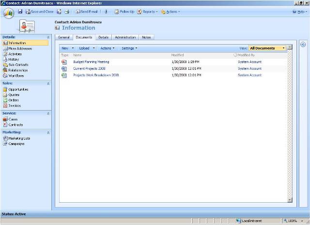
Once created, I uploaded my new master pager to the site Master Page Gallery, then used Office SharePoint Designer 2007 to set it as the Default Master Page and the results you can see for yourself.

As the ever-helpful chap I am (modest too.!), I have uploaded a copy of my new master page here, so you can get up and running quickly.
This posting is provided "AS IS" with no warranties, and confers no rights.
Comments
Anonymous
April 14, 2008
ping back from http://www.castorsoft.com/articles/2008.4.11.htmAnonymous
April 23, 2008
Following on from my previous post where I described how to define a minimal master page for WindowsAnonymous
April 27, 2008
Can I Play With Madness... Now that I have a custom site definition that incorporates a minimal master