Creating Styles in Expression Blend 2
Apologies for leaving it so long since my last post; the last 6-12 months have been extremely busy, but I must add, busy with lots of learning! So I felt that the time was right to start posting some of those learnings.
So… Styles! Those of you from traditional Web Designing backgrounds will be used to separating your styling from your content using CSS. This is something that is also possible in Expression Blend, and was always its intention to separate behaviour from look and feel, making designing styles and enabling rapid changes, quick and easy. They’re great for setting styles on text, such as headings, body and hyperlinks, as well as creating styled buttons, etc.
Styles are not to be confused with templates, they can work together, but offer different capabilities to the project. A template allows you to change the entire look and feel of the control, such as a button or check box. For example, you may want to have green round buttons in your application or website. To make the standard rectangular button round, you would need to make the change in the template by creating a new shape that is round. However, the green colour could be taken care of by the style functions. This allows you to “skin” the button with the current colour scheme, whilst planning for easy change later down the line.
Let’s get started with the tutorial on creating styles!
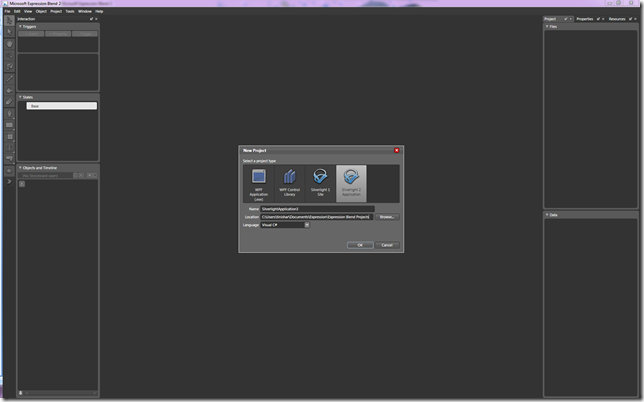
Firstly, open Expression Blend 2. In this example we shall create a Silverlight 2 Application. Name your file and store it somewhere meaningful.
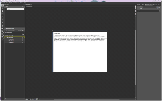
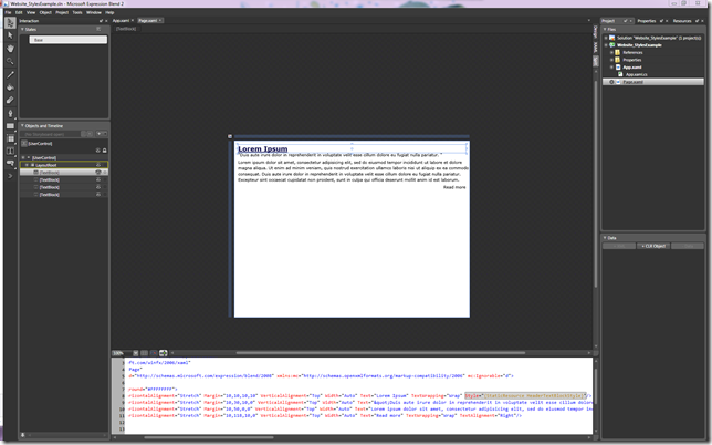
I have added 3 text blocks into the LayoutRoot and placed some “Lorem ipsum” text inside as a placeholder for this web article.
I would like to create some text styles for this article, which will include a heading style, a body style, a quotation style and a hyperlink style.
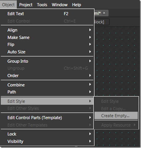
To create a style, go to: Object > Edit Style > Create Empty
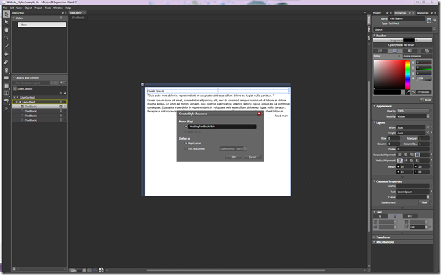
As the first style we shall create is going to be the Heading style, I am naming the style HeaderTextBlockStyle and selecting the style to be defined within the Application as I will want to reuse it outside of this specific page.
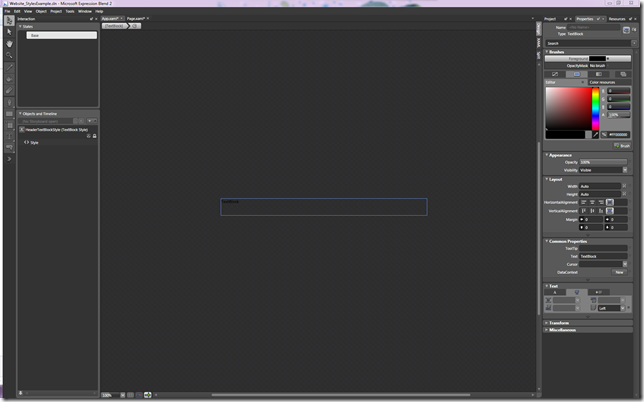
Once the name is chosen, and OK selected, we are taken to the Style UI within the App.xaml file
Let’s start creating the HeaderTextBlockStyle – feel free to experiment with your own styles here, I will show you my example and what can be edited as a Style.
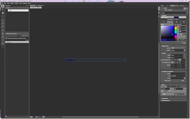
So, here is an edited style:
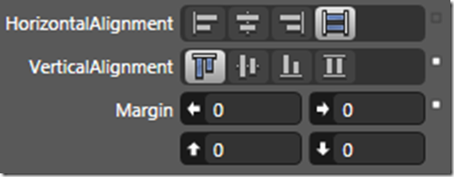
As you can see from the screen shot of the Properties panel, the properties that I have changed, now have a small white box next to them.
Let’s take a look at the XAML generated for this HeaderTextBlockStyle to get a better understanding as to what is happening behind the Style UI.
Within the App.xaml folder, a block of <Style> mark-up has been placed within the <Application.Resources> segment
<Style x:Key="HeaderTextBlockStyle" TargetType="TextBlock">
<Setter Property="Foreground" Value="#FF100E4F"/>
<Setter Property="VerticalAlignment" Value="Top"/>
<Setter Property="Margin" Value="0,0,0,0"/>
<Setter Property="FontFamily" Value="Verdana"/>
<Setter Property="FontSize" Value="18"/>
<Setter Property="FontWeight" Value="Bold"/>
<Setter Property="TextDecorations" Value="Underline"/>
</Style>
This text simply defines a name, the type that the style is targeting and a list of properties and values defined by the <Setter>
There are many other properties that can be placed within this block of mark-up, such as TextWrapping, Margins, Widths, etc. For the moment, I am just placing some basic examples in here.
This style is then referenced from the TextBlock within the Page.xaml as:
Style="{StaticResource HeaderTextBlockStyle}"
Here is what the text now looks like with the new style applied:
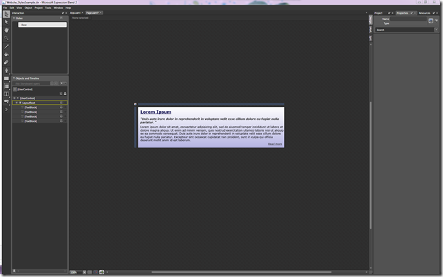
I will now quickly go through and make the other changes to the rest of the article’s TextBlocks. Here is the finished page:
If we take a look at the XAML from App.xaml, we see the following:
<Application.Resources>
<!-- Resources scoped at the Application level should be defined here. -->
<Style x:Key="HeaderTextBlockStyle" TargetType="TextBlock">
<Setter Property="FontFamily" Value="Verdana"/>
<Setter Property="FontSize" Value="18"/>
<Setter Property="FontWeight" Value="Bold"/>
<Setter Property="Foreground" Value="#FF100E4F"/>
<Setter Property="TextDecorations" Value="Underline"/>
<Setter Property="VerticalAlignment" Value="Top"/>
</Style>
<Style x:Key="QuotationTextBlockStyle" TargetType="TextBlock">
<Setter Property="FontFamily" Value="Verdana"/>
<Setter Property="FontSize" Value="12"/>
<Setter Property="FontStyle" Value="Italic"/>
<Setter Property="FontWeight" Value="Bold"/>
<Setter Property="Foreground" Value="#FF282828"/>
<Setter Property="VerticalAlignment" Value="Top"/>
</Style>
<Style x:Key="BodyTextBlockStyle" TargetType="TextBlock">
<Setter Property="FontFamily" Value="Verdana"/>
<Setter Property="FontSize" Value="12"/>
<Setter Property="Foreground" Value="#FF000000"/>
<Setter Property="VerticalAlignment" Value="Top"/>
</Style>
<Style x:Key="HyperlinkTextBlockStyle" TargetType="TextBlock">
<Setter Property="FontFamily" Value="Verdana"/>
<Setter Property="FontSize" Value="11"/>
<Setter Property="Foreground" Value="#FF282828"/>
<Setter Property="TextAlignment" Value="Right"/>
<Setter Property="VerticalAlignment" Value="Top"/>
<Setter Property="TextDecorations" Value="Underline"/>
</Style>
</Application.Resources>
We can see that a variety of styles have been created and stored here, and within the Page.xaml, each TextBlock refers to one of these style references, as shown below:
<TextBlock Margin="10,10,10,10" Text="Lorem Ipsum" Style="{StaticResourceHeaderTextBlockStyle}"/>
This is a very basic example of what Styles can help you to achieve in your Expression Blend projects. They’re great for separating the look and feel from the logic or behaviour of the site or application.
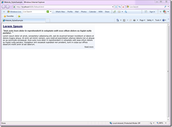
Here’s a finished example in IE8:
Thanks for stopping by,
Tinisha
Comments
Anonymous
June 18, 2009
Fantastic post! Great that you are providing the detail on when to use a style, and when to use a template, as this always catches people out!Anonymous
June 18, 2009
Thank you for submitting this cool story - Trackback from DotNetShoutoutAnonymous
June 18, 2009
A neat blog post by Tinisha Rocca on creating styles in Expression Blend 2.
