MIX09 Day 2 Keynote Pt 2: Deborah Adler on Changing Behavior by Design
Deborah Adler presented a fascinating case study of how user experience design can really have a positive impact on the lives of those who touch our products. She was the principal designer behind Target’s ClearRx drug prescription packaging, which has had a big impact in avoiding drug prescription misusage. As Bill Buxton highlighted in his introduction, “she doesn’t come from our culture. To her, a developer is someone who turns your photos into prints!” Nevertheless, her talk was very relevant to all of us involved in creating rich user experiences, whether we realize it or not!
The Challenge: Confusing Design Costs Lives
When you wipe away the high-tech jargon, we’re all in the business of creating an experience for a customer. When you make it a comfortable or enjoyable one, your job is done. In redesigning the Target packaging, Deborah started with her grandmother, who accidentally took her husband’s prescription. When she investigated further, it was easy to see why – they both were prescribed the same drug at different strengths, and since their names were similar, there was very little to notice different about the two packages.
60% of Americans don’t take their medications correctly. On average, over ten prescriptions per person are filled each year. With 300 million citizens, that represents three billion drug prescriptions. We spend a huge amount of money dealing with the issues of incorrect drug usage, and the costs are measured in lives.
Deborah highlighted some of the design issues that plague drug packaging – poorly printed text with bad iconography, large quantities of small print text with poor formatting and long line length, complex text (“do not take with nitrates” is only meaningful if you know what a nitrate is). There’s no hierarchy of information – how do you know what is relevant and what is just manufacturing information?
Redesigning with the End User in Mind
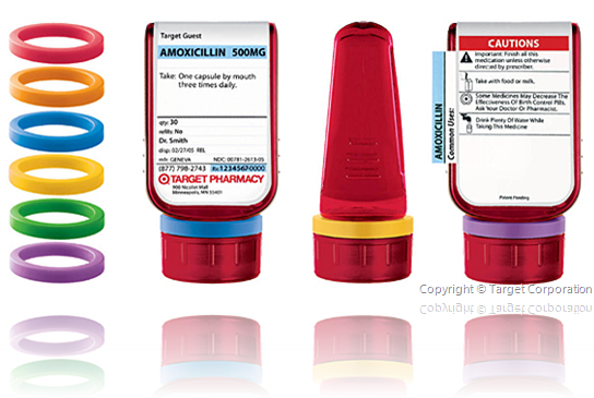
In redesigning the packaging, the goal was to combine information architecture with intuition and previous knowledge of cognitive schemas (knowledge of what the most important pieces of information are). She used color coding so that no two people in the same household have the same color bottle. She wanted people at a glance to know who it was for, what the drug was, and when to take it. The updated packaging even included a magnifying lens in the back of the bottle to make it easier for those with poor eyesight to read the small print.
They’re continuing to investigate further innovations, for example printing with chemicals that change color over time (so that when a drug expires, a big cross appears over the label).
Turning Design into Production
When Deborah completed her thesis, at first she took it to the FDA with an ambitious goal of having the new prescription labeling being mandated as a federal standard. For various reasons, including the way that control over packaging was mostly federated at a state level, this was unsuccessful. So she started looking for a large nationwide pharmacy to see whether they would adopt it for their own usage.
Target has a “design for all” philosophy, and they took the idea under their wings and refined it into the ClearRx system , which is now standard for all Target prescriptions.

There were lots of real-world challenges that had to be addressed in productizing this: for example, there are 23 variations of the system that had to be produced due to state law differences. It required a retooling of the production system too (for example with duplex printing).
When Richard Carmona, the former US Surgeon General reviewed this, he said, “the new design is a simple yet important step in improving the health literacy of all Americans.” New York Magazine first broke the story about the ClearRx system – it was great to hear the story presented both from the designer’s perspective and the end-users’ perspective.
Some life-long lessons learned from this project:
- What separates you from your competitors isn’t design or development, it’s truly thinking about the person who will use your design or development and figuring out how it can solve their needs.
- Once you start thinking about your customers’ needs, it becomes a habit. When you start from this perspective, you’re no longer just a designer, you’re a user experience designer: worth saluting!
Comments
Anonymous
March 19, 2009
PingBack from http://blog.a-foton.ru/index.php/2009/03/19/mix09-day-2-keynote-pt-2-deborah-adler-on-changing-behavior-by-design/Anonymous
March 20, 2009
From now through the end of the MIX09 conference in Las Vegas, Rob Burke will be providing his insightsAnonymous
March 20, 2009
From now through the end of the MIX09 conference in Las Vegas, Rob Burke will be providing his insightsAnonymous
March 20, 2009
From now through the end of the MIX09 conference in Las Vegas, Rob Burke will be providing his insights