SQL Server 2008 R2 RTM

SQL Server 2008 R2was just released to manufacturing (RTM) today. You can read more details about the overall SQL Server 2008 R2 release here.
SQL Server 2008 R2 is a big release, with new “editions” (MSDN contains the detailed feature by edition matrix), and includes also significant enhancements in Reporting Services. I summarized many of those new Reporting Services features already in previous postings on this blog: additions in August CTP, additions in November CTP, as well as other related postings. Future postings will specifically drill-down into details on a number of these new areas and feature enhancements.
The stand-alone download package for Report Builder 3.0 will be made available soon; in the meantime you can read the Report Builder 3.0 FAQ document. A more detailed overview of enhancements for Reporting Services 2008 R2 is available in the documentation. In this posting, I just want to highlight three key enhancements in Reporting Services 2008 R2.
1. Report Part Gallery:
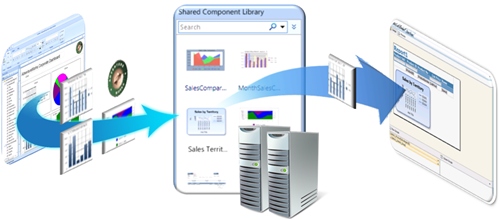
You can publish parts of reports as shared report parts, e.g. a map visualization, a table, a company logo. Each report part preserves its original binding to parameters and (shared) datasets as metadata.
End-users can then build new reports in two easy steps: 1. connect to a report part gallery and search based on name or metadata for already existing report parts, and 2. simply drag those report parts into the new report - done!
Adding report parts to a new report automatically adds any dependent parameters, data sources, and datasets – your end users don’t have to write queries, or worry about formatting. Also if someone else updates a report part in the gallery later, you get notified and can decide whether you want to integrate the updated report part into your report.
2. Sparklines, Data Bars, and State Indicators:
Examples of these visualizations are shown in the report screenshot below, and covered in more detail in blog postings about sparklines and data bars by my colleague Sean Boon.
- Sparklines are data intense, word-sized graphics. When embedded inside another data region, the axes are automatically aligned (using the DomainScope feature that I will cover in an upcoming blog posting). Sparklines can also be converted into full charts to support additional scenarios.
- Data bars usually depict a single value in a cell represented as a bar with min/max synchronized across different data bars to enable quick visual comparisons.
- State indicators are visualized as a set of built-in icon sets to depict the status against a value, goal, or a trend. You can also create your own icon sets. Colors, icon, and size can change based on data.
3. Map Visualizations:
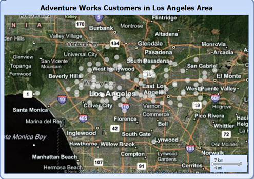
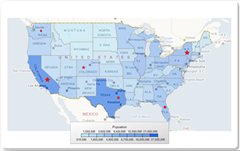
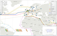
Maps are visualization of spatial data. In previous postings, I covered more details about maps utilizing Bing Maps as well as utilizing ESRI shape files. The spatial data integration provided in Reporting Services 2008 R2 is quite powerful and also goes beyond map visualizations; more about this though in upcoming blog posts. Below I included several examples of maps created with Reporting Services in 2008 R2.
Enjoy!


