PowerPoint and Excel: Perfect Partners for Communicating Your Data’s Story
Editor’s note: The following post was written by PowerPoint MVP Glenna Shaw as part of our Technical Tuesday series.
I’m a huge fan of the Hierarchy of Knowledge theory which is also known as the DIKW pyramid. Basically, it says there are four steps to transform data to wisdom.
- Gather the data
- Organize into information – put the data in context such as a table or chart
- Apply knowledge – analyze the table or chart
- Impart wisdom – take action based on the results
Unfortunately, most presentations stop at the second step. If the purpose of your presentation is for the audience to analyze the results themselves and draw their own conclusions, then that’s fine. But that is rarely the case.
To present data effectively, you’ll want to determine the message and then make sure your data visualization communicates it clearly. Use titles to state the message of a chart and emphasize the relevant parts of the chart to reinforce the message.
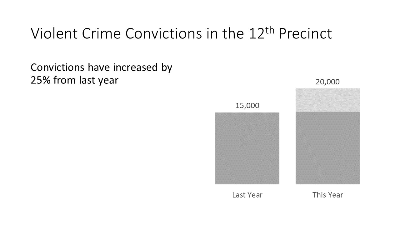
The chart above clearly conveys the message of the 25% increase by highlighting the difference. This is accomplished by applying a linear up gradient fill to the second series column with the following settings:
- 1st gradient stop – gray (same as first series) – 0%
- 2nd gradient stop – gray (same as first series) – 75%
- 3rd gradient stop – light gray – 76%
All extraneous elements have been removed from the chart (axis, gridlines, etc.) because they offer no benefit and would only add noise to the chart. While this chart is very effective, it’s not very engaging to the audience. This is especially true when you have a presentation that contains many charts. If your slides consist of one chart right after another, pretty soon you may find your messages become blurred to your audience – no matter how much effort you expend to make the data message clear. This is because we are predisposed to ignore repetitiveness. One method of counteracting this predisposition is through the occasional use of non-traditional visualizations.
Let me say up front that you should never sacrifice clarity of the data for the purpose of a more engaging visualization. While you may draw in your audience at first glance, they’ll soon be frustrated if they can’t easily understand the data. In other words, never sacrifice substance for style.
Having said that, there are many ways you can visualize data clearly without a traditional chart.
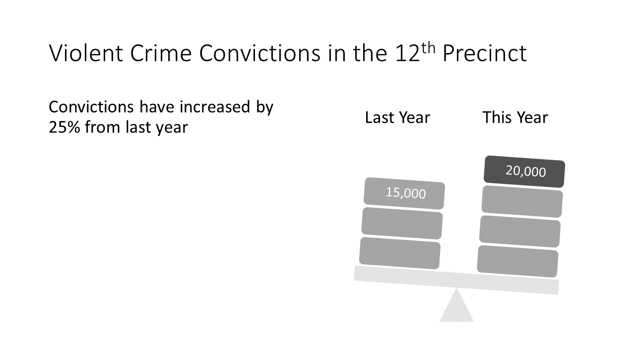
I’ve replaced the previous chart with the SmartArt balance graphic. This works for a couple of reasons. First the data itself is very simple and easily represented by the figures in the SmartArt and second the SmartArt balance graphic is directly relatable to the subject of the data. If your data can meet this criteria, there are a number of SmartArt graphics you can easily modify to make your data visualizations more engaging.
Another method you can use is a chart comprised of shapes and/or images, most commonly referred to as infographics. You should always be careful when using infographics because it’s very easy to get carried away with the design and obscure or distort the actual data.
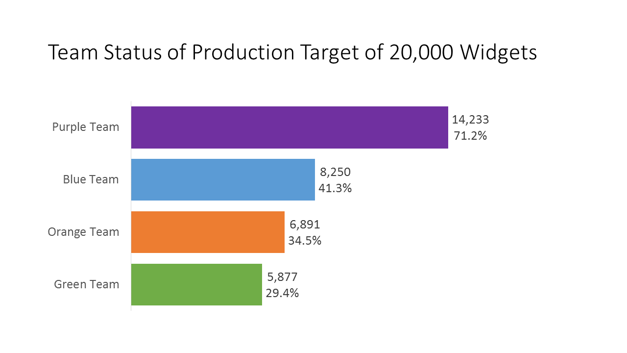
The example above is obviously a competition among teams to achieve a target goal. Though I’ve color coded each series to match the team, this actually works against the viewer because it’s harder to make comparisons with multiple colors. Tip: Avoid checking the Vary colors by point checkbox for series fill when your chart’s purpose is comparison of series. Another thing that makes this slide less effective is the awkward title even though it’s the only way we have of knowing the target goal.
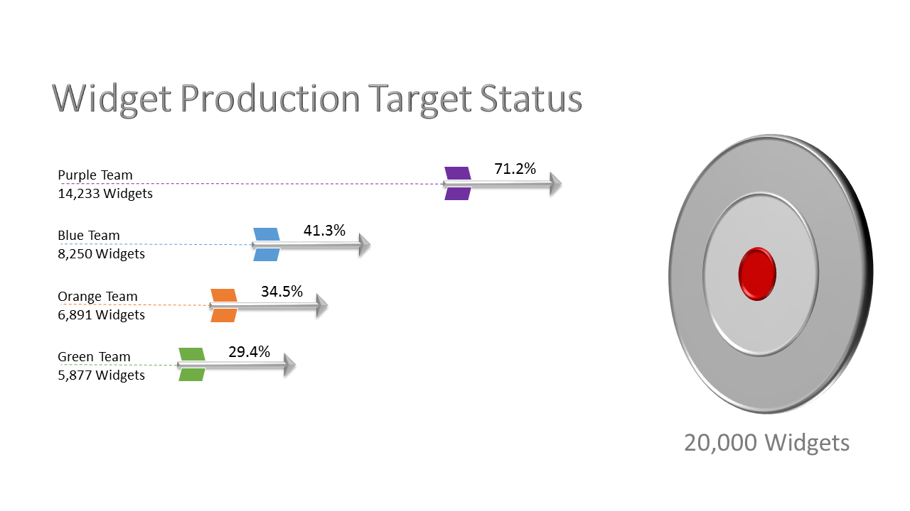
I’ve replaced the chart bars with arrows and used the fletching to represent the team colors. Because the arrows are all the same color, it’s easier to make comparisons. The arrows also provide a sense of motion or progress that is missing from the original chart. This visualization is easily created using arrow shapes and aligning them with the ends of the bar chart series and then using the selection pane to hide the chart. The target center is aligned with the 100% mark on the chart and gives a better perception of distance to the goal than the bar chart. This visualization eliminates the need to mention the goal elsewhere. Normally I would not endorse the use of 3D, but in this example it doesn’t distort or detract from the data and it complements the manufacturing nature of the data. I consider this a rare win/win chart. Not only is it more engaging, it also more clearly shows the message of the data.
In my final example, I’ll step through the process of creating a chart manually for when traditional charts fail to clearly convey the data’s message.
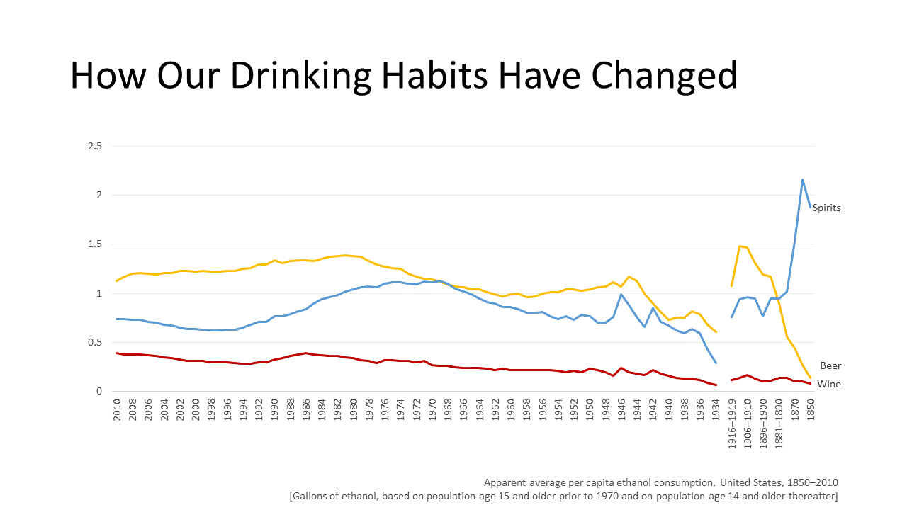
Although accurate, this cart has a number of problems. First and foremost, it doesn’t clearly convey the message at a glance. You have to really study the chart in order to perceive how our drinking habits have changed. The awkward timeline on the axis is ordered from newest to oldest which contradicts our natural tendency to order from oldest to newest. The awkward time increments for the oldest data also make comparisons more difficult. The gap for prohibition distracts from the message. While the series are color coded to match the adult beverage, it provides only nominal benefit for absorbing the data.
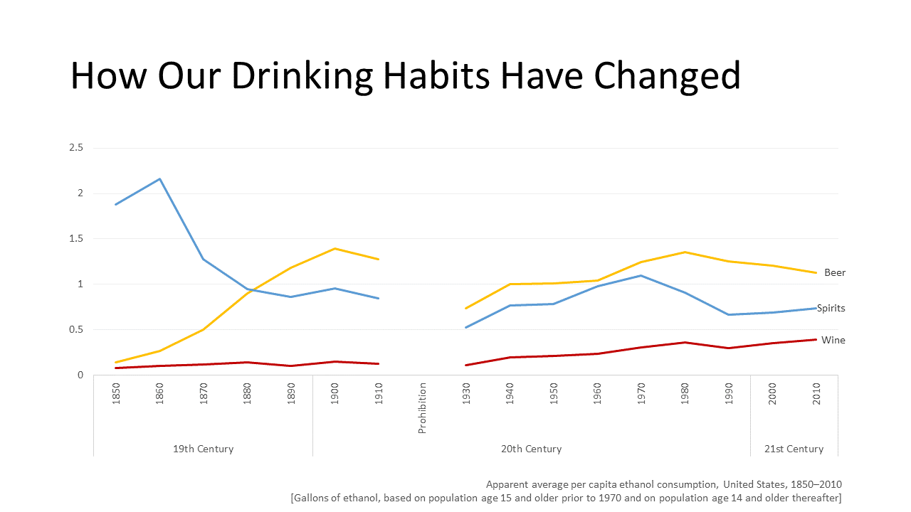
By aggregating the data for averages by decade the chart is significantly improved, however the huge gap for prohibition takes over the chart. If the message was about the impact of prohibition on drinking habits this might be a very effective chart, but since our message is about overall drinking habits, the message is lost.
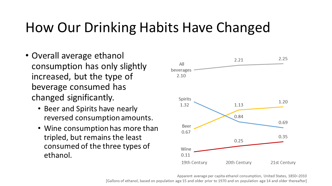
With the average consumption aggregated by century, the message becomes much clearer. Adding a line for all beverages reinforces the message of very little change in overall consumption. Although this chart is ok, it still doesn’t quite show the changes to our drinking habits at a glance. It takes a bit of study to see the changes.
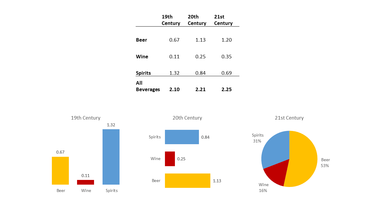
Some alternatives I tried were a simple table and other types of charts as I thought I might make a panel chart showing each century. None of these satisfactorily conveys a sense of volume which is the data I’m measuring.
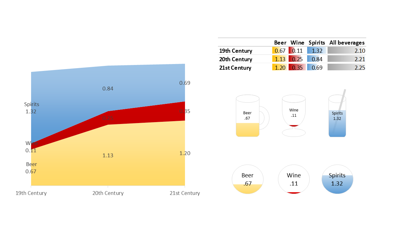
Here I tried an area chart and while it does give a sense of volume it doesn’t clearly show the reversal between spirits and beer. Conditional formatting with bars on a table aren’t effective because the bar size is only in relation to the single type of beverage and falsely inflates the amount of wine. I tried custom icons with a gradient fill to show the percentage for each spirit for each century. However, we aren’t very good at perceiving area (or volume) in disparate shapes and you can see there is ambiguity between the beer mug and the cocktail glass. Because we know a beer mug is wider than a cocktail glass, our brains will try and adjust the volume comparison. Finally, I decided to use circles with a gradient fill. This gives a sense of volume without ambiguity.
In my final visualization I used circles showing a fill for the percentage of the beverage for each century. I calculated the percentage and then used the gradient fill technique I described earlier to show the volume for each drink for each century. I further enhanced the impression of liquid by making the color at the bottom of each circle slightly darker than the color at the top. I could have used any shape as long as they were consistently the same shape but I chose circles for a number of reasons: first we inherently prefer circles to any other shape and second, we typically drink out of round glasses. At a glance, this chart clearly shows the increase of beer consumption and decrease of spirit consumption until they’re nearly reversed, the tripling of wine consumption even though it’s a small fraction of the overall consumption, and how very little overall consumption has changed. I’ve never seen a chart like this so I’m choosing to call it a volume chart and I consider it a good chart for showing comparisons of liquids.
In conclusion, when presenting data, I encourage you to expend your efforts in determining the message of your data and make sure your charts emphasize that message. It doesn’t hurt to visualize outside the chart as long as you ensure your data is unobstructed and your message is clear.
You can download the Nontraditionalcharts.pptx file from my OneDrive Visualology folder. All my other samples, templates, and resources are also available for download.
About the author
For more than two decades Glenna has been creating data visualizations in the form of presentations, project management tools, dashboards, demos, prototypes and system user interfaces. She is a Certified Project Management Professional and an active member of the PowerPoint Community. Glenna specializes in creating Microsoft Office files that are fully accessible to persons using assistive technology.
Also known as the PowerPoint Magician, Glenna is the author of the popular PowerPak for PowerPoint series, an innovative collection of lesson and educational game templates. Glenna has been a spotlight speaker at events, a technical editor for books and training courses and frequently teaches advanced PowerPoint and Word classes. Glenna is also the author of tutorials on using sensory psychology with presentations on her visualology.net blog.
Glenna holds certificates in Cloud Computing, Accessible Information Technology, Graphic Design, Information Design, Knowledge Management and Professional Technical Writing.
