Putting the Rich in RIA : User Account Profiles.
A User Account Today.
 Typically when you set out to build a RIA, you look at what data you're about to keep about a persons account. In that obviously "Username, Password and Email" are three key pieces of information you need to begin. The rest is the other metadata associated to an account, and in CRM's you'd go deeper in terms of phone numbers etc.
The data is up to you and I'd never dictate what you should and shouldn't capture. What I am focused on is how you present that data, in that how "Rich" do you want the experience to be in terms of presenting what is probably the most boring data in a RIA.
I'd wager majority use Tabs + Forms and basically categories this into neat portions that are close to being semantically correct (in terms of which heading they fall under - look into information architecture).
Context is what though?
What's the context of having a person(s) username & password in a form along side their other information? Isn't this more of a security thing vs a personal bio? What if you're profiling your accounts based on experience they've had with you as well? where do you put that data?
Point is, suddenly your tabbed approach starts to get bogged down and the next thing you know it, you're facing a comprehensive set of tabs (stacked ontop of one another most likely) and the form probably grows in metrics - width/height to accommodate).
Let's put the Rich back into RIA.
Well, I'd now argue that if you're using some of the new RIA technologies, why the heck are you using Tabs? In that, you've got the ability to go beyond a form now, in that the technology is a blank canvas and the experience is up to your imagination (alongside some basic Usability Principals).
That's the key, why present a form which after traversing through a grid presents you with more then you bargained for. Why drop the experience there, why not approach it differently - radically if you will.
Step away from the Tabs as you know it..
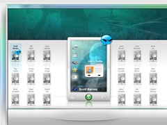
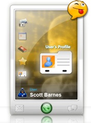
 In the blow example I did something trivial, I took all these pieces of a users profile and applied them in a format that is well similar to a Mobile Phone.
The reason I did this is what's the best device on the planet at the moment that has almost figured out how to cram a lot of data into a small portion (screen). In that assign "icons" to represent what the tabs would typically do, but also do so that it's broken into piece meal format(s). Let the user then decide which part of a users detail they want to drill into.
That's all well in good, but where is the Form?
So once the "Profile PDA" (if you will) has been conjured up, how does the end user get into the form?
Well, this is where your imagination needs to do it's job. In that take the above example, it states that I've selected the "User Profile" card, which in this case means "this is the users contact profile" so the form could then spring out (overlay the top of grid style layout) and present the persons details in a similar looking "Contact Card". (Sorry still working on the artwork for that).
Point is, you've just isolated the overall account metadata into one small piece, once clicked it expands into a richer experience (I assume your next step will be rich!). The experience is the motivator here, in that let's make this form almost feel like some GUI found within games, like you've hacked into some year 2055 future looking CRM - have fun with the data but be serious with it, as it's business still.
What are your users thinking?
I hinted in an article before that when you build your RIA's you should think about monitoring the users interaction with it. In that in the above GUI you will note a "smiley speech bubble icon". This is basically an idea whereby when a user logs into the system, they not only get asked their Username & Password but also "how you feeling right now?".
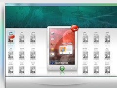
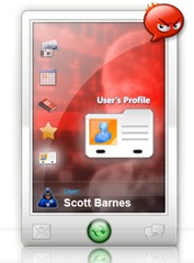
Based on their answer, the Profile PDA adjusts it's UI to suite. This will then empower the owner of the RIA system to get an understanding of the emotional state of their users (why isn't important, it serves this example so stop asking questions).
let's assume when I logged in today, I nominated my emotion as angry. This then updates a row in a database (simple flag) and the UI reacts to my emotional state (in that what if the outer GUI would reflect on colours that would help cheer me up or does something that makes me laugh? - maybe a joke in a newsticker or a funny youtube overlay).
Emotions are for weaklings, I love Vista how does this matter?
 Well, as you'll note in the Profile PDA next to the "Scott Barnes" part, there is also a "Vista Zealot" icon (I got these from an icon set called "Forum Faces"). In my RIA I'm curious to know what type of breed my profiles are? in that what do their peers think of them and again, can the User Interface react to suite this (advertising could suite more towards Vista compatible software instead of BeOS hehe). If the account in question was a Mac fanboi etc you could also insert an icon that represents this.. etc etc..
Conclusion.
 The objective of this post was to trigger thought, in that you are armed with some of the greatest, most agile and excited technology to build with and the first thing we typically see in most RIA's is a typical "form" mentality and I often ponder on this. I can see it's easier to ship, and well I don't fault that at all. It just irritates me the most though, as I think user experience isn't just about pre-defined design patterns, it has more potential and the objective I'd like to see tomorrow's RIA have is that they react to context.
I want software to react to me for a change, I want to be able to punish and reward my software and lastly I want it to be something that can adjust my mood and that of the work force.
Software isn't just about balancing general ledgers, it can also be about fun and just because you're building a complex financial system doesn't mean it also can't be fun at the same time.
Think about it, why does the Friday emails get sent around in email about some funny random act that happened around the world. It helps break the day up a little and that's my hope for RIA.
Q.What's that RIA you're building Scott?
I've got this idea for a RIA Platform, it's something I've been very slowly chipping away at for the past 2 years. It's being built in Microsoft technology (was built in Adobe Flex), and I'll expand more another day, as I'm not ready to talk about it just yet (it's my personal project that I hope to release before I grow old and retire heh).
(I'm also thinking of ways to one day pitch it internally to become a Microsoft Product.. i have but a dream..)
Comments
- Anonymous
December 01, 2007
PingBack from http://www.absolutely-people-search.info/?p=2076
