Understanding and Using OData - Analysing OData Feeds (3 of 4)
This article is part of a series:
- Understanding and Using OData (1 of 4)
- OData Publication (2 of 4)
- Analysing OData Feeds (3 of 4) – This article
- Creating a Windows Phone 7 OData Client Application (4 of 4)
Hopefully these articles will show you how to produce and publish an OData Feed, Create relationships between feeds from different sources, analyse OData and finally how to develop a custom OData client. This should give a really good appreciation of some of the possible uses for OData.
In the previous article in this series, I described how to create an OData feed using SQL Server, SQL Azure and SQL Labs. The feeds I created are available anonymously:
- https://odata.sqlazurelabs.com/OData.svc/v0.1/frq6joxf0e/DWP
- https://odata.sqlazurelabs.com/OData.svc/v0.1/frq6joxf0e/ONS
The former feed simulates available data published by the Department for Work and Pensions, the latter simulates data from the Office for National Statistics, both government agencies in the UK.
This article shows how the data from the feeds I created can be analysed using OData aware analysis tools, and also shows how data published independently by the two sources can be combined or ‘mashed-up’ to produce an entirely new analysis.
The tools I will be using are Microsoft’s PowerPivot and Tableau Software’s Tableau Public.
Analysing a feed using Tableau Public
Tableau Public is a free service that lets anyone publish interactive data to the web. Once on the web, anyone can interact with the data, download it, or create their own visualizations of it. No programming skills are required. The public edition has a storage limit of 50 Mb and is limited to 100,000 rows.
The dataset I will use in this post is published by the Department for Work and Pensions in the UK, and relates to the New Deal programme, which is a fundamental part of the Government’s wider welfare reform and will underpin the principles of working towards eradicating child poverty by 2020.
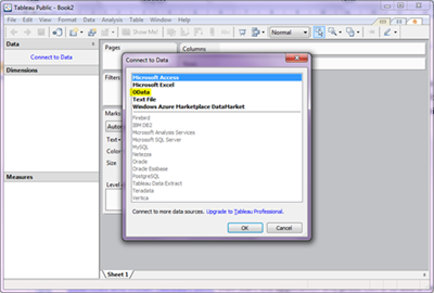
Download and install Tableau Public, then start the application and press Ctrl-D to add a new Data Connection:
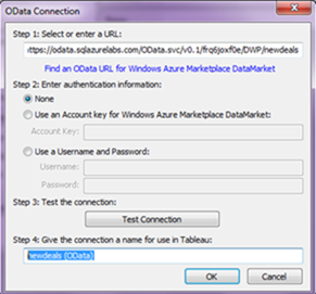
Select an OData connection. This will prompt you for the OData URL to connect to. Enter https://odata.sqlazurelabs.com/OData.svc/v0.1/frq6joxf0e/DWP/newdeals (no authentication is necessary). Test the connection and provide a name for the connection. I used “newdeals (OData)”:
Once your connection is defined, press OK. This will make the new connection available in Tableau:
This feed has two dimensions:
- Contract Package Area: This is the area of the UK where the new deal programme is running
- Provider: This is an organisation running the new deal programme in one or more areas
There are three measures in the dataset (plus some automatically derived by Tableau):
- Starts: The number of individuals who started on the programme
- Short Job Outcomes: The number of individuals that managed to gain employment through the programme
- Sustained Job Outcomes: the number of individuals who managed to sustain their employment
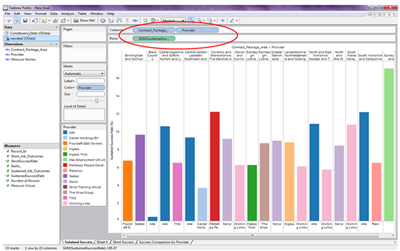
This now enables you to slice and dice the data feed as if it were an analysis cube. I chose to compare the sustained job outcomes for the different providers within area:
Tableau Public allows you to publish your analyses to the web. This is done by selecting File – Save To Web. This means that the workbook can be shared with collaborative teams:
Combining Feeds using PowerPivot
Many of the analysis tools that accept OData will enable you join (mash-up) data from different sources. This is true of both Tableau and Excel PowerPivot.
PowerPivot for Excel is a data analysis tool that delivers unmatched computational power directly within the application users already know and love—Microsoft Excel. It’s the user-friendly way to perform data analysis using familiar Excel features you already know, such as the Office Fluent user interface, PivotTable and, PivotChart views, and slicers.
In this example, I use PowerPivot to join data from both my DWP and ONS feeds to create an entirely new analysis. The feeds are:
- DWP – Benefits by Constituency. This feed contains a breakdown of the numbers of benefit claimants (for each different type of benefit) by Parliamentary Constituency
- ONS – Constituency Population Statistics. This feed contains a breakdown of population by age band and parliamentary constituency.
This example shows some of the power of publishing open data – it can be used to combine data in completely new ways.
I’ll assume you have already downloaded and installed PowerPivot. Start-up Excel and select the PowerPivot tab in the ribbon, and select PowerPivot Window Launch:
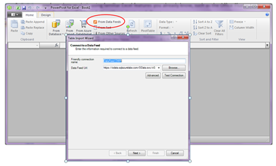
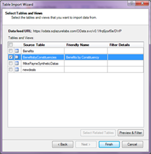
This will activate the PowerPivot window. Select the option to access data “From Data Feeds”. This will bring up the Table Import Wizard to allow you to connect to a Data Feed:
Key in my DWP data feed https://odata.sqlazurelabs.com/OData.svc/v0.1/frq6joxf0e/DWP and test the connection. Click Next which will display a list of tables within the feed:
I selected the BenefitsbyConstituencies table, and gave it the friendly name “Benefits by Constituency”. Then click Finish.
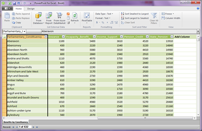
This will import the data. In this case there are only 632 rows, but for larger feeds you have the option of previewing and filtering the feed before importing. The data will then be displayed as a sheet containing a table within PowerPivot:
You have the option of defining calculated columns and other adornments at this point.
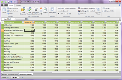
Next, repeat for the ONS Feed: https://odata.sqlazurelabs.com/OData.svc/v0.1/frq6joxf0e/ONS/ specifying table ConstituencyStats and a friendly name of “Constituency Statistics”:
Next, I needed to join the two datasets so that I could produce my ‘mash-up’ analysis. The ‘primary key’ for the data in each feed is Parliamentary Constituency. On the PowerPivot ribbon select “Design -> Create Relationship”. This brings up the Create Relationship dialog:
Use the dialog to join the two tables on the relevant Constituency columns.
My aim was then to produce a chart, showing the Top 15 constituencies where the largest proportion of the working age population was claiming Income Support benefit.
To support this I added a new column to the table called EligibleConstituents which was the sum of all constituents aged 15 or over from the dataset, using the formula (this is not strictly accurate, but this is only an example!):
='Constituency Statistics'[AllAges]-'Constituency Statistics'[Age0to4]-'Constituency Statistics'[Age10to14]
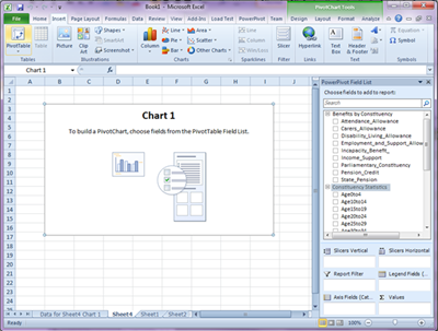
Then I used the PowerPivot ribbon to insert a pivot chart:
This builds an empty chart, and the PowerPivot Field List shows both tables available for the chart. I had all the data available apart from the proportion of the population on Income Support. To make this available, I then added a new measure to the Benefits by Constituency Table in the field list. In order to this, right click the table name and choose ‘Add New Measure…”:
Once this was completed, I could then define the PivotChart using the available data:
My chart shows information that could not be derived from one of the OData feeds alone.
Written by Nick Hill

