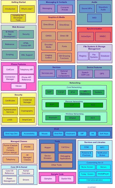
Windows Mobile: Another Imagemap Navigation Experiment - Take 2

Comments
Anonymous
July 05, 2007
Ok, it's a little less legible (sigh) but at least it's all visible! I like the fact that the tool tips give you a hint as to what a topic or section is about before you click.Anonymous
July 05, 2007
As a smart person once said, anything with pictures is good. Or something like that. I think that you are on to something. It is a lot on a page and you have to avoid looking like one of those spaghetti diagrams that Tufte disciples like to lampoon. And, really, how often does anyone get to lampoon. I think cartographers have a similar problem. How many colors do you need to draw a political map of the world. For some reason, (trivial pursuit?) I think the answer is five. In other words, my eyes...they burn. But I like the idea. You have a navigable image that captures the big ticket items. Or so it would seem looking at the diagram without a lot of mobile knowledge. (or stationary knowledge some might say.)Anonymous
July 05, 2007
Here's the big question to any Windows Mobile developers out there: If I prettied this up and put it into the SDK on MSDN, would you use it?Anonymous
July 05, 2007
Those at-a-glance pics are really helpful, not only for beginners. Take this for example: http://java.sun.com/j2se/1.5.0/docs/ The answer is yes, I'd be happy to use it.Anonymous
July 06, 2007
Hi Maciej - I like the Sun one. Packs a lot in there. It seems to be architectural in nature, whereas Windows Mobile isn't - it's more a collection of technologies built on a layer that isn't exposed.Anonymous
July 06, 2007
Some suggestions I've received thus far:Fix the spacing, design and typographical errors.
Don't use so many colours!
Make use of colour, for example, grouping similarly graphically related items in shades of blue, getting started and tools in shades of red, and so on.
Anonymous
July 18, 2007
The comment has been removed