Excelling at Excel: Using data bars to illustrate number ranges
Once you understand the basics of conditional formatting, you'll be ready for a slightly more advanced move: Creating data bars to illustrate numeric values in Excel 2007.
There are several ways you can do this, but one of the most practical is for percentages.
Let's add a column to our profit and loss spreadsheet to represent the net income as a percentage of the gross:
See how data bars display how the values compare visually?
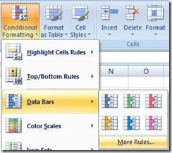
To add them, first select the range of cells you want included and click the Conditional Formatting button in the Styles section of your Home tab. In the dropdown menu, select Data Bars and then More Rules.
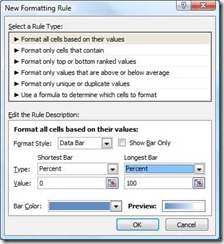
Set your Shortest and Longest bar types to Percent (they'll default to 0 and 100 for their respective value fields). If you like, you can change the default bar color and suppress the numbers by checking the checkbox so only the bars show.
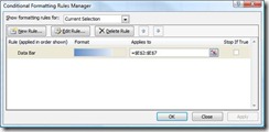
You'll notice that the bar lengths appear in relation to each other, so you can quickly spot the highest and lowest values. As you add more diverse values to the set, you'll see them adjust accordingly. If you ever need to expand the range that's include in your formatting rule, select Manage Rules under the Conditional Formatting drop down and you can quickly edit the range:
Suzanne


