Excelling at Excel - Exposing hidden chart ranges
Just the other day, I was updating a chart and became vexed when a range of values that I added did not appear.
After a little head scratching, I realized this happened because I had customized the scale of my chart to show only values from 1 to 50 and the new values exceeded this. Customizing your scale in Axis Options may improve the appearance of your chart with a specific data set, but it turns off auto scaling.
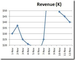
If new values are added later that don't fall within your custom axis range, they'll run off the top, bottom or side of your chart like so:
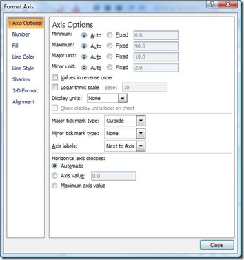
In this example, the vertical axis is set to a fixed maximum of 50 and a minimum of 20. If this happens, just adjust your chart scale by right clicking the problematic axis on the chart and selecting Format Axis:
Just restore the Minimum and Maximum to Auto, or select Fixed values that fit your new data ranges.
Suzanne

