Developing for Surface Dial
Code: Chapter47_RotateImage on https://github.com/sbaidachni/Win10BookSamples
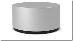
Today, I want to discuss one more sensor – Surface Dial. It’s a new Bluetooth device from Microsoft that has own API that you can use in your UWP applications. Due to this API, I decided to show how to work with this device in a separate post rather than extend my post about Bluetooth (see next one in couple days).
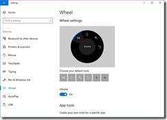
Surface Dial is a device that you can buy separately, and it can work with any computer on Windows 10 Creators Update and later. Once you connect the device to your computer, you will be able to use Wheel settings window to setup default tools and even associate your Surface Dial with an application, assigning application shortcuts to Surface Dial tools.
In general, Surface Dial supports three ways to interact: rotation, click, tap and hold. Of course, it’s possible to understand rotation direction and other parameters like angle. In the case of tap and hold this action is reserved for the Dial and allows users to display Surface Dial menu. Counting all available actions (click, rotation left and rotation right), you can assign up to three application shortcuts to each custom tool. Therefore, we can say that it’s possible to integrate the device with any application that supports shortcuts.
There are several standard tools like Volume, Scroll, Zoom and so on. Some of these tools like Volume can have sense anywhere, but some of them like Scroll have sense just for subset of applications. In any case, you can configure up to six custom and standard tools in total and start using them without any development effort. But we are developers and below I will describe how to create own custom tools dynamically that users will be able to invoke in your application’s context.
Let’s look at the API. Almost all needed classes are located in Windows.UI.Input namespace and you should not install any additional packages, because Surface Dial API is a part of UWP platform in Windows 10. In our example, we will primary use three classes from the namespace: RadialController, RadialControllerConfiguration and RadialControllerMenuItem. The first class describes the controller itself and allows us to get access to all menu items and events. The second class allows us to activate/deactivate some features that are related to the controller. Finally, the RadialControllerMenuItem class helps us to create additional menu items/tools.
It’s not wisely to setup the controller in the context of the whole application. Each page in your application may have own features and custom tools and it’s better to setup the controller in the context of each page. Therefore, in the case of multi-page applications you need to create a separate class that will help you to setup the controller in OnNavigatedTo method. In our case we will have just one page and it’s possible to setup the controller in the constructor right after InitializeComponent call.
Let’s look at the code below:
controller = RadialController.CreateForCurrentView();
customItem = RadialControllerMenuItem.CreateFromKnownIcon(
"Rotate", RadialControllerMenuKnownIcon.Ruler);
controller.Menu.Items.Add(customItem);
controller.RotationChanged += Controller_RotationChanged;
This code allows us to get a reference to the controller and create a new menu item with Rotate name and using a standard icon Ruler. Of course, I could use my own icon using CreateFromIcon method or even glyph using CreateFromFontGlyph, but you can experiment with these methods yourselves. Additionally, we assign our own event handler to RotationChanged event. Thanks to this event handler we are going to rotate an image in our application:
private void Controller_RotationChanged(RadialController sender,
RadialControllerRotationChangedEventArgs args)
{
rotateTransform.Angle += args.RotationDeltaInDegrees;
}
XAML for our page is below:
<Grid Background="{ThemeResource ApplicationPageBackgroundThemeBrush}">
<Image Source="Assets/mushroom.jpg" Margin="100" RenderTransformOrigin="0.5,0.5">
<Image.RenderTransform>
<RotateTransform
x:Name="rotateTransform"></RotateTransform>
</Image.RenderTransform>
</Image>
</Grid>
Of course, there are some tricks that you have to know even implementing this simple code:
- RotationChanged or button events will work only for your custom tools. It means that your image will not be rotated until a user select our Rotate tool. Therefore, it’s safe to assign handlers and it will not override default behavior for standard tools;
- In our case we have just one custom menu item, but in the case of two menu items RotationChanged will fire for both. That’s why it’s important to use Invoke event that you can find in each menu item. Using this event, you can setup some flags to store information about selected menu item and implement your code based on the context;
One more important thing that you have to count is maximum number of menu items (six). Potentially you can get some problems if a user filled all slots. At the same time your application may not support all standard tools. So, it’s better to leave just needed tools in your application. It’s possible thanks to the RadialControllerConfiguration class.
config = RadialControllerConfiguration.GetForCurrentView();
config.SetDefaultMenuItems(new[] {
RadialControllerSystemMenuItemKind.Volume,
RadialControllerSystemMenuItemKind.Scroll });
You can see that we left just two menu items, and we have enough room for our custom tools. If you want to remove all of them, you can pass empty array as the parameter.
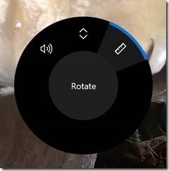
It’s time to start our application. If you start the application, you will be able to see the following menu once you tap and hold the controller:
There are two standard menu items and our custom one. If you select the custom one and rotate the controller, it will rotate our image. But the application has some problems. The first one is in that the controller generates RotationChanged event if you rotate it for 10 degrees or more. So, our rotation effect is not smooth. We can change this behavior using RotationResolutionInDegrees property:
controller.RotationResolutionInDegrees = 1;
But once we change the property, we will have another problem: the controller will produce permanent buzz. It will happen due to haptic feedback. If the controller generates the feedback not too often, it works fine, but once the controller starts to generate feedback continuously, you will want to disable it. It’s possible to do using the following line:
controller.UseAutomaticHapticFeedback = false;
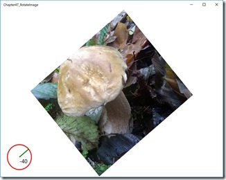
So, we have added two more line to our code and now the application works better. But for the final user it’s still not clear how our tool work, and the rotation itself didn’t display any additional parameters like the current angle. So, it’s wisely to display own user control once a user selects your custom tool. In our case we can build a user control that will display the current angle using digits and graphical representation.
I decided to use Win2D in order to build own control. It’s easy to do and our XAML contains just couple elements:
<Grid>
<canvas:CanvasControl Name="canvasControl" Draw="canvasControl_Draw" />
</Grid>
C# code is not very complex as well. It just declares a dependency property and a method that draws our UI:
public static readonly DependencyProperty AngleProperty = DependencyProperty.Register(
"Angle",
typeof(float),
typeof(RotationControl),
new PropertyMetadata(null)
);
public float Angle
{
get
{
return (float)GetValue(AngleProperty);
}
set
{
SetValue(AngleProperty, value);
canvasControl.Invalidate();
}
}
private void canvasControl_Draw(Microsoft.Graphics.Canvas.UI.Xaml.CanvasControl sender,
Microsoft.Graphics.Canvas.UI.Xaml.CanvasDrawEventArgs args)
{
int stroke = 3;
float width = (float)this.ActualWidth;
float height = (float)this.ActualHeight;
float radius=Math.Min(width, height)/2-2*stroke;
float centerX = width / 2;
float centerY = height / 2;
float lineEndX = radius * (float)Math.Cos(Math.PI * Angle / 180) + centerX;
float lineEndY = radius * (float)Math.Sin(Math.PI * Angle / 180) + centerY;
args.DrawingSession.DrawCircle(centerX, centerY, radius, Colors.Red,stroke);
args.DrawingSession.DrawLine(centerX, centerY,lineEndX , lineEndY,
Colors.Green, stroke);
args.DrawingSession.DrawText(Angle.ToString(), centerX, centerY, Colors.Black);
}
We use Invalidate method of Win2D surface to redraw our surface once we change the angle and the surface itself contain a circle, a line and text. You can design better UI, but I wanted to simplify my code.
Now, I can modify my XAML in Main.xaml:
<Image Source="Assets/mushroom.jpg" Margin="100" RenderTransformOrigin="0.5,0.5">
<Image.RenderTransform>
<RotateTransform Angle="{Binding Angle, ElementName=rotationControl}"
x:Name="rotateTransform"></RotateTransform>
</Image.RenderTransform>
</Image>
<controls:RotationControl Visibility="Collapsed" x:Name="rotationControl" HorizontalAlignment="Left" VerticalAlignment="Bottom" Width="100" Height="100" Margin="20"></controls:RotationControl>
You can see that there is an element binding to avoid unsynchronized behavior between the image and our control. Additionally, our control is collapsed by default. We have to display it just in the case if our custom tool is selected. To understand it, we can use ControlLost and ControlAquired events:
controller.ControlLost += Controller_ControlLost;
controller.ControlAcquired += Controller_ControlAcquired;
private void Controller_ControlAcquired(RadialController sender, RadialControllerControlAcquiredEventArgs args)
{
rotationControl.Visibility = Visibility.Visible;
}
private void Controller_ControlLost(RadialController sender, object args)
{
rotationControl.Visibility = Visibility.Collapsed;
}
Finally, we need to modify RotationChanged method:
private void Controller_RotationChanged(RadialController sender, RadialControllerRotationChangedEventArgs args)
{
rotationControl.Angle += (float)args.RotationDeltaInDegrees;
}
If you run the application and select our custom tool, you will be able to see our user control:
That’s not all. Now, I want to modify the code counting that we don’t need any standard tools. But if we have just our tool, probably, it’s wisely to suppress standard menu at all. API allows me to fully suppress the standard menu and work with ButtonHolding event if the menu is suppressed. In order to do that we can add just four lines of code:
controller.Menu.SelectMenuItem(customItem);
config.ActiveControllerWhenMenuIsSuppressed = controller;
config.IsMenuSuppressed = true;
controller.ButtonHolding += Controller_ButtonHolding;
The first line activates exactly our custom menu item. Next two lines allow us to suppress the menu. It’s important to use the ActiveControllerWhenMenuIsSuppressed property and if you don’t assign it nothing will work. Finally, we need to handle ButtonHolding event to activate and deactivate our control. You can find ButtonHolding event handler below:
private void Controller_ButtonHolding(RadialController sender,
RadialControllerButtonHoldingEventArgs args)
{
if (rotationControl.Visibility == Visibility.Visible)
{
controller.RotationChanged -= Controller_RotationChanged;
rotationControl.Visibility = Visibility.Collapsed;
}
else
{
controller.RotationChanged += Controller_RotationChanged;
rotationControl.Visibility = Visibility.Visible;
}
}
Running this code, you will be able to see that we fully suppressed the default menu and used our own control as an alternative menu instead. It’s really great! In fact, you can do anything with the controller in the context of the application, but that’s not all.
Some devices like Surface Studio allows users to work with the controller directly on screen. In this case, you can handle three events: ScreenContactStarted, ScreenContactEnded and ScreenContactContinued. Thanks to these events you will be able to know a position of the controller and a virtual rectangle that contains the controller. Using this information, it’s possible to execute tools applying actions to the position of the controller. For example, we can rotate our image not around its center but around the center of the controller. But the most beautiful effects can be created exactly around your own custom menu. In our case, the menu can be expanded to include the controller inside the area, and as for me, it’s the most important guideline that you have to follow: if you have a custom menu always handle screen contact events and adjust your menu based on location of the controller on the screen. In our case it will require some additional work, but it’s not a problem to write ten more lines of code (add width and height properties to the control, change text location and handle the events placing the control using Margin property).


