plates overflowing with CSS
I think I'm the only person at Microsoft who brings her own plate to the cafeterias on campus here in Redmond. I've gotten a lot of positive encouragement from other people who notice me and my plate, but I've yet to see anyone else doing this in my two years here. I do this because in many ways, including aesthetically, it's more pleasurable to eat off a ceramic plate than a styrofoam plate, and more importantly, because it's less wasteful. Bringing my own plate to work is a good habit I got into while working at Adobe in Seattle, after seeing a few guys doing this there.
And I don't bring just any ol' plate...I bring a nice green ceramic plate that's divided like a tv dinner plate is (complete with a little circle to put the matching drinking cup on) and that was designed by Belle Kogan. Here's an image of my plate, waiting for its grilled tofu salad at my favorite Microsoft cafeteria:
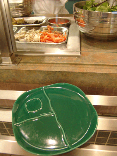
I started working at Microsoft in January of 2006, and so I estimate that by bringing my own plate to the cafeteria, I've avoided using 490 disposable styrofoam plates! Four hundred and ninety styrofoam plates! What do 490 styrofoam plates look like? Well, I wish I had an image to show you that's as impressive as the photographs of Chris Jordan, but what I can do is show you a stack of 70 styrofoam plates that I photographed at the cafeteria and then cloned 7 times in Photoshop.
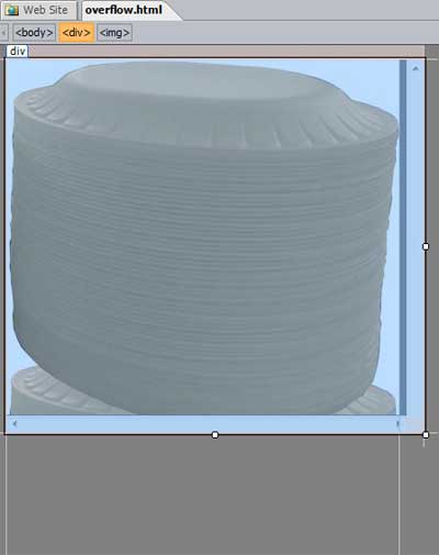
Rather than make you scroll the entire web page to view the image, I've instead used the BETA version of Expression Web 2 to put the image into a <div> container, set the height of the div to a much shorter height than the image, and then set the CSS overflow property to scroll. The scroll value masks out the areas of the image that extend beyond the div's dimensions and provides scroll bars so users can scroll the div container without having to scroll the entire web page.
Here it is in action...scroll baby scroll!

Now if you setup your own overflowing div in the first version of Expression Web, you'll discover that the Design view does not render the overflow property correctly. To see the results, you had to preview your page in a browser that supports the property. I'm pleased to report that the Design view of Expression Web 2 does properly render the overflow property.
Here's how to setup an overflowing div like my example above using any tool you want:
Put your content (image, text, whatever you want...) between a set of <div> </div> tags.
Tip for Expression Web users: if the content is already in your page, and you need to wrap the content with a set of <div> </div> tags, then with your content selected, press CTRL + Q to open the Quick Tag Editor, and type <div> and click the Enter button.Use CSS to set the width and height of the div to the desired dimensions. For example, here's an inline style applied to a div: <div style="width: 450px; height: 375px;"> .
To set these dimensions in the Design view of Expression Web, click the <div> tag in the quick tag selector bar that lies along the top of your page (see image that follows )...this makes sure your <div> tag is selected and not your <img> tag - very important! And then to set the width of the div, drag the square handle (see image that follows) that's in the middle of the right edge of the div, and then to set the height, drag the square handle that's in the middle of the bottom edge of the div. Again, it's important that you do this while the div is selected, otherwise you'll resize the image instead. And it's very important to drag the handle of a side and not to drag the edge on either side of the handle...if you drag the edge then you'll set the margin of the div instead of the dimension.
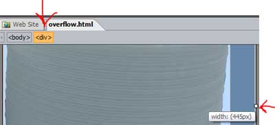
After you've set the size of the div so that it's smaller than your content, the Design view of your page will show the content extending out of, or overflowing, the div like this:
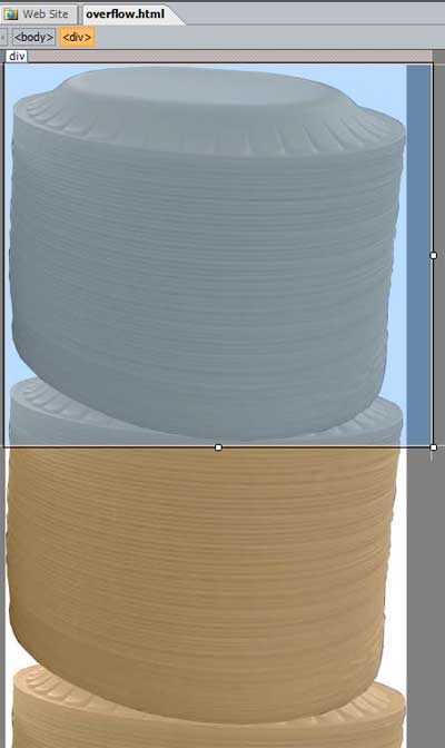
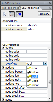
Now to mask the photograph so that you can only see the portion of it that is showing within the outline of the div, you need to add the overflow property to the style you've applied to your div, and set the property's value to scroll (or to "hidden" if you don't want to provide the user with the option to scroll in the div). To do this in Expression Web, select your div, and then in the CSS Properties task pane, with the inline style (or your own style) selected under Applied Rules in the task pane, locate the overflow property and set it to scroll.
With the overflow property set to scroll, the Design view in Expression Web 2 masks the area of the photograph that goes beyond the area of the div and shows a scroll bar. The scrollbars don't function in Expression Web...you'll have to preview in your browser to test those out. And the Design view shows an outline of whatever content is overflowing outside of your div. For example, look at the white vertical lines extending downward below the selected div...those lines represent the photograph that is being masked by the div.
Power Expression Web user tip: If you want to avoid inline styles, such as the inline style that was created and applied to the div when you dragged the edges of the div in Design view, then change your CSS settings in the Page Editor Options like this: choose Tools > Page Editor Options. In the Page Editor Options dialog box, click the CSS tab, and change the Sizing, positioning, and floating option to CSS (classes) . Then next time you drag the square handles of a selected element in Design view, Expression Web will generate a class for you instead of an inline style.
Comments
- Anonymous
June 01, 2009
PingBack from http://woodtvstand.info/story.php?id=10395