SQL Server Advent Calendar 10 – Reporting Services Charts
Day 10 of my virtual advent calendar, about stuff I like in SQL Server 2008..
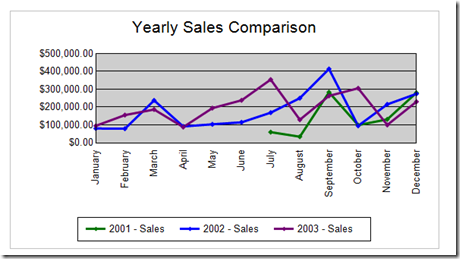
I have been using Reporting Services since beta 2 in SQL Server 2000, and for me the weak link was the charts which even then looked pretty basic…
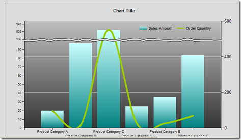
Many people resorted to using add-ons including the ubiquitous Dundas charts. Microsoft noticed this trend and simply bought those tools and put them into Reporting services 2008. The chart below shows different axes and chart types for different data series, and the improved control there is over formatting the chart.
There are also gauges available now and at some point there will hopefully be the maps to leverage the spatial spatial data types in the SQL Server 2008 database engine.
If you are using Dundas charts already then they'll be updated automatically to pick up the versions embedded in reporting services. If you weren't then your charts will look the same, but will have been migrated to the new chart type as well and you can then change them if you want and usethe new features like I have show above, or….
Technorati Tags: SQL Server 2008,dundas,charts,reporting services
Comments
Anonymous
December 10, 2008
PingBack from http://bestwebhostingservices.com/andrew-fryers-blog-sql-server-advent-calendar-10-%e2%80%93-reporting/Anonymous
December 17, 2008
Pour tous ceux qui ont gardé une âme d'enfant ! SQL Server Advent Calendar SQL Server Advent

