Setting a Picker's ItemsSource Property
The Picker view is a control for selecting a text item from a list of data. This article explains how to populate a Picker with data by setting the ItemsSource property, and how to respond to item selection by the user.
Xamarin.Forms 2.3.4 has enhanced the Picker view by adding the ability to populate it with data by setting its ItemsSource property, and to retrieve the selected item from the SelectedItem property. In addition, the color of the text for the selected item can be changed by setting the TextColor property to a Color.
Populating a Picker with data
A Picker can be populated with data by setting its ItemsSource property to an IList collection. Each item in the collection must be of, or derived from, type object. Items can be added in XAML by initializing the ItemsSource property from an array of items:
<Picker x:Name="picker"
        Title="Select a monkey"
        TitleColor="Red">
  <Picker.ItemsSource>
    <x:Array Type="{x:Type x:String}">
      <x:String>Baboon</x:String>
      <x:String>Capuchin Monkey</x:String>
      <x:String>Blue Monkey</x:String>
      <x:String>Squirrel Monkey</x:String>
      <x:String>Golden Lion Tamarin</x:String>
      <x:String>Howler Monkey</x:String>
      <x:String>Japanese Macaque</x:String>
    </x:Array>
  </Picker.ItemsSource>
</Picker>
Note
Note that the x:Array element requires a Type attribute indicating the type of the items in the array.
The equivalent C# code is shown below:
var monkeyList = new List<string>();
monkeyList.Add("Baboon");
monkeyList.Add("Capuchin Monkey");
monkeyList.Add("Blue Monkey");
monkeyList.Add("Squirrel Monkey");
monkeyList.Add("Golden Lion Tamarin");
monkeyList.Add("Howler Monkey");
monkeyList.Add("Japanese Macaque");

var picker = new Picker { Title = "Select a monkey", TitleColor = Color.Red };
picker.ItemsSource = monkeyList;
Responding to item selection
A Picker supports selection of one item at a time. When a user selects an item, the SelectedIndexChanged event fires, the SelectedIndex property is updated to an integer representing the index of the selected item in the list, and the SelectedItem property is updated to the object representing the selected item. The SelectedIndex property is a zero-based number indicating the item the user selected. If no item is selected, which is the case when the Picker is first created and initialized, SelectedIndex will be -1.
Note
Item selection behavior in a Picker can be customized on iOS with a platform-specific. For more information, see Controlling Picker Item Selection.
The following code example shows how to retrieve the SelectedItem property value from the Picker in XAML:
<Label Text="{Binding Source={x:Reference picker}, Path=SelectedItem}" />
The equivalent C# code is shown below:
var monkeyNameLabel = new Label();
monkeyNameLabel.SetBinding(Label.TextProperty, new Binding("SelectedItem", source: picker));
In addition, an event handler can be executed when the SelectedIndexChanged event fires:
void OnPickerSelectedIndexChanged(object sender, EventArgs e)
{
  var picker = (Picker)sender;
  int selectedIndex = picker.SelectedIndex;

  if (selectedIndex != -1)
  {
    monkeyNameLabel.Text = (string)picker.ItemsSource[selectedIndex];
  }
}
This method obtains the SelectedIndex property value, and uses the value to retrieve the selected item from the ItemsSource collection. This is functionally equivalent to retrieving the selected item from the SelectedItem property. Note that each item in the ItemsSource collection is of type object, and so must be cast to a string for display.
Note
A Picker can be initialized to display a specific item by setting the SelectedIndex or SelectedItem properties. However, these properties must be set after initializing the ItemsSource collection.
Populating a Picker with data using data binding
A Picker can be also populated with data by using data binding to bind its ItemsSource property to an IList collection. In XAML this is achieved with the Binding markup extension:
<Picker Title="Select a monkey"
        TitleColor="Red"
        ItemsSource="{Binding Monkeys}"
        ItemDisplayBinding="{Binding Name}" />
The equivalent C# code is shown below:
var picker = new Picker { Title = "Select a monkey", TitleColor = Color.Red };
picker.SetBinding(Picker.ItemsSourceProperty, "Monkeys");
picker.ItemDisplayBinding = new Binding("Name");
The ItemsSource property data binds to the Monkeys property of the connected view model, which returns an IList<Monkey> collection. The following code example shows the Monkey class, which contains four properties:
public class Monkey
{
  public string Name { get; set; }
  public string Location { get; set; }
  public string Details { get; set; }
  public string ImageUrl { get; set; }
}
When binding to a list of objects, the Picker must be told which property to display from each object. This is achieved by setting the ItemDisplayBinding property to the required property from each object. In the code examples above, the Picker is set to display each Monkey.Name property value.
Responding to item selection
Data binding can be used to set an object to the SelectedItem property value when it changes:
<Picker Title="Select a monkey"
        TitleColor="Red"
        ItemsSource="{Binding Monkeys}"
        ItemDisplayBinding="{Binding Name}"
        SelectedItem="{Binding SelectedMonkey}" />
<Label Text="{Binding SelectedMonkey.Name}" ... />
<Label Text="{Binding SelectedMonkey.Location}" ... />
<Image Source="{Binding SelectedMonkey.ImageUrl}" ... />
<Label Text="{Binding SelectedMonkey.Details}" ... />
The equivalent C# code is shown below:
var picker = new Picker { Title = "Select a monkey", TitleColor = Color.Red };
picker.SetBinding(Picker.ItemsSourceProperty, "Monkeys");
picker.SetBinding(Picker.SelectedItemProperty, "SelectedMonkey");
picker.ItemDisplayBinding = new Binding("Name");

var nameLabel = new Label { ... };
nameLabel.SetBinding(Label.TextProperty, "SelectedMonkey.Name");

var locationLabel = new Label { ... };
locationLabel.SetBinding(Label.TextProperty, "SelectedMonkey.Location");

var image = new Image { ... };
image.SetBinding(Image.SourceProperty, "SelectedMonkey.ImageUrl");

var detailsLabel = new Label();
detailsLabel.SetBinding(Label.TextProperty, "SelectedMonkey.Details");
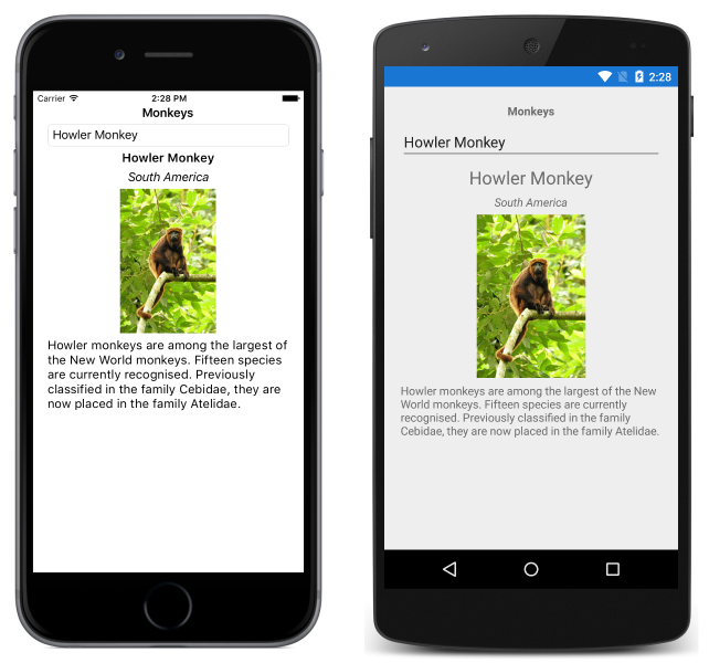
The SelectedItem property data binds to the SelectedMonkey property of the connected view model, which is of type Monkey. Therefore, when the user selects an item in the Picker, the SelectedMonkey property will be set to the selected Monkey object. The SelectedMonkey object data is displayed in the user interface by Label and Image views:

Note
Note that the SelectedItem and SelectedIndex properties both support two-way bindings by default.