Design your own dashboard card with the card designer
Use the Card Designer to create cards that can link to other sites, open media, display a location, open a teams app, and more. Card designer gives users the ability to quickly build "custom" cards without the need for custom code by using a template with the option to create a secondary view, also called a quick view.
Quick view is a powerful tool that enables the card designer to create cards that go beyond the traditional dashboard cards to create something interactive and informative using Adaptive Card JavaScript Object Notation (JSON). You're able to "code" a single quick view by using the power of Adaptive Card markup to make their cards dynamic. The result can be previewed within the card designer before sharing with others.
Note
To design your own cards using quick view, you should be familiar with JSON and Adaptive Card templates. For more information, see Adaptive Cards Templating.
Edit the dashboard
You need member or owner level permissions to access the card designer from the dashboard card toolbox. See the article on creating a Viva Connections dashboard and adding cards for information on getting started.
Use a card template
The card designer has a set of card view templates that can be used to easily create cards with helpful information, links, and media. The following steps walk you through creating a new large sized card using the image template to create a link for users.
While in edit mode, select + Add a card from the dashboard.
Select Card designer.
After selecting the Card designer card, select the Edit icon to open the property pane.
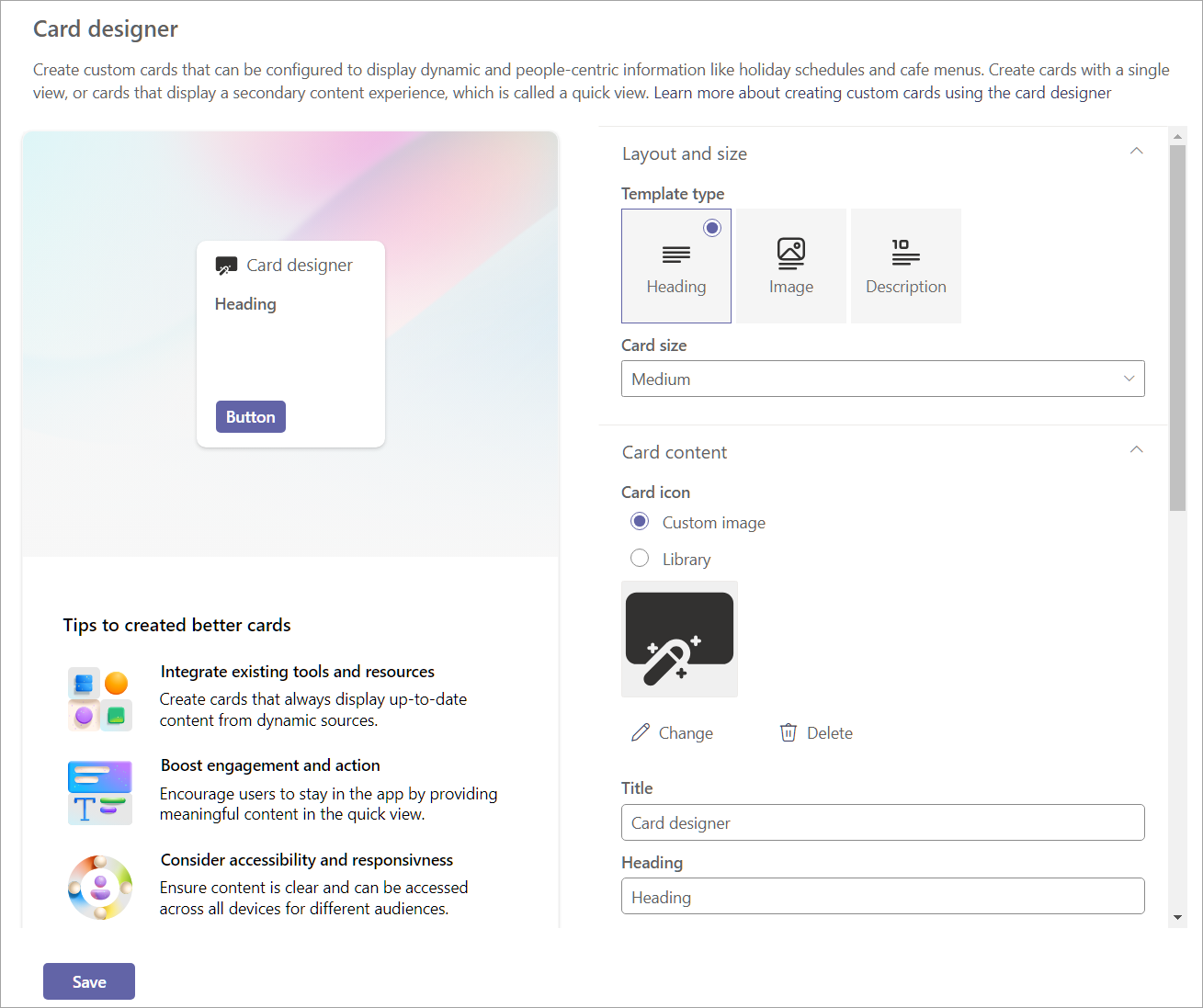
As you create your card through selecting options, a preview of how the card looks appears to the left of the options.
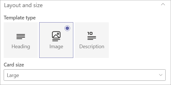
Under Template type, select one of three templates to apply:
- Heading: Create a card with a simple heading.
- Image: Create a card with a heading and image.
- Description: Create a card with a heading and description.
Note
Buttons are disabled when selecting the Image template for a medium sized card, but a card action can still be assigned to trigger when the user selects the card.
Depending on the template type chosen, fields matching the template type populates in the card content section. For example, if you chose the Image template, you can enter values for the Image and Heading properties in their respective text boxes.
Select a card size:
- Medium: the default card size and allows you to add one button to the Heading and Description templates.
- Large: takes the space of two medium cards together and allows the use of two buttons.
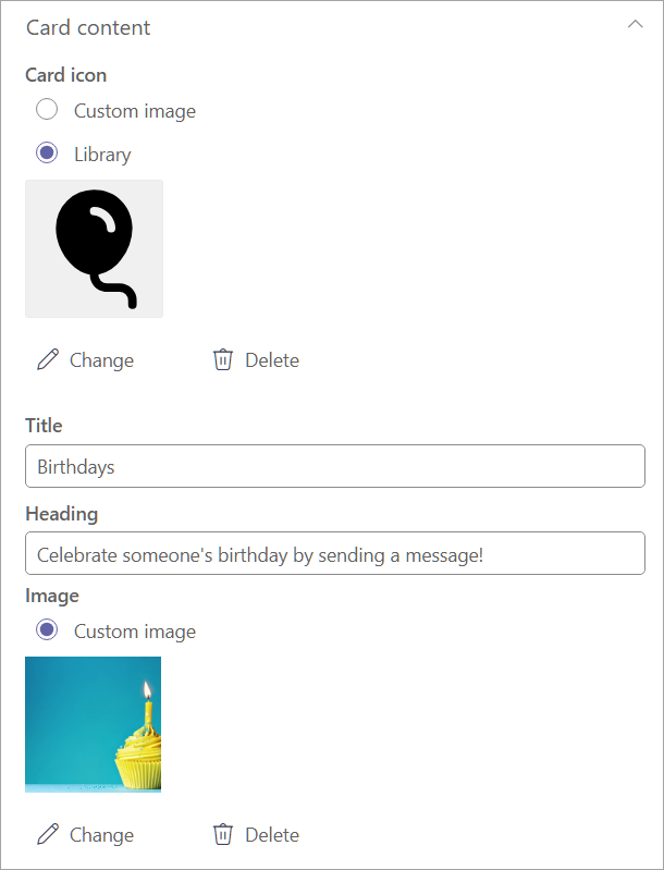
Under Card icon select one of the following options:
- Custom image: Select custom image then Change to upload your own image or select an existing image from your site or from an online source (for example, web search, OneDrive, Site).
- Library: Select an icon from a pre-existing list of available icons. For example, select Library then Change to choose a new icon.
Note
When uploading custom images for your icons, we recommend using PNG images between 24x24 and 32x32 pixels.
Enter a Title to be displayed at the top of your card.
Enter a Heading.
Depending on the template type chosen, enter values for the properties corresponding to your selection below the heading field. For this example, the image template is being shown:
Image: Select change to upload your own image or select an existing image from your site or from an online source (for example, web search, OneDrive, Site).
Note
- Image recommendations for cards in the dashboard: medium cards should be 300x150 to 400x200 with 2:1 aspect ratio and large cards 300x300 to 400x400 with 1:1 aspect ratio to prevent stretching in the mobile app.
- Image URLS in card properties must be an absolute URL for the link to work in the mobile app.
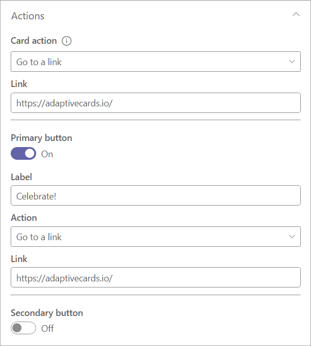
- Under card action, select an action to be performed when a user selects the card. Depending on the action selected, more fields appear to customize the action.
Note
The card action cannot be disabled.
Show the quick view: Select to use JSON code to create a more interactive dashboard card. If selected, the Save button changes to Next, which leads to more settings for customizing your quick view card. One quick view is available for each card, which can be opened as the card action, or by using a button. For steps on using quick view, refer to add a quick view to a card.
Go to a link: Enter a URL to direct users to.
Go to teams app: the user is directed to the specified teams app by the URL provided (admins can also use the appID to direct users to the appropriate Teams app). For more information, see Deep link to an application.
For example, selecting Go to a link from the dropdown displays a field for entering the link.
Under Link, enter the URL you wish users to be directed to.
Buttons can be toggled on and off (where available). If enabled, the same values found under card action can be selected for the Primary and Secondary buttons.
Note
When using a medium sized card, only one button can be enabled using the heading or description template. The image template will disable the use of buttons when medium size is selected.
For this example, the Primary button is set to direct users to the same link as the card action. The Secondary button is disabled.
Under Audiences to target enter one or more groups to target so only those audiences specified see the card in the dashboard. For more information, see audience targeting in Viva Connections.

Select Save to save the updates to your card.
Add a quick view to a card
Quick view allows you to add adaptive card JSON code to Dashboard cards to provide a more comprehensive, interactive, and engaging experience to users. By using static or dynamic data sources (like SharePoint Representational State Transfer (REST) API or Microsoft Graph API), cards can be created that provide information within the Connections experience, without the user having to navigate away.
To get started, follow the steps in use a card template up to selecting a Card action.
Under card action select Show the quick view.
Finish setting up your card by enabling or disabling buttons and selecting actions for active buttons.
Note
One quick view is available for each card, which can be opened as the card action, or by using a button.
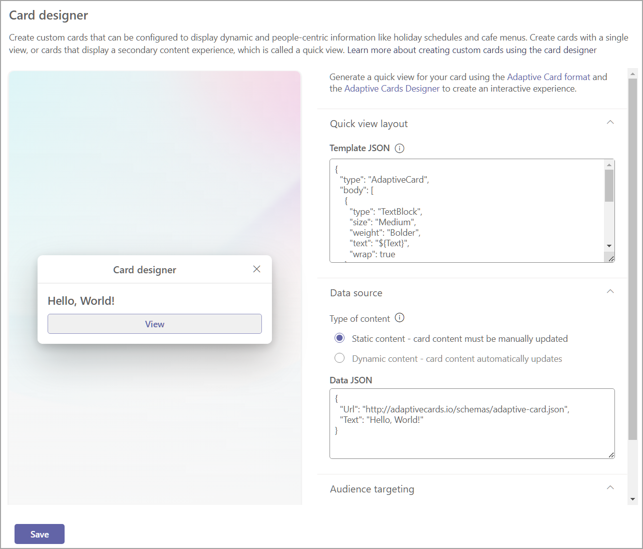
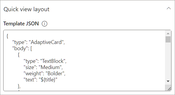
Select Next to display the quick view layout.
A preview of how the card looks on the dashboard displays to the left of the options.
Note
The Adaptive Card designer tool can be used to help create the JSON Template and Data code for your card. For more information on the adaptive card structure and creating adaptive cards, see Getting Started - Adaptive Cards.
In the Template JSON field, enter your JSON code that contains the structure of your Adaptive Card.
Under Type of Content, select one of the following options for your data set:
- Static: displays static information and must be manually updated.
- Dynamic: integrates with data sources from SharePoint API or Microsoft Graph to automatically update content.
Note
Selecting Dynamic content will display additional options allowing you to select the data source and API endpoint.
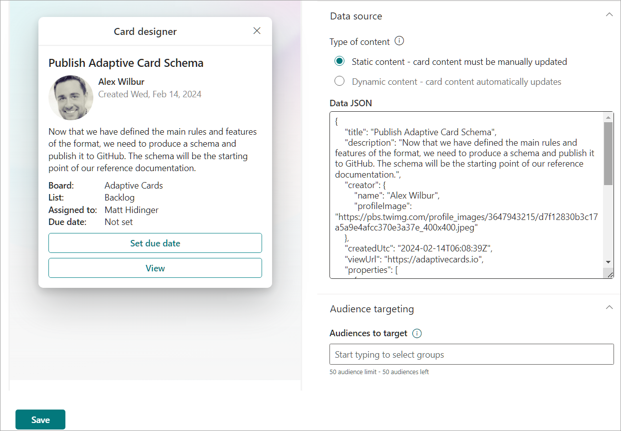
Selecting Static as the type of content
In the Data JSON field, enter your JSON code that contains the data to be displayed within your Adaptive Card.
In the Audiences to target field, enter any audiences you wish to target the card to.
Select Save to your updates.
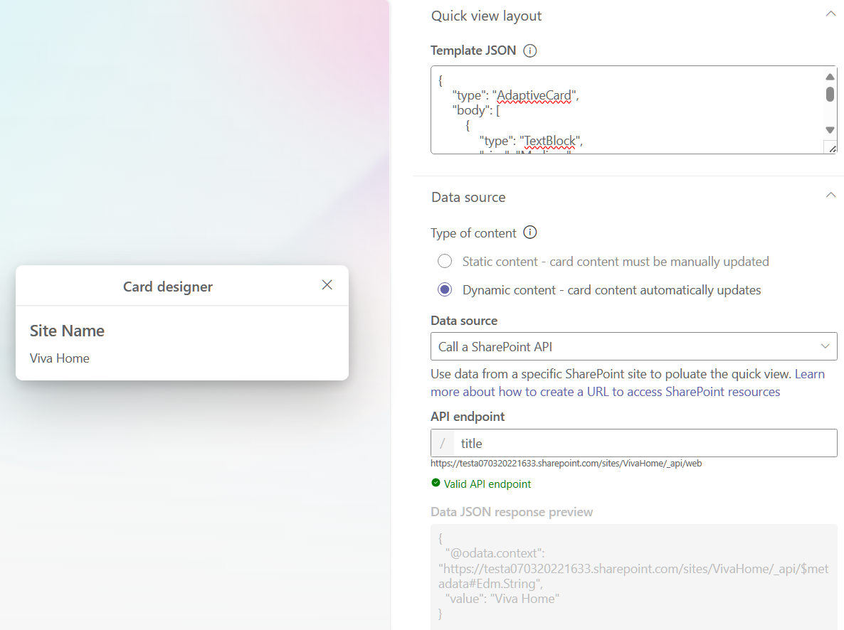
Selecting Dynamic as the type of content with SharePoint as the data source
From the Data Source dropdown, select SharePoint API.
In the API endpoint, enter the REST URL endpoint you wish to use.
For example, if you wanted to retrieve the title of a SharePoint site, you would enter
titlein the API Endpoint field (sinceweb/is already part of the default prefix). See this article for more examples of SharePoint REST endpoints.The Data JSON response preview will open and display the code used. A preview of how the card looks on the dashboard appears to the left of the property pane.
In the Audiences to target field, enter any audiences you wish to target the card to.
Select Save to save your updates to your custom card.
Selecting Dynamic as the type of content with Microsoft Graph as the data source
From the Data Source dropdown, select Microsoft Graph.
Select the Graph version from the dropdown (where version is the target service version, usually 1.0).
In the API endpoint, enter the REST URL endpoint you wish to use.
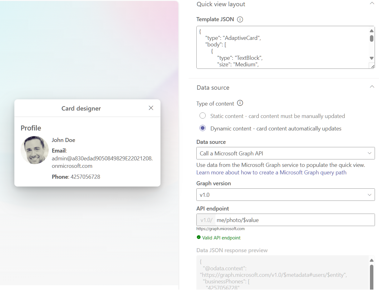
For example, if you wanted to retrieve the profile and photo of a specific user, you would enter the Microsoft Graph REST URL
me/photo/$valuein the API Endpoint field. See more common use cases in 1.0 for Microsoft Graph REST API here.The Data JSON response preview will open and display the code used and a preview of how the card looks on the dashboard appears to the left of the property pane.
In the Audiences to target field, enter any audiences you wish to target the card to.
Select Save to save updates to your custom card.
