UX design for SharePoint Add-ins
Important
The SharePoint Add-In model in SharePoint Online has been deprecated as of November 27th 2023, checkout the full retirement announcement to learn more.
Deprecation means that the feature will not get any new investments, but it's still supported. SharePoint add-in model is retired fully on April 2nd, 2026 and is no longer available after that time. Primary replacement technology for the SharePoint add-in model is SharePoint Framework (SPFx) which continues to be supported also in future.
As a developer, you should always give high priority to the user experience (UX) when you are creating add-ins. The model for SharePoint Add-ins offers many UX components and mechanisms that help you build a great user experience. The user experience in the add-in model is also flexible enough to let you use the techniques and platforms that best adapt to the needs of end users.
High-level overview of add-in UX in SharePoint
As the add-in developer, you have to know the architecture of your add-in. After you determine how your add-in will be distributed in remote and SharePoint platforms, you can decide among the available alternatives for building your add-in UX. You might ask yourself the following questions:
What can I use if I am creating a cloud-hosted add-in?
What can I use if I am creating a SharePoint-hosted add-in? For more information, see Choose patterns for developing and hosting your SharePoint Add-in.
How can I connect my UX to the host web? For more information, see Host webs, add-in webs, and SharePoint components in SharePoint.
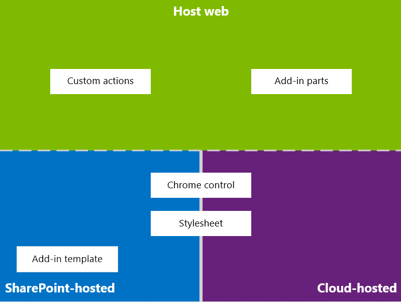
The following diagram shows the main scenarios and options to consider when you are designing your add-in UX.
Figure 1. Add-in UX main scenarios and options

In choosing your design, you should fundamentally consider which parts of your add-in are hosted in SharePoint and which are not. You should also consider how your add-in interacts with the host web.
Add-in UX scenarios in cloud-hosted add-ins
Suppose that you determine that some of your user experience is not hosted in SharePoint. In these scenarios, it is expected that your end users go back and forth between a SharePoint website and the cloud-hosted add-in. You can use the techniques and tools in the platform, but SharePoint also provides resources to help you design a smooth experience for users.
The following UX resources are available for cloud-hosted add-ins in SharePoint:
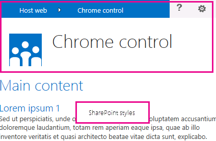
Chrome control: The chrome control enables you to use the navigation header of a specific SharePoint site in your add-in without needing to register a server library or use a specific technology or tool. To use this functionality, you must register a SharePoint JavaScript library through standard
<script>tags. You can provide a placeholder by using an HTML div element and further customize the control by using the available options. The control inherits its appearance from the specified SharePoint website. For more information, see Use the client chrome control in SharePoint Add-ins.Stylesheet: You can reference a SharePoint website's style sheet in your SharePoint Add-in and use it to style your webpages using the available classes. In addition, if the end users change the SharePoint website's theme, your add-in can adopt the new set of styles without modifying the reference in your add-in. For more information, see Use a SharePoint website's style sheet in SharePoint Add-ins.
Figure 2 shows the resources in the model for SharePoint Add-ins for cloud-hosted add-ins.
Figure 2. Add-in UX resources for cloud-hosted add-ins

Add-in UX scenarios in SharePoint-hosted add-ins
If your add-in is hosted in SharePoint, the user experience is less likely to change very much when users move back and forth between the host web and the add-in web. When the add-in is deployed, the add-in web takes the style sheet and theme from the host web. You can still use the chrome control and style sheet in a SharePoint-hosted add-in, but the most significant difference with cloud-hosted scenarios is the availability of the add-in template.
The following UX resource is available for SharePoint-hosted add-ins:
- Add-in template: The add-in template includes the app.master masterpage. It is the default option when you create an add-in web.
SharePoint-hosted add-ins also benefit from existing resources and technologies in SharePoint such as the Ribbon, web part infrastructure, and client-side rendering.
Scenarios for connecting the add-in UX to the host web
Some of the use cases for your add-in can be triggered from within the host web. SharePoint provides ways to open your add-in from a document library or list in addition to ways to show some of your add-in UX within SharePoint-hosted pages.
The following UX resources are available to connect your add-in UX to the host web:
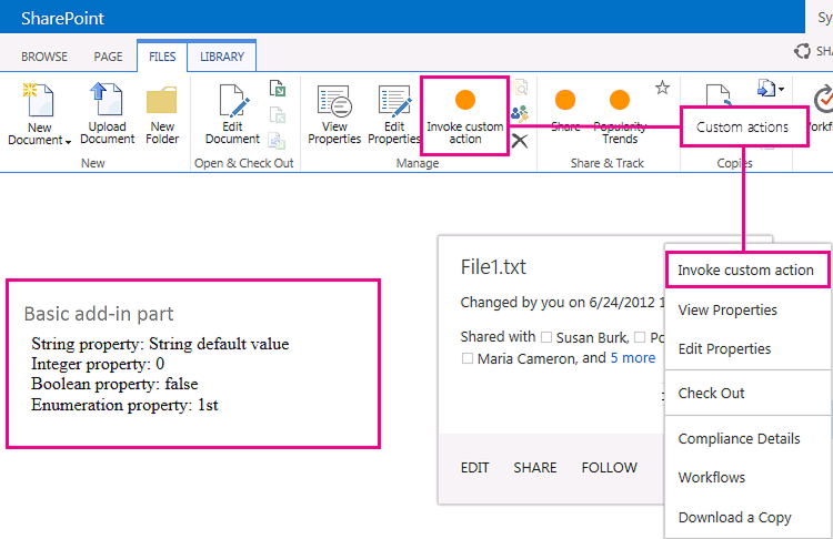
Custom actions: You can use custom actions to connect the host web UX with your add-in. There are two types of custom actions: Ribbon or ECB. A custom action can send parameters such as the list or item on which it was invoked to a remote page. For more information, see Create custom actions to deploy with SharePoint Add-ins.
Add-in parts: You can include some of your add-in user experience in the host web by using add-in parts. The add-in part is available in the Web Part Gallery in the host web when you deploy the add-in. Users can add the add-in part to a page by using the Web Part Adder control. For more information, see Create add-in parts to install with your SharePoint Add-in.
Figure 3 shows the resources in the model for SharePoint Add-ins to connect your add-in UX to the host web.
Figure 3. Add-in UX resources for the host web

See also
- Design SharePoint Add-ins
- SharePoint Add-ins
- Three ways to think about design options for SharePoint Add-ins
- Important aspects of the SharePoint Add-in architecture and development landscape
- Host webs, add-in webs, and SharePoint components in SharePoint
- SharePoint Add-ins UX design guidelines
- Create UX components in SharePoint
- Use a SharePoint website's style sheet in SharePoint Add-ins
- Use the client chrome control in SharePoint Add-ins
- Create add-in parts to install with your SharePoint Add-in
- Create custom actions to deploy with SharePoint Add-ins