Branding patterns
These patterns provide brand visibility and context to your add-in users.
Best practices
| Do | Don't |
|---|---|
| Use familiar UI components with applied branding accents like typography and color. | Don't invent new UI components that contradict established Office UI. |
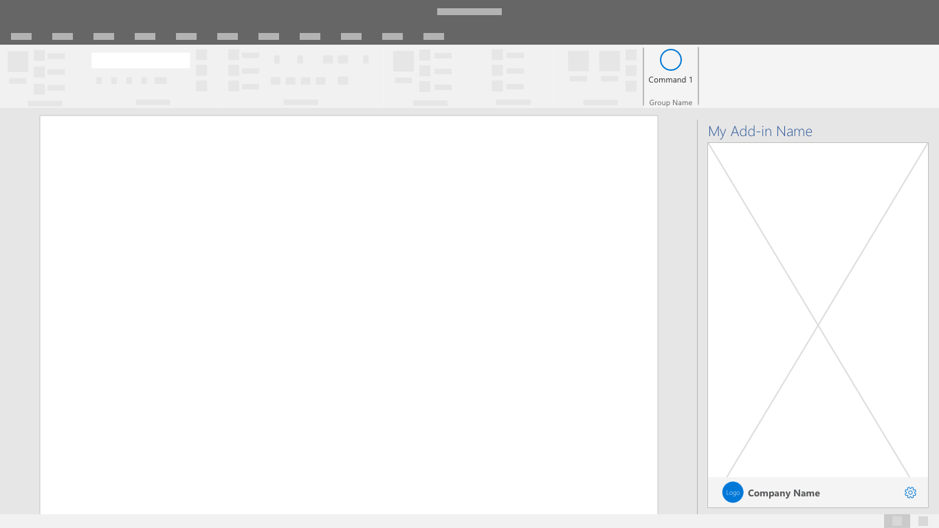
| Place your add-in branding in a brand bar footer at the bottom of your UI. | Don't repeat your task pane name in an immediately adjacent brand bar at the top of your UI. |
| Use brand elements sparingly. Fit your solution into Office such that is complementary. | Don't insert excessively branded elements into Office UI that distract and confuse customers. |
| Make your solution recognizable and connect your screens together with consistent visual elements. | Don't hide your solution with unrecognizable and inconsistently applied visual elements. |
| Build connection with a parent service or business to ensure that customers know and trust your solution. | Don't make customers learn a new brand concept if there's a useful and understandable relationship that can be leveraged to build trust and value. |
Apply the following patterns and components as applicable to allow users to embrace the full utility of your add-in.
Brand Bar
The brand bar is a space in the footer to include your brand name and logo. It also serves as a link to your brand's website and an optional access location.

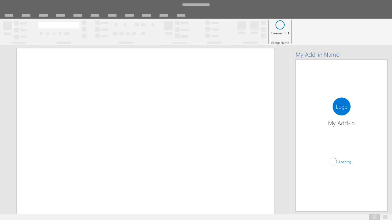
Splash Screen
Use this screen to display your branding while the add-in is loading or transitioning between UI states.

Spolupracujte s námi na GitHubu
Zdroj tohoto obsahu najdete na GitHubu, kde můžete také vytvářet a kontrolovat problémy a žádosti o přijetí změn. Další informace najdete v našem průvodci pro přispěvatele.
Office Add-ins