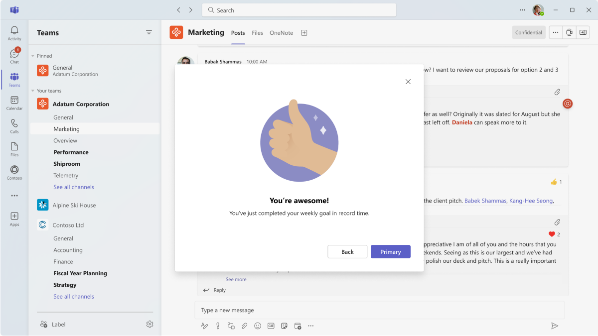
Designing dialogs for your Microsoft Teams app
You can create modal pop-up experiences in your Teams app with dialogs (referred as task modules in TeamsJS v1.x). Use this capability to display rich media and information or complete a complex task.
Microsoft Teams UI Kit
You can find more comprehensive dialog design guidelines, including elements that you can grab and modify as needed, in the Microsoft Teams UI Kit.
Open a dialog
Dialogs can be launched from almost anywhere in your app.
- Tab: A dialog can be launched from any link within a tab. Use in scenarios where you want the user to focus on an interaction.
- Bot: A dialog can be launched from a link inside a bot message.
- Adaptive Card: A dialog can be launched from an Adaptive Card (sent with a message extension or by a bot) when a user selects a button.
- Message extension (action commands): Message extensions allow you to take a particular action on message content. Selecting an action opens a dialog.
- Message extension (compose box context): In the compose box, you can design a message extension to open a dialog instead of the typical flyout. Reserve dialogs for complex interactions, such as completing a form.
Anatomy
Dialogs provide a flexible surface for hosted app experiences. They're built using an iframe (desktop) or webview (mobile), so you can design dialogs with our UI templates (recommended) or from scratch.
They can also be built with the Adaptive Cards framework, which can be a simpler and faster way to facilitate common scenarios (such as forms).
Mobile
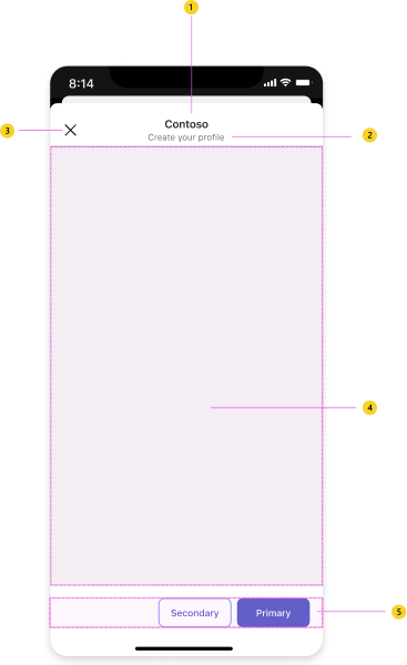
| Counter | Description |
|---|---|
| 1 | Header: Make headers clear and concise. Describe the task you want users to complete. |
| 2 | App name: Full name of your app. |
| 3 | Close button: Closes the dialog. Does not apply unsaved changes in the app content. |
| 4 | webview: Responsive space that hosts your app content. |
| 5 | Actions (optional): Buttons related to your app content. |
Desktop
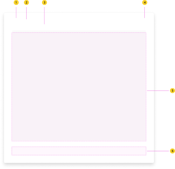
| Counter | Description |
|---|---|
| 1 | App icon |
| 2 | App name: Full name of your app. |
| 3 | Header: Make headers clear and concise. Describe the task you want users to complete. |
| 4 | Close button: Closes the dialog. Does not apply unsaved changes in the app content. |
| 5 | iframe: Responsive space that hosts your app content. |
| 6 | Actions (optional): Buttons related to your app content. |
Designing with UI templates
Consider using templates for common layouts inside your dialogs. Each one is made up of smaller components to create an elegant, responsive design that can be used out of the box or customized for your scenario or with your brand look and feel.
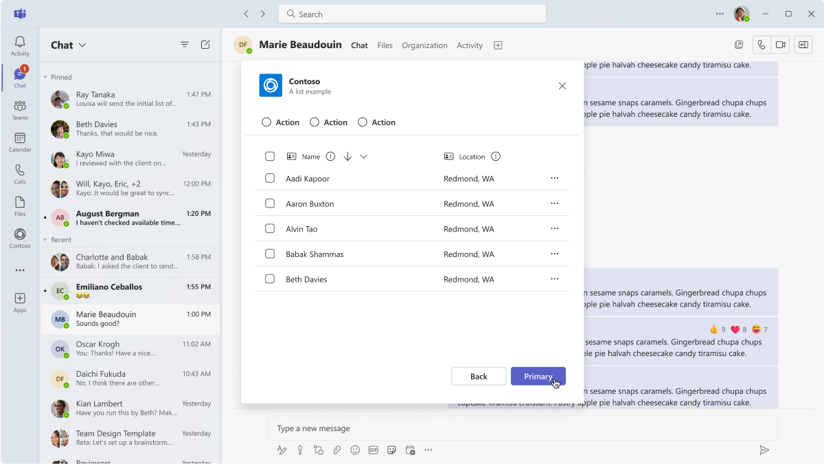
- List: Lists can display related items in a scannable format and allow users to take actions on an entire list or individual items.
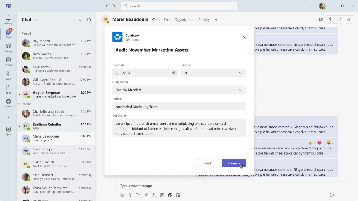
- Form: Forms are for collecting, validating, and submitting user input in a structured way.
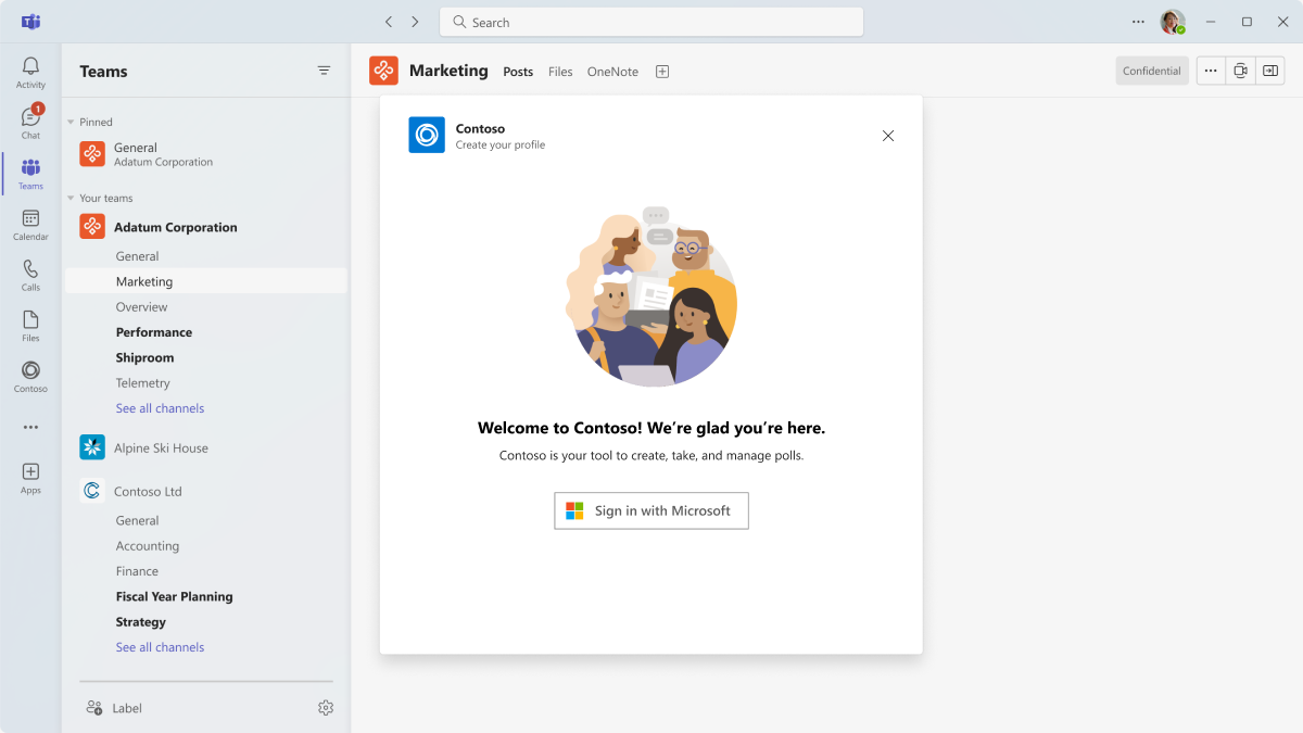
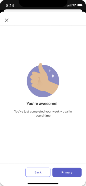
- Empty state: The empty state template can be used for many scenarios, including sign in, first-run experiences, error messages, and more.
Examples
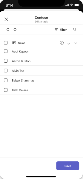
List
Lists work nicely in a dialog because they're easy to scan.
Mobile
Desktop
Form
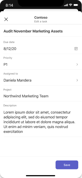
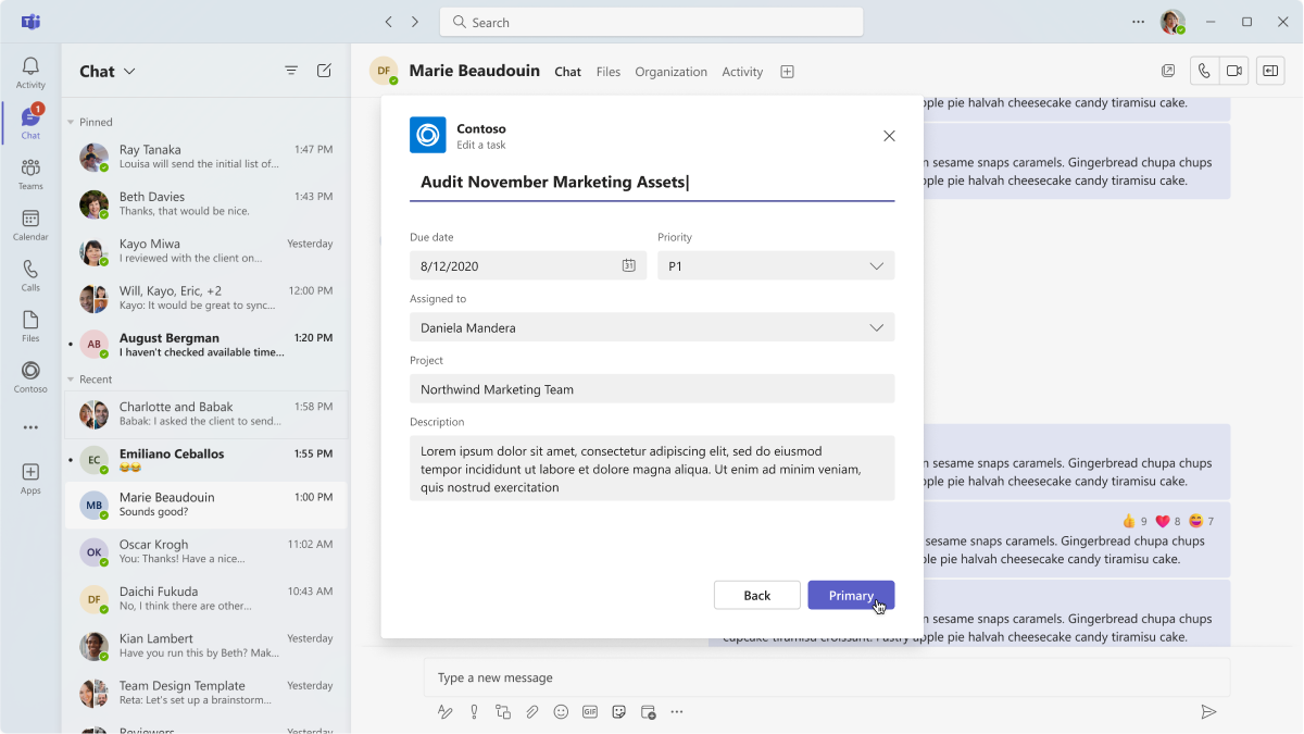
Dialogs are a great place to surface forms with sequential user inputs and inline validation. You can leverage Adaptive Cards as a way to embed form elements.
Mobile
Desktop
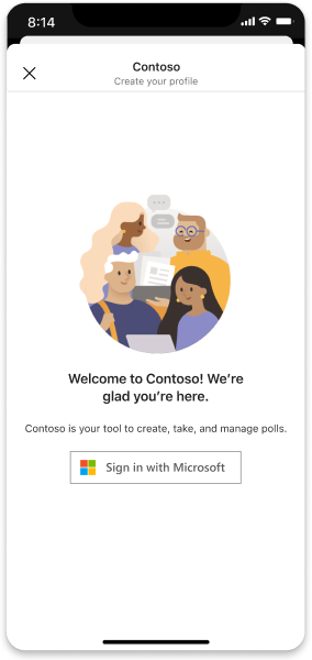
Sign in
Create a focused sign in or sign up flow with a series of dialogs, letting users move easily through sequential steps.
Mobile
Desktop
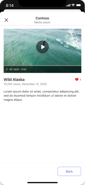
Media
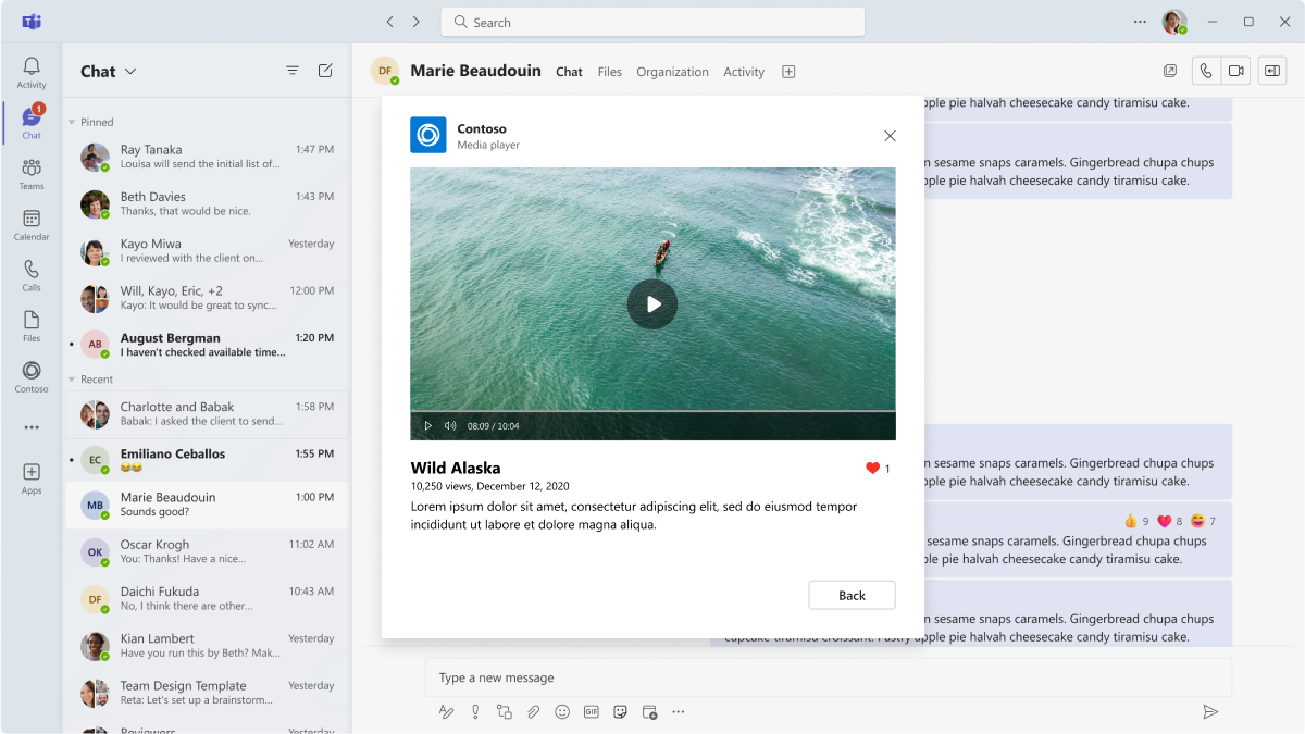
Embed media content in a dialog for a focused viewing experience.
Mobile
Desktop
Empty state
Use for welcome, error, and success messages.
Mobile
Desktop
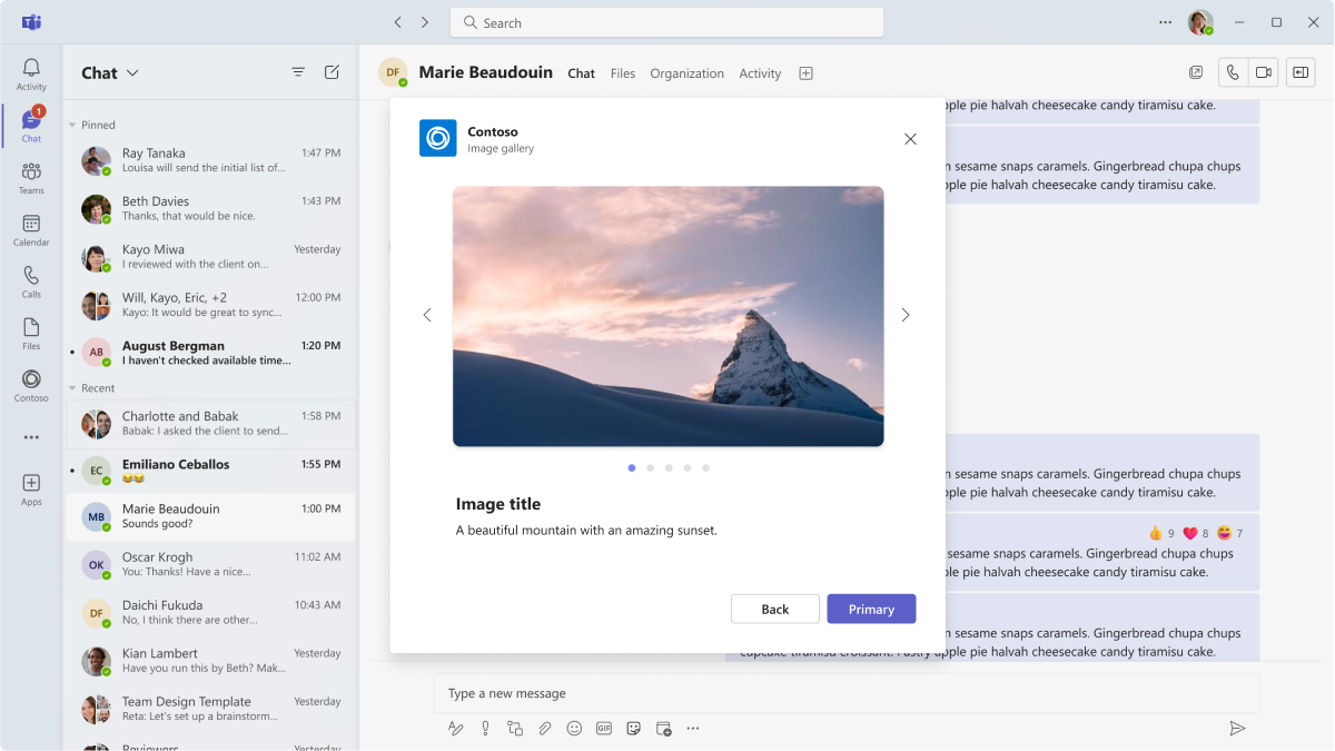
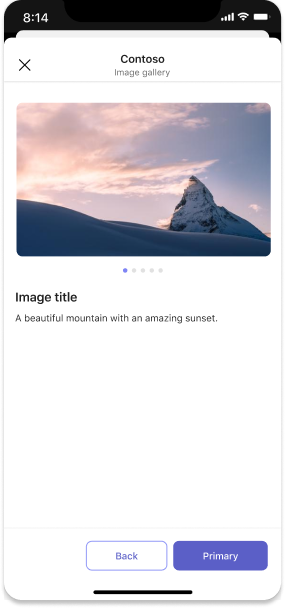
Image gallery
Embed a gallery carousel in an iframe (desktop) or webview (mobile).
Mobile
Desktop
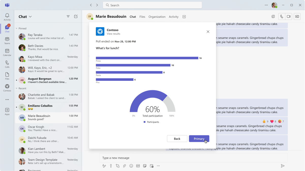
Poll
This example shows poll results launched from an Adaptive Card. The poll can be placed inside a dialog, too.
Mobile
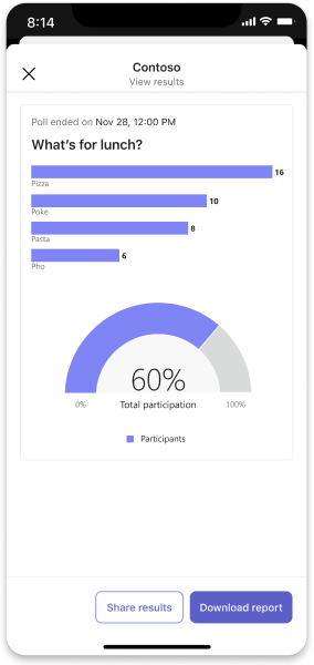
Desktop
Best practices
Use these recommendations to create a quality app experience.
Usability
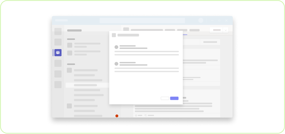
Do: Show one dialog at a time
The goal is to focus the user on completing a task after all!
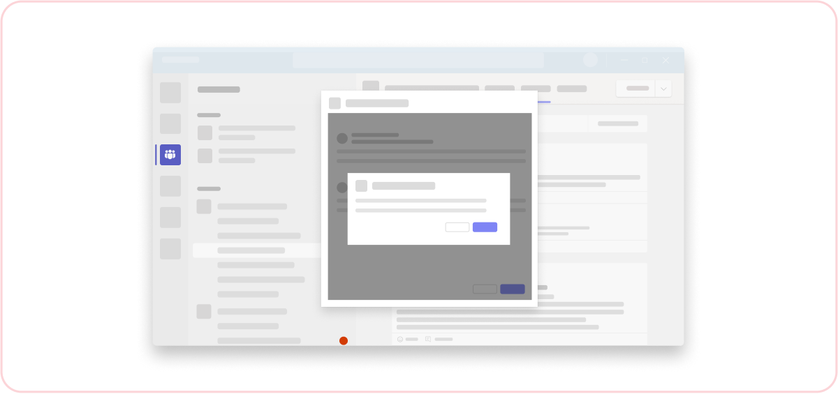
Don't: Pop a dialog on top of a dialog
This creates an unfocused, confusing user experience.
Responsive
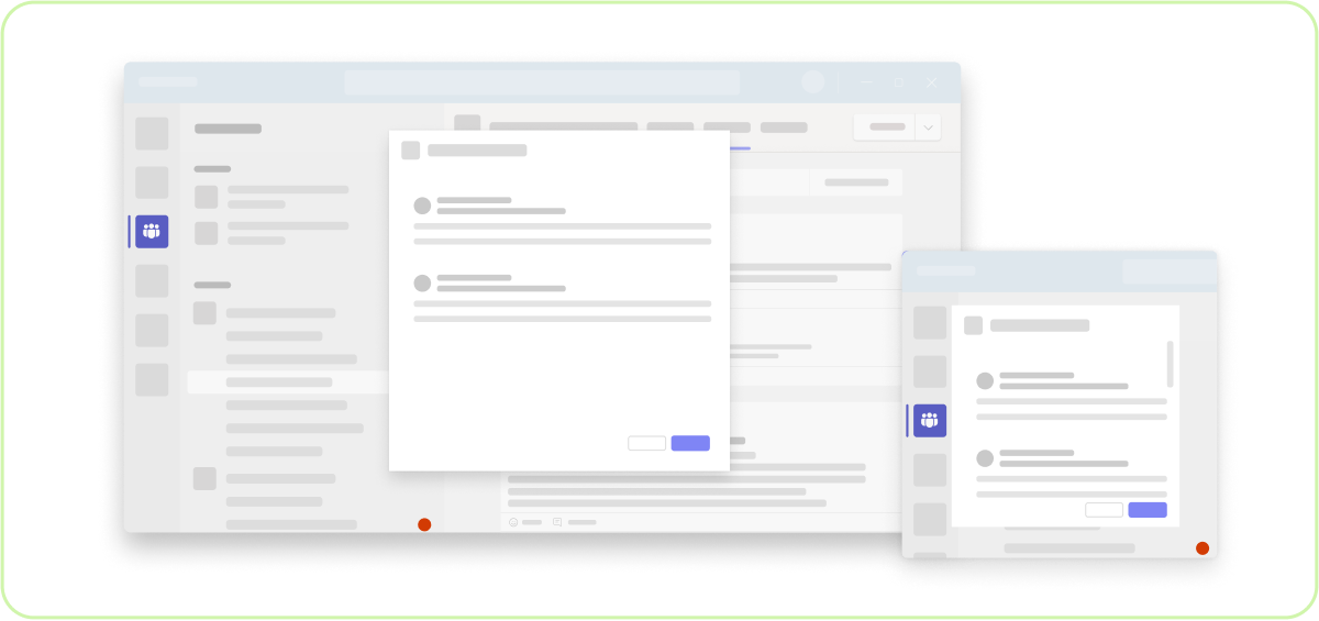
Do: Make sure the content is responsive
While Adaptive Cards hosted in a dialog render well on mobile devices, if you choose to use an iframe to host app content, make sure the UI is responsive and works well across devices.
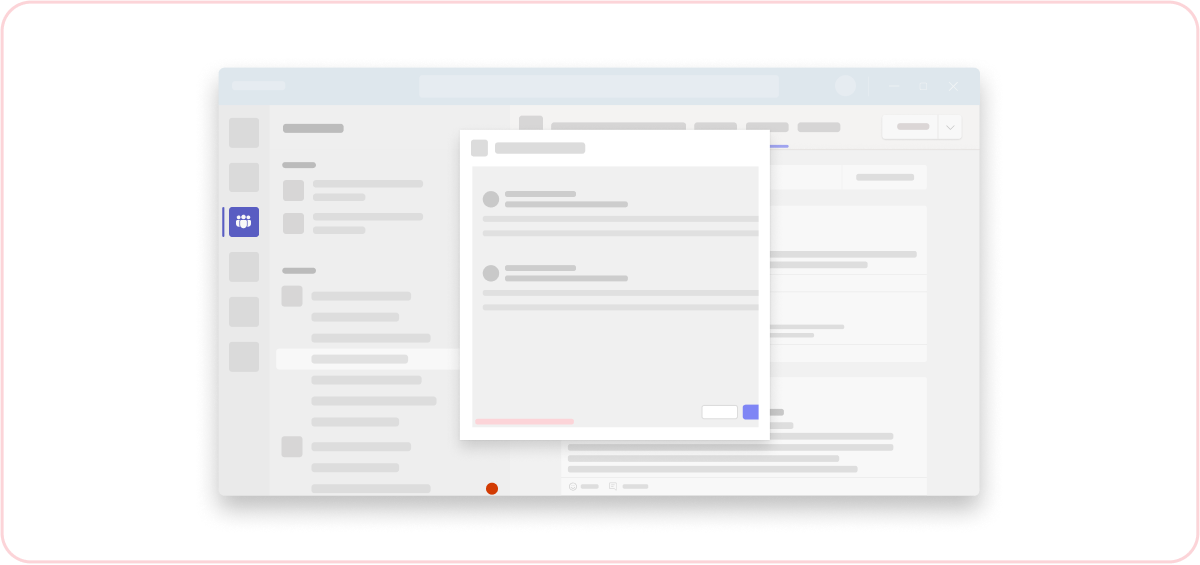
Don't: Use horizontal scroll bars
It's a best practice to keep content focused and not too lengthy. If a scroll is necessary, scroll vertically and not horizontally.
Simplicity
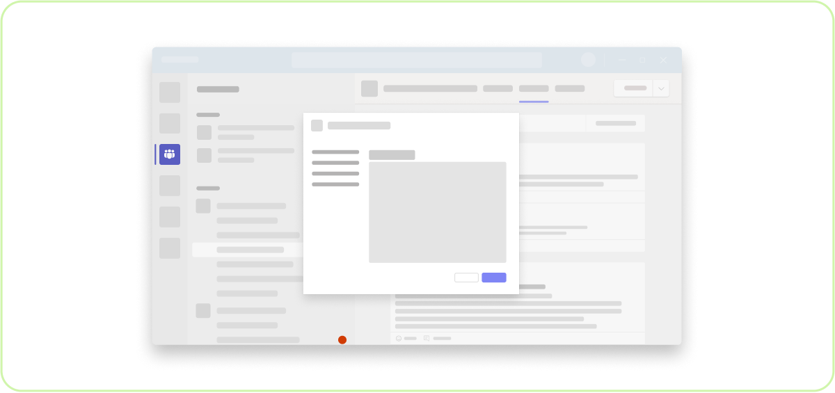
Do: Keep it short
You can easily create a multi-step wizard, but that doesn't necessarily mean you should! A multi-screen dialog can be problematic because incoming messages are distracting and tempt users to exit. If your task is really involved, pop out to a full webpage instead of a dialog.
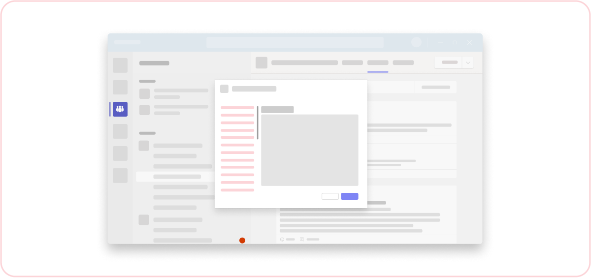
Don't: Have long interactions
Try to keep your interactions short and to the point.
Error messages
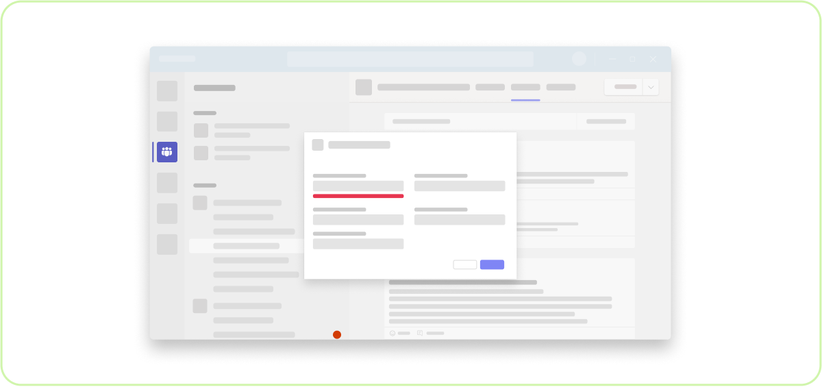
Do: Use inline error messages
See the forms UI template for guidelines on inline error handling.
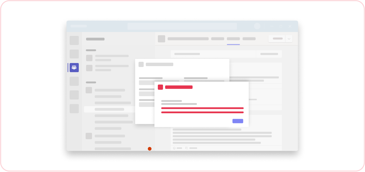
Don't: Put error messages in dialogs
Don't pop an error message in a dialog on top of a dialog. It creates a confusing user experience.
