Types of cards
Adaptive, hero, list, connector card for Microsoft 365 Groups, receipt, sign in, and thumbnail cards and card collections are supported in bots for Microsoft Teams. They're based on cards defined by the Bot Framework, but Teams doesn't support all Bot Framework cards and has added some of its own.
Before you identify the different card types, understand how to create a hero card, thumbnail card, or Adaptive Card.
Create a hero card, thumbnail card, or Adaptive Card
To create a hero card, thumbnail card, or Adaptive Card from Developer Portal for Teams:
Go to Developer Portal for Teams.
Select Design and build Adaptive Cards.
Select New card.
Enter card name and select Save.
Select one of the cards from Hero Card, Thumbnail Card, or Adaptive Card.
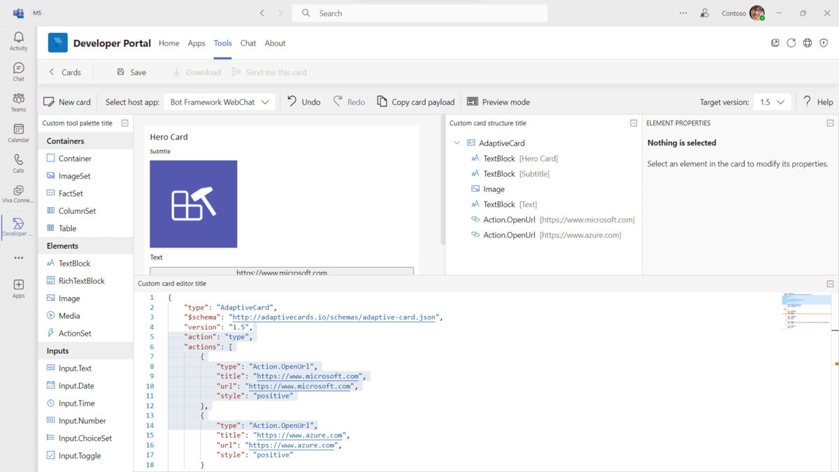
Select Save.
Select Send me this card. The card is sent to you as a chat message.
Card examples
You can find additional information on how to use cards in the documentation for the Bot Builder SDK v3. Code samples are also available in the Microsoft/BotBuilder-Samples repository on GitHub. Following are a few card examples:
.NET
Node.js
Card types
You can identify and use different types of cards based on your application requirements. The following table shows the types of cards available to you:
| Card type | Description |
|---|---|
| Adaptive Card | This card is highly customizable and can contain any combination of text, speech, images, buttons, and input fields. |
| Hero card | This card typically contains a single large image, one or more buttons, and a small amount of text. |
| List card | This card contains a scrolling list of items. |
| Connector card for Microsoft 365 Groups | This card has a flexible layout with multiple sections, fields, images, and actions. |
| Receipt card | This card provides a receipt to the user. |
| Signin card | This card enables a bot to request that a user signs in. |
| Thumbnail card | This card typically contains a single thumbnail image, some short text, and one or more buttons. |
| Card collections | This card collection is used to return multiple items in a single response. |
Features that support different card types
| Card type | Bots | Message extension previews | Message extension results | Dialogs (referred as task modules in TeamsJS v1.x) | Outgoing Webhooks | Incoming Webhooks | Connectors for Microsoft 365 Groups |
|---|---|---|---|---|---|---|---|
| Adaptive Card | ✔️ | ❌ | ✔️ | ✔️ | ✔️ | ✔️ | ❌ |
| Connector card for Microsoft 365 Groups | ✔️ | ❌ | ✔️ | ❌ | ✔️ | ✔️ | ✔️ |
| Hero card | ✔️ | ✔️ | ✔️ | ❌ | ✔️ | ✔️ | ❌ |
| Thumbnail card | ✔️ | ✔️ | ✔️ | ❌ | ✔️ | ✔️ | ❌ |
| List card | ✔️ | ❌ | ❌ | ❌ | ✔️ | ✔️ | ❌ |
| Receipt card | ✔️ | ❌ | ❌ | ❌ | ❌ | ✔️ | ❌ |
| Sign in card | ✔️ | ❌ | ❌ | ❌ | ❌ | ❌ | ❌ |
Note
For Adaptive Cards in Incoming Webhooks, all native Adaptive Card schema elements, except
Action.Submit, are fully supported. The supported actions are Action.OpenURL, Action.ShowCard, Action.ToggleVisibility, and Action.Execute.Adaptive Card supports only Incoming Webhook connectors for Microsoft 365 groups type. For these connectors, you can send the Adaptive Card using the following format.
Common properties for all cards
You can go through some common properties that are applicable to all cards.
Note
Hero and thumbnail cards with multiple actions are automatically split into multiple cards in a carousel layout.
Inline card images
The card can contain an inline image by including a link to the publicly available image. For performance purposes, it's highly recommended you host the image on a public Content Delivery Network (CDN).
Images are scaled up or down in size to maintain the aspect ratio for covering the image area. Images are then cropped from center to achieve the appropriate aspect ratio for the card.
Images must be at most 1024 × 1024 and in PNG, JPEG, or GIF format. Animated GIF isn't supported.
The following table provides the properties of inline card images:
| Property | Type | Description |
|---|---|---|
| url | URL | HTTPS URL to the image. |
| alt | String | Accessible description of the image. |
Note
If a card includes an image URL that is redirected before the final image, the redirect in image URL is not supported. This occurs for images shared on the public cloud.
Buttons
Buttons are shown stacked at the bottom of the card. Button text is always on a single line and is truncated if the text exceeds the button width. Any additional buttons beyond the maximum number supported by the card aren't shown.
For more information, see card actions.
Card formatting
For more information on text formatting in cards, see card formatting.
After identifying the common properties for all cards, you can now work with Adaptive Cards, which help you increase engagement and efficiency by adding your actionable content directly into the apps you use.
Adaptive Card
An Adaptive Card is a customizable card that can contain any combination of text, speech, images, buttons, and input fields. For more information, see Adaptive Cards.
To explore Adaptive Card templates, see Adaptive Card starter collection.
Support for Adaptive Cards
The following table provides the features that support Adaptive Cards:
| Bots in Teams | Message extensions | Connectors | Bot Framework |
|---|---|---|---|
| ✔️ | ✔️ | ❌ | ✔️ |
Note
- Teams platform supports v1.5 or earlier of Adaptive Card features for bot sent cards and action based message extensions.
- Teams platform supports v1.5 or earlier of Adaptive Card features for other capabilities, such as cards sent by user (search based message extensions and link unfurling), tabs, and dialogs.
- Positive or destructive action styling is not supported in Adaptive Cards on the Teams platform.
- Test your full width Adaptive Card in narrow form factors such as mobile and meeting side panels to ensure that content is not truncated.
- Adaptive Cards within Teams don't provide support for file or image uploads.
- The
isEnabledproperty forAction.Submittype in an Adaptive Card isn't supported in Teams.
Example of Adaptive Card
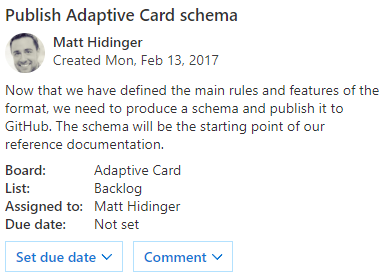
The following code shows an example of an Adaptive Card:
{
  "contentType": "application/vnd.microsoft.card.adaptive",
  "content": {
    "$schema": "http://adaptivecards.io/schemas/adaptive-card.json",
    "type": "AdaptiveCard",
    "version": "1.0",
    "body": [
      {
        "type": "Container",
        "items": [
          {
            "type": "TextBlock",
            "text": "Publish Adaptive Card schema",
            "weight": "bolder",
            "size": "medium"
          },
          {
            "type": "ColumnSet",
            "columns": [
              {
                "type": "Column",
                "width": "auto",
                "items": [
                  {
                    "type": "Image",
                    "url": "https://pbs.twimg.com/profile_images/3647943215/d7f12830b3c17a5a9e4afcc370e3a37e_400x400.jpeg",
                    "size": "small",
                    "style": "person"
                  }
                ]
              },
              {
                "type": "Column",
                "width": "stretch",
                "items": [
                  {
                    "type": "TextBlock",
                    "text": "Matt Hidinger",
                    "weight": "bolder",
                    "wrap": true
                  },
                  {
                    "type": "TextBlock",
                    "spacing": "none",
                    "text": "Created {{DATE(2017-02-14T06:08:39Z, SHORT)}}",
                    "isSubtle": true,
                    "wrap": true
                  }
                ]
              }
            ]
          }
        ]
      },
      {
        "type": "Container",
        "items": [
          {
            "type": "TextBlock",
            "text": "Now that we have defined the main rules and features of the format, we need to produce a schema and publish it to GitHub. The schema will be the starting point of our reference documentation.",
            "wrap": true
          },
          {
            "type": "FactSet",
            "facts": [
              {
                "title": "Board:",
                "value": "Adaptive Card"
              },
              {
                "title": "List:",
                "value": "Backlog"
              },
              {
                "title": "Assigned to:",
                "value": "Matt Hidinger"
              },
              {
                "title": "Due date:",
                "value": "Not set"
              }
            ]
          }
        ]
      }
    ],
    "actions": [
      {
        "type": "Action.ShowCard",
        "title": "Set due date",
        "card": {
          "type": "AdaptiveCard",
          "body": [
            {
              "type": "Input.Date",
              "id": "dueDate"
            }
          ],
          "actions": [
            {
              "type": "Action.Submit",
              "title": "OK"
            }
          ]
        }
      },
      {
        "type": "Action.ShowCard",
        "title": "Comment",
        "card": {
          "type": "AdaptiveCard",
          "body": [
            {
              "type": "Input.Text",
              "id": "comment",
              "isMultiline": true,
              "placeholder": "Enter your comment"
            }
          ],
          "actions": [
            {
              "type": "Action.Submit",
              "title": "OK"
            }
          ]
        }
      }
    ]
  }
}
Adaptive Cards best practices
Adaptive Cards must not display a horizontal scroll. To avoid horizontal scrolls, don’t specify a fixed width.
ColumnSets
- Avoid defining ColumnSets with more than three columns.
- Don’t use explicit pixel width on more than one column in the set.
- When using an explicit width, don’t specify a value that would make the column use more than one-fourth of the narrowest possible card width (for example, the width of a card in the meeting chat pane or in Microsoft 365 Copilot).
- In general, 48 pixels is about the maximum explicit width you’d want to use, although there may be exceptions depending on the scenario.
Sizing images
- When using an image inside a ColumnSet with more than one Column, prefer specifying the size of the column that contains the image rather than the image itself (set the image’s size to “auto” or “stretch”).
- If your image isn’t in a ColumnSet, it’s generally advisable to set its size to “auto” or “stretch”.
- If using an explicit width in pixels, make sure it doesn’t exceed 3/4 of the narrowest card width.
- When using explicit sizing in pixels, either set the width or the height, but not both. Setting only one will ensure your image has the proper aspect ratio.
- In general, only set the width of the image, not the height, although there might be exceptions depending on the scenario.
Additional information on Adaptive Cards
Note
The speak property in an Adaptive Card for Teams bots is supported for immersive readers only.
You can pass dynamic values in an Adaptive Card using the dollar symbol ($) and curly braces. For more information, see Adaptive Cards Templating.
Example:
{
 "type": "TextBlock",
 "text": "${titleText}",
 "size": "default",
 "weight": "bolder"
}
Bot Framework reference:
To know more about Adaptive Cards, see Adaptive Cards.
You can now work with a hero card, which is a multipurpose card used to visually highlight a potential user selection.
Your bot can mention tags in an Adaptive Card posted into channels. For more information, see Tag mention.
Hero card
A card that typically contains a single large image, one or more buttons, and text.
Support for hero cards
The following table provides the features that support hero cards:
| Bots in Teams | Message extensions | Connectors | Bot Framework |
|---|---|---|---|
| ✔️ | ✔️ | ❌ | ✔️ |
Properties of a hero card
The following table provides the properties of a hero card:
| Property | Type | Description |
|---|---|---|
| title | Rich text | Title of the card. Maximum two lines. |
| subtitle | Rich text | Subtitle of the card. Maximum two lines. |
| text | Rich text | Text appears under the subtitle. For formatting options, see card formatting. |
| images | Array of images | Image displayed at the top of the card. Aspect ratio 16:9. |
| buttons | Array of action objects | Set of actions applicable to the current card. Maximum six. |
| tap | Action object | Activated when the user taps on the card itself. |
Example of a hero card
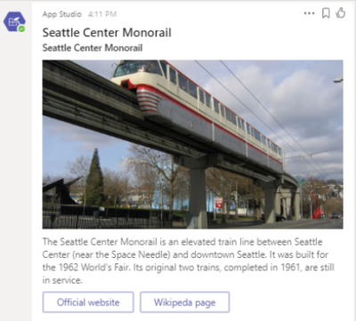
The following code shows an example of a hero card:
{
   "contentType": "application/vnd.microsoft.card.hero",
   "content": {
     "title": "Seattle Center Monorail",
     "subtitle": "Seattle Center Monorail",
     "text": "The Seattle Center Monorail is an elevated train line between Seattle Center (near the Space Needle) and downtown Seattle. It was built for the 1962 World's Fair. Its original two trains, completed in 1961, are still in service.",
     "images": [
       {
         "url":"https://upload.wikimedia.org/wikipedia/commons/thumb/4/49/Seattle_monorail01_2008-02-25.jpg/1024px-Seattle_monorail01_2008-02-25.jpg"
       }
     ],
    "buttons": [
      {
         "type": "openUrl",
         "title": "Official website",
         "value": "https://www.seattlemonorail.com"
       },
      {
        "type": "openUrl",
        "title": "Wikipeda page",
        "value": "https://en.wikipedia.org/wiki/Seattle_Center_Monorail"
       }
     ]
   }
}
Additional information on hero cards
Bot Framework reference:
List card
The list card has been added by Teams to provide functions beyond what the list collection can provide. The list card provides a scrolling list of items.
Support for list cards
The following table provides the features that support list cards:
| Bots in Teams | Message extensions | Connectors | Bot Framework |
|---|---|---|---|
| ✔️ | ❌ | ❌ | ✔️ |
Properties of a list card
The following table provides the properties of a list card:
| Property | Type | Description |
|---|---|---|
| title | Rich text | Title of the card. Maximum two lines. |
| items | Array of list items | Set of items applicable to the card. |
| buttons | Array of action objects | Set of actions applicable to the current card. Maximum 6. |
Example of a list card
The following code shows an example of a list card:
{
  "contentType": "application/vnd.microsoft.teams.card.list",
  "content": {
    "title": "Card title",
    "items": [
      {
        "type": "file",
        "id": "https://contoso.sharepoint.com/teams/new/Shared%20Documents/Report.xlsx",
        "title": "Report",
        "subtitle": "teams > new > design",
        "tap": {
          "type": "imBack",
          "value": "editOnline https://contoso.sharepoint.com/teams/new/Shared%20Documents/Report.xlsx"
        }
      },
      {
        "type": "resultItem",
        "icon": "https://cdn2.iconfinder.com/data/icons/social-icons-33/128/Trello-128.png",
        "title": "Trello title",
        "subtitle": "A Trello subtitle",
        "tap": {
          "type": "openUrl",
          "value": "http://trello.com"
        }
      },
      {
        "type": "section",
        "title": "Manager"
      },
      {
        "type": "person",
        "id": "JohnDoe@contoso.com",
        "title": "John Doe",
        "subtitle": "Manager",
        "tap": {
          "type": "imBack",
          "value": "whois JohnDoe@contoso.com"
        }
      }
    ],
    "buttons": [
      {
        "type": "imBack",
        "title": "Select",
        "value": "whois"
      }
    ]
  }
}
Connector card for Microsoft 365 Groups
You can work with a connector card for Microsoft 365 Groups that provides a flexible layout and is a great way to get useful information. The connector card for Microsoft 365 Groups is supported in Teams, not in Bot Framework. This card provides a flexible layout with multiple sections, fields, images, and actions. This card contains a connector card so that it can be used by bots. For differences between connector cards and the connector card for Microsoft 365 Groups, see Connector card for Microsoft 365 Groups.
Support for connector cards for Microsoft 365 Groups
The following table provides the features that support connector cards for Microsoft 365 Groups:
| Bots in Teams | Message extensions | Connectors | Bot Framework |
|---|---|---|---|
| ✔️ | ✔️ | ✔️ | ❌ |
Properties of the connector card for Microsoft 365 Groups
The following table provides the properties of the connector card for Microsoft 365 Groups:
| Property | Type | Description |
|---|---|---|
| title | Rich text | Title of the card. Maximum two lines. |
| summary | Rich text | Required if the card doesn't contain a text property, otherwise optional. The summary property is typically displayed in the notification pop-up in Teams, as a way to quickly determine what the card is all about. Do always include a summary. Don't include the details in the summary. For example, for a Twitter post, a summary might read **New tweet from @someuser** without mentioning the content of the tweet itself. |
| text | Rich text | Text appears under the subtitle. For formatting options, see card formatting. |
| themeColor | HEX string | Color that overrides the accentColor provided from the application manifest. |
For more information on the properties of the connector card for Microsoft 365 Groups, see card fields.
Additional information on the connector card for Microsoft 365 Groups
Connector cards for Microsoft 365 Groups function properly in Microsoft Teams, including ActionCard actions.
The important difference between using connector cards from a connector and using connector cards in your bot is the handling of card actions. The following table lists the difference:
| Connector | Bot |
|---|---|
| The endpoint receives the card payload through HTTP POST. | The HttpPOST action triggers an invoke activity that sends only the action ID and body to the bot. |
Each connector card can display a maximum of 10 sections, and each section can contain a maximum of five images and five actions.
Note
Any additional sections, images, or actions in a message do not appear.
All text fields support Markdown and HTML. You can control which sections use Markdown or HTML by setting the markdown property in a message. By default, markdown is set to true. If you want to use HTML instead, set markdown to false.
If you specify the themeColor property, it overrides the accentColor property in the app manifest.
To specify the rendering style for activityImage, you can set activityImageType as shown in the following table:
| Value | Description |
|---|---|
avatar |
Default, activityImage is cropped as a circle. |
article |
activityImage is displayed as a rectangle and retains its aspect ratio. |
For all other details about connector card properties, see actionable message card reference. The only connector card properties that Teams doesn't support are as follows:
heroImagehideOriginalBodystartGroupalways treated astruein TeamsoriginatorcorrelationId
Example of a connector card for Microsoft 365 Groups
The following code shows an example of a connector card for Microsoft 365 Groups:
{
  "contentType": "application/vnd.microsoft.teams.card.o365connector",
  "content": {
    "@type": "MessageCard",
    "@context": "http://schema.org/extensions",
    "summary": "John Doe commented on Trello",
    "title": "Project Tango",
    "sections": [
        {
            "activityTitle": "John Doe commented",
            "activitySubtitle": "On Project Tango",
            "activityText": "\"Here are the designs\"",
            "activityImage": "http://connectorsdemo.azurewebsites.net/images/MSC12_Oscar_002.jpg"
        },
        {
            "title": "Details",
            "facts": [
                {
                    "name": "Labels",
                    "value": "Designs, redlines"
                },
                {
                    "name": "Due date",
                    "value": "Dec 7, 2016"
                },
                {
                    "name": "Attachments",
                    "value": "[final.jpg](http://connectorsdemo.azurewebsites.net/images/WIN14_Jan_04.jpg)"
                }
            ]
        },
        {
            "title": "Images",
            "images": [
                {
                    "image":"http://connectorsdemo.azurewebsites.net/images/MicrosoftSurface_024_Cafe_OH-06315_VS_R1c.jpg"
                },
                {
                    "image":"http://connectorsdemo.azurewebsites.net/images/WIN12_Scene_01.jpg"
                },
                {
                    "image":"http://connectorsdemo.azurewebsites.net/images/WIN12_Anthony_02.jpg"
                }
            ]
        }
    ],
    "potentialAction": [
        {
            "@context": "http://schema.org",
            "@type": "ViewAction",
            "name": "View in Trello",
            "target": [
                "https://trello.com/c/1101/"
            ]
        }
    ]
  }
}
Receipt card
Teams supports receipt card, which enables a bot to provide a receipt to the user. It typically contains the list of items to include on the receipt, such as tax and total information.
Support for receipt cards
The following table provides the features that support receipt cards:
| Bots in Teams | Message extensions | Connectors | Bot Framework |
|---|---|---|---|
| ✔️ | ✔️ | ❌ | ✔️ |
Example of a receipt card
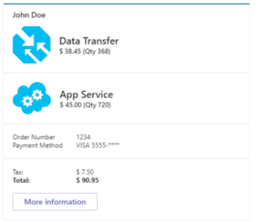
The following code shows an example of a receipt card:
{
  "contentType": "application/vnd.microsoft.card.receipt",
  "content": {
    "title": "John Doe",
    "facts": [
      {
        "key": "Order Number",
        "value": "1234"
      },
      {
        "key": "Payment Method",
        "value": "VISA 5555-****"
      }
    ],
    "items": [
      {
        "title": "Data Transfer",
        "image": {
          "url": "https://github.com/amido/azure-vector-icons/raw/master/renders/traffic-manager.png"
        },
        "price": "$ 38.45",
        "quantity": "368"
      },
      {
        "title": "App Service",
        "image": {
          "url": "https://github.com/amido/azure-vector-icons/raw/master/renders/cloud-service.png"
        },
        "price": "$ 45.00",
        "quantity": "720"
      }
    ],
    "total": "$ 90.95",
    "tax": "$ 7.50",
    "buttons": [
      {
        "type": "openUrl",
        "title": "More information",
        "image": "https://account.windowsazure.com/content/6.10.1.38-.8225.160809-1618/aux-pre/images/offer-icon-freetrial.png",
        "value": "https://azure.microsoft.com/en-us/pricing/"
      }
    ]
  }
}
Additional information on receipt cards
Bot Framework reference:
Sign in card
The sign in card in Teams is similar to the sign in card in the Bot Framework except that the sign in card in Teams only supports two actions signin and openUrl.
The sign in action can be used from any card in Teams, not just the sign in card. For more information, see Teams authentication flow for bots.
Support for sign in cards
The following table provides the features that support sign in cards:
| Bots in Teams | Message extensions | Connectors | Bot Framework |
|---|---|---|---|
| ✔️ | ❌ | ❌ | ✔️ |
Additional information on sign in cards
Bot Framework reference:
Thumbnail card
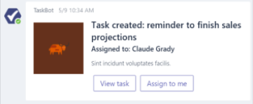
You can work with a thumbnail card that is used for sending a simple actionable message. A card that typically contains a single thumbnail image, one or more buttons, and text.
Support for thumbnail cards
The following table provides the features that support thumbnail cards:
| Bots in Teams | Message extensions | Connectors | Bot Framework |
|---|---|---|---|
| ✔️ | ✔️ | ❌ | ✔️ |
Properties of a thumbnail card
The following table provides the properties of a thumbnail card:
| Property | Type | Description |
|---|---|---|
| title | Rich text | Title of the card. Maximum two lines. |
| subtitle | Rich text | Subtitle of the card. Maximum two lines. |
| text | Rich text | Text appears under the subtitle. For formatting options, see card formatting. |
| images | Array of images | Image displayed at the top of the card. Aspect ratio 1:1 square. |
| buttons | Array of action objects | Set of actions applicable to the current card. Maximum 6. |
| tap | Action object | Activated when the user taps on the card itself. |
Example of a thumbnail card
The following code shows an example of a thumbnail card:
{
  "contentType": "application/vnd.microsoft.card.thumbnail",
  "content": {
    "title": "Bender",
    "subtitle": "tale of a robot who dared to love",
    "text": "Bender Bending Rodríguez is a main character in the animated television series Futurama. He was created by series creators Matt Groening and David X. Cohen, and is voiced by John DiMaggio",
    "images": [
      {
        "url": "https://upload.wikimedia.org/wikipedia/en/a/a6/Bender_Rodriguez.png",
        "alt": "Bender Rodríguez"
      }
    ],
    "buttons": [
      {
        "type": "imBack",
        "title": "Thumbs Up",
        "image": "http://moopz.com/assets_c/2012/06/emoji-thumbs-up-150-thumb-autox125-140616.jpg",
        "value": "I like it"
      },
      {
        "type": "imBack",
        "title": "Thumbs Down",
        "image": "http://yourfaceisstupid.com/wp-content/uploads/2014/08/thumbs-down.png",
        "value": "I don't like it"
      },
      {
        "type": "openUrl",
        "title": "I feel lucky",
        "image": "http://thumb9.shutterstock.com/photos/thumb_large/683806/148441982.jpg",
        "value": "https://www.bing.com/images/search?q=bender&qpvt=bender&qpvt=bender&qpvt=bender&FORM=IGRE"
      }
    ],
    "tap": {
      "type": "imBack",
      "value": "Tapped it!"
    }
  }
}
Additional information
Bot Framework reference:
Card collections
You can work with card collections that include carousel and list collections. Teams supports card collections. Card collections include builder.AttachmentLayout.carousel and builder.AttachmentLayout.list. These collections contain Adaptive, hero, or thumbnail cards.
Carousel collection
The carousel layout shows a carousel of cards, optionally with associated action buttons.
Support for carousel collections
The following table provides the features that support carousel collections:
| Bots in Teams | Message extensions | Connectors | Bot Framework |
|---|---|---|---|
| ✔️ | ❌ | ❌ | ✔️ |
Note
A carousel can display a maximum of ten cards per message.
Properties of a carousel card
Properties of a carousel card are same as the hero and thumbnail cards.
Example of a carousel collection
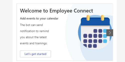
The following code shows an example of a carousel collection:
{
 "attachmentLayout": "carousel",
 "attachments":[
    {
      "contentType": "application/vnd.microsoft.card.adaptive",
      "content": {
        "type": "AdaptiveCard",
        "version": "1.0",
        "body": [
          {
            "type": "Container",
            "items": [
              {
                "type": "TextBlock",
                "size": "extraLarge",
                "weight": "bolder",
                "text": "Welcome to Employee Connect",
                "height": "stretch"
              },
              {
                "type": "TextBlock",
                "size": "medium",
                "weight": "bolder",
                "text": "Add events to your calendar",
                "height": "stretch"
              },
              {
                "type": "TextBlock",
                "weight": "bolder",
                "text": "The bot can send \r\rnotification to remind \r\ryou about the latest \r\revents and trainings.",
                "wrap": true,
                "height": "stretch"
              },
              {
                "type": "ColumnSet",
                "columns": [
                  {
                    "type": "Column",
                    "items": [],
                    "height": "stretch"
                  }
                ]
              },
              {
                "type": "ColumnSet",
                "columns": [
                  {
                    "type": "Column",
                    "items": [],
                    "height": "stretch"
                  }
                ]
              }
            ]
          }
        ],
        "actions": [
          {
            "type": "Action.Submit",
            "title": "Let's get started"
          }
        ]
      }
    },
    {
      "contentType": "application/vnd.microsoft.card.adaptive",
      "content": {
        "type": "AdaptiveCard",
        "version": "1.2",
        "body": [
          {
            "type": "Container",
            "items": [
              {
                "type": "TextBlock",
                "size": "large",
                "weight": "bolder",
                "text": "Employee connect"
              },
              {
                "type": "TextBlock",
                "text": "The bot can send notifications \r\rto remind you about the latest \r\r events and trainings",
                "wrap": true,
                "maxWidth": 2
              },
              {
                "type": "ColumnSet",
                "columns": [
                  {
                    "type": "Column",
                    "items": [],
                    "height": "stretch"
                  }
                ]
              },
              {
                "type": "ColumnSet",
                "columns": [
                  {
                    "type": "Column",
                    "items": [],
                    "height": "stretch"
                  }
                ]
              }
            ]
          }
        ],
        "actions": [
          {
            "type": "Action.Submit",
            "title": "Let's get started"
          }
        ]
      }
    },
    {
      "contentType": "application/vnd.microsoft.card.adaptive",
      "content": {
        "type": "AdaptiveCard",
        "version": "1.0",
        "body": [
          {
            "type": "Container",
            "items": [
              {
                "type": "TextBlock",
                "size": "large",
                "weight": "bolder",
                "text": "Employee Connect final"
              },
              {
                "type": "TextBlock",
                "weight": "bolder",
                "text": "Create and manage your tasks",
                "wrap": true
              },
              {
                "type": "TextBlock",
                "text": "The app identifies all your pending tasks \r\r and helps you manage everything at \r\r one place.",
                "wrap": true
              },
              {
                "type": "TextBlock",
                "weight": "bolder",
                "text": "Try these commands \r\r- Pending Submissions \r\r- Pending Approvals- My Tools",
                "wrap": true,
                "height": "stretch"
              }
            ]
          }
        ],
        "actions": [
          {
            "type": "Action.Submit",
            "title": "Let's get started"
          }
        ]
      }
    }
  ]
}
Syntax for carousel collections
builder.AttachmentLayoutTypes.Carousel is the syntax for carousel collections.
List collection
The list layout shows a vertically stacked list of cards, optionally with associated action buttons.
Support for list collections
The following table provides the features that support list collections:
| Bots in Teams | Message extensions | Connectors | Bot Framework |
|---|---|---|---|
| ✔️ | ✔️ | ❌ | ✔️ |
Example of a list collection
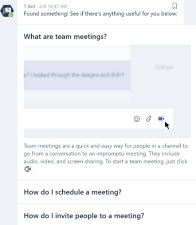
Properties of list collections are same as the hero or thumbnail cards.
A list can display a maximum of 10 cards per message.
Note
Some combinations of list cards aren't yet supported on iOS and Android.
Syntax for list collections
builder.AttachmentLayout.list is the syntax for list collections.
Cards not supported in Teams
The following cards are implemented by the Bot Framework, but aren't supported by Teams:
- Animation cards
- Audio cards
- Video cards
Code samples
| S.No. | Description | .NET | Node.js | Manifest |
|---|---|---|---|---|
| 1 | This sample shows how user can send different types of cards using bot which are supported in Teams. | View | View | View |