Optimizing User Experience of Apps for SharePoint 2013
The User Experience Challenge
Just a decade ago iframes were frowned upon on the web. Not all browsers supported them and some organizations even applied browser policies to block iframes. Fast-forward to today and iframes are a staple of web development and the cornerstone of both the Facebook and SharePoint 2013 app architecture. But that doesn't mean iframes don't come with some unique challenges. One challenge I've been particularly concerned about is the user experience (UX) of apps for SharePoint and how apps from the Office Marketplace appear in existing SharePoint sites.
Thankfully, MSDN has fantastic resources and guidance on UX design for apps in SharePoint 2013, which should be considered the definitive guide for designing SharePoint app UX. In this post I will explore some of these resources and provide samples and lessons learned for optimizing the user experience of apps for SharePoint 2013.
SharePoint Apps 101
To understand the UX challenge, it helps to have some basic understanding of SharePoint’s app architecture. Apps for SharePoint deliver additional capabilities, but run outside of the host SharePoint site. These apps can be SharePoint-hosted as HTML/client-side script OR Cloud-hosted anywhere in the world using any web technology (ex: PHP from a Private Cloud web server on-premise, ASP.NET MVC from Azure, Ruby hosted with a 3rd party ISV, etc). The important point is that in all cases, the app’s code runs outside of the SharePoint site collection that is consuming it. Yes, this is even the case with SharePoint-hosted apps, which get hosted in a different domain in the farm. For more information on app hosting options, see Hosting options for apps for SharePoint.
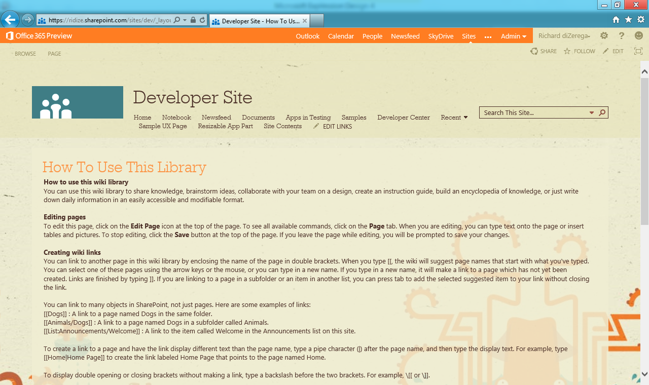
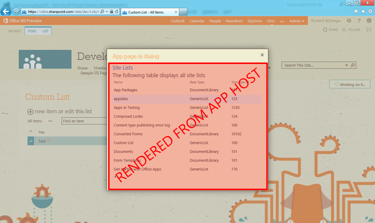
Apps for SharePoint can be displayed in two basic ways. The first option is to display app pages in full-screen (full content area of a browser), which is the only required experience an app must provide. In this configuration, apps are launched from links or custom actions in SharePoint, which redirect to the remote app host along with some contextual information requested by the app developer. When this redirection occurs, users are taken completely out of the site and to the app (as the browser URL will indicate). The second delivery option is to display the app pages in an iframe via SharePoint dialog or the new app part. SharePoint dialogs are similar to 2010 and can be leveraged in an app through a custom action. App parts are very similar to Page Viewer web parts, but have a mechanism to dynamically pass contextual information and app part properties to the page they display. With SharePoint dialogs and app parts, users stay in their SharePoint site, but have iframe windows into app pages.
| Regular SharePoint Page | App Page Displayed in Full-Screen |
 |
 |
| App Page Displayed in a SharePoint Dialog | App Pages Displayed in App Parts |
 |
 |
Now back to the UX challenge. Imagine a SharePoint 2013 site with a number of app parts. Without meticulous design, each of these app parts could appear like completely separated experiences. With the introduction of the Office Marketplace, app developers will be developing apps for thousands of tenants, each with their own unique style/branding. So how does an app developer write apps that take on the appearance of a tenant's environment? The answer is a little different for each display option:
Pages Displayed in Full-Screen
For app pages displayed in full-screen, SharePoint redirects users away from the SharePoint site and to the location where the app is hosted (along with some contextual information passed through URL parameters and/or POST messages). When created in Visual Studio, SharePoint-hosted pages reference the host site styles by default, while cloud-hosted pages start relatively un-styled. Without the developer taking an action, it will seem that SharePoint-hosted pages automatically fit in with the host site while cloud-hosted pages have nothing from the host site to style them. Luckily, app developers for cloud-hosted apps can inherit the appearance of a specified SharePoint site by wrapping app pages in the SharePoint Client Chrome Control. The Chrome Control adds header html (title, breadcrumb, icon, etc.) and injects styles from the referenced SharePoint site for styling other html elements. Here are the high-level steps to implement the Chrome Control:
Step 1: Configure the query string in the AppManifest.xml to load the correct default app page and pass the appropriate contextual information through the URL
Step 2: Add a div placeholder element to the top of all app pages for hosting the SharePoint Client Chrome Control
Step 3: Include script on app pages to reference the SP.UI.Controls.js script from the host site and use it to load the Chrome Control into the placeholder from step #2
Pages Displayed in iframe Elements
App parts or "client web parts" display app pages in iframes on the host SharePoint site. Although similar to a Page Viewer web part, app parts have the added ability for custom web part properties. These properties get passed to the app part's page via URL parameters (along with additional contextual information the developer requests). Since app parts and pages displayed in the SharePoint dialog do not display full-screen, they should NOT leverage the SharePoint Client Chrome Control like pages displayed in full-screen. Instead, SharePoint styles can be incorporated by referencing style resources from the host SharePoint site. Here are the high-level steps to implement SharePoint style resources in an app part page:
Step 1: Add a Client Web Part to your SharePoint 2013 app project
Step 2: Configure the client web part's Content Source in the Element.xml to correct page and pass the appropriate contextual information through the URL
Step 3: Include script on app part pages to inject a new style sheet link element into the head of the page referencing the /_layouts/15/defaultcss.ashx resource from the host SharePoint site
Here are the high-level steps to implement SharePoint style resources in a page displayed in the SharePoint dialog:
Step 1: Add a UI Custom Action (Host Web) to your SharePoint 2013 app project
Step 2: Configure the UrlAction in the Element.xml to correct page and pass the appropriate contextual information through the URL and set HostWebDialog="true" on the Custom Action (HostWebDialogHeight and HostWebDialogWidth should also be set)
Step 3: Include script on the dialog pages to inject a new style sheet link element into the head of the page referencing the /_layouts/15/defaultcss.ashx resource from the host SharePoint site
So I've Referenced SharePoint Styles…Now What?
Importing SharePoint style resources from the referenced site is only half the battle. App developers need to be aware of SharePoint style classes in order to take on the appearance of the SharePoint site. The MSDN documentation on Apps for SharePoint design guidelines has several comprehensive tables detailing common SharePoint style classes. However, a good bowser developer tool (such as Internet Explorer's F12 Developer Tools) can help identify additional classes.
Resizing app parts can be another challenge, particularly in highly dynamic app pages. Resizing is controlled by the app part's height and width web part properties, which are ultimately applied to the height and width of the iframe that gets rendered. These properties can be configured to a default size by the developer in the Elements.xml, but can be changed by a site designer when placed on a page. Unfortunately, app parts do not auto-size as the content contained in them grows. Additionally, an app page cannot walk the DOM hierarchy outside the page to adjust itself (this is blocked across domains). However, SharePoint 2013 implements the HTML5/javascript postMessage framework to achieve resizing from an app part page. window.postMessage enables safe cross-domain communication between a parent page and iframe page, provided they are listening for messages. Here is SharePoint's implementation of postMessage for app part pages:
//**************** IMPORTANT ****************//postMessage resizing has a bug in the SharePoint 2013 Preview//This is a know bug that will be fixed in the final releasewindow.parent.postMessage('<message senderId={your ID}>resize(120, 300)</message>', this.location.hostname); |
IMPORTANT NOTE: At the time of this post, postMessage resizing had a bug in the SharePoint 2013 Preview. This is a known bug that will be fixed in the final release. Later in the article, I will provide additional details of postMessage communication and a sample solution. Here are some general recommendations for resizing app part pages:
- Microsoft recommends sizing app parts in increments of 30px. If all app developers follow this guideline, app parts will more smoothly dovetail into a tenant's page (there is nothing worse than two web parts displayed side-by-side, but 2-3px off...increments of 30px greatly help this).
- Width is typically more challenging to deal with as height, since inadequate width will usually wrap elements and thus increase the height required to display all page content. Height is also challenged by dynamic elements such as a Repeaters and GridViews that grow vertically. As such, I recommend avoiding overuse of no-wrap styling.
- Regardless of resizing capabilities, you should try designing to a predictable size. This isn't a foolproof approach, since styles can have a huge impact on rendering height (ex: padding and font size). However, careful design planning can get you close. I recommend constraining dynamic content such as implementing paging on GridView elements. This combined with the ClientWebPart configuration for DefaultHeight and DefaultWidth properties can deliver a great result in most cases.
- Try to minimize scrolling containers. SharePoint minimally uses these and you should too. They make fixed-size design easy but can quickly make a page look like an iframe mess.
Getting Started
If you haven’t already figured it out, apps get most contextual information about the host SharePoint site through URL parameters (user information is also available through other methods). MSDN has some great documentation on URL string and tokens in apps for SharePoint that details the dynamic URL parameter options. In addition to these parameters, developers can pass their own. In my case, I passed a DisplayType parameter so my script could be reused and have a method to determine if the page was being displayed in full-screen or in an iframe. This could be especially helpful if your app contained a page that is leveraged across both display options. All the samples below were developed using Autohosted apps. Autohosted apps are deployed in Azure, which emphasizes the separation between SharePoint and my app (it also enables me to write server-side code).
Step 1: Provision a Developer Site for debugging your app (this must be site collection using the “Developer Site” template). I’m debugging my app in Office 365, so I provisioned my Developer Site in the Office 365 Admin Portal:
Step 2: Create new project in Visual Studio 2012 using the App for SharePoint 2013 template:
Step 3: Select the site you created in step 1 for debugging and leave the default hosting option of Autohosted and click Finish. You may be prompted to authenticate to the SharePoint site:
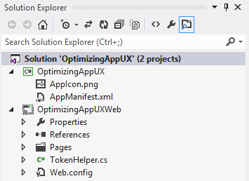
If you are new to apps for SharePoint 2013, you will notice the solution contains two projects. The first project is the actual SharePoint app, which will contain nothing but xml manifests/elements to define the contents of the app. The second project is a web application to host all the markup and code for the app. When debugging Autohosted apps, SharePoint will direct app requests to this web application running on localhost in IIS Express. If you deploy the app, it will be provisioned inside Azure.
Solution Explorer of a New App for SharePoint 2013 Project
Creating an App with Full-Screen Display
By default, new SharePoint 2013 app projects already include a page to handle the launch experience, which is always a full page. This page can be found in the web application project under Pages\Default.aspx. The new project could immediately be deployed, but let's go a little deeper by adding some addition information and the Chrome Control:
Step 1 – The Manifest: Locate the AppManifest.xml in the SharePoint app project and open it. Visual Studio provides a great AppManifest editor that launches by default. Locate the Start page field...this tells SharePoint what the default page is for the app. The Start page should already point to Default.aspx and have a special {StandardTokens} parameter in the Query string field. SharePoint will use this to pass contextual information to the app's default page (ex: Site URL, Language, etc.). Update the Query string field with additional parameters for SPHostTitle={HostTitle}, SPHostLogo={HostLogoUrl}, and DisplayType=FullScreen as seen below:
Step 2 – The Chrome Placeholder: Open the Default.aspx markup page and add a div placeholder for the SharePoint Client Chrome Control. This should be the first element in the body/form of the html page as seen below:
<body> <form id="form1" runat="server"> <!-- Chrome control placeholder --> <div id="divSPChrome"></div> |
Step 3 – The Script: Script to load the SharePoint Client Chrome Control can be added directly to the page. However, I created a script file so I could re-leverage the script on multiple pages. I also wanted the script to leverage my custom DisplayType URL parameter for reuse across full-screen and iframe page displays. The script has three basic components:
- Document loaded event to check the DisplayType and initialize the appropriate script (/_layouts/15/SP.UI.Controls.js in the case of full-screen pages):
$(document).ready( function () { //Get the DisplayType from url parameters var displayType = decodeURIComponent(getQueryStringParameter('DisplayType')); //Get the URI decoded SharePoint site url from the SPHostUrl parameter. var spHostUrl = decodeURIComponent(getQueryStringParameter('SPHostUrl')); //Build absolute path to the layouts root with the spHostUrl var layoutsRoot = spHostUrl + '/_layouts/15/'; //Execute the correct script based on the displayType if (displayType == 'FullScreen') { //Load the SP.UI.Controls.js file to render the App Chrome $.getScript(layoutsRoot + 'SP.UI.Controls.js', renderSPChrome); } else if (displayType == 'iframe') { //Create a Link element for the defaultcss.ashx resource var linkElement = document.createElement('link'); linkElement.setAttribute('rel', 'stylesheet'); linkElement.setAttribute('href', layoutsRoot + 'defaultcss.ashx'); //Add the linkElement as a child to the head section of the html var headElement = document.getElementsByTagName('head'); headElement[0].appendChild(linkElement); } });
- Callback function for loading the chrome after the appropriate scripts have loaded:
function renderSPChrome() { //Get the host site logo url from the SPHostLogoUrl parameter var hostlogourl = decodeURIComponent(getQueryStringParameter('SPHostLogoUrl')); //Set the chrome options for launching Help, Account, and Contact pages var options = { 'appIconUrl': hostlogourl, 'appTitle': document.title, 'appHelpPageUrl': 'Help.html?' + document.URL.split('?')[1], 'settingsLinks': [ { 'linkUrl': 'Account.html?' + document.URL.split('?')[1], 'displayName': 'Account settings' }, { 'linkUrl': 'Contact.html?' + document.URL.split('?')[1], 'displayName': 'Contact us' } ] }; //Load the Chrome Control in the divSPChrome element of the page var chromeNavigation = new SP.UI.Controls.Navigation('divSPChrome', options); chromeNavigation.setVisible(true);}
- A utility function to pull named parameters from the URL:
function getQueryStringParameter(urlParameterKey) { var params = document.URL.split('?')[1].split('&'); var strParams = ''; for (var i = 0; i < params.length; i = i + 1) { var singleParam = params[i].split('='); if (singleParam[0] == urlParameterKey) return singleParam[1]; }}
After referencing the custom UX script, Microsoft AJAX, and jQuery, the head of the markup page should look like similar to the following:
<head runat="server"> <title>My Full-Screen Page</title> <script type="text/javascript" src="../Script/MicrosoftAjax.js"></script> <script type="text/javascript" src="../Script/jquery-1.7.2.min.js"></script> <script type="text/javascript" src="../Script/UXScript.js"></script></head> |
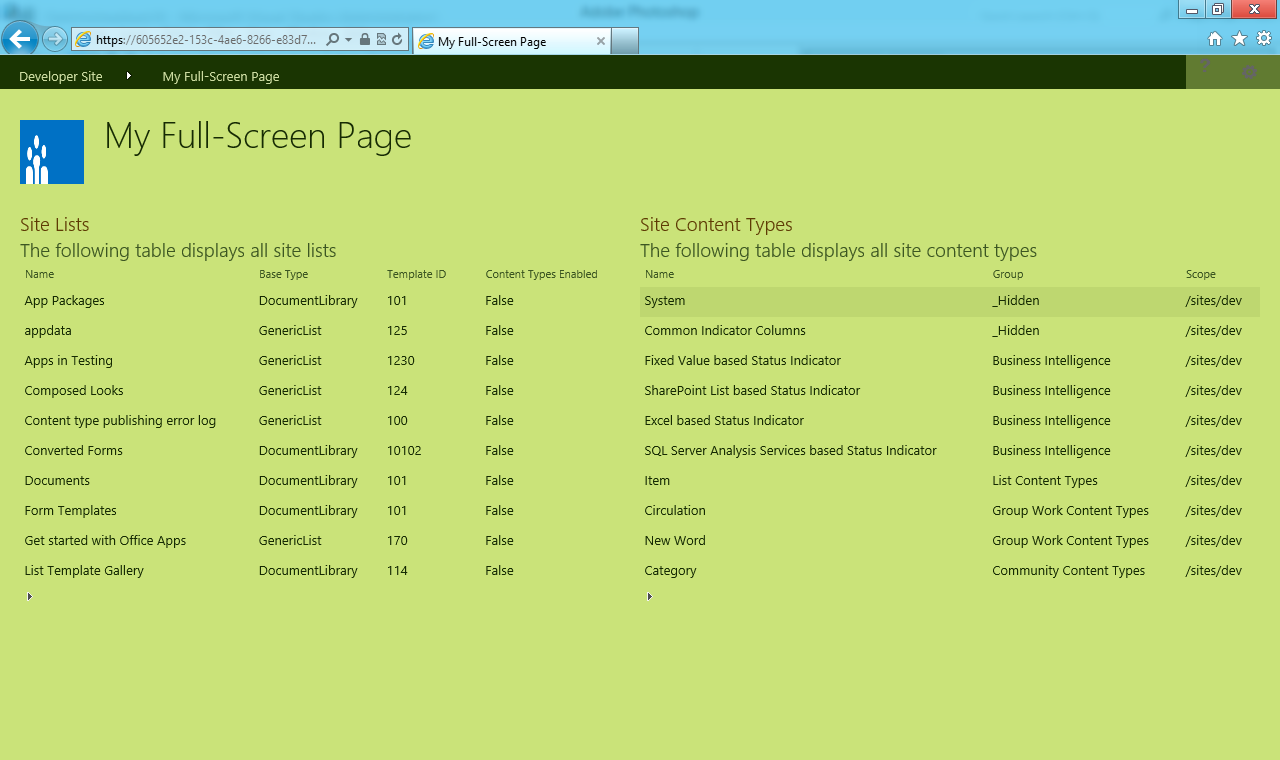
Step 4 – Testing: I added text and controls to my page referencing known CSS classes from SharePoint (ex: ms-accentText, ms-listviewtable, etc.). I then deployed and tested my full-screen app page in three scenarios…with the custom chrome script removed, with the chrome script and the default composed look, and the chrome script with several alternate composed looks. Here are the results:
Chrome Control with Default Composed Look

Chrome Control with "Sea Monster" Composed Look

Chrome Control with "Nature" Composed Look

Creating an App with App Part Page Display
Step 1 – Adding the App Part: Right-click the SharePoint app project and Add > New Item to bring up the new item dialog. Select Client Web Part (Host Web) from the list, name it, and click the Add button:
You should notice that the new client web part added an Elements.xml file to the project but no markup or code. Remember, the SharePoint app project will contain nothing but xml manifests/elements to define the contents of the app. All markup and code will live in the web application project that is deployed to the web server (Azure in the case of our Autohosted app).
Step 2 – The Element.xml: Open the client web part’s Elements.xml file. This file contains the app part’s configuration for the markup page to render, the default size, and any custom web part properties. I added a Property for useSiteStyles so I can toggle the SharePoint style resource on and off inside my app part. Next, set the Content Src to the appropriate page from the web application project and including the contextual URL parameters for the useSiteTypes property, {StandardTokens}, and DisplayType=iframe as seen below:
<?xml version="1.0" encoding="utf-8"?><Elements xmlns="https://schemas.microsoft.com/sharepoint/"> <ClientWebPart Name="MyClientWebPart" Title="My Client WebPart" Description="Basic Client WebPart with property to optionally consume styles from the parent SharePoint site" DefaultWidth="500" DefaultHeight="400"> <Content Type="html" Src="~remoteAppUrl/Pages/MyClientWebPartPage.aspx?useSiteStyles=_useSiteStyles_&{StandardTokens}&DisplayType=iframe" /> <Properties> <Property Name="useSiteStyles" Type="boolean" RequiresDesignerPermission="true" DefaultValue="true" WebCategory="App Settings" WebDisplayName="Import Site Styles"> </Property> </Properties> </ClientWebPart></Elements> |
Step 3 – The Script: If you looked carefully at the full-screen script, you may have noticed a check for DisplayType of “iframe”. That’s right; the script for importing SharePoint style resources is already in place to support app parts and SharePoint dialogs:
…else if (displayType == 'iframe') { //Create a Link element for the defaultcss.ashx resource var linkElement = document.createElement('link'); linkElement.setAttribute('rel', 'stylesheet'); linkElement.setAttribute('href', layoutsRoot + 'defaultcss.ashx'); //Add the linkElement as a child to the head section of the html var headElement = document.getElementsByTagName('head'); headElement[0].appendChild(linkElement);}… |
However, our app part will conditionally use this script based on the useSiteStyles web part property value. I decided to implement this server-side using the RegisterClientScriptInclude method in my page loaded event:
//get the useSiteStyles property and register the UXScript.js if the property is truebool useSiteStyles = Convert.ToBoolean(Page.Request["useSiteStyles"]);if (useSiteStyles) { Page.ClientScript.RegisterClientScriptInclude(typeof(MyClientWebPartPage), "MyClientWebPartPageScript", "../Script/UXScript.js");} |
Step 4 – Testing: Like the full-screen app page, I added text and controls to my app part page referencing known CSS classes from SharePoint (ex: ms-accentText, ms-listviewtable, etc.). Next, I created a two column wiki page and placed my app part in each column side-by-side. The left app part had useSiteStyles set to false and the right app part had this property set to true for a nice side-by-side comparison. Finally, I tested the app parts in three scenarios…without paging on the GridView, with paging on the GridView, and with several alternate composed looks. Here are the results:
App Parts without GridView Paging

App Parts with GridView Paging

App Parts with "Sea Monster" Composed Look

App Parts with "Nature" Composed Look

**One thing I learned developing this post is that IE now supports transparent windowed elements such as iframes...even cross-domain. I was startled to see the site's background images showing through the app parts. To do this, I explicitly set the background-color of the app part pages to transparent. Older and non-IE browsers may not have the same results (I tested IE and Chrome and both rendered transparent). The picture above illustrates the look without a transparent body on the app part pages and what I would expect in older browsers.
Creating an App with SharePoint Dialog Page Display
App pages can also be launched inside of the SharePoint dialog framework using custom actions. From a UX perspective, the SharePoint dialog is implemented almost identically to an app part. Both should typically be displayed with SharePoint styles, but without the chrome control. Functionally, pages launched in the SharePoint dialog tend to differ from app parts in the contextual information passed to the page (ex: selected list or items), how the page is launched (ribbon button, contextual menu, etc.), and how it displays on the screen (in the dialog instead of an element on a SharePoint page). Here are the steps to deliver a page in the SharePoint dialog:
Step 1 – Adding the Custom Action: Right-click the SharePoint app project and Add > New Item to bring up the new item dialog. Select Custom Action (Host Web) from the list, name it, and click the Add button:
You should notice that the new custom action added an Elements.xml file to the project but no markup or code. Remember, the SharePoint app project will contain nothing but xml manifests/elements to define the contents of the app. All markup and code will live in the web application project that is deployed to the web server (Azure in the case of our Autohosted app).
Step 2 – The Element.xml: Open the custom action's Elements.xml file. This xml is very similar to traditional SharePoint custom actions, but takes advantage of special app URL parameters and has properties for launching the page in the SharePoint dialog (HostWebDialog, HostWebDialogWidth, HostWebDialogHeight). Also notice my use of DisplayType=iframe so I can reuse my chrome/style script. If you are new to custom actions, the following adds a "Launch Page" button to the "Manage" group of the "Files" tab in a Document Library:
<?xml version="1.0" encoding="utf-8"?><Elements xmlns="https://schemas.microsoft.com/sharepoint/"> <CustomAction Id="LaunchDialogAction" RegistrationId="101" RegistrationType="List" Location="CommandUI.Ribbon" Title="Launch Dialog" HostWebDialog="true" HostWebDialogHeight="420" HostWebDialogWidth="510"> <CommandUIExtension> <CommandUIDefinitions> <CommandUIDefinition Location="Ribbon.Documents.Manage.Controls._children"> <Button Id="Ribbon.Library.Settings.PropertyViewer" Alt="Launch Dialog" Sequence="40" Command="Invoke_LaunchDialog" LabelText="Launch Dialog" TemplateAlias="o1" Image32by32="_layouts/15/images/placeholder32x32.png" Image16by16="_layouts/15/images/placeholder16x16.png"/> </CommandUIDefinition> </CommandUIDefinitions> <CommandUIHandlers> <CommandUIHandler Command="Invoke_LaunchDialog" CommandAction="~remoteAppUrl/Pages/MyDialogPage.aspx?useSiteStyles=true&{StandardTokens}&DisplayType=iframe&HostUrl={HostUrl}&Source={Source}&ListURLDir={ListUrlDir}&SelectedListID={SelectedListId}&SelectedItemID={SelectedItemId}"/> </CommandUIHandlers> </CommandUIExtension> </CustomAction></Elements> |
Step 3 – The Script: Identical to app parts...just make sure you include the script on the app page.
Step 4 – Testing: As mention above, the custom action adds in this solution adds a button to the "Files" tab for Document Libraries. The app page it launches will display all the selected files in the Document Library. This is a little different from other parts of the app, in that the app needs read permissions to list(s) in the site. The pictures below illustrate this permission setting in the AppManifest, the app permission screen in SharePoint where the app is trusted to read a specific list, and the launched app page in the SharePoint dialog (with consistent styling):
Permissions Settings in AppManifest
App Page Displayed in SharePoint Dialog

postMessage Resizing
As mentioned earlier, the final release of SharePoint 2013 will support app part page resizing through postMessage client-side communication. In this model, the parent page and iframe page can communicate to each other, provided they are listening for messages. SharePoint 2013 will listen for resize messages from app part pages and adjust the height and width of the app part based on the size specified in the message. The MSDN documentation for this will not work in the SharePoint 2013 Preview, but will be available in the final SharePoint 2013 release. Since postMessage is a relatively new to most developers, I have provided a code sample that illustrates this communication in a simple web application (outside of SharePoint). When SharePoint 2013 is released, look for an update or new post outlining postMessage resizing in SharePoint. You can download the postMessage solution here: postMessage.zip.
Conclusion
The UX Challenge with apps for SharePoint 2013 will exist. App developers need to be aware of SharePoint style classes and the methods discussed in this article for achieving the best UX. Consider the MSDN documentation on UX design for apps in SharePoint 2013 as the definitive source for UX design decisions. With these resources and good design planning an app developer can achieve excellent results for almost any tenant!
You can download my sample project here: OptimizingAppUX.zip
Hope this help!
Comments
Anonymous
October 07, 2012
Nicely explained.Anonymous
May 26, 2013
The comment has been removedAnonymous
July 23, 2013
Great read! Thanks! MaxAnonymous
September 16, 2013
The comment has been removedAnonymous
September 16, 2013
The comment has been removedAnonymous
September 16, 2013
The comment has been removedAnonymous
May 20, 2014
The comment has been removedAnonymous
June 26, 2014
Creating an App with App Part Page Display Where the scripts goes for checking display type in provider hosted appAnonymous
November 18, 2014
Thanks Very good article.. Helps me a lot to display app in model..Anonymous
June 25, 2015
The comment has been removedAnonymous
August 15, 2015
Great Article. Well explained.


