UX Research Tools and Techniques
Hi, let us introduce ourselves. I’m Tim Weber (UX Researcher) and I’m Tricia Fejfar (UX Research Manager) in the Office Design Group (ODG). As Shawn indicated in his “Designing with Customers in Mind” post, ODG includes UX Researchers who work to understand user needs and to integrate user feedback into our software design process. We want to tell you a little bit about some of our research for Office 2010 and how it’s made the overall experience better for users like you.
Tell me again, what is UX Research?
UX research is complementary to other types of research that Microsoft does, including market research and product planning research. While there is overlap among these different types of research, you could think of UX research as providing information to help create the Office experiences you have in Excel, Word, SharePoint, PowerPoint, Visio, Project, etc. As UX Researchers, we answer questions such as:
- How well do the scenarios we’re building map to customer needs and expectations?
- In choosing a feature set to work on, what will be most useful for Office users?
- In designing an experience, what is the best design, and what tweaks do we need to make to help our users be more productive?
Throughout the product cycle, UX researchers answer these (and many more) questions. Basically, we get to do the fun stuff of interacting with our customers and see obvious impact in our product from the customer feedback we collect.
When most people think of UX research, they think of Usability studies or as we call them – Lab Studies. While we do conduct lab studies there are many other methods we use to collect data from users around the globe. Some examples are cognitive walk-throughs, multi-user remote studies, eye tracking, field studies, workshops, focus groups, and surveys.
So, how do we decide which research method to use?
It really depends on the research questions that we have and how much time we have to answer the question. For example, in a typical lab study we are working closely with the UX Designers in our group and Program Managers from the product teams to iterate on feature designs. We bring people from outside of Microsoft into a small room (a.k.a., the lab) that contains a desk and a PC so they can work with our software. Inside the lab, there are some cameras and a piece of one-way glass so the researcher, the designers, PMs, testers and developers can all monitor whether or not the software being studied is meeting the needs of the user. We conduct these lab studies in order to find problems that affect the usability of our software and we typically do a few thousand hours of these studies for each release of Office.
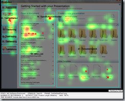
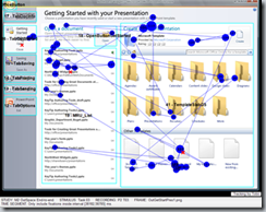
One of our favorite pieces of equipment to use in the lab is the eye tracker. The eye tracker allows us to see what people are looking at while they are using our software. This is incredibly useful when building new UI like the Ribbon and the Backstage because the mouse pointer doesn’t always tell an accurate story about where people are looking on the screen. Below is an example of output (a heat map on the left and gaze plot on the right) from one of our eye tracking studies conducted on the Backstage view using an early prototype.
The heat map on the left tells us where people spent most of their time looking for something. The longer someone looks at a specific location, or the more times someone’s gaze returns to a specific location, the hotter the color on the heat map. The gaze plot on the right tells us the path the eyes followed to get to a particular location.
The study participants’ goal was to open a recently used file. To complete the task successfully, a participant needed to open a specific file – the third in the Most Recently Used (MRU) list shown in the middle pane (of the 3 panes displayed on the screen). All participants were successful on this task. What we learned from the pictures above, however, was that while people eventually located the correct file, they spent a lot of time searching through the templates section in the right pane before going to the MRU.
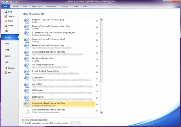
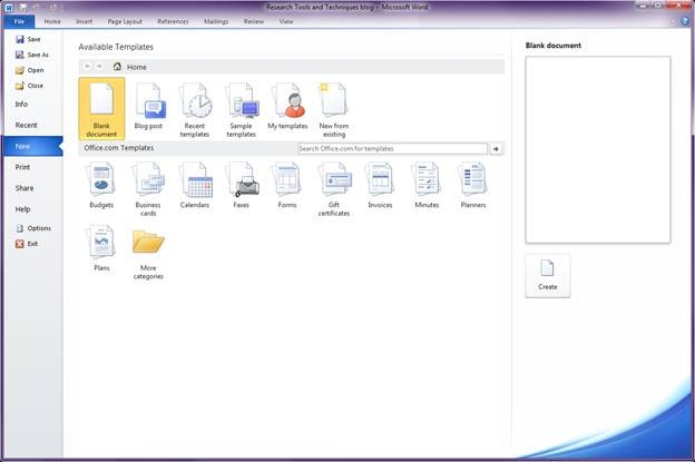
This finding made us reconsider our design and we decided to split the MRU and templates sections into separate places with their own tabs in the left navigation pane. The screens below show what these places look like today (Recent and New):
Eye Tracking, however, is only one of many research tools used by the Office Design Group to help prepare our software for your use. Another way we gather research broadly is through our Send-a-Smile feedback. You may have read an earlier blog on Send-a-Smile (SaS). If not, we encourage you to take a look so you can start using it today!
We really do take your feedback seriously. Our researchers spend hours and hours a week to deeply analyze SaS user experience comments, look for trends, and triangulate with other data. For example, SaS comments sent in during the Technical Preview led to several changes in Outlook:
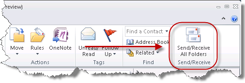
- In the Technical Preview, the Send/Receive button was located in the QAT (below top image), and on the Send/Receive tab, but based on SaS feedback that indicated it was difficult to find, it has been moved to the Ribbon (below bottom image) when connected to an IMAP or POP account. (Note: The Send/Receive button is not on the Home Tab when connected to an Exchange account because Exchange servers push new mail to Outlook as it is received, so the Send/Receive button does not impact when e-mail is delivered in Exchange environments.)
Send/Receive button in the Technical Preview |
Send/Receive button in the upcoming Beta |
- In the Technical Preview, the title of a private appointment is not shown in the To Do bar. Instead, subject lines are shown simply as Private Appointment (below left). The option to hide the title of private appointments was added to Office 14 because it was a common feature request, but when the feedback from the Technical Preview started rolling in it turned out that a larger percentage of people actually wanted to see the subject of their private appointments, so the change was made for the Beta release (below right) to change the option to default to off (you can turn it back on by going to the View Tab, then clicking To-Do Bar, then Options).
How Private Appointments looked in the Technical Preview |
How Private Appointments look in the upcoming Beta |
- An updated feature in Outlook that has generated a lot of buzz is the Conversation arrangement. In the Technical Preview, double clicking on some types of conversations opened a message in the Reading Pane, but did not open the message in a separate window. An overwhelming amount of feedback from users, however, indicated that double-clicking a conversation should always open a message in a separate window. Based on that feedback, this is the new behavior in the upcoming Office 14 Beta release.
Did we mention our work is global?
Besides having researchers based in the US and in some of our Remote Development Centers, we also have the technology to do virtual multi-user remote studies. This technology was developed by members of our group. We call this setup our Virtual Research Lab (VRL for short), which allows up to 100 remote participants to simultaneously log into our servers and run through specific tasks on our software. We are able to recruit people from across the U.S. and internationally to participate in our studies from the comfort of their home, office, or anywhere they have access to the internet. With this technology, we can gather data from more users in a shorter period of time and we’re also able to expand our participant population. All of this is good for Microsoft and you the end user.
Another technique that we’ve used a lot more in this product cycle to get more early validation is what we call “kitchens”. Kitchens are weeklong events where small teams of people from multiple companies around the globe come to our Microsoft campus to “play” around with working builds of our software. For these events we typically invite people from the IT or Developer community and ask them to build their real-world solutions on top of our early working code. Participants in the kitchens get access to an advanced preview of our new release of Office and are able to provide in depth feedback during a concentrated effort. Also, participants and our engineering team (including Developers, Testers, Program Managers, UX Researchers and Designers, Product Planning and User Assistance) get lots of face-to-face time with each other to better understand concerns and answer questions. These Kitchens are held several times throughout the product release cycle and are valuable to us because they allow us to address user feedback early and fix missing gaps before we release more broadly during the Beta timeframe.
What’s next?
As we mentioned earlier, these are just some of the research tools and techniques we use throughout the Office development cycle to better understand user needs. We hope you enjoyed reading about them. We couldn’t do any of it without great people like you! Look for one of our upcoming posts on Design Tools and Techniques used in ODG. We look forward to hearing what you think! Thanks for reading.
Comments
Anonymous
January 01, 2003
you mention the conversation view. i think you need to ask the user if they want this to be the default when they upgrade from a previous version. i don't want conversation view. never use it. so i don't want mine converted automatically, without notice, when i upgrade to 2010.Anonymous
January 01, 2003
Will it be possible to put Send/Receive back up in the QAT in Outlook 2010? I find it's a convenient and easy place for it to be.Anonymous
October 29, 2009
Very insightful. Thanks for posting this!Anonymous
October 30, 2009
@gkeramidas I actually do like the conversation view in 2007 but it does have some problems; Visual noise the hard lines between conversations - which is pretty distracting to scan down a list with large numbers of one off emails. The lack of date separation – the date dividers in the date view really help quickly place emails in time and they just aren’t available in conversation view. Personally I’d rely on the drop arrow to signify a grouped conversation (perhaps with a colour hint or make the arrow bigger with better use of the space around it).Anonymous
October 30, 2009
The comment has been removedAnonymous
October 31, 2009
Nice use of the eye tracker to see where people are looking at on the screen. The fact that a user interface (UI) can be designed so that commonly used features can be placed in easier to find positions based on the tracking data is interesting. It shows that the UI layout is important, however that makes me wonder how much the color and contrast of a software package can affect how much we like it. Certainly the new Office button menu in Office 2010 is very different to that of Office 2007, I don’t have a problem with the menu layout but the color contrast can be very different to the main application. Do your test subjects / users find it slightly unpleasant switching from reading dark text on a light background to reading light text on a dark background? Does the dilation of their pupils change? I don’t know the answers to these questions but certainly the new Office 2010 Menu does encourage this switching. In the Office 2010 test build I am using 14.0.4006.100, there is no way to change the color scheme. Although there are placeholders for “Color Scheme 2(Post Beta)” and “Color Scheme 3(Post Beta)”, so hopefully the color schemes available in the final release will give users some more choice. I do like the send a smile/frown feedback agents, although the inability to capture pictures of some context menus does limit them somewhat.Anonymous
November 01, 2009
The ribbon is a classic example of how scientific techniques that you mention and the "feedback" gathered from the customer feedback program regarding usage can go terribly wrong....and how even companies like MS who usually get the UI right but the product wrong can get the wrong UI A quick look at the ribbon and we know it was designed for a) the Visually Challenged - arbitrarily buttons had to become larger - The paste button is 3.5 larger than the earlier versions - which the same functionality and same icon. There does not seem to any logic as to why the Paste button is larger than the copy button... b) The mentally challenged - The buttons had to be spelled out. Even button that are have in excel for over 15 years like Copy, Paste Format Painter etc had to be spelled out.. Is there any reason why on the Page Layout tab (in Excel) we have a group called Arrange for Manipulating shapes!!!...This group is there on the contextual tab as well ...so why have it in the Page Layout tab... Some suggestions for the File Tab Why make it cryptic why have an "Open" button, lets call it as "Open a Closed file", Why call it close...lets call it "Close a Open file" That way it will occupy more screen space....Anonymous
November 13, 2009
Hey Team! I love that the ET is in the current design cycle! :)Anonymous
December 10, 2009
Thanks for sharing this powerful information.That's very helpful and interesting.Anonymous
December 10, 2009
By auto-updating, you put huge pressure on software developers to ensure their apps work long after the browser has been upgraded, and at the same time, you hinder IE's progress, because you always have to cater to old applications that can't handle new features, or updates to the specs that break old IE behavior!
