Use the Power of Excel Pivot Tables to analyze attacks and session distribution
Usually we’re using tools like Network Monitor, various text file parser, Procmon, Windbg… to solve ISA/TMG cases every day in and out in Microsoft Customer Service & Support. Sometimes we also use Excel to be able to filter the exported Firewall or Web Proxy Logs our customers send to us, e.g. only display traffic for a specific Client IP or for a specific rule.
Some time ago I realized that there’s another quite powerful feature of Excel, which I didn’t connect with analyzing network traffic before, but more with things like management analysis or accountancy: Excel Pivot Tables!
In this blog I want to describe how Pivot tables can be quite handy for analyzing TMG Logs if you want to identify specific patterns or things like netstat if you want to get an overview about who’s talking with your server.
Scenario 1 – Is the load* in my TMG Web Farm distributed well? (*based on number of requests)
You’re using TMG Web Farm publishing. In your web farm you have 9 Web Server, publishing one SSL site. 2 Server currently drained for maintenance.
The Web Server Internal IP addresses are 10.1.1.1-10.1.1.9.
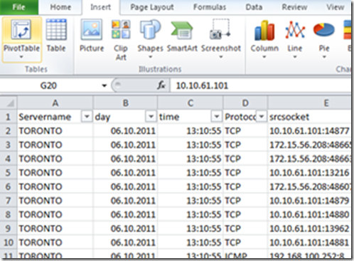
We have an export of a Firewall Log which might look similar to this (the header descriptions had been modified):
[…thousands* of rows to follow…]
*check Excel specifications and limits for details how many rows Excel allows in one Worksheet, you might need to split files for large logs
First Steps creating a Pivot Table
In order to find how many connections had been handled by each of your published web server, you could just use the Sort & Filter Option in Excel, and just filter each server and count rows, or you create a new Pivot Table.
Insert -> PivotTable
This will automatically select a coherent section in the Worksheet:
And will create the PivotTable in a new Worksheet.
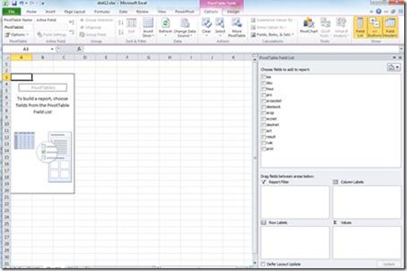
In Excel 2010 you’ll find the blank Pivot Table in the Worksheet in the left and on the right you’ll see the PivotTable Field List, which is you main tool to modify the Pivot Table:
For the case you don’t see the Field List, make sure, that the Field List Button is selected in the upper right.
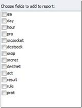
In the Field List you can see a list of fields which can be used for the Pivot Table. This list of fields represents all columns for your worksheet:
Your “Pivot Tools” can be found in the lower right:
Report Filter: You can add columns here to filter the data sources
Row Labels: Labels for the rows you want to summarize.
Values: Used to calculate the results summarized in the rows
Column Labels: If you want to have multiple columns per row, these can be used
Let’s pivot 
In our scenario we have a fair number of columns and lots of data to analyze. Remember, in this scenario, we want to know how many requests had been handled by each internal server in our farm. If we look at the fields we can use to generate the PivotTable the most interesting one is the “destsock”, which contains the destination IP+Port of the connection.
Let’s use this field in the Row Labels area.
This will generate a list like this, showing all sockets which had been logged:
You can now filter the destsock, to only display the sockets we’re interested in. In this case these are 10.1.1.1:443 to 10.1.1.9:443
In order to filter the list, just move your cursor to the list of fields we can add over the destsock:
And click on the little arrow, this will pop up the Excel Search&Filter list:
In the search field I now enter 10.1.1. and select the sockets of interest. This will give me a list like this:
Now if you want to know how many times this socket had been logged, you can move one of the fields to the Values area, e.g. Server name:
You’ll immediately get an updated Pivot Table, with a list of how many times each socket had been logged and how many times the filtered sockets had been logged in total:
With very few steps this already provides a quite good overview about the connection distribution for each Web server. You can also identify the two drained server very easy. They both are logged 172 times in this example.
If you wonder which they are logged at all, you can simply double click the 172 in the pivot column “Count of Servername”, and a new Worksheet will open with a filtered view for these lines:
We have no information about the User Agent in this log, but based on the time you can see, that the requests are logged exactly every 30 sec, which is the default behavior for connectivity verifier.
Based on this Filtered view, you can also see that every connection (almost) always contains 2 actions, “Establish” and “Terminate”. If you’re only interested in the number of Established connections, you need to go back to the Pivot Table and move “Action” to the Report Filter:
This will move Action to the Top of the Pivot Table, just select the drop down array again, and Filter for “Established”:
Based on this list, you can clearly say, that the balancing seems to work quite good… all with the help of Excel and a few mouse-clicks ;-)
Scenario 2 - Who is connecting to / attacking my server ?
In Scenario 1, we already found if the connections to the web server are balanced equally, among each server. With a few additional mouse-clicks you can analyze who is actually causing the load on your server, based on the client IP, using mostly the same steps we did before. Unfortunately we didn’t log the original client IP in this set of log, with this information you could just move the original client IP to the Rows Area to see which client connected to which server.
As we don’t have the information, we cannot determine which client connected to which backend server, but we can still analyze which clients connected to the published web site, as we know the socket on which we configured the TMG Web Listener. In this case it’s the 192.168.100.101:443.
To get a nice Table, which shows number of Established connections to this socket, the fields will look like this:
You can filter “Action” to show only Established connections and “destsock” to show only connections to socket 192.168.100.101:443 and you’ll get a table like this:
You can sort the list to get the “Top Talker” to the Top of the list, by right-clicking the “Count of Action” column and choose Sort -> Largest to smallest:
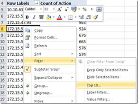
If you want to see only the Top10 “Talkers”, just right-click the Row Label column and choose Filter -> Top10
If you want to “Pimp” your results, you can either use the Excel “Conditional Formatting”, to highlight the results:
Or create a PivotChart (PivotTable Tools -> PivotChart -> Pie):
This can help you to understand who caused the most connections to your farm. In case of an attack I would double check the 10.10.63.247 in this scenario, and eventually create a rule to block this traffic J
Scenario 3 –Using Excel Pivot Tables to identify an ongoing flood attack
In a scenario, where you don’t have any exported logs yet, e.g. when you’re just experiencing an attack on the TMG or on a Webserver, you might need to use different types of data to analyze the source of an attack.
One tool I find quite handy for these situations is NETSTAT. The Netstat output provides an immediate view on the connections the server is currently handling.
In order to receive better results I would always suggest to use Netstat in combination with the –n switch, to avoid name resolution for addresses, which can take a while when you have thousands of connections to your server and the –ao switch, to display all sockets and the PID of the process, which is handling the socket.
In order to have everything in a file a sample command would look like this: netstat –ano > netstat.txt
Next step is to import the text file into Excel. As Excel will most like put all the data into one column you need to use Data -> Text-To-Columns, to generate one column for each type of information.
In the Wizard select the Space as separator and “Treat consecutive delimiters as one”:
In this case you might also want to delimit the Sockets, in order to be able to better filter on the source IP of the potential attacker. You can do this by just selecting the column with the socket and run Text-To-Column again, using the “:” as delimiter this time.
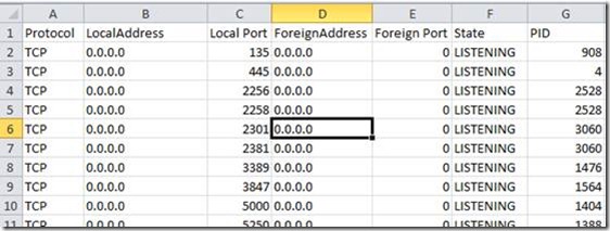
In the end the worksheet might look similar to this one:
Now you can create a new Pivot Table. Use the Foreign Address in the Row Labels again, and a column of your choice in the Values, and you can see which IP has the most connections to your server:
Please make sure to verify the IP addresses before configuring any sort of deny rule in your firewall. You don’t want to block the NAT IP if you most valuable customer J
Hope that helps!
P.S: There might also be other ways to analyze these scenarios, fell free to let me know about your favorite tools in the comments ![]()
Author
Philipp Sand
Microsoft CSS Forefront Security Edge Team
Technical Reviewer
Eric Detoc
Microsoft CSS Forefront Security Edge Team
Comments
- Anonymous
October 11, 2011
Nice article. The pivot charts are the best friend for it managers to understand what's going on.

