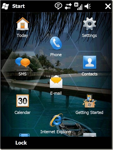
Windows Mobile 6.5
There is plenty to like in the Windows Mobile 6.5 but one of the things that really appeals to me is incredibly simple: In order to make the touch screen easier to use, especially for people with stubby fingers like me, the icons are arranged in a honeycomb pattern. This means that there is more space between the icons and therefore it’s less likely you’ll press the wrong one.
What appeals to me about this is that it’s one of those really simple ideas once you’ve seen it, but must have taken a leap of lateral thinking to do it.
The obvious thing with touch screens – and what everyone else does – is just to ape the arrangement you had before touch screens came along ie a grid of icons. But that is not as effective as this honeycomb arrangement for touch. I love seeing thinking of this kind - not just transferring what used to work on an old format to a new format, but thinking about what the new format means and re-thinking the accepted wisdom.
Comments
Anonymous
February 16, 2009
PingBack from http://www.clickandsolve.com/?p=9446Anonymous
February 17, 2009
I think that this honeycomb arrangement for touch is awesome. But it can contain less quick lunch icons in compare with grid one. Better say you should scroll more to access other icons.Anonymous
February 19, 2009
Hmm however if I had the choice between more icons but I kept pressing the wrong one because they're too close, and less icons that you hit right first time every time but you have to scroll for some of them....I know what I'd choose :-)Anonymous
February 23, 2009
Ah the honeycomb, one of natures finest patterns. Perhaps, one day, when we get pineapple shaped screens, we could use the fibonacci sequence to define the icon layout...Anonymous
February 23, 2009
:-) I'm not sure this concept was chosen for the beauty of its pattern. Kind of more about making it easier to use which just might be slightly more important....Anonymous
March 01, 2009
That is so much better than the old Windows Mobile interface. I've not used any of the newer WM devices, but perhaps its about time I revisted them.
