Project Management with Excel: Your first Gantt chart
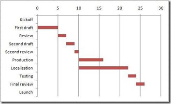
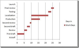
Once you've built a basic schedule, you can greatly improve its usefulness by adding a Gantt chart. This is basically just a bar chart that visually displays your project schedule tasks and the dependencies between them:
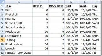
Excel 2007 doesn't have full Gantt chart capability out of the box, but there is an easy way to simulate a Gantt chart. Let's start with the schedule we built in yesterday’s post. The first thing we need to do is add a column to our schedule that we'll call Days In, which represents the number of days into the project that each task begins:
To calculate Days In, use this formula in B2: =(NETWORKDAYS(D2,D2,Holidays))-1 and then increment the second "D2" for each row (for example, B3 is =(NETWORKDAYS(D2,D3,Holidays))-1 and B4 is =(NETWORKDAYS(D2,D4,Holidays))-1 ) . You can't simply fill down for this without having to correct the formulas to match the desired pattern. But once you get it set up, it will automatically adjust your chart if you need to modify the Work Days or Start date values anywhere in your schedule.
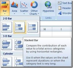
When you are done creating your Days In column, select the values in the first three columns including the header row but omitting the Project Summary row. On the Insert tab, look under Charts and click Bar and under 2-D Bar, select Stacked Bar:
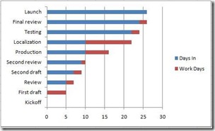
Your chart initially should look something like this:
Believe it or not, it's actually very close to done. You just need to make a few adjustments.
First, make sure your chart is selected and go to the Format tab. At the upper left is a dropdown box that says Chart Area:
Click it, select Series "Days In" and then click the Format Selection button directly below the box. You'll open a popup box called Format Data Series. Click to the Fill section, select No fill and click Close. There, now it's looking like a Gantt chart:
Only one thing is wrong - it's backwards! No worries. Simply select the chart again, go back to the Chart Area box, and select Vertical (Category) Axis. Click the Format Selection button again and, under Axis Options, check the Categories in reverse order check box and click Close. Voila!
Now select and delete the Legend to the right of your chart and you're done!
Suzanne
Comments
Anonymous
July 13, 2010
Thanks for this great rundown of how to build a gantt chart, v helpful. Just discovered how MS project can be useful in all types of places, have a look at Luke Skywalkers project plan... http://bit.ly/9n5UplAnonymous
November 18, 2010
I found a gantt chart for excel that saved me days of coding. Found www.chartgantt.com really brilliantly simple.Anonymous
January 19, 2013
I like the "charting" capabilities built-in to Excel but I prefer to create a much more visually appealing Gantt... I put together a free template that includes a Gantt chart based on project activities... users that are interested may download this template for free at www.mlynn.org/.../excel-project-planning-spreadsheet-updated-version-3 Enjoy!
