Excelling at Excel - Getting started with PivotTables: fields and areas
Last week, we overcame one of the main obstacles to understanding and getting good value out of Excel PivotTables: optimizing your data. With that done, let's look at the fields required to make a useful PivotTable.
If you followed along with my example, you should have an empty PivotTable with all of your fields available. Click inside this box if you don't see your fields:
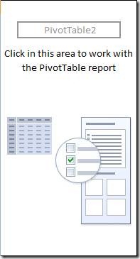
This brings up the key to PivotTable creation in Excel 2007: the PivotTable Field List.
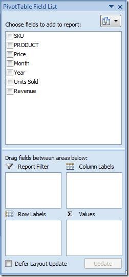
If this box disappears, just click anywhere in your PivotTable to bring it back up.
There are four areas to understand if you want to generate meaningful reports and analysis. You'll drag and drop your fields into these areas to get the results you require:
Row Labels: This is where you'll want to start. Drag in the fields you want to appear in the rows along the left side of your table. Order matters, so stack these in the hierarchy that makes sense for your data. For my example report, I want an annual report with monthly breakdowns for each product which means Year, then Product, then Month:

If you don't get the results you're looking for, drag and drop the fields up and down in the Row Labels box until you find the structure that works best for you. The great thing here is how quickly and easily you can manipulate the fields to generate a useful view of your data.
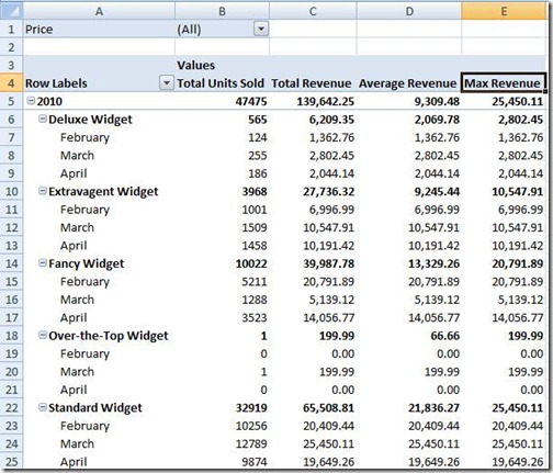
Values: Here is where you can add up all of your data (or perform other useful tricks). For my example, I dragged the Units Sold and Revenue fields here to generate sum totals in the report. I also created averages and the highest value ("max") for each section so I can quickly see how things are trending and what performed best.

When you drag fields to Values, they should default to what you need - but if for some reason they don't (say, you get a Count instead of a Sum) or you want to include additional functions (as I did for Average and Max above), just click the little arrow and select Value Field Settings to change it to Sum, Count, Average, Max, Min, or one of several other options. You also can edit the display name for your column headings here.
Column Labels: This can be used to add additional fields along the columns, but Excel auto-generates the Values field when you build your Values.
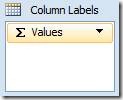
If you remove Values from the Column Labels area, your data will disappear - so let's leave this one alone for now.
Report Filter: This is where the magic happens. Say you wanted to see how price affects sales. Drag Price to the Report Filter field to generate a filter at the top of the report.
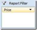
You won't see any changes to your report right away, but click the (All) dropdown to select the price point(s) you want to isolate. Experiment with different filters to dig deep into your data and extract useful insights.
Here is the report I generated using these techniques:
Here's the fun part. In addition to adjusting my Price filter at the top, I can quickly collapse the months by removing Month from Row Labels. Or move Products to the top of Row Labels to shift the report's focus. Or filter on Month to zoom in on a particular month or set of months (say, the last quarter) for that executive presentation I'm doing.
Now that you have a firm grasp of PivotTables, how will you use them? The possibilities are endless - but the important thing is that you can use them to extract a deeper understanding of what the numbers mean to make better business decisions.
Suzanne
