Xamarin.Forms Material Visual
Material Design is an opinionated design system created by Google, that prescribes the size, color, spacing, and other aspects of how views and layouts should look and behave.
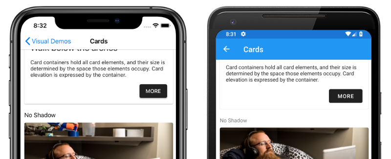
Xamarin.Forms Material Visual can be used to apply Material Design rules to Xamarin.Forms applications, creating applications that look largely identical on iOS and Android. When Material Visual is enabled, supported views adopt the same design cross-platform, creating a unified look and feel.
The process for enabling Xamarin.Forms Material Visual in your application is:
- Add the Xamarin.Forms.Visual.Material NuGet package to your iOS and Android platform projects. This NuGet package delivers optimized Material Design renderers on iOS and Android. On iOS, the package provides the transitive dependency to Xamarin.iOS.MaterialComponents, which is a C# binding to Google's Material Components for iOS. On Android, the package provides build targets to ensure that your TargetFramework is correctly set up.
- Initialize Material Visual in each platform project. For more information, see Initialize Material Visual.
- Create Material Visual controls by setting the
Visualproperty toMaterialon any pages that should adopt the Material Design rules. For more information, see Consume Material renderers. - [optional] Customize Material controls. For more information, see Customize Material controls.
Important
On Android, Material Visual requires a minimum version of 5.0 (API 21) or greater, and a TargetFramework of version 9.0 (API 28). In addition, your platform project requires Android support libraries 28.0.0 or greater, and its theme needs to inherit from a Material Components theme or continue to inherit from an AppCompat theme. For more information, see Getting started with Material Components for Android.
Material Visual currently supports the following controls:
ActivityIndicatorButtonCheckBoxDatePickerEditorEntryFramePickerProgressBarSliderStepperTimePicker
Material controls are realized by Material renderers, which apply the Material Design rules. Functionally, Material renderers are no different to the default renderers. For more information, see Customize Material Visual.
Initialize Material Visual
After installing the Xamarin.Forms.Visual.Material NuGet package, the Material renderers must be initialized in each platform project.
On iOS, this should occur in AppDelegate.cs by invoking the Xamarin.Forms.FormsMaterial.Init method after the Xamarin.Forms.Forms.Init method:
global::Xamarin.Forms.Forms.Init();
global::Xamarin.Forms.FormsMaterial.Init();
On Android, this should occur in MainActivity.cs by invoking the Xamarin.Forms.FormsMaterial.Init method after the Xamarin.Forms.Forms.Init method:
global::Xamarin.Forms.Forms.Init(this, savedInstanceState);
global::Xamarin.Forms.FormsMaterial.Init(this, savedInstanceState);
Apply Material Visual
Applications can enable Material Visual by setting the VisualElement.Visual property on a page, layout, or view, to Material:
<ContentPage Visual="Material"
             ...>
    ...
</ContentPage>
The equivalent C# code is:
ContentPage contentPage = new ContentPage();
contentPage.Visual = VisualMarker.Material;
Setting the VisualElement.Visual property to Material directs your application to use the Material Visual renderers instead of the default renderers. The Visual property can be set to any type that implements IVisual, with the VisualMarker class providing the following IVisual properties:
Default– indicates that the view should render using the default renderer.MatchParent– indicates that the view should use the same renderer as its direct parent.Material– indicates that the view should render using a Material renderer.
Important
The Visual property is defined in the VisualElement class, with views inheriting the Visual property value from their parents. Therefore, setting the Visual property on a ContentPage ensures that any supported views in the page will use that Visual. In addition, the Visual property can be overridden on a view.
The following screenshots show a user interface rendered using the default renderers:
The following screenshots show the same user interface rendered using the Material renderers:
The main visible differences between the default renderers and Material renderers, shown here, are that the Material renderers capitalize Button text, and round the corners of Frame borders. However, Material renderers use native controls, and therefore there may still be user interface differences between platforms for areas such as fonts, shadows, colors, and elevation.
Note
Material Design components adhere closely to Google's guidelines. As a result, Material Design renderers are biased towards that sizing and behavior. When you require greater control of styles or behavior, you can still create your own Effect, Behavior, or Custom Renderer to achieve the detail you require.
Customize Material Visual
The Material Visual NuGet package is a collection of renderers that realize the Xamarin.Forms controls. Customizing Material Visual controls is identical to customizing default controls.
Effects are the recommended technique when the goal is to customize an existing control. If a Material Visual renderer exists, it is less work to customize the control with an effect than it is to subclass the renderer. For more information about effects see Xamarin.Forms effects.
Custom renderers are the recommended technique when a Material renderer does not exist. The following renderer classes are included with Material Visual:
MaterialButtonRendererMaterialCheckBoxRendererMaterialEntryRendererMaterialFrameRendererMaterialProgressBarRendererMaterialDatePickerRendererMaterialTimePickerRendererMaterialPickerRendererMaterialActivityIndicatorRendererMaterialEditorRendererMaterialSliderRendererMaterialStepperRenderer
Subclassing a Material renderer is almost identical to non-Material renderers. However, when exporting a renderer that subclasses a Material renderer, you must provide a third argument to the ExportRenderer attribute that specifies the VisualMarker.MaterialVisual type:
using Xamarin.Forms.Material.Android;

[assembly: ExportRenderer(typeof(ProgressBar), typeof(CustomMaterialProgressBarRenderer), new[] { typeof(VisualMarker.MaterialVisual) })]
namespace MyApp.Android
{
    public class CustomMaterialProgressBarRenderer : MaterialProgressBarRenderer
    {
        //...
    }
}
In this example, the ExportRendererAttribute specifies that the CustomMaterialProgressBarRenderer class will be used to render the ProgressBar view, with the IVisual type registered as the third argument.
Note
A renderer that specifies an IVisual type, as part of its ExportRendererAttribute, will be used to render opted in views, rather than the default renderer. At renderer selection time, the Visual property of the view is inspected and included in the renderer selection process.
For more information about custom renderers, see Custom Renderers.


