Xamarin.Forms Slider
Use a Slider for selecting from a range of continuous values.
The Xamarin.Forms Slider is a horizontal bar that can be manipulated by the user to select a double value from a continuous range.
The Slider defines three properties of type double:
Minimumis the minimum of the range, with a default value of 0.Maximumis the maximum of the range, with a default value of 1.Valueis the slider's value, which can range betweenMinimumandMaximumand has a default value of 0.
All three properties are backed by BindableProperty objects. The Value property has a default binding mode of BindingMode.TwoWay, which means that it's suitable as a binding source in an application that uses the Model-View-ViewModel (MVVM) architecture.
Warning
Internally, the Slider ensures that Minimum is less than Maximum. If Minimum or Maximum are ever set so that Minimum is not less than Maximum, an exception is raised. See the Precautions section below for more information on setting the Minimum and Maximum properties.
The Slider coerces the Value property so that it is between Minimum and Maximum, inclusive. If the Minimum property is set to a value greater than the Value property, the Slider sets the Value property to Minimum. Similarly, if Maximum is set to a value less than Value, then Slider sets the Value property to Maximum.
Slider defines a ValueChanged event that is fired when the Value changes, either through user manipulation of the Slider or when the program sets the Value property directly. A ValueChanged event is also fired when the Value property is coerced as described in the previous paragraph.
The ValueChangedEventArgs object that accompanies the ValueChanged event has two properties, both of type double: OldValue and NewValue. At the time the event is fired, the value of NewValue is the same as the Value property of the Slider object.
Slider also defines DragStarted and DragCompleted events, that are fired at the beginning and end of the drag action. Unlike the ValueChanged event, the DragStarted and DragCompleted events are only fired through user manipulation of the Slider. When the DragStarted event fires, the DragStartedCommand, of type ICommand, is executed. Similarly, when the DragCompleted event fires, the DragCompletedCommand, of type ICommand, is executed.
Warning
Do not use unconstrained horizontal layout options of Center, Start, or End with Slider. On both Android and the UWP, the Slider collapses to a bar of zero length, and on iOS, the bar is very short. Keep the default HorizontalOptions setting of Fill, and don't use a width of Auto when putting Slider in a Grid layout.
The Slider also defines several properties that affect its appearance:
MinimumTrackColoris the bar color on the left side of the thumb.MaximumTrackColoris the bar color on the right side of the thumb.ThumbColoris the thumb color.ThumbImageSourceis the image to use for the thumb, of typeImageSource.
Note
The ThumbColor and ThumbImageSource properties are mutually exclusive. If both properties are set, the ThumbImageSource property will take precedence.
Basic Slider code and markup
The sample begins with three pages that are functionally identical, but are implemented in different ways. The first page uses only C# code, the second uses XAML with an event handler in code, and the third is able to avoid the event handler by using data binding in the XAML file.
Creating a Slider in code
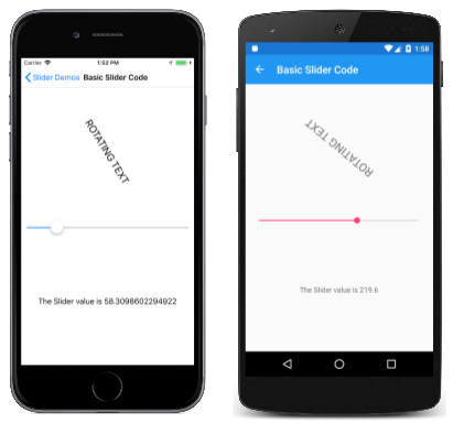
The Basic Slider Code page shows show to create a Slider and two Label objects in code:
public class BasicSliderCodePage : ContentPage
{
    public BasicSliderCodePage()
    {
        Label rotationLabel = new Label
        {
            Text = "ROTATING TEXT",
            FontSize = Device.GetNamedSize(NamedSize.Large, typeof(Label)),
            HorizontalOptions = LayoutOptions.Center,
            VerticalOptions = LayoutOptions.CenterAndExpand
        };

        Label displayLabel = new Label
        {
            Text = "(uninitialized)",
            HorizontalOptions = LayoutOptions.Center,
            VerticalOptions = LayoutOptions.CenterAndExpand
        };

        Slider slider = new Slider
        {
            Maximum = 360
        };
        slider.ValueChanged += (sender, args) =>
        {
            rotationLabel.Rotation = slider.Value;
            displayLabel.Text = String.Format("The Slider value is {0}", args.NewValue);
        };

        Title = "Basic Slider Code";
        Padding = new Thickness(10, 0);
        Content = new StackLayout
        {
            Children =
            {
                rotationLabel,
                slider,
                displayLabel
            }
        };
    }
}
The Slider is initialized to have a Maximum property of 360. The ValueChanged handler of the Slider uses the Value property of the slider object to set the Rotation property of the first Label and uses the String.Format method with the NewValue property of the event arguments to set the Text property of the second Label. These two approaches to obtain the current value of the Slider are interchangeable.
Here's the program running on iOS and Android devices:
The second Label displays the text "(uninitialized)" until the Slider is manipulated, which causes the first ValueChanged event to be fired. Notice that the number of decimal places that are displayed is different for each platform. These differences are related to the platform implementations of the Slider and are discussed later in this article in the section Platform implementation differences.
Creating a Slider in XAML
The Basic Slider XAML page is functionally the same as Basic Slider Code but implemented mostly in XAML:
<ContentPage xmlns="http://xamarin.com/schemas/2014/forms"
             xmlns:x="http://schemas.microsoft.com/winfx/2009/xaml"
             x:Class="SliderDemos.BasicSliderXamlPage"
             Title="Basic Slider XAML"
             Padding="10, 0">
    <StackLayout>
        <Label x:Name="rotatingLabel"
               Text="ROTATING TEXT"
               FontSize="Large"
               HorizontalOptions="Center"
               VerticalOptions="CenterAndExpand" />

        <Slider Maximum="360"
                ValueChanged="OnSliderValueChanged" />

        <Label x:Name="displayLabel"
               Text="(uninitialized)"
               HorizontalOptions="Center"
               VerticalOptions="CenterAndExpand" />
    </StackLayout>
</ContentPage>
The code-behind file contains the handler for the ValueChanged event:
public partial class BasicSliderXamlPage : ContentPage
{
    public BasicSliderXamlPage()
    {
        InitializeComponent();
    }

    void OnSliderValueChanged(object sender, ValueChangedEventArgs args)
    {
        double value = args.NewValue;
        rotatingLabel.Rotation = value;
        displayLabel.Text = String.Format("The Slider value is {0}", value);
    }
}
It's also possible for the event handler to obtain the Slider that is firing the event through the sender argument. The Value property contains the current value:
double value = ((Slider)sender).Value;
If the Slider object were given a name in the XAML file with an x:Name attribute (for example, "slider"), then the event handler could reference that object directly:
double value = slider.Value;
Data binding the Slider
The Basic Slider Bindings page shows how to write a nearly equivalent program that eliminates the Value event handler by using Data Binding:
<ContentPage xmlns="http://xamarin.com/schemas/2014/forms"
             xmlns:x="http://schemas.microsoft.com/winfx/2009/xaml"
             x:Class="SliderDemos.BasicSliderBindingsPage"
             Title="Basic Slider Bindings"
             Padding="10, 0">
    <StackLayout>
        <Label Text="ROTATING TEXT"
               Rotation="{Binding Source={x:Reference slider},
                                  Path=Value}"
               FontSize="Large"
               HorizontalOptions="Center"
               VerticalOptions="CenterAndExpand" />

        <Slider x:Name="slider"
                Maximum="360" />

        <Label x:Name="displayLabel"
               Text="{Binding Source={x:Reference slider},
                              Path=Value,
                              StringFormat='The Slider value is {0:F0}'}"
               HorizontalOptions="Center"
               VerticalOptions="CenterAndExpand" />
    </StackLayout>
</ContentPage>
The Rotation property of the first Label is bound to the Value property of the Slider, as is the Text property of the second Label with a StringFormat specification. The Basic Slider Bindings page functions a little differently from the two previous pages: When the page first appears, the second Label displays the text string with the value. This is a benefit of using data binding. To display text without data binding, you'd need to specifically initialize the Text property of the Label or simulate a firing of the ValueChanged event by calling the event handler from the class constructor.
Precautions
The value of the Minimum property must always be less than the value of the Maximum property. The following code snippet causes the Slider to raise an exception:
// Throws an exception!
Slider slider = new Slider
{
    Minimum = 10,
    Maximum = 20
};
The C# compiler generates code that sets these two properties in sequence, and when the Minimum property is set to 10, it is greater than the default Maximum value of 1. You can avoid the exception in this case by setting the Maximum property first:
Slider slider = new Slider
{
    Maximum = 20,
    Minimum = 10
};
Setting Maximum to 20 is not a problem because it is greater than the default Minimum value of 0. When Minimum is set, the value is less than the Maximum value of 20.
The same problem exists in XAML. Set the properties in an order that ensures that Maximum is always greater than Minimum:
<Slider Maximum="20"
        Minimum="10" ... />
You can set the Minimum and Maximum values to negative numbers, but only in an order where Minimum is always less than Maximum:
<Slider Minimum="-20"
        Maximum="-10" ... />
The Value property is always greater than or equal to the Minimum value and less than or equal to Maximum. If Value is set to a value outside that range, the value will be coerced to lie within the range, but no exception is raised. For example, this code will not raise an exception:
Slider slider = new Slider
{
    Value = 10
};
Instead, the Value property is coerced to the Maximum value of 1.
Here's a code snippet shown above:
Slider slider = new Slider
{
    Maximum = 20,
    Minimum = 10
};
When Minimum is set to 10, then Value is also set to 10.
If a ValueChanged event handler has been attached at the time that the Value property is coerced to something other than its default value of 0, then a ValueChanged event is fired. Here's a snippet of XAML:
<Slider ValueChanged="OnSliderValueChanged"
        Maximum="20"
        Minimum="10" />
When Minimum is set to 10, Value is also set to 10, and the ValueChanged event is fired. This might occur before the rest of the page has been constructed, and the handler might attempt to reference other elements on the page that have not yet been created. You might want to add some code to the ValueChanged handler that checks for null values of other elements on the page. Or, you can set the ValueChanged event handler after the Slider values have been initialized.
Platform implementation differences
The screenshots shown earlier display the value of the Slider with a different number of decimal points. This relates to how the Slider is implemented on the Android and UWP platforms.
The Android implementation
The Android implementation of Slider is based on the Android SeekBar and always sets the Max property to 1000. This means that the Slider on Android has only 1,001 discrete values. If you set the Slider to have a Minimum of 0 and a Maximum of 5000, then as the Slider is manipulated, the Value property has values of 0, 5, 10, 15, and so forth.
The UWP implementation
The UWP implementation of Slider is based on the UWP Slider control. The StepFrequency property of the UWP Slider is set to the difference of the Maximum and Minimum properties divided by 10, but not greater than 1.
For example, for the default range of 0 to 1, the StepFrequency property is set to 0.1. As the Slider is manipulated, the Value property is restricted to 0, 0.1, 0.2, 0.3, 0.4, 0.5, 0.6, 0.7, 0.8, 0.9, and 1.0. When the difference between the Maximum and Minimum properties is 10 or greater, then StepFrequency is set to 1, and the Value property has integral values.
The StepSlider solution
A more versatile StepSlider is discussed in Chapter 27. Custom renderers of the book Creating Mobile Apps with Xamarin.Forms. The StepSlider is similar to Slider but adds a Steps property to specify the number of values between Minimum and Maximum.
Sliders for color selection
The final two pages in the sample both use three Slider instances for color selection. The first page handles all the interactions in the code-behind file, while the second page shows how to use data binding with a ViewModel.
Handling Sliders in the code-behind file
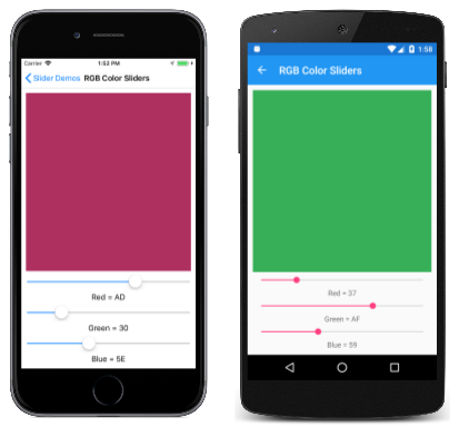
The RGB Color Sliders page instantiates a BoxView to display a color, three Slider instances to select the red, green, and blue components of the color, and three Label elements for displaying those color values:
<ContentPage xmlns="http://xamarin.com/schemas/2014/forms"
             xmlns:x="http://schemas.microsoft.com/winfx/2009/xaml"
             x:Class="SliderDemos.RgbColorSlidersPage"
             Title="RGB Color Sliders">
    <ContentPage.Resources>
        <ResourceDictionary>
            <Style TargetType="Slider">
                <Setter Property="Maximum" Value="255" />
            </Style>

            <Style TargetType="Label">
                <Setter Property="HorizontalTextAlignment" Value="Center" />
            </Style>
        </ResourceDictionary>
    </ContentPage.Resources>

    <StackLayout Margin="10">
        <BoxView x:Name="boxView"
                 Color="Black"
                 VerticalOptions="FillAndExpand" />

        <Slider x:Name="redSlider"
                ValueChanged="OnSliderValueChanged" />

        <Label x:Name="redLabel" />

        <Slider x:Name="greenSlider"
                ValueChanged="OnSliderValueChanged" />

        <Label x:Name="greenLabel" />

        <Slider x:Name="blueSlider"
                ValueChanged="OnSliderValueChanged" />

        <Label x:Name="blueLabel" />
    </StackLayout>
</ContentPage>
A Style gives all three Slider elements a range of 0 to 255. The Slider elements share the same ValueChanged handler, which is implemented in the code-behind file:
public partial class RgbColorSlidersPage : ContentPage
{
    public RgbColorSlidersPage()
    {
        InitializeComponent();
    }

    void OnSliderValueChanged(object sender, ValueChangedEventArgs args)
    {
        if (sender == redSlider)
        {
            redLabel.Text = String.Format("Red = {0:X2}", (int)args.NewValue);
        }
        else if (sender == greenSlider)
        {
            greenLabel.Text = String.Format("Green = {0:X2}", (int)args.NewValue);
        }
        else if (sender == blueSlider)
        {
            blueLabel.Text = String.Format("Blue = {0:X2}", (int)args.NewValue);
        }

        boxView.Color = Color.FromRgb((int)redSlider.Value,
                                      (int)greenSlider.Value,
                                      (int)blueSlider.Value);
    }
}
The first section sets the Text property of one of the Label instances to a short text string indicating the value of the Slider in hexadecimal. Then, all three Slider instances are accessed to create a Color value from the RGB components:
Binding the Slider to a ViewModel
The HSL Color Sliders page shows how to use a ViewModel to perform the calculations used to create a Color value from hue, saturation, and luminosity values. Like all ViewModels, the HSLColorViewModel class implements the INotifyPropertyChanged interface, and fires a PropertyChanged event whenever one of the properties changes:
public class HslColorViewModel : INotifyPropertyChanged
{
    Color color;

    public event PropertyChangedEventHandler PropertyChanged;

    public double Hue
    {
        set
        {
            if (color.Hue != value)
            {
                Color = Color.FromHsla(value, color.Saturation, color.Luminosity);
            }
        }
        get
        {
            return color.Hue;
        }
    }

    public double Saturation
    {
        set
        {
            if (color.Saturation != value)
            {
                Color = Color.FromHsla(color.Hue, value, color.Luminosity);
            }
        }
        get
        {
            return color.Saturation;
        }
    }

    public double Luminosity
    {
        set
        {
            if (color.Luminosity != value)
            {
                Color = Color.FromHsla(color.Hue, color.Saturation, value);
            }
        }
        get
        {
            return color.Luminosity;
        }
    }

    public Color Color
    {
        set
        {
            if (color != value)
            {
                color = value;
                PropertyChanged?.Invoke(this, new PropertyChangedEventArgs("Hue"));
                PropertyChanged?.Invoke(this, new PropertyChangedEventArgs("Saturation"));
                PropertyChanged?.Invoke(this, new PropertyChangedEventArgs("Luminosity"));
                PropertyChanged?.Invoke(this, new PropertyChangedEventArgs("Color"));
            }
        }
        get
        {
            return color;
        }
    }
}
ViewModels and the INotifyPropertyChanged interface are discussed in the article Data Binding.
The HslColorSlidersPage.xaml file instantiates the HslColorViewModel and sets it to the page's BindingContext property. This allows all the elements in the XAML file to bind to properties in the ViewModel:
<ContentPage xmlns="http://xamarin.com/schemas/2014/forms"
             xmlns:x="http://schemas.microsoft.com/winfx/2009/xaml"
             xmlns:local="clr-namespace:SliderDemos"
             x:Class="SliderDemos.HslColorSlidersPage"
             Title="HSL Color Sliders">

    <ContentPage.BindingContext>
        <local:HslColorViewModel Color="Chocolate" />
    </ContentPage.BindingContext>

    <ContentPage.Resources>
        <ResourceDictionary>
            <Style TargetType="Label">
                <Setter Property="HorizontalTextAlignment" Value="Center" />
            </Style>
        </ResourceDictionary>
    </ContentPage.Resources>

    <StackLayout Margin="10">
        <BoxView Color="{Binding Color}"
                 VerticalOptions="FillAndExpand" />

        <Slider Value="{Binding Hue}" />
        <Label Text="{Binding Hue, StringFormat='Hue = {0:F2}'}" />

        <Slider Value="{Binding Saturation}" />
        <Label Text="{Binding Saturation, StringFormat='Saturation = {0:F2}'}" />

        <Slider Value="{Binding Luminosity}" />
        <Label Text="{Binding Luminosity, StringFormat='Luminosity = {0:F2}'}" />
    </StackLayout>
</ContentPage>
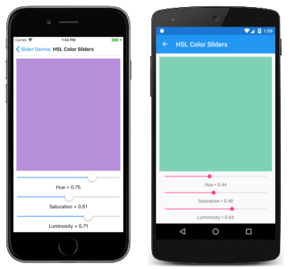
As the Slider elements are manipulated, the BoxView and Label elements are updated from the ViewModel:
The StringFormat component of the Binding markup extension is set for a format of "F2" to display two decimal places. (String formatting in data bindings is discussed in the article String Formatting.) However, the UWP version of the program is limited to values of 0, 0.1, 0.2, ... 0.9, and 1.0. This is a direct result of the implementation of the UWP Slider as described above in the section Platform implementation differences.


