Xamarin.Forms MenuItem
The Xamarin.Forms MenuItem class defines menu items for menus such as ListView item context menus and Shell application flyout menus.
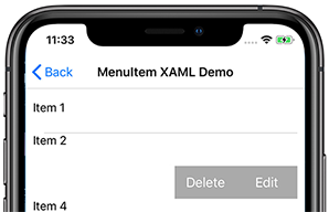
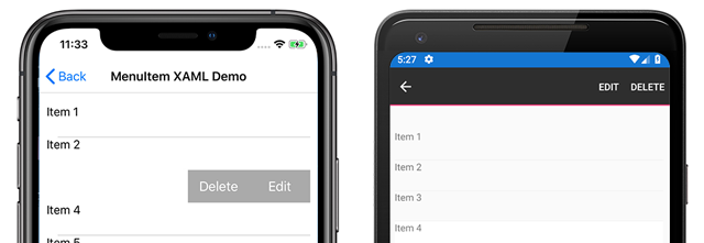
The following screenshots show MenuItem objects in a ListView context menu on iOS and Android:
The MenuItem class defines the following properties:
Commandis anICommandthat allows binding user actions, such as finger taps or clicks, to commands defined on a viewmodel.CommandParameteris anobjectthat specifies the parameter that should be passed to theCommand.IconImageSourceis anImageSourcevalue that defines the display icon.IsDestructiveis aboolvalue that indicates whether theMenuItemremoves its associated UI element from the list.IsEnabledis aboolvalue that indicates whether this object responds to user input.Textis astringvalue that specifies the display text.
These properties are backed by BindableProperty objects so the MenuItem instance can be the target of data bindings.
Create a MenuItem
MenuItem objects can be used within a context menu on a ListView object's items. The most common pattern is to create MenuItem objects within a ViewCell instance, which is used as the DataTemplate object for the ListViews ItemTemplate. When the ListView object is populated it will create each item using the DataTemplate, exposing the MenuItem choices when the context menu is activated for an item.
The following example shows MenuItem instantiation within the context of a ListView object:
<ListView>
    <ListView.ItemTemplate>
        <DataTemplate>
            <ViewCell>
                <ViewCell.ContextActions>
                    <MenuItem Text="Context Menu Option" />
                </ViewCell.ContextActions>
                <Label Text="{Binding .}" />
            </ViewCell>
        </DataTemplate>
    </ListView.ItemTemplate>
</ListView>
A MenuItem can also be created in code:
// A function returns a ViewCell instance that
// is used as the template for each list item
DataTemplate dataTemplate = new DataTemplate(() =>
{
    // A Label displays the list item text
    Label label = new Label();
    label.SetBinding(Label.TextProperty, ".");

    // A ViewCell serves as the DataTemplate
    ViewCell viewCell = new ViewCell
    {
        View = label
    };

    // Add a MenuItem instance to the ContextActions
    MenuItem menuItem = new MenuItem
    {
        Text = "Context Menu Option"
    };
    viewCell.ContextActions.Add(menuItem);

    // The function returns the custom ViewCell
    // to the DataTemplate constructor
    return viewCell;
});

// Finally, the dataTemplate is provided to
// the ListView object
ListView listView = new ListView
{
    ...
    ItemTemplate = dataTemplate
};
Define MenuItem behavior with events
The MenuItem class exposes a Clicked event. An event handler can be attached to this event to react to taps or clicks on the MenuItem instance in XAML:
<MenuItem ...
          Clicked="OnItemClicked" />
An event handler can also be attached in code:
MenuItem item = new MenuItem { ... }
item.Clicked += OnItemClicked;
Previous examples referenced an OnItemClicked event handler. The following code shows an example implementation:
void OnItemClicked(object sender, EventArgs e)
{
    // The sender is the menuItem
    MenuItem menuItem = sender as MenuItem;

    // Access the list item through the BindingContext
    var contextItem = menuItem.BindingContext;

    // Do something with the contextItem here
}
Define MenuItem behavior with MVVM
The MenuItem class supports the Model-View-ViewModel (MVVM) pattern through BindableProperty objects and the ICommand interface. The following XAML shows MenuItem instances bound to commands defined on a viewmodel:
<ContentPage.BindingContext>
    <viewmodels:ListPageViewModel />
</ContentPage.BindingContext>

<StackLayout>
    <Label Text="{Binding Message}" ... />
    <ListView ItemsSource="{Binding Items}">
        <ListView.ItemTemplate>
            <DataTemplate>
                <ViewCell>
                    <ViewCell.ContextActions>
                        <MenuItem Text="Edit"
                                    IconImageSource="icon.png"
                                    Command="{Binding Source={x:Reference contentPage}, Path=BindingContext.EditCommand}"
                                    CommandParameter="{Binding .}"/>
                        <MenuItem Text="Delete"
                                    Command="{Binding Source={x:Reference contentPage}, Path=BindingContext.DeleteCommand}"
                                    CommandParameter="{Binding .}"/>
                    </ViewCell.ContextActions>
                    <Label Text="{Binding .}" />
                </ViewCell>
            </DataTemplate>
        </ListView.ItemTemplate>
    </ListView>
</StackLayout>
In the previous example, two MenuItem objects are defined with their Command and CommandParameter properties bound to commands on the viewmodel. The viewmodel contains the commands referenced in the XAML:
public class ListPageViewModel : INotifyPropertyChanged
{
    ...

    public ICommand EditCommand => new Command<string>((string item) =>
    {
        Message = $"Edit command was called on: {item}";
    });

    public ICommand DeleteCommand => new Command<string>((string item) =>
    {
        Message = $"Delete command was called on: {item}";
    });
}
The sample application includes a DataService class used to get a list of items for populating the ListView objects. A viewmodel is instantiated, with items from the DataService class, and set as the BindingContext in the code-behind:
public MenuItemXamlMvvmPage()
{
    InitializeComponent();
    BindingContext = new ListPageViewModel(DataService.GetListItems());
}
MenuItem icons
Warning
MenuItem objects only display icons on Android. On other platforms, only the text specified by the Text property will be displayed.
Icons are specified using the IconImageSource property. If an icon is specified, the text specified by the Text property will not be displayed. The following screenshot shows a MenuItem with an icon on Android:
![]()
For more information on using images in Xamarin.Forms, see Images in Xamarin.Forms.
Enable or disable a MenuItem at runtime
To enable of disable a MenuItem at runtime, bind its Command property to an ICommand implementation, and ensure that a canExecute delegate enables and disables the ICommand as appropriate.
Important
Do not bind the IsEnabled property to another property when using the Command property to enable or disable the MenuItem.
The following example shows a MenuItem whose Command property binds to an ICommand named MyCommand:
<MenuItem Text="My menu item"
          Command="{Binding MyCommand}" />
The ICommand implementation requires a canExecute delegate that returns the value of a bool property to enable and disable the MenuItem:
public class MyViewModel : INotifyPropertyChanged
{
    bool isMenuItemEnabled = false;
    public bool IsMenuItemEnabled
    {
        get { return isMenuItemEnabled; }
        set
        {
            isMenuItemEnabled = value;
            MyCommand.ChangeCanExecute();
        }
    }

    public Command MyCommand { get; private set; }

    public MyViewModel()
    {
        MyCommand = new Command(() =>
        {
            // Execute logic here
        },
        () => IsMenuItemEnabled);
    }
}
In this example, the MenuItem is disabled until the IsMenuItemEnabled property is set. When this occurs, the Command.ChangeCanExecute method is called which causes the canExecute delegate for MyCommand to be re-evaluated.
Cross-platform context menu behavior
Context menus are accessed and displayed differently on each platform.
On Android, the context menu is activated by long-press on a list item. The context menu replaces the title and navigation bar area and MenuItem options are displayed as horizontal buttons.
![]()
On iOS, the context menu is activated by swiping on a list item. The context menu is displayed on the list item and MenuItems are displayed as horizontal buttons.

On UWP, the context menu is activated by right-clicking on a list item. The context menu is displayed near the cursor as a vertical list.

