The Xamarin.Forms FlexLayout
Use FlexLayout for stacking or wrapping a collection of child views.
The Xamarin.Forms FlexLayout is new in Xamarin.Forms version 3.0. It is based on the CSS Flexible Box Layout Module, commonly known as flex layout or flex-box, so called because it includes many flexible options to arrange children within the layout.
FlexLayout is similar to the Xamarin.Forms StackLayout in that it can arrange its children horizontally and vertically in a stack. However, the FlexLayout is also capable of wrapping its children if there are too many to fit in a single row or column, and also has many options for orientation, alignment, and adapting to various screen sizes.
FlexLayout derives from Layout<View> and inherits a Children property of type IList<View>.
FlexLayout defines six public bindable properties and five attached bindable properties that affect the size, orientation, and alignment of its child elements. (If you're not familiar with attached bindable properties, see the article Attached properties.) These properties are described in detail in the sections below on The bindable properties in detail and The attached bindable properties in detail. However, this article begins with a section on some Common usage scenarios of FlexLayout that describes many of these properties more informally. Towards the end of the article, you'll see how to combine FlexLayout with CSS style sheets.
Common usage scenarios
The sample program contains several pages that demonstrate some common uses of FlexLayout and allows you to experiment with its properties.
Using FlexLayout for a simple stack
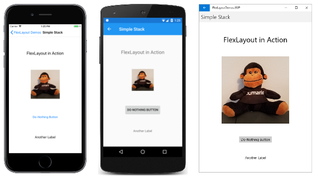
The Simple Stack page shows how FlexLayout can substitute for a StackLayout but with simpler markup. Everything in this sample is defined in the XAML page. The FlexLayout contains four children:
<ContentPage xmlns="http://xamarin.com/schemas/2014/forms"
             xmlns:x="http://schemas.microsoft.com/winfx/2009/xaml"
             xmlns:local="clr-namespace:FlexLayoutDemos"
             x:Class="FlexLayoutDemos.SimpleStackPage"
             Title="Simple Stack">

    <FlexLayout Direction="Column"
                AlignItems="Center"
                JustifyContent="SpaceEvenly">

        <Label Text="FlexLayout in Action"
               FontSize="Large" />

        <Image Source="{local:ImageResource FlexLayoutDemos.Images.SeatedMonkey.jpg}" />

        <Button Text="Do-Nothing Button" />

        <Label Text="Another Label" />
    </FlexLayout>
</ContentPage>
Here's that page running on iOS, Android, and the Universal Windows Platform:
Three properties of FlexLayout are shown in the SimpleStackPage.xaml file:
The
Directionproperty is set to a value of theFlexDirectionenumeration. The default isRow. Setting the property toColumncauses the children of theFlexLayoutto be arranged in a single column of items.When items in a
FlexLayoutare arranged in a column, theFlexLayoutis said to have a vertical main axis and a horizontal cross axis.The
AlignItemsproperty is of typeFlexAlignItemsand specifies how items are aligned on the cross axis. TheCenteroption causes each item to be horizontally centered.If you were using a
StackLayoutrather than aFlexLayoutfor this task, you would center all the items by assigning theHorizontalOptionsproperty of each item toCenter. TheHorizontalOptionsproperty doesn't work for children of aFlexLayout, but the singleAlignItemsproperty accomplishes the same goal. If you need to, you can use theAlignSelfattached bindable property to override theAlignItemsproperty for individual items:<Label Text="FlexLayout in Action" FontSize="Large" FlexLayout.AlignSelf="Start" />With that change, this one
Labelis positioned at the left edge of theFlexLayoutwhen the reading order is left-to-right.The
JustifyContentproperty is of typeFlexJustify, and specifies how items are arranged on the main axis. TheSpaceEvenlyoption allocates all leftover vertical space equally between all the items, and above the first item, and below the last item.If you were using a
StackLayout, you would need to assign theVerticalOptionsproperty of each item toCenterAndExpandto achieve a similar effect. But theCenterAndExpandoption would allocate twice as much space between each item than before the first item and after the last item. You can mimic theCenterAndExpandoption ofVerticalOptionsby setting theJustifyContentproperty ofFlexLayouttoSpaceAround.
These FlexLayout properties are discussed in more detail in the section The bindable properties in detail below.
Using FlexLayout for wrapping items
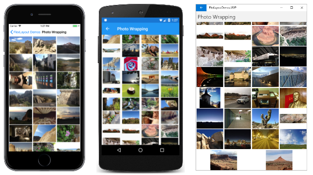
The Photo Wrapping page of the sample demonstrates how FlexLayout can wrap its children to additional rows or columns. The XAML file instantiates the FlexLayout and assigns two properties of it:
<ContentPage xmlns="http://xamarin.com/schemas/2014/forms"
             xmlns:x="http://schemas.microsoft.com/winfx/2009/xaml"
             x:Class="FlexLayoutDemos.PhotoWrappingPage"
             Title="Photo Wrapping">
    <Grid>
        <ScrollView>
            <FlexLayout x:Name="flexLayout"
                        Wrap="Wrap"
                        JustifyContent="SpaceAround" />
        </ScrollView>

        <ActivityIndicator x:Name="activityIndicator"
                           IsRunning="True"
                           VerticalOptions="Center" />
    </Grid>
</ContentPage>
The Direction property of this FlexLayout is not set, so it has the default setting of Row, meaning that the children are arranged in rows and the main axis is horizontal.
The Wrap property is of an enumeration type FlexWrap. If there are too many items to fit on a row, then this property setting causes the items to wrap to the next row.
Notice that the FlexLayout is a child of a ScrollView. If there are too many rows to fit on the page, then the ScrollView has a default Orientation property of Vertical and allows vertical scrolling.
The JustifyContent property allocates leftover space on the main axis (the horizontal axis) so that each item is surrounded by the same amount of blank space.
The code-behind file accesses a collection of sample photos and adds them to the Children collection of the FlexLayout:
public partial class PhotoWrappingPage : ContentPage
{
    // Class for deserializing JSON list of sample bitmaps
    [DataContract]
    class ImageList
    {
        [DataMember(Name = "photos")]
        public List<string> Photos = null;
    }

    public PhotoWrappingPage ()
    {
        InitializeComponent ();

        LoadBitmapCollection();
    }

    async void LoadBitmapCollection()
    {
        using (WebClient webClient = new WebClient())
        {
            try
            {
                // Download the list of stock photos
                Uri uri = new Uri("https://raw.githubusercontent.com/xamarin/docs-archive/master/Images/stock/small/stock.json");
                byte[] data = await webClient.DownloadDataTaskAsync(uri);

                // Convert to a Stream object
                using (Stream stream = new MemoryStream(data))
                {
                    // Deserialize the JSON into an ImageList object
                    var jsonSerializer = new DataContractJsonSerializer(typeof(ImageList));
                    ImageList imageList = (ImageList)jsonSerializer.ReadObject(stream);

                    // Create an Image object for each bitmap
                    foreach (string filepath in imageList.Photos)
                    {
                        Image image = new Image
                        {
                            Source = ImageSource.FromUri(new Uri(filepath))
                        };
                        flexLayout.Children.Add(image);
                    }
                }
            }
            catch
            {
                flexLayout.Children.Add(new Label
                {
                    Text = "Cannot access list of bitmap files"
                });
            }
        }

        activityIndicator.IsRunning = false;
        activityIndicator.IsVisible = false;
    }
}
Here's the program running, progressively scrolled from top to bottom:
Page layout with FlexLayout
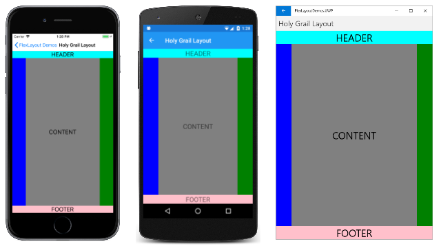
There is a standard layout in web design called the holy grail because it's a layout format that is very desirable, but often hard to realize with perfection. The layout consists of a header at the top of the page and a footer at the bottom, both extending to the full width of the page. Occupying the center of the page is the main content, but often with a columnar menu to the left of the content and supplementary information (sometimes called an aside area) at the right. Section 5.4.1 of the CSS Flexible Box Layout specification describes how the holy grail layout can be realized with a flex box.
The Holy Grail Layout page of the sample shows a simple implementation of this layout using one FlexLayout nested in another. Because this page is designed for a phone in portrait mode, the areas to the left and right of the content area are only 50 pixels wide:
<ContentPage xmlns="http://xamarin.com/schemas/2014/forms"
             xmlns:x="http://schemas.microsoft.com/winfx/2009/xaml"
             x:Class="FlexLayoutDemos.HolyGrailLayoutPage"
             Title="Holy Grail Layout">

    <FlexLayout Direction="Column">

        <!-- Header -->
        <Label Text="HEADER"
               FontSize="Large"
               BackgroundColor="Aqua"
               HorizontalTextAlignment="Center" />

        <!-- Body -->
        <FlexLayout FlexLayout.Grow="1">

            <!-- Content -->
            <Label Text="CONTENT"
                   FontSize="Large"
                   BackgroundColor="Gray"
                   HorizontalTextAlignment="Center"
                   VerticalTextAlignment="Center"
                   FlexLayout.Grow="1" />

            <!-- Navigation items-->
            <BoxView FlexLayout.Basis="50"
                     FlexLayout.Order="-1"
                     Color="Blue" />

            <!-- Aside items -->
            <BoxView FlexLayout.Basis="50"
                     Color="Green" />

        </FlexLayout>

        <!-- Footer -->
        <Label Text="FOOTER"
               FontSize="Large"
               BackgroundColor="Pink"
               HorizontalTextAlignment="Center" />
    </FlexLayout>
</ContentPage>
Here it is running:
The navigation and aside areas are rendered with a BoxView on the left and right.
The first FlexLayout in the XAML file has a vertical main axis and contains three children arranged in a column. These are the header, the body of the page, and the footer. The nested FlexLayout has a horizontal main axis with three children arranged in a row.
Three attached bindable properties are demonstrated in this program:
The
Orderattached bindable property is set on the firstBoxView. This property is an integer with a default value of 0. You can use this property to change the layout order. Generally developers prefer the content of the page to appear in markup prior to the navigation items and aside items. Setting theOrderproperty on the firstBoxViewto a value less than its other siblings causes it to appear as the first item in the row. Similarly, you can ensure that an item appears last by setting theOrderproperty to a value greater than its siblings.The
Basisattached bindable property is set on the twoBoxViewitems to give them a width of 50 pixels. This property is of typeFlexBasis, a structure that defines a static property of typeFlexBasisnamedAuto, which is the default. You can useBasisto specify a pixel size or a percentage that indicates how much space the item occupies on the main axis. It is called a basis because it specifies an item size that is the basis of all subsequent layout.The
Growproperty is set on the nestedLayoutand on theLabelchild representing the content. This property is of typefloatand has a default value of 0. When set to a positive value, all the remaining space along the main axis is allocated to that item and to siblings with positive values ofGrow. The space is allocated proportionally to the values, somewhat like the star specification in aGrid.The first
Growattached property is set on the nestedFlexLayout, indicating that thisFlexLayoutis to occupy all the unused vertical space within the outerFlexLayout. The secondGrowattached property is set on theLabelrepresenting the content, indicating that this content is to occupy all the unused horizontal space within the innerFlexLayout.There is also a similar
Shrinkattached bindable property that you can use when the size of children exceeds the size of theFlexLayoutbut wrapping is not desired.
Catalog items with FlexLayout
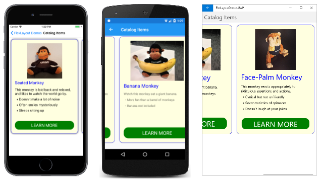
The Catalog Items page in the sample is similar to Example 1 in Section 1.1 of the CSS Flex Layout Box specification except that it displays a horizontally scrollable series of pictures and descriptions of three monkeys:
Each of the three monkeys is a FlexLayout contained in a Frame that is given an explicit height and width, and which is also a child of a larger FlexLayout. In this XAML file, most of the properties of the FlexLayout children are specified in styles, all but one of which is an implicit style:
<ContentPage xmlns="http://xamarin.com/schemas/2014/forms"
xmlns:x="http://schemas.microsoft.com/winfx/2009/xaml"
xmlns:local="clr-namespace:FlexLayoutDemos"
x:Class="FlexLayoutDemos.CatalogItemsPage"
Title="Catalog Items">
<ContentPage.Resources>
<Style TargetType="Frame">
<Setter Property="BackgroundColor" Value="LightYellow" />
<Setter Property="BorderColor" Value="Blue" />
<Setter Property="Margin" Value="10" />
<Setter Property="CornerRadius" Value="15" />
</Style>
<Style TargetType="Label">
<Setter Property="Margin" Value="0, 4" />
</Style>
<Style x:Key="headerLabel" TargetType="Label">
<Setter Property="Margin" Value="0, 8" />
<Setter Property="FontSize" Value="Large" />
<Setter Property="TextColor" Value="Blue" />
</Style>
<Style TargetType="Image">
    <Setter Property="FlexLayout.Order" Value="-1" />
    <Setter Property="FlexLayout.AlignSelf" Value="Center" />
</Style>
<Style TargetType="Button">
<Setter Property="Text" Value="LEARN MORE" />
<Setter Property="FontSize" Value="Large" />
<Setter Property="TextColor" Value="White" />
<Setter Property="BackgroundColor" Value="Green" />
<Setter Property="BorderRadius" Value="20" />
</Style>
</ContentPage.Resources>
<ScrollView Orientation="Both">
<FlexLayout>
<Frame WidthRequest="300"
HeightRequest="480">
<FlexLayout Direction="Column">
<Label Text="Seated Monkey"
Style="{StaticResource headerLabel}" />
<Label Text="This monkey is laid back and relaxed, and likes to watch the world go by." />
<Label Text=" • Doesn't make a lot of noise" />
<Label Text=" • Often smiles mysteriously" />
<Label Text=" • Sleeps sitting up" />
<Image Source="{local:ImageResource FlexLayoutDemos.Images.SeatedMonkey.jpg}"
WidthRequest="180"
HeightRequest="180" />
<Label FlexLayout.Grow="1" />
<Button />
</FlexLayout>
</Frame>
<Frame WidthRequest="300"
HeightRequest="480">
<FlexLayout Direction="Column">
<Label Text="Banana Monkey"
Style="{StaticResource headerLabel}" />
<Label Text="Watch this monkey eat a giant banana." />
<Label Text=" • More fun than a barrel of monkeys" />
<Label Text=" • Banana not included" />
<Image Source="{local:ImageResource FlexLayoutDemos.Images.Banana.jpg}"
WidthRequest="240"
HeightRequest="180" />
<Label FlexLayout.Grow="1" />
<Button />
</FlexLayout>
</Frame>
<Frame WidthRequest="300"
HeightRequest="480">
<FlexLayout Direction="Column">
<Label Text="Face-Palm Monkey"
Style="{StaticResource headerLabel}" />
<Label Text="This monkey reacts appropriately to ridiculous assertions and actions." />
<Label Text=" • Cynical but not unfriendly" />
<Label Text=" • Seven varieties of grimaces" />
<Label Text=" • Doesn't laugh at your jokes" />
<Image Source="{local:ImageResource FlexLayoutDemos.Images.FacePalm.jpg}"
WidthRequest="180"
HeightRequest="180" />
<Label FlexLayout.Grow="1" />
<Button />
</FlexLayout>
</Frame>
</FlexLayout>
</ScrollView>
</ContentPage>
The implicit style for the Image includes settings of two attached bindable properties of Flexlayout:
<Style TargetType="Image">
<Setter Property="FlexLayout.Order" Value="-1" />
<Setter Property="FlexLayout.AlignSelf" Value="Center" />
</Style>
The Order setting of –1 causes the Image element to be displayed first in each of the nested FlexLayout views regardless of its position within the children collection. The AlignSelf property of Center causes the Image to be centered within the FlexLayout. This overrides the setting of the AlignItems property, which has a default value of Stretch, meaning that the Label and Button children are stretched to the full width of the FlexLayout.
Within each of the three FlexLayout views, a blank Label precedes the Button, but it has a Grow setting of 1. This means that all the extra vertical space is allocated to this blank Label, which effectively pushes the Button to the bottom.
The bindable properties in detail
Now that you've seen some common applications of FlexLayout, the properties of FlexLayout can be explored in more detail.
FlexLayout defines six bindable properties that you set on the FlexLayout itself, either in code or XAML, to control orientation and alignment. (One of these properties, Position, is not covered in this article.)
You can experiment with the five remaining bindable properties using the Experiment page of the sample. This page allows you to add or remove children from a FlexLayout and to set combinations of the five bindable properties. All the children of the FlexLayout are Label views of various colors and sizes, with the Text property set to a number corresponding to its position in the Children collection.
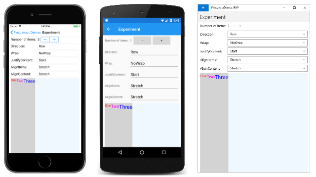
When the program starts up, five Picker views display the default values of these five FlexLayout properties. The FlexLayout towards the bottom of the screen contains three children:
Each of the Label views has a gray background that shows the space allocated to that Label within the FlexLayout. The background of the FlexLayout itself is Alice Blue. It occupies the entire bottom area of the page except for a little margin at the left and right.
The Direction property
The Direction property is of type FlexDirection, an enumeration with four members:
ColumnColumnReverse(or "column-reverse" in XAML)Row, the defaultRowReverse(or "row-reverse" in XAML)
In XAML, you can specify the value of this property using the enumeration member names in lowercase, uppercase, or mixed case, or you can use two additional strings shown in parentheses that are the same as the CSS indicators. (The "column-reverse" and "row-reverse" strings are defined in the FlexDirectionTypeConverter class used by the XAML parser.)
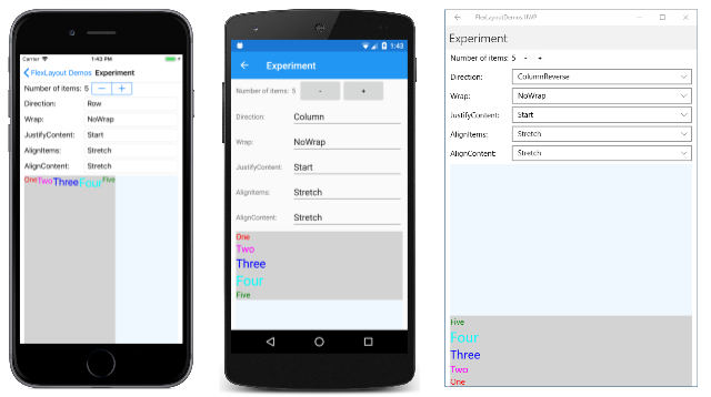
Here's the Experiment page showing (from left to right), the Row direction, Column direction, and ColumnReverse direction:
Notice that for the Reverse options, the items start at the right or bottom.
The Wrap property
The Wrap property is of type FlexWrap, an enumeration with three members:
NoWrap, the defaultWrapReverse(or "wrap-reverse" in XAML)
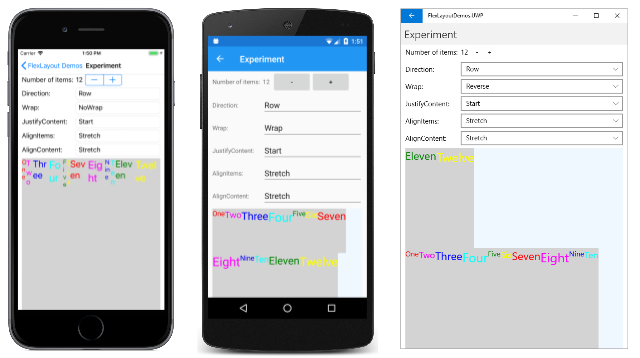
From left to right, these screens show the NoWrap, Wrap and Reverse options for 12 children:
When the Wrap property is set to NoWrap and the main axis is constrained (as in this program), and the main axis is not wide or tall enough to fit all the children, the FlexLayout attempts to make the items smaller, as the iOS screenshot demonstrates. You can control the shrinkness of the items with the Shrink attached bindable property.
The JustifyContent property
The JustifyContent property is of type FlexJustify, an enumeration with six members:
Start(or "flex-start" in XAML), the defaultCenterEnd(or "flex-end" in XAML)SpaceBetween(or "space-between" in XAML)SpaceAround(or "space-around" in XAML)SpaceEvenly
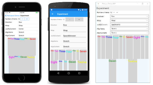
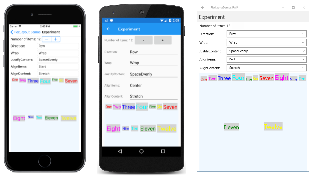
This property specifies how the items are spaced on the main axis, which is the horizontal axis in this example:
In all three screenshots, the Wrap property is set to Wrap. The Start default is shown in the previous Android screenshot. The iOS screenshot here shows the Center option: all the items are moved to the center. The three other options beginning with the word Space allocate the extra space not occupied by the items. SpaceBetween allocates the space equally between the items; SpaceAround puts equal space around each item, while SpaceEvenly puts equal space between each item, and before the first item and after the last item on the row.
The AlignItems property
The AlignItems property is of type FlexAlignItems, an enumeration with four members:
Stretch, the defaultCenterStart(or "flex-start" in XAML)End(or "flex-end" in XAML)
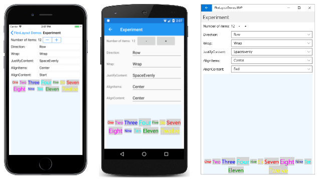
This is one of two properties (the other being AlignContent) that indicates how children are aligned on the cross axis. Within each row, the children are stretched (as shown in the previous screenshot), or aligned on the start, center, or end of each item, as shown in the following three screenshots:
In the iOS screenshot, the tops of all the children are aligned. In the Android screenshots, the items are vertically centered based on the tallest child. In the UWP screenshot, the bottoms of all the items are aligned.
For any individual item, the AlignItems setting can be overridden with the AlignSelf attached bindable property.
The AlignContent property
The AlignContent property is of type FlexAlignContent, an enumeration with seven members:
Stretch, the defaultCenterStart(or "flex-start" in XAML)End(or "flex-end" in XAML)SpaceBetween(or "space-between" in XAML)SpaceAround(or "space-around" in XAML)SpaceEvenly
Like AlignItems, the AlignContent property also aligns children on the cross axis, but affects entire rows or columns:
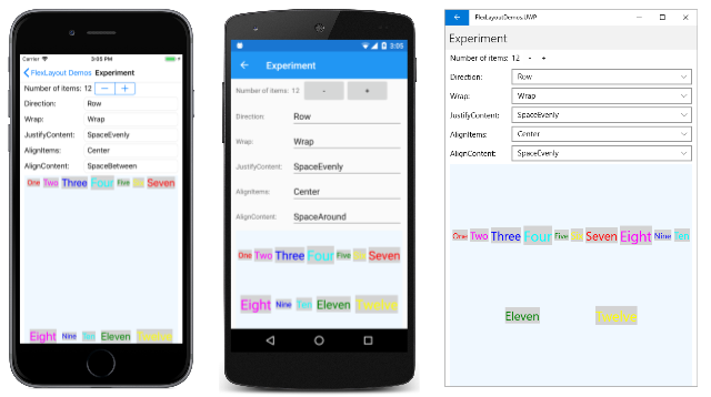
In the iOS screenshot, both rows are at the top; in the Android screenshot they're in the center; and in the UWP screenshot they're at the bottom. The rows can also be spaced in various ways:
The AlignContent has no effect when there is only one row or column.
The attached bindable properties in detail
FlexLayout defines five attached bindable properties. These properties are set on children of the FlexLayout and pertain only to that particular child.
The AlignSelf Property
The AlignSelf attached bindable property is of type FlexAlignSelf, an enumeration with five members:
Auto, the defaultStretchCenterStart(or "flex-start" in XAML)End(or "flex-end" in XAML)
For any individual child of the FlexLayout, this property setting overrides the AlignItems property set on the FlexLayout itself. The default setting of Auto means to use the AlignItems setting.
For a Label element named label (or example), you can set the AlignSelf property in code like this:
FlexLayout.SetAlignSelf(label, FlexAlignSelf.Center);
Notice that there is no reference to the FlexLayout parent of the Label. In XAML, you set the property like this:
<Label ... FlexLayout.AlignSelf="Center" ... />
The Order Property
The Order property is of type int. The default value is 0.
The Order property allows you to change the order that the children of the FlexLayout are arranged. Usually, the children of a FlexLayout are arranged is the same order that they appear in the Children collection. You can override this order by setting the Order attached bindable property to a non-zero integer value on one or more children. The FlexLayout then arranges its children based on the setting of the Order property on each child, but children with the same Order setting are arranged in the order that they appear in the Children collection.
The Basis Property
The Basis attached bindable property indicates the amount of space that is allocated to a child of the FlexLayout on the main axis. The size specified by the Basis property is the size along the main axis of the parent FlexLayout. Therefore, Basis indicates the width of a child when the children are arranged in rows, or the height when the children are arranged in columns.
The Basis property is of type FlexBasis, a structure. The size can be specified in either device-independent units or as a percentage of the size of the FlexLayout. The default value of the Basis property is the static property FlexBasis.Auto, which means that the child's requested width or height is used.
In code, you can set the Basis property for a Label named label to 40 device-independent units like this:
FlexLayout.SetBasis(label, new FlexBasis(40, false));
The second argument to the FlexBasis constructor is named isRelative and indicates whether the size is relative (true) or absolute (false). The argument has a default value of false, so you can also use the following code:
FlexLayout.SetBasis(label, new FlexBasis(40));
An implicit conversion from float to FlexBasis is defined, so you can simplify it even further:
FlexLayout.SetBasis(label, 40);
You can set the size to 25% of the FlexLayout parent like this:
FlexLayout.SetBasis(label, new FlexBasis(0.25f, true));
This fractional value must be in the range of 0 to 1.
In XAML, you can use a number for a size in device-independent units:
<Label ... FlexLayout.Basis="40" ... />
Or you can specify a percentage in the range of 0% to 100%:
<Label ... FlexLayout.Basis="25%" ... />
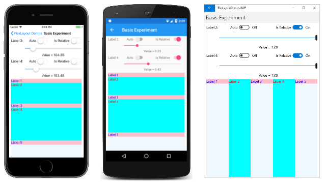
The Basis Experiment page of the sample allows you to experiment with the Basis property. The page displays a wrapped column of five Label elements with alternating background and foreground colors. Two Slider elements let you specify Basis values for the second and fourth Label:
The iOS screenshot at the left shows the two Label elements being given heights in device-independent units. The Android screen shows them being given heights that are a fraction of the total height of the FlexLayout. If the Basis is set at 100%, then the child is the height of the FlexLayout, and will wrap to the next column and occupy the entire height of that column, as the UWP screenshot demonstrates: It appears as if the five children are arranged in a row, but they're actually arranged in five columns.
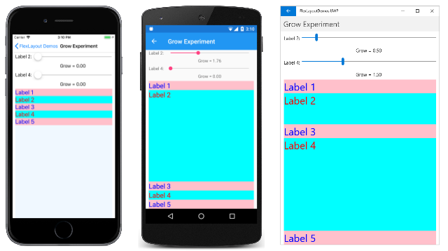
The Grow Property
The Grow attached bindable property is of type int. The default value is 0, and the value must be greater than or equal to 0.
The Grow property plays a role when the Wrap property is set to NoWrap and the row of children has a total width less than the width of the FlexLayout, or the column of children has a shorter height than the FlexLayout. The Grow property indicates how to apportion the leftover space among the children.
In the Grow Experiment page, five Label elements of alternating colors are arranged in a column, and two Slider elements allow you to adjust the Grow property of the second and fourth Label. The iOS screenshot at the far left shows the default Grow properties of 0:
If any one child is given a positive Grow value, then that child takes up all the remaining space, as the Android screenshot demonstrates. This space can also be allocated among two or more children. In the UWP screenshot, the Grow property of the second Label is set to 0.5, while the Grow property of the fourth Label is 1.5, which gives the fourth Label three times as much of the leftover space as the second Label.
How the child view uses that space depends on the particular type of child. For a Label, the text can be positioned within the total space of the Label using the properties HorizontalTextAlignment and VerticalTextAlignment.
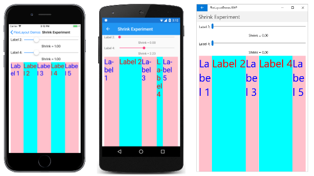
The Shrink Property
The Shrink attached bindable property is of type int. The default value is 1, and the value must be greater than or equal to 0.
The Shrink property plays a role when the Wrap property is set to NoWrap and the aggregate width of a row of children is greater than the width of the FlexLayout, or the aggregate height of a single column of children is greater than the height of the FlexLayout. Normally the FlexLayout will display these children by constricting their sizes. The Shrink property can indicate which children are given priority in being displayed at their full sizes.
The Shrink Experiment page creates a FlexLayout with a single row of five Label children that require more space than the FlexLayout width. The iOS screenshot at the left shows all the Label elements with default values of 1:
In the Android screenshot, the Shrink value for the second Label is set to 0, and that Label is displayed in its full width. Also, the fourth Label is given a Shrink value greater than one, and it has shrunk. The UWP screenshot shows both Label elements being given a Shrink value of 0 to allow them to be displayed in their full size, if that is possible.
You can set both the Grow and Shrink values to accommodate situations where the aggregate child sizes might sometimes be less than or sometimes greater than the size of the FlexLayout.
CSS styling with FlexLayout
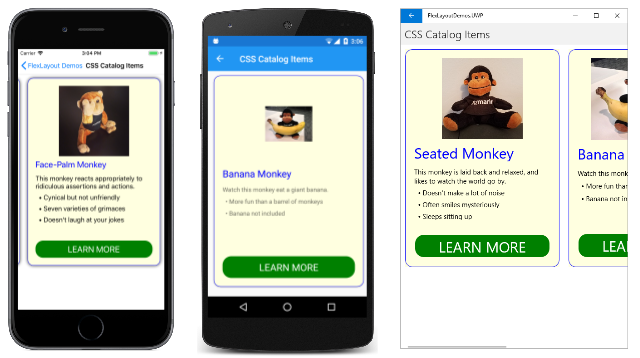
You can use the CSS styling feature introduced with Xamarin.Forms 3.0 in connection with FlexLayout. The CSS Catalog Items page of the sample duplicates the layout of the Catalog Items page, but with a CSS style sheet for many of the styles:
The original CatalogItemsPage.xaml file has five Style definitions in its Resources section with 15 Setter objects. In the CssCatalogItemsPage.xaml file, that has been reduced to two Style definitions with just four Setter objects. These styles supplement the CSS style sheet for properties that the Xamarin.Forms CSS styling feature currently doesn't support:
<ContentPage xmlns="http://xamarin.com/schemas/2014/forms"
xmlns:x="http://schemas.microsoft.com/winfx/2009/xaml"
xmlns:local="clr-namespace:FlexLayoutDemos"
x:Class="FlexLayoutDemos.CssCatalogItemsPage"
Title="CSS Catalog Items">
<ContentPage.Resources>
<StyleSheet Source="CatalogItemsStyles.css" />
<Style TargetType="Frame">
<Setter Property="BorderColor" Value="Blue" />
<Setter Property="CornerRadius" Value="15" />
</Style>
<Style TargetType="Button">
<Setter Property="Text" Value="LEARN MORE" />
<Setter Property="BorderRadius" Value="20" />
</Style>
</ContentPage.Resources>
<ScrollView Orientation="Both">
<FlexLayout>
<Frame>
<FlexLayout Direction="Column">
<Label Text="Seated Monkey" StyleClass="header" />
<Label Text="This monkey is laid back and relaxed, and likes to watch the world go by." />
<Label Text=" • Doesn't make a lot of noise" />
<Label Text=" • Often smiles mysteriously" />
<Label Text=" • Sleeps sitting up" />
<Image Source="{local:ImageResource FlexLayoutDemos.Images.SeatedMonkey.jpg}" />
<Label StyleClass="empty" />
<Button />
</FlexLayout>
</Frame>
<Frame>
<FlexLayout Direction="Column">
<Label Text="Banana Monkey" StyleClass="header" />
<Label Text="Watch this monkey eat a giant banana." />
<Label Text=" • More fun than a barrel of monkeys" />
<Label Text=" • Banana not included" />
<Image Source="{local:ImageResource FlexLayoutDemos.Images.Banana.jpg}" />
<Label StyleClass="empty" />
<Button />
</FlexLayout>
</Frame>
<Frame>
<FlexLayout Direction="Column">
<Label Text="Face-Palm Monkey" StyleClass="header" />
<Label Text="This monkey reacts appropriately to ridiculous assertions and actions." />
<Label Text=" • Cynical but not unfriendly" />
<Label Text=" • Seven varieties of grimaces" />
<Label Text=" • Doesn't laugh at your jokes" />
<Image Source="{local:ImageResource FlexLayoutDemos.Images.FacePalm.jpg}" />
<Label StyleClass="empty" />
<Button />
</FlexLayout>
</Frame>
</FlexLayout>
</ScrollView>
</ContentPage>
The CSS style sheet is referenced in the first line of the Resources section:
<StyleSheet Source="CatalogItemsStyles.css" />
Notice also that two elements in each of the three items include StyleClass settings:
<Label Text="Seated Monkey" StyleClass="header" />
···
<Label StyleClass="empty" />
These refer to selectors in the CatalogItemsStyles.css style sheet:
frame {
    width: 300;
    height: 480;
    background-color: lightyellow;
    margin: 10;
}

label {
    margin: 4 0;
}

label.header {
    margin: 8 0;
    font-size: large;
    color: blue;
}

label.empty {
    flex-grow: 1;
}

image {
    height: 180;
    order: -1;
    align-self: center;
}

button {
    font-size: large;
    color: white;
    background-color: green;
}
Several FlexLayout attached bindable properties are referenced here. In the label.empty selector, you'll see the flex-grow attribute, which styles an empty Label to provide some blank space above the Button. The image selector contains an order attribute and an align-self attribute, both of which correspond to FlexLayout attached bindable properties.
You've seen that you can set properties directly on the FlexLayout and you can set attached bindable properties on the children of a FlexLayout. Or, you can set these properties indirectly using traditional XAML-based styles or CSS styles. What's important is to know and understand these properties. These properties are what makes the FlexLayout truly flexible.
FlexLayout with Xamarin.University
Xamarin.Forms 3.0 Flex Layout video
