Xamarin.Forms ContentView
The Xamarin.Forms ContentView class is a type of Layout that contains a single child element and is typically used to create custom, reusable controls. The ContentView class inherits from TemplatedView. This article, and associated sample, explain how to create a custom CardView control based on the ContentView class.
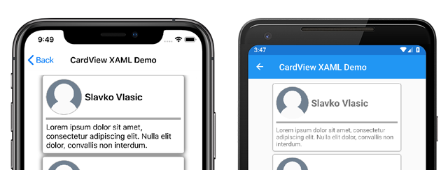
The following screenshot shows a CardView control that derives from the ContentView class:
The ContentView class defines a single property:
Contentis aViewobject. This property is backed by aBindablePropertyobject so it can be the target of data bindings.
The ContentView also inherits a property from the TemplatedView class:
ControlTemplateis aControlTemplatethat can define or override the appearance of the control.
For more information about the ControlTemplate property, see Customize appearance with a ControlTemplate.
Create a custom control
The ContentView class offers little functionality by itself but can be used to create a custom control. The sample project defines a CardView control - a UI element that displays an image, title, and description in a card-like layout.
The process for creating a custom control is to:
- Create a new class using the
ContentViewtemplate in Visual Studio 2019. - Define any unique properties or events in the code-behind file for the new custom control.
- Create the UI for the custom control.
Note
It's possible to create a custom control whose layout is defined in code instead of XAML. For simplicity, the sample application only defines a single CardView class with a XAML layout. However, the sample application contains a CardViewCodePage class that shows the process of consuming the custom control in code.
Create code-behind properties
The CardView custom control defines the following properties:
CardTitle: astringobject that represents the title shown on the card.CardDescription: astringobject that represents the description shown on the card.IconImageSource: anImageSourceobject that represents the image shown on the card.IconBackgroundColor: aColorobject that represents the background color for the image shown on the card.BorderColor: aColorobject that represents the color of the card border, image border, and divider line.CardColor: aColorobject that represents the background color of the card.
Note
The BorderColor property affects multiple items for the purposes of demonstration. This property could be broken out into three properties if needed.
Each property is backed by a BindableProperty instance. The backing BindableProperty allows each property to be styled, and bound, using the MVVM pattern.
The following example shows how to create a backing BindableProperty:
public static readonly BindableProperty CardTitleProperty = BindableProperty.Create(
    "CardTitle",        // the name of the bindable property
    typeof(string),     // the bindable property type
    typeof(CardView),   // the parent object type
    string.Empty);      // the default value for the property
The custom property uses the GetValue and SetValue methods to get and set the BindableProperty object values:
public string CardTitle
{
    get => (string)GetValue(CardView.CardTitleProperty);
    set => SetValue(CardView.CardTitleProperty, value);
}
For more information about BindableProperty objects, see Bindable Properties.
Define UI
The custom control UI uses a ContentView as the root element for the CardView control. The following example shows the CardView XAML:
<ContentView ...
             x:Name="this"
             x:Class="CardViewDemo.Controls.CardView">
    <Frame BindingContext="{x:Reference this}"
            BackgroundColor="{Binding CardColor}"
            BorderColor="{Binding BorderColor}"
            ...>
        <Grid>
            ...
            <Frame BorderColor="{Binding BorderColor, FallbackValue='Black'}"
                   BackgroundColor="{Binding IconBackgroundColor, FallbackValue='Grey'}"
                   ...>
                <Image Source="{Binding IconImageSource}"
                       .. />
            </Frame>
            <Label Text="{Binding CardTitle, FallbackValue='Card Title'}"
                   ... />
            <BoxView BackgroundColor="{Binding BorderColor, FallbackValue='Black'}"
                     ... />
            <Label Text="{Binding CardDescription, FallbackValue='Card description text.'}"
                   ... />
        </Grid>
    </Frame>
</ContentView>
The ContentView element sets the x:Name property to this, which can be used to access the object bound to the CardView instance. Elements in the layout set bindings on their properties to values defined on the bound object.
For more information about data binding, see Xamarin.Forms Data Binding.
Note
The FallbackValue property provides a default value in case the binding is null. This also allows the XAML Previewer in Visual Studio to render the CardView control.
Instantiate a custom control
A reference to the custom control namespace must be added to a page that instantiates the custom control. The following example shows a namespace reference called controls added to a ContentPage instance in XAML:
<ContentPage ...
             xmlns:controls="clr-namespace:CardViewDemo.Controls" >
Once the reference has been added the CardView can be instantiated in XAML, and its properties defined:
<controls:CardView BorderColor="DarkGray"
                   CardTitle="Slavko Vlasic"
                   CardDescription="Lorem ipsum dolor sit..."
                   IconBackgroundColor="SlateGray"
                   IconImageSource="user.png"/>
A CardView can also be instantiated in code:
CardView card = new CardView
{
    BorderColor = Color.DarkGray,
    CardTitle = "Slavko Vlasic",
    CardDescription = "Lorem ipsum dolor sit...",
    IconBackgroundColor = Color.SlateGray,
    IconImageSource = ImageSource.FromFile("user.png")
};
Customize appearance with a ControlTemplate
A custom control that derives from the ContentView class can define appearance using XAML, code, or may not define appearance at all. Regardless of how appearance is defined, a ControlTemplate object can override the appearance with a custom layout.
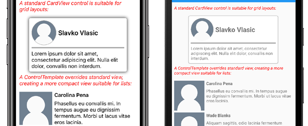
The CardView layout might occupy too much space for some use cases. A ControlTemplate can override the CardView layout to provide a more compact view, suitable for a condensed list:
<ContentPage.Resources>
    <ResourceDictionary>
        <ControlTemplate x:Key="CardViewCompressed">
            <Grid>
                <Grid.RowDefinitions>
                    <RowDefinition Height="100" />
                </Grid.RowDefinitions>
                <Grid.ColumnDefinitions>
                    <ColumnDefinition Width="100" />
                    <ColumnDefinition Width="100*" />
                </Grid.ColumnDefinitions>
                <Image Grid.Row="0"
                       Grid.Column="0"
                       Source="{TemplateBinding IconImageSource}"
                       BackgroundColor="{TemplateBinding IconBackgroundColor}"
                       WidthRequest="100"
                       HeightRequest="100"
                       Aspect="AspectFill"
                       HorizontalOptions="Center"
                       VerticalOptions="Center"/>
                <StackLayout Grid.Row="0"
                             Grid.Column="1">
                    <Label Text="{TemplateBinding CardTitle}"
                           FontAttributes="Bold" />
                    <Label Text="{TemplateBinding CardDescription}" />
                </StackLayout>
            </Grid>
        </ControlTemplate>
    </ResourceDictionary>
</ContentPage.Resources>
Data binding in a ControlTemplate uses the TemplateBinding markup extension to specify bindings. The ControlTemplate property can then be set to the defined ControlTemplate object, by using its x:Key value. The following example shows the ControlTemplate property set on a CardView instance:
<controls:CardView ControlTemplate="{StaticResource CardViewCompressed}"/>
The following screenshots show a standard CardView instance and CardView whose ControlTemplate has been overridden:
For more information about control templates, see Xamarin.Forms Control Templates.

