Xamarin.Forms FlyoutPage
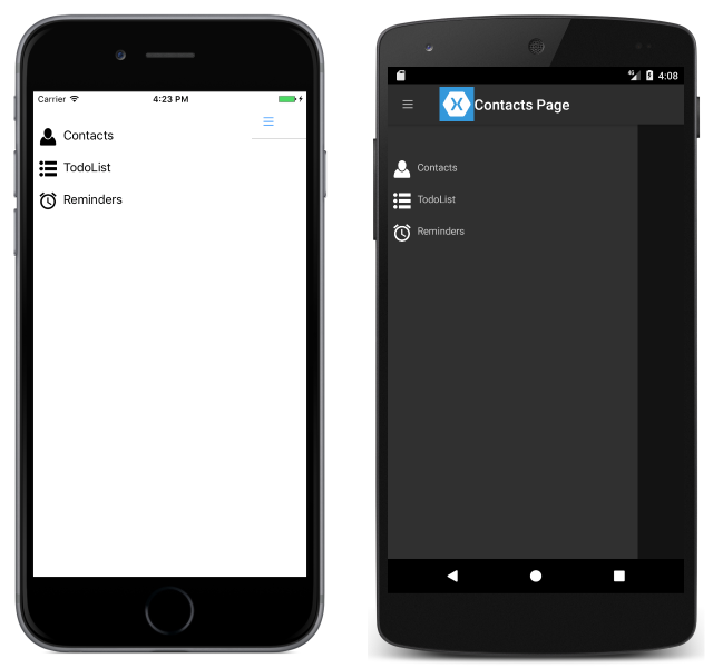
A flyout page typically displays a list of items, as shown in the following screenshots:
The location of the list of items is identical on each platform, and selecting one of the items will navigate to the corresponding detail page. In addition, the flyout page also features a navigation bar that contains a button that can be used to navigate to the active detail page:
- On iOS, the navigation bar is present at the top of the page and has a button that navigates to the detail page. In addition, the active detail page can be navigated to by swiping the flyout to the left.
- On Android, the navigation bar is present at the top of the page and displays a title, an icon, and a button that navigates to the detail page. The icon is defined in the
[Activity]attribute that decorates theMainActivityclass in the Android platform-specific project. In addition, the active detail page can be navigated to by swiping the flyout page to the left, by tapping the detail page at the far right of the screen, and by tapping the Back button at the bottom of the screen. - On the Universal Windows Platform (UWP), the navigation bar is present at the top of the page and has a button that navigates to the detail page.
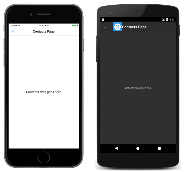
A detail page displays data that corresponds to the item selected on the flyout page, and the main components of the detail page are shown in the following screenshots:

The detail page contains a navigation bar, whose contents are platform-dependent:
- On iOS, the navigation bar is present at the top of the page and displays a title, and has a button that returns to the flyout page, provided that the detail page instance is wrapped in the
NavigationPageinstance. In addition, the flyout page can be returned to by swiping the detail page to the right. - On Android, a navigation bar is present at the top of the page and displays a title, an icon, and a button that returns to the flyout page. The icon is defined in the
[Activity]attribute that decorates theMainActivityclass in the Android platform-specific project. - On UWP, the navigation bar is present at the top of the page and displays a title, and has a button that returns to the flyout page.
Navigation behavior
The behavior of the navigation experience between flyout and detail pages is platform dependent:
- On iOS, the detail page slides to the right as the flyout page slides from the left, and the left part of the detail page is still visible.
- On Android, the detail and flyout pages are overlaid on each other.
- On UWP, the flyout page slides from the left over part of the detail page, provided that the
FlyoutLayoutBehaviorproperty is set toPopover.
Similar behavior will be observed in landscape mode, except that the flyout page on iOS and Android has a similar width as the flyout page in portrait mode, so more of the detail page will be visible.
For information about controlling the navigation behavior, see Control the detail page layout behavior.
Create a FlyoutPage
A FlyoutPage contains Flyout and Detail properties that are both of type Page, which are used to get and set the flyout and detail pages respectively.
Important
A FlyoutPage is designed to be a root page, and using it as a child page in other page types could result in unexpected and inconsistent behavior. In addition, it's recommended that the flyout page of a FlyoutPage should always be a ContentPage instance, and that the detail page should only be populated with TabbedPage, NavigationPage, and ContentPage instances. This will help to ensure a consistent user experience across all platforms.
The following XAML code example shows a FlyoutPage that sets the Flyout and Detail properties:
<FlyoutPage xmlns="http://xamarin.com/schemas/2014/forms"
            xmlns:x="http://schemas.microsoft.com/winfx/2009/xaml"
            xmlns:local="clr-namespace:FlyoutPageNavigation;assembly=FlyoutPageNavigation"
            x:Class="FlyoutPageNavigation.MainPage">
    <FlyoutPage.Flyout>
        <local:FlyoutMenuPage x:Name="flyoutPage" />
    </FlyoutPage.Flyout>
    <FlyoutPage.Detail>
        <NavigationPage>
            <x:Arguments>
                <local:ContactsPage />
            </x:Arguments>
        </NavigationPage>
    </FlyoutPage.Detail>
</FlyoutPage>
The following code example shows the equivalent FlyoutPage created in C#:
public class MainPageCS : FlyoutPage
{
    FlyoutMenuPageCS flyoutPage;

    public MainPageCS()
    {
        flyoutPage = new FlyoutMenuPageCS();
        Flyout = flyoutPage;
        Detail = new NavigationPage(new ContactsPageCS());
        ...
    }
    ...
}
The Flyout property is set to a ContentPage instance. The Detail property is set to a NavigationPage containing a ContentPage instance.
Create the flyout page
The following XAML code example shows the declaration of the FlyoutMenuPage object, which is referenced through the Flyout property:
<ContentPage xmlns="http://xamarin.com/schemas/2014/forms"
             xmlns:x="http://schemas.microsoft.com/winfx/2009/xaml"
             xmlns:local="using:FlyoutPageNavigation"
             x:Class="FlyoutPageNavigation.FlyoutMenuPage"
             Padding="0,40,0,0"
             IconImageSource="hamburger.png"
             Title="Personal Organiser">
    <StackLayout>
        <ListView x:Name="listView" x:FieldModifier="public">
            <ListView.ItemsSource>
                <x:Array Type="{x:Type local:FlyoutPageItem}">
                    <local:FlyoutPageItem Title="Contacts" IconSource="contacts.png" TargetType="{x:Type local:ContactsPage}" />
                    <local:FlyoutPageItem Title="TodoList" IconSource="todo.png" TargetType="{x:Type local:TodoListPage}" />
                    <local:FlyoutPageItem Title="Reminders" IconSource="reminders.png" TargetType="{x:Type local:ReminderPage}" />
                </x:Array>
            </ListView.ItemsSource>
            <ListView.ItemTemplate>
                <DataTemplate>
                    <ViewCell>
                        <Grid Padding="5,10">
                            <Grid.ColumnDefinitions>
                                <ColumnDefinition Width="30"/>
                                <ColumnDefinition Width="*" />
                            </Grid.ColumnDefinitions>
                            <Image Source="{Binding IconSource}" />
                            <Label Grid.Column="1" Text="{Binding Title}" />
                        </Grid>
                    </ViewCell>
                </DataTemplate>
            </ListView.ItemTemplate>
        </ListView>
    </StackLayout>
</ContentPage>
The page consists of a ListView that's populated with data in XAML by setting its ItemsSource property to an array of FlyoutPageItem objects. Each FlyoutPageItem defines Title, IconSource, and TargetType properties.
A DataTemplate is assigned to the ListView.ItemTemplate property, to display each FlyoutPageItem. The DataTemplate contains a ViewCell that consists of an Image and a Label. The Image displays the IconSource property value, and the Label displays the Title property value, for each FlyoutPageItem.
The page has its Title and IconImageSource properties set. The icon will appear on the detail page, provided that the detail page has a title bar. This must be enabled on iOS by wrapping the detail page instance in a NavigationPage instance.
The following code example shows the equivalent page created in C#:
public class FlyoutMenuPageCS : ContentPage
{
    ListView listView;
    public ListView ListView { get { return listView; } }

    public FlyoutMenuPageCS()
    {
        var flyoutPageItems = new List<FlyoutPageItem>();
        flyoutPageItems.Add(new FlyoutPageItem
        {
            Title = "Contacts",
            IconSource = "contacts.png",
            TargetType = typeof(ContactsPageCS)
        });
        flyoutPageItems.Add(new FlyoutPageItem
        {
            Title = "TodoList",
            IconSource = "todo.png",
            TargetType = typeof(TodoListPageCS)
        });
        flyoutPageItems.Add(new FlyoutPageItem
        {
            Title = "Reminders",
            IconSource = "reminders.png",
            TargetType = typeof(ReminderPageCS)
        });

        listView = new ListView
        {
            ItemsSource = flyoutPageItems,
            ItemTemplate = new DataTemplate(() =>
            {
                var grid = new Grid { Padding = new Thickness(5, 10) };
                grid.ColumnDefinitions.Add(new ColumnDefinition { Width = new GridLength(30) });
                grid.ColumnDefinitions.Add(new ColumnDefinition { Width = GridLength.Star });

                var image = new Image();
                image.SetBinding(Image.SourceProperty, "IconSource");
                var label = new Label { VerticalOptions = LayoutOptions.FillAndExpand };
                label.SetBinding(Label.TextProperty, "Title");

                grid.Children.Add(image);
                grid.Children.Add(label, 1, 0);

                return new ViewCell { View = grid };
            }),
            SeparatorVisibility = SeparatorVisibility.None
        };

        IconImageSource = "hamburger.png";
        Title = "Personal Organiser";
        Padding = new Thickness(0, 40, 0, 0);
        Content = new StackLayout
        {
            Children = { listView }
        };
    }
}
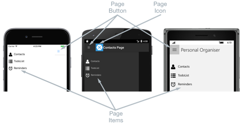
The following screenshots show the flyout page on each platform:

Create and display the detail page
The FlyoutMenuPage instance contains a ListView property that exposes its ListView instance so that the MainPage FlyoutPage instance can register an event-handler to handle the ItemSelected event. This enables the MainPage instance to set the Detail property to the page that represents the selected ListView item. The following code example shows the event-handler:
public partial class MainPage : FlyoutPage
{
    public MainPage()
    {
        ...
        flyoutPage.listView.ItemSelected += OnItemSelected;
    }

    void OnItemSelected(object sender, SelectedItemChangedEventArgs e)
    {
        var item = e.SelectedItem as FlyoutPageItem;
        if (item != null)
        {
            Detail = new NavigationPage((Page)Activator.CreateInstance(item.TargetType));
            flyoutPage.listView.SelectedItem = null;
            IsPresented = false;
        }
    }
}
The OnItemSelected method performs the following actions:
- It retrieves the
SelectedItemfrom theListViewinstance, and provided that it's notnull, sets the detail page to a new instance of the page type stored in theTargetTypeproperty of theFlyoutPageItem. The page type is wrapped in aNavigationPageinstance to ensure that the icon referenced through theIconImageSourceproperty on theFlyoutMenuPageis shown on the detail page in iOS. - The selected item in the
ListViewis set tonullto ensure that none of theListViewitems will be selected next time theFlyoutMenuPageis presented. - The detail page is presented to the user by setting the
FlyoutPage.IsPresentedproperty tofalse. This property controls whether the flyout or detail page is presented. It should be set totrueto display the flyout page, and tofalseto display the detail page.
The following screenshots show the ContactPage detail page, which is shown after it's been selected on the flyout page:

Control the detail page layout behavior
How the FlyoutPage manages the flyout and detail pages depends on whether the application is running on a phone or tablet, the orientation of the device, and the value of the FlyoutLayoutBehavior property. This property determines how the detail page will be displayed. It's possible values are:
Default– The pages are displayed using the platform default.Popover– The detail page covers, or partially covers the flyout page.Split– The flyout page is displayed on the left and the detail page is on the right.SplitOnLandscape– A split screen is used when the device is in landscape orientation.SplitOnPortrait– A split screen is used when the device is in portrait orientation.
The following XAML code example demonstrates how to set the FlyoutLayoutBehavior property on a FlyoutPage:
<FlyoutPage xmlns="http://xamarin.com/schemas/2014/forms"
            xmlns:x="http://schemas.microsoft.com/winfx/2009/xaml"
            x:Class="FlyoutPageNavigation.MainPage"
            FlyoutLayoutBehavior="Popover">
  ...
</FlyoutPage>
The following code example shows the equivalent FlyoutPage created in C#:
public class MainPageCS : FlyoutPage
{
    FlyoutMenuPageCS flyoutPage;

    public MainPageCS()
    {
        ...
        FlyoutLayoutBehavior = FlyoutLayoutBehavior.Popover;
    }
}
Important
The value of the FlyoutLayoutBehavior property only affects applications running on tablets or the desktop. Applications running on phones always have the Popover behavior.
