Introduction to Custom Renderers
Custom renderers provide a powerful approach for customizing the appearance and behavior of Xamarin.Forms controls. They can be used for small styling changes or sophisticated platform-specific layout and behavior customization. This article provides an introduction to custom renderers, and outlines the process for creating a custom renderer.
Xamarin.Forms Pages, Layouts and Controls present a common API to describe cross-platform mobile user interfaces. Each page, layout, and control is rendered differently on each platform, using a Renderer class that in turn creates a native control (corresponding to the Xamarin.Forms representation), arranges it on the screen, and adds the behavior specified in the shared code.
Developers can implement their own custom Renderer classes to customize the appearance and/or behavior of a control. Custom renderers for a given type can be added to one application project to customize the control in one place while allowing the default behavior on other platforms; or different custom renderers can be added to each application project to create a different look and feel on iOS, Android, and the Universal Windows Platform (UWP). However, implementing a custom renderer class to perform a simple control customization is often a heavy-weight response. Effects simplify this process, and are typically used for small styling changes. For more information, see Effects.
Examining Why Custom Renderers are Necessary
Changing the appearance of a Xamarin.Forms control, without using a custom renderer, is a two-step process that involves creating a custom control through subclassing, and then consuming the custom control in place of the original control. The following code example shows an example of subclassing the Entry control:
public class MyEntry : Entry
{
  public MyEntry ()
  {
    BackgroundColor = Color.Gray;
  }
}
The MyEntry control is an Entry control where the BackgroundColor is set to gray, and can be referenced in Xaml by declaring a namespace for its location and using the namespace prefix on the control element. The following code example shows how the MyEntry custom control can be consumed by a ContentPage:
<ContentPage
    ...
    xmlns:local="clr-namespace:CustomRenderer;assembly=CustomRenderer"
    ...>
    ...
    <local:MyEntry Text="In Shared Code" />
    ...
</ContentPage>
The local namespace prefix can be anything. However, the namespace and assembly values must match the details of the custom control. Once the namespace is declared, the prefix is used to reference the custom control.
Note
Defining the xmlns is much simpler in .NET Standard library projects than Shared Projects. A .NET Standard library is compiled into an assembly so it's easy to determine what the assembly=CustomRenderer value should be. When using Shared Projects, all the shared assets (including the XAML) are compiled into each of the referencing projects, which means that if the iOS, Android, and UWP projects have their own assembly names it is impossible to write the xmlns declaration because the value needs to be different for each application. Custom controls in XAML for Shared Projects will require every application project to be configured with the same assembly name.
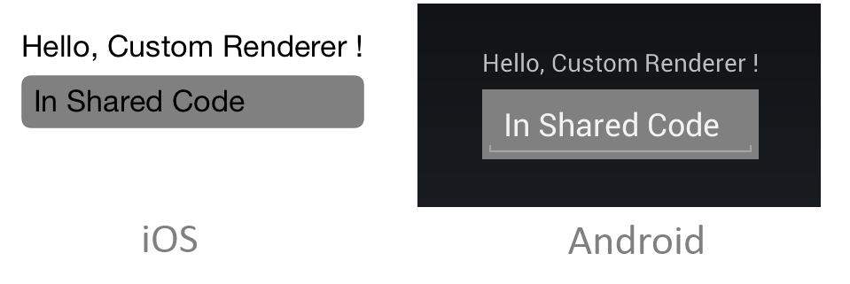
The MyEntry custom control is then rendered on each platform, with a gray background, as shown in the following screenshots:

Changing the background color of the control on each platform has been accomplished purely through subclassing the control. However, this technique is limited in what it can achieve as it is not possible to take advantage of platform-specific enhancements and customizations. When they are required, custom renderers must be implemented.
Creating a Custom Renderer Class
The process for creating a custom renderer class is as follows:
- Create a subclass of the renderer class that renders the native control.
- Override the method that renders the native control and write logic to customize the control. Often, the
OnElementChangedmethod is used to render the native control, which is called when the corresponding Xamarin.Forms control is created. - Add an
ExportRendererattribute to the custom renderer class to specify that it will be used to render the Xamarin.Forms control. This attribute is used to register the custom renderer with Xamarin.Forms.
Note
For most Xamarin.Forms elements, it is optional to provide a custom renderer in each platform project. If a custom renderer isn't registered, then the default renderer for the control's base class will be used. However, custom renderers are required in each platform project when rendering a View or ViewCell element.
The topics in this series will provide demonstrations and explanations of this process for different Xamarin.Forms elements.
Troubleshooting
If a custom control is contained in a .NET Standard library project that's been added to the solution (i.e. not the .NET Standard library created by the Visual Studio for Mac/Visual Studio Xamarin.Forms App project template), an exception may occur in iOS when attempting to access the custom control. If this issue occurs it can be resolved by creating a reference to the custom control from the AppDelegate class:
var temp = new ClassInPCL(); // in AppDelegate, but temp not used anywhere
This forces the compiler to recognize the ClassInPCL type by resolving it. Alternatively, the Preserve attribute can be added to the AppDelegate class to achieve the same result:
[assembly: Preserve (typeof (ClassInPCL))]
This creates a reference to the ClassInPCL type, indicating that it's required at runtime. For more information, see Preserving Code.
Summary
This article has provided an introduction to custom renderers, and has outlined the process for creating a custom renderer. Custom renderers provide a powerful approach for customizing the appearance and behavior of Xamarin.Forms controls. They can be used for small styling changes or sophisticated platform-specific layout and behavior customization.