Azure Time Series Insights Gen1 Explorer
Note
The Time Series Insights service will be retired on 7 July 2024. Consider migrating existing environments to alternative solutions as soon as possible. For more information on the deprecation and migration, visit our documentation.
Caution
This is a Gen1 article.
This article describes the features and options for the Azure Time Series Insights Gen1 Explorer web app. The Azure Time Series Insights Explorer demonstrates the powerful data visualization capabilities provided by the service and can be accessed within your own environment.
Azure Time Series Insights is a fully managed analytics, storage, and visualization service that makes it simple to explore and analyze billions of IoT events simultaneously. It gives you a global view of your data, which lets you quickly validate your IoT solution and avoid costly downtime to mission-critical devices. You can discover hidden trends, spot anomalies, and conduct root-cause analyses in near real time.
Tip
For a guided tour through the demonstration environment, read the Azure Time Series Insights quickstart.
Video
Learn about querying data by using the Azure Time Series Insights Explorer.
Note
Play the preceding video "Getting started with Azure Time Series Insights by using an Azure IoT Solution Accelerator."
Prerequisites
Before you can use Azure Time Series Insights Explorer, you must:
- Create an Azure Time Series Insights environment. For more information, read How to get started with Azure Time Series Insights.
- Provide access to your account in the environment.
- Add an IoT hub or event hub event source to it.
Explore and query data
Within minutes of connecting your event source to your Azure Time Series Insights environment, you can explore and query your time series data.
To start, open the Azure Time Series Insights Explorer in your web browser. On the left side of the window, select an environment. All environments that you have access to are listed in alphabetical order.
After you select an environment, either use the From and To configurations at the top, or select and drag over the timespan you want. Select the magnifying glass in the upper-right corner, or right-click on the selected timespan and select Search.
You also can refresh availability automatically every minute by selecting the Auto On button. The Auto On button only applies to the availability chart, not the content of the main visualization.
The Azure cloud icon takes you to your environment in the Azure portal.
Next, a chart that shows a count of all events during the selected timespan is displayed. Here you have a number of controls:
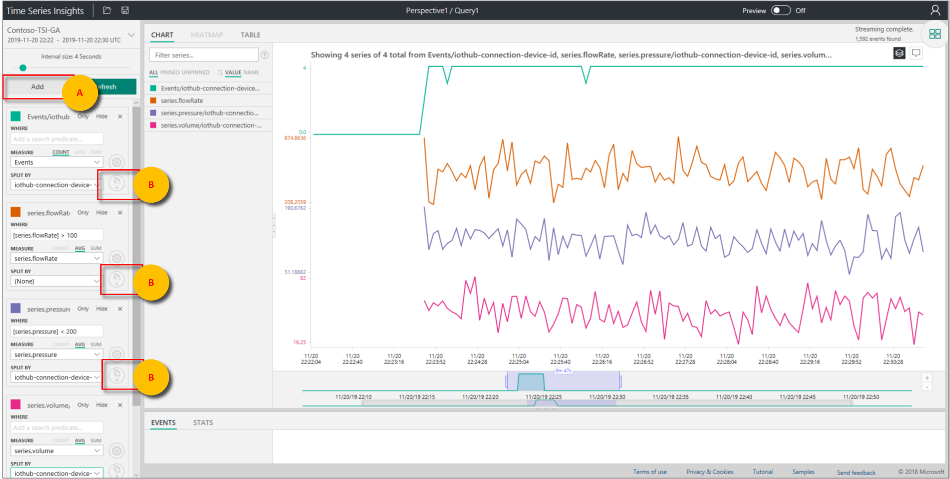
- Terms Editor panel: The term space is where you query your environment. It's found on the left side of the screen:
MEASURE: This drop-down list shows all numeric columns (Doubles).
SPLIT BY: This drop-down list shows categorical columns (Strings).
You can enable step interpolation, show minimum and maximum, and adjust the y-axis from the control panel next to MEASURE. You also can adjust whether data shown is a count, average, or sum of the data.
You can add up to five terms to view on the same x-axis. Select Add to add a fresh term or use the Clone this term button to add a copy of an existing term.
Predicate: Use the predicate to quickly filter your events by using the set of operands listed in the following table. If you conduct a search by selecting or clicking, the predicate automatically updates based on that search. Supported operand types include:
Operation Supported types Notes <, >, <=, >= Double, DateTime, TimeSpan =, !=, <> String, Bool, Double, DateTime, TimeSpan, NULL IN String, Bool, Double, DateTime, TimeSpan, NULL All operands should be of the same type or be NULL constant. HAS String Only constant string literals are allowed at the right side. Empty string and NULL aren't allowed. Example queries
- Terms Editor panel: The term space is where you query your environment. It's found on the left side of the screen:
You can use the Interval Size slider tool to zoom in and out of intervals over the same timespan. The slider provides more precise control of movement between large slices of time that show smooth trends down to slices as small as the millisecond, which allow you to display and analyze granular, high-resolution cuts of your data. The slider's default starting point is set as the most optimal view of the data from your selection to balance resolution, query speed, and granularity.
The Time brush tool makes it easy to navigate from one timespan to another.
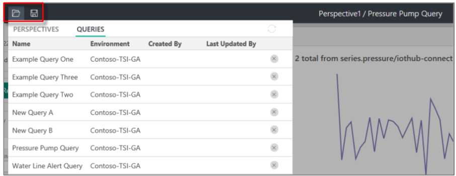
Select the Save icon to save your current query and share it with other users of the environment. When you select the Open icon, you can review all of your saved queries and any shared queries of other users in environments you have access to.
Visualize data
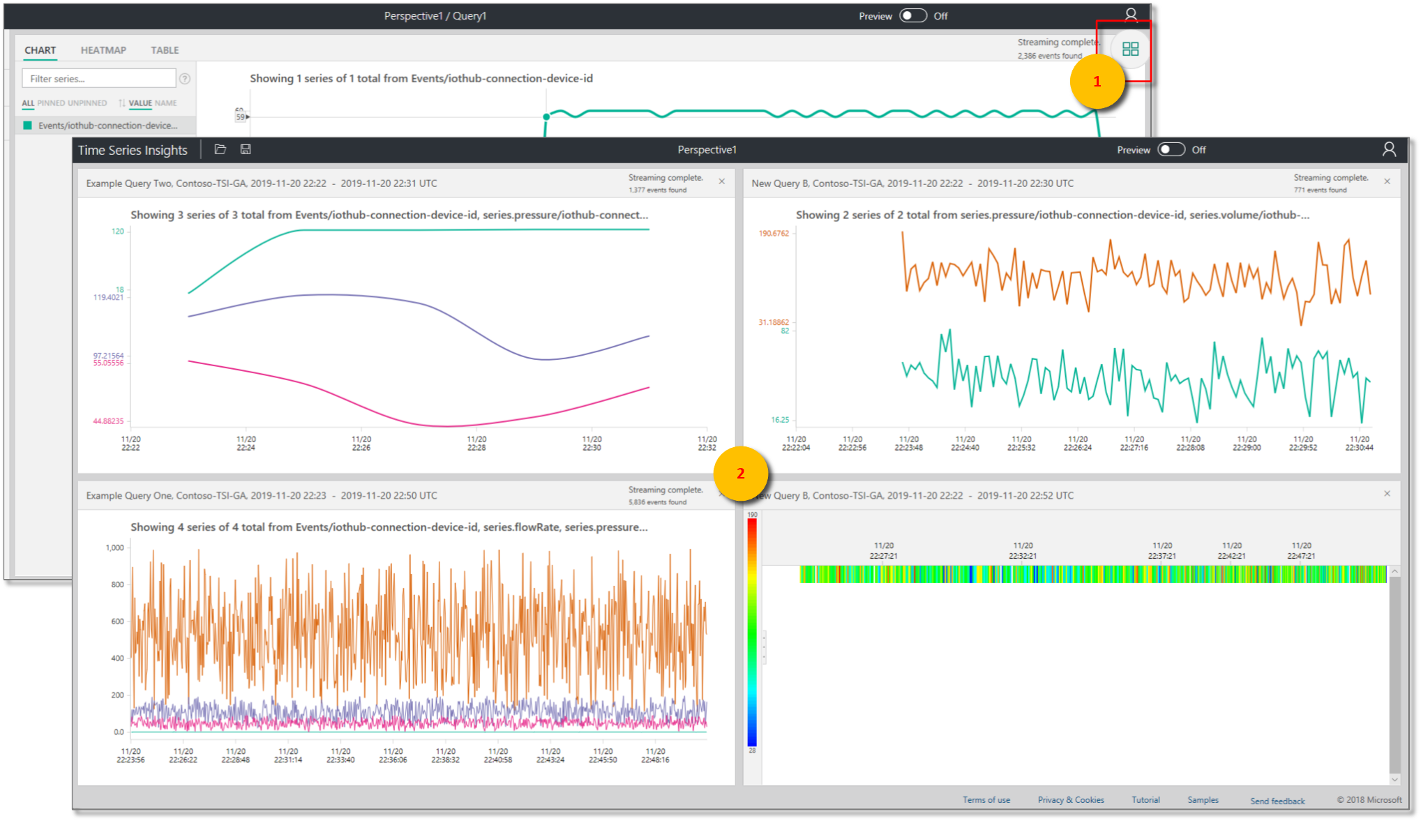
Use the Perspective View tool for a simultaneous view of up to four unique queries. The Perspective View button is in the upper-right corner of the chart.
View a chart to visually explore your data, and use the Chart tools:
- Select or click a specific timespan or a single data series.
- Within a timespan selection, you can zoom or explore events.
- Within a data series, you can split the series by another column, add the series as a new term, show only the selected series, exclude the selected series, ping that series, or explore events from the selected series.
- In the filter area to the left of the chart, you can review all displayed data series and reorder by value or name. You also can view all data series or any pinned or unpinned series. You can select a single data series and split the series by another column, add the series as a new term, show only the selected series, exclude the selected series, pin that series, or explore events from the selected series.
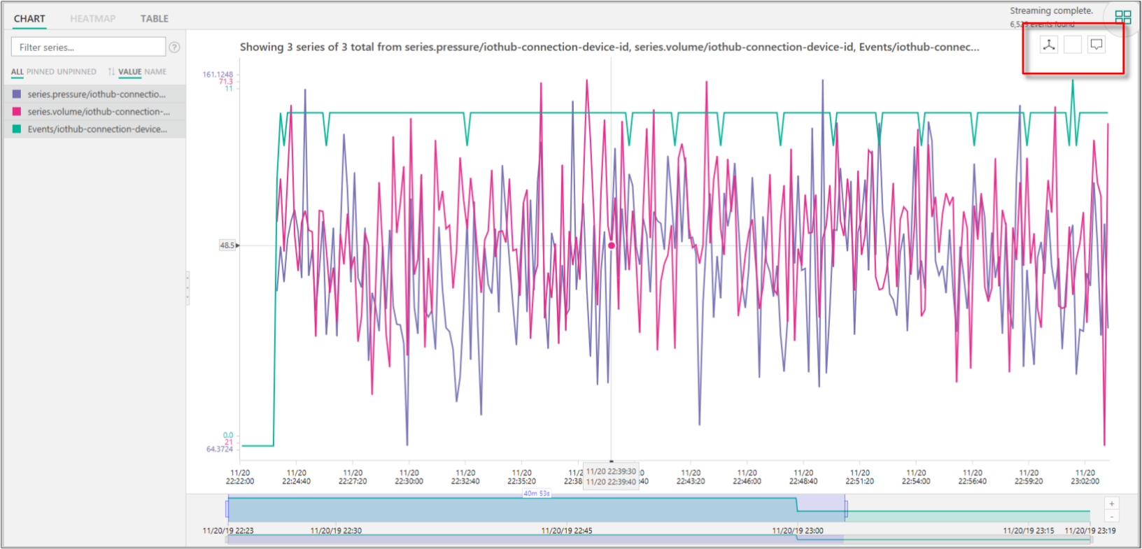
- When you view multiple terms simultaneously, you can stack, unstack, review additional data about a data series, and use the same y-axis across all terms. Use the buttons in the upper-right corner of the chart.
Use the heatmap to quickly spot unique or anomalous data series in a given query. Only one search term can be visualized as a heatmap.
Time Series Insights explorer heatmap charting](media/time-series-insights-explorer/tsi-ga-example-heatmap-charting.png#lightbox)
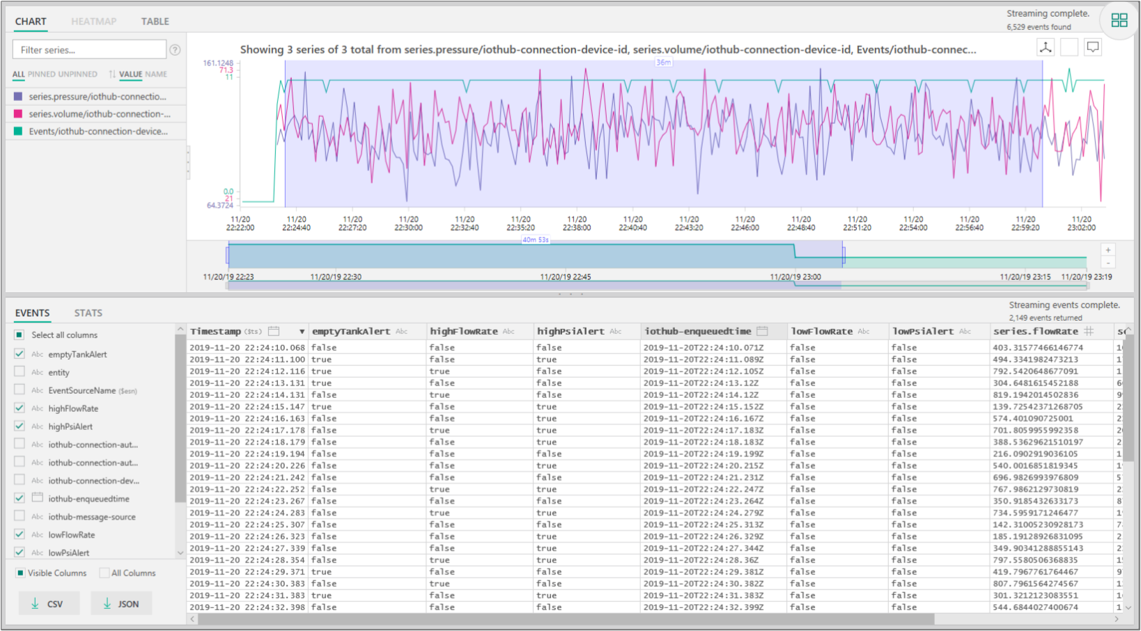
When you explore events by selecting or right-clicking, the EVENTS panel is made available. Here, you can review all of your raw events and export your events as JSON or CSV files. Azure Time Series Insights stores all raw data.
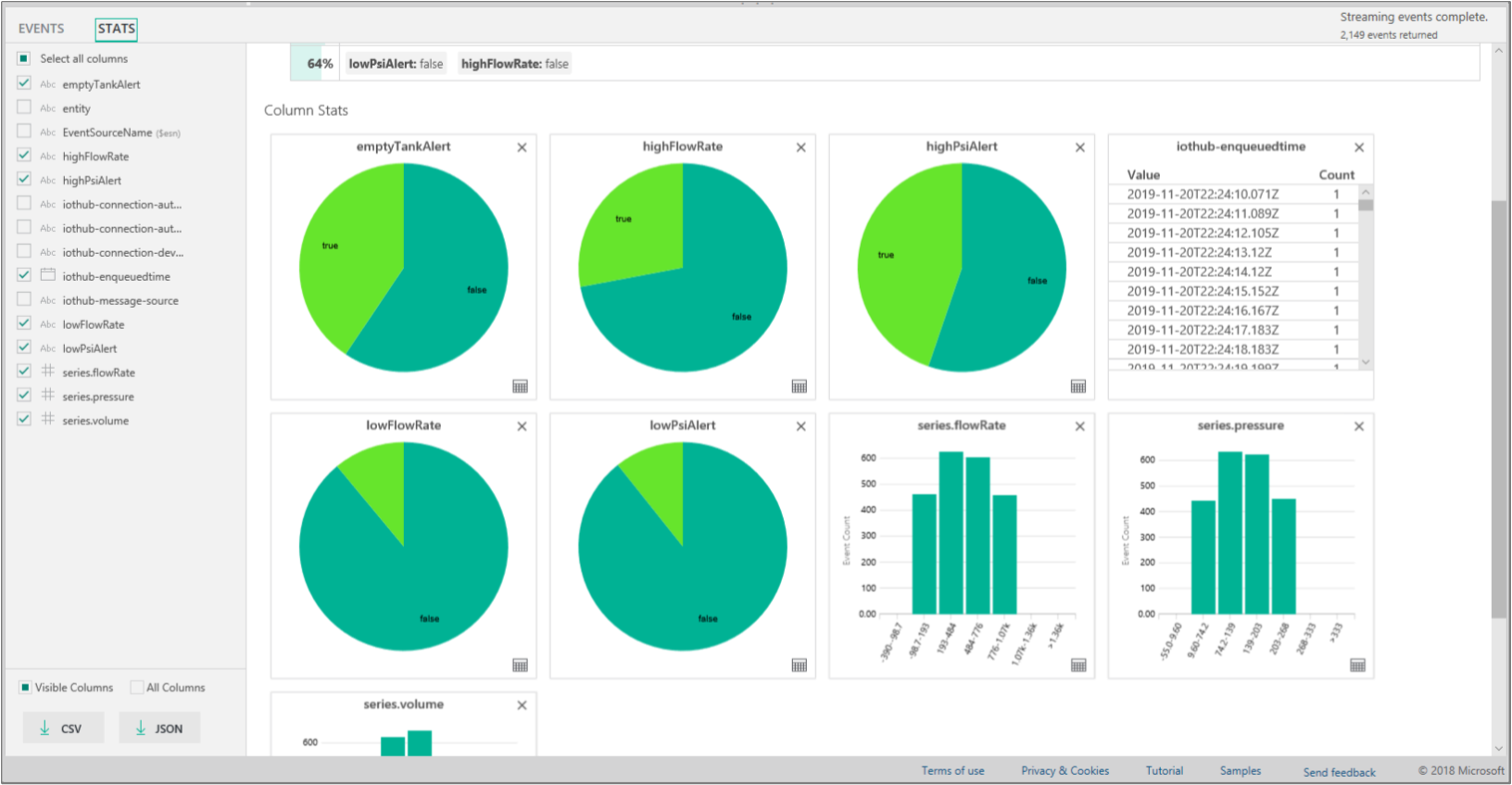
Select the STATS tab after you explore events to expose patterns and column stats.
Patterns: This feature proactively surfaces the most statistically significant patterns in a selected data region. You don't have to look at thousands of events to understand what patterns require the most time and energy. With Azure Time Series Insights, you can jump directly into these statistically significant patterns to continue conducting an analysis. This feature is also helpful for post-mortem investigations into historical data.
Column Stats: Column stats provide charts and tables that break down data from each column of the selected data series over the selected timespan.
Now you've learned about the key features, configuration settings, and display options that are available in the Azure Time Series Insights explorer web app.
Next steps
Learn how to diagnose and solve problems in your Azure Time Series Insights environment.
Take the guided Azure Time Series Insights quickstart tour.

